Client
Northern Alberta Institute of Technology (NAIT) Athletics association
Date
2016
About
Since 1964, NAIT's men and women's sports teams have been called the 'Ooks', short for 'ookpik', the Inuktitut name for snowy owl. The Ook was selected as the mascot and namesake for NAIT to represent qualities of strength, survival and pride, characteristics we engender in our student-athletes.
At the request of the coaches and off the back of a perfect season for the Men’s hockey team, the decision was made by the department heads to revise the existing logo. As part of this redesign, foundations were to be placed to set in a more comprehensive design for what had, in the past, been a somewhat piece-meal set of visual criteria. This project was led by the brand manager as a distinct sub-brand apart from NAIT’s core brand.
Goals
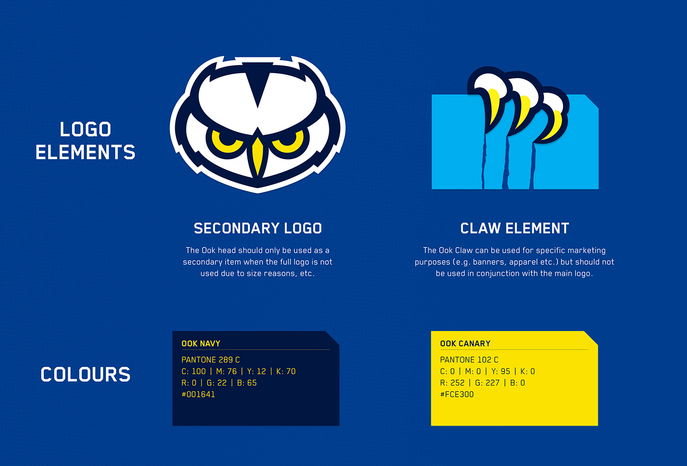
Create a logo that had better scalability for digital, print and embroidery Achieved though a simplification of the silhouette and removal of superfluous details
Place more emphasis on team name (over logo) — revised typography, unified institution name with team name (grouped together on single banner)
Create a subset of design assets for specific applications (claws etc.)
Create comprehensive brand guidelines for retail partners and designers
Roles
Art direction, graphic design, illustration
Awards
2017 CASE District VIII Communication, Silver, Logo and Brand Identity Graphics