
Designing a journalism brand from scratch
De Correspondent
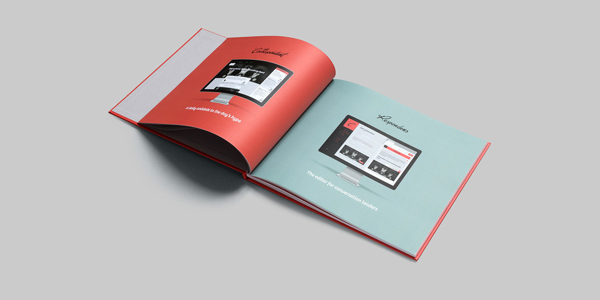
As co-founder of the online journalism start-up De Correspondent, Momkai has handled its brand identity, platform, and events from the beginning. Working with our fellow co-founder, editor-in-chief Rob Wijnberg, we created a bespoke brand to match De Correspondent’s unique concept.
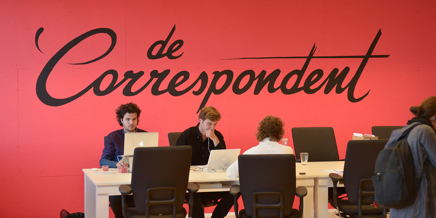
Photo: Bas Losekoot
Raising a rebel
De Correspondent launched in 2013, setting a crowdfunding world record. The ad-free site shifts the news focus from the sensational to the foundational by equipping its correspondents to do in-depth research and giving them access to the expertise of its 60,000 paying members. For us, co-founding this journalistic revolution meant designing De Correspondent’s brand identity from scratch.
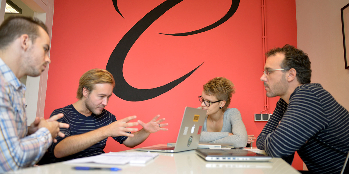
Photo: Bas Losekoot
The notion of authorship
We deliberately gave the site a handcrafted feel to emphasise the notion of authorship, facilitate the sense of a personal relationship between readers and writers, and provide an intriguing contrast with the smoothness of the digital platform.
The style is hard to copy and works as an extension of the branding: wherever a correspondent’s characteristic hand-drawn portrait pops up, viewers will immediately think of De Correspondent. There’s no need for our logo or name.
Bridging the gap between the digital and physical
Setting ourselves apart
To distinguish itself in a crowded field, our unique journalistic venture needed a name that would clearly convey its personal, subjective approach. Opposing the tendency of media organisations to define themselves geographically (The New York Times, The Washington Post), we chose to define ourselves with reference to the conversation leaders who make up the essence of what De Correspondent is – whether they report on the economy, forgotten wars, the climate, or love.


A personal touch
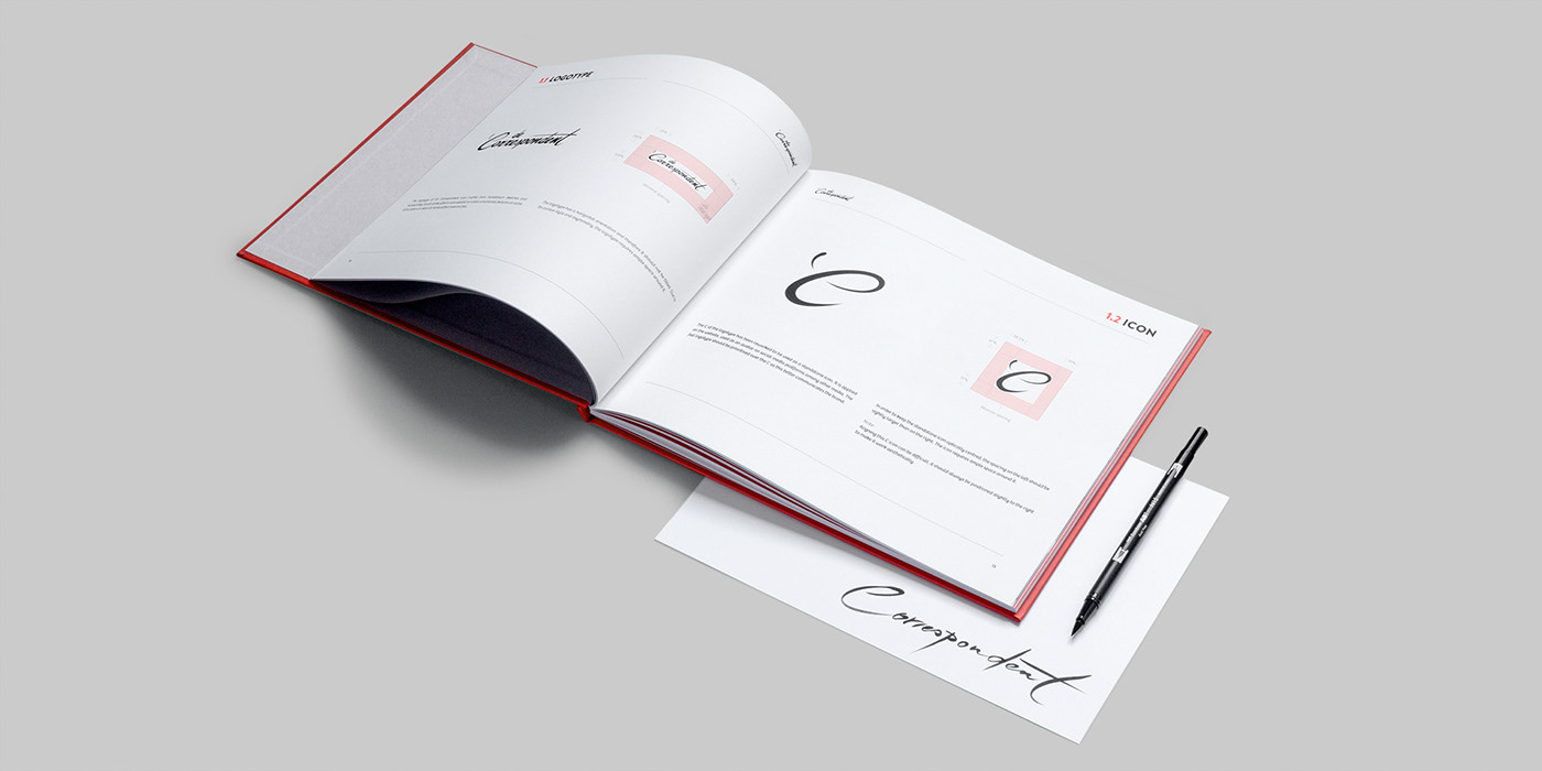
Our design reflects our focus on the person behind the professional. Our logo was handwritten by our co-founder Harald Dunnink, while the “C” emblem references a single quotation mark – the opening of a personal statement. Just as our correspondents are visible on the site as experts who bring stories to life, we wanted to let the designer’s personality show in the site’s visual identity.
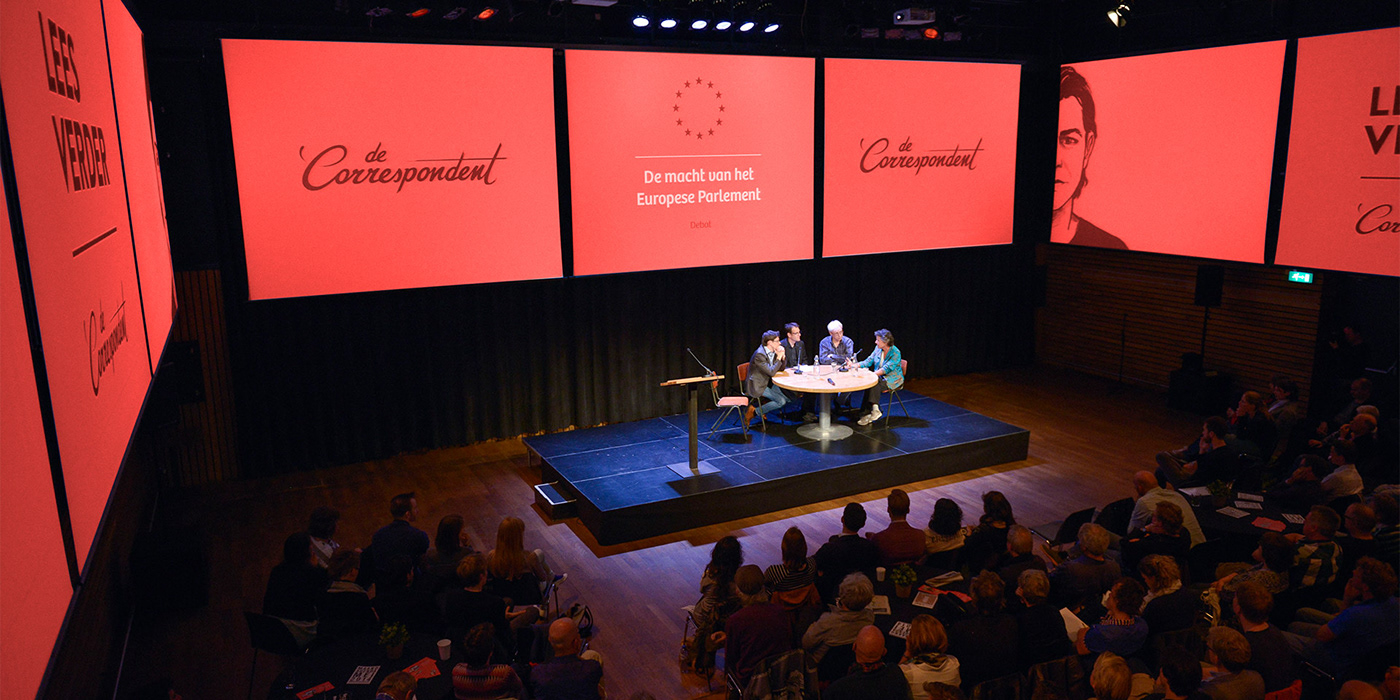
Photo: Bas Losekoot
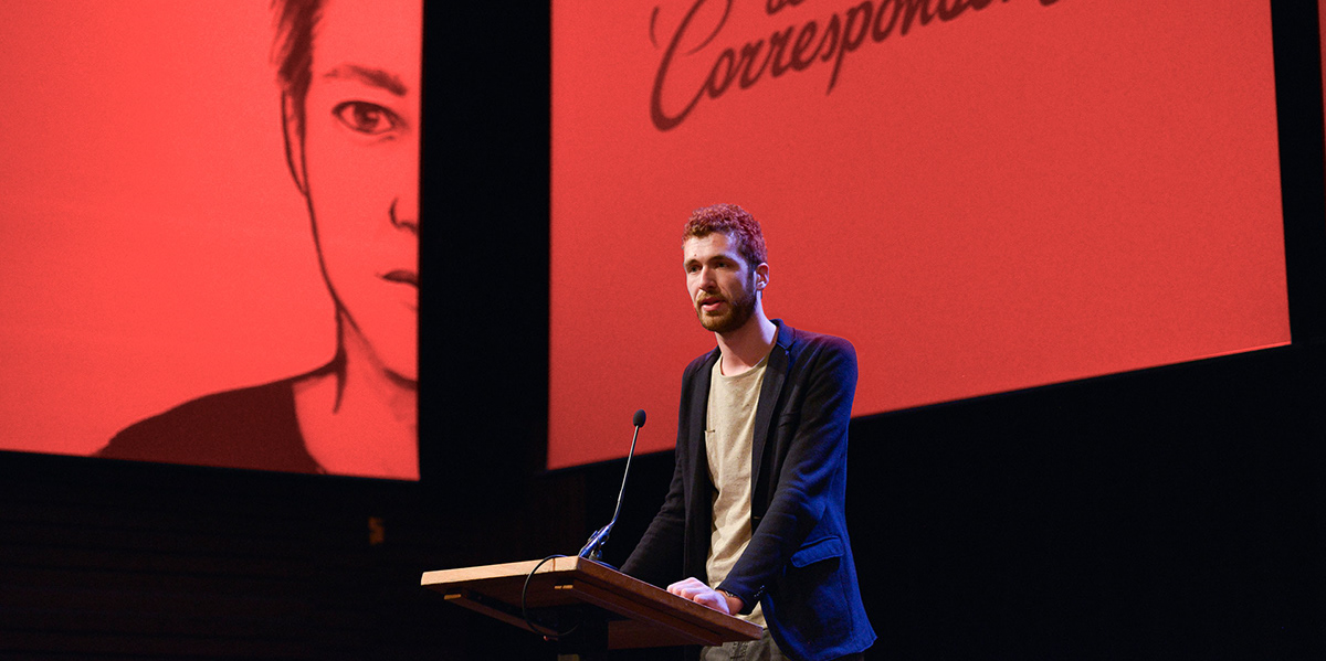
Photo: Bas Losekoot
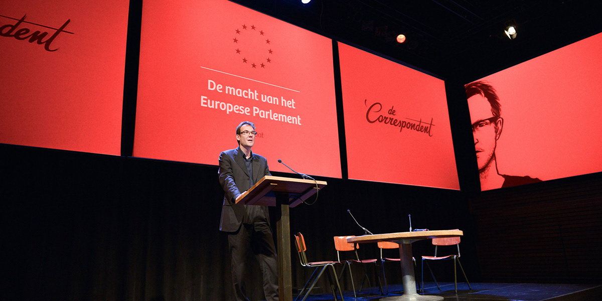
Photo: Bas Losekoot
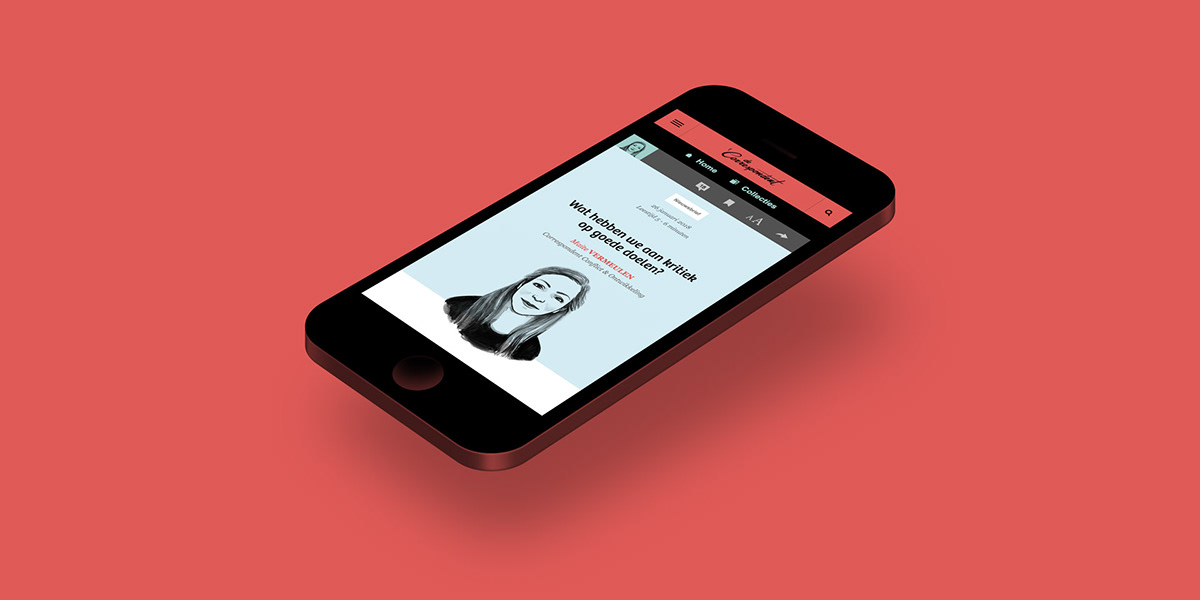
Human connection
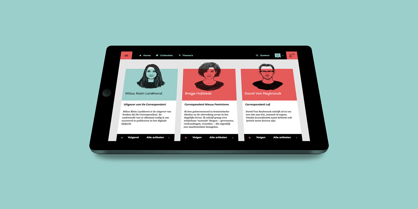
Cléa Dieudonné’s unique avatar illustrations unite our correspondents in a visually identifiable group. Her pen-and-ink portraits are more than snapshots. By downplaying clothing and amplifying the artist’s interpretation, they represent each person in a more essential way. A core element of the branding, these human illustrations link each individual correspondent with the greater whole of De Correspondent in a deliberate departure from picture-perfect media representations.


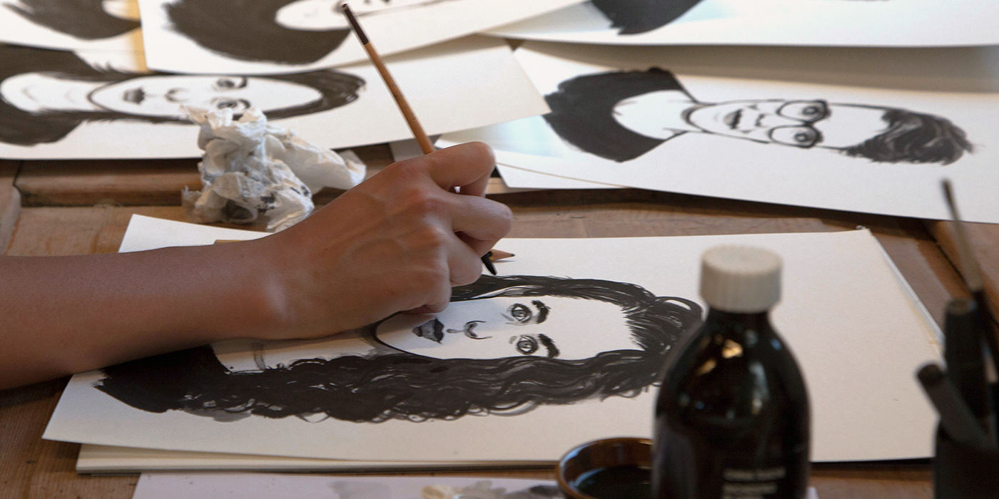


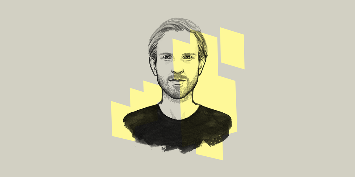

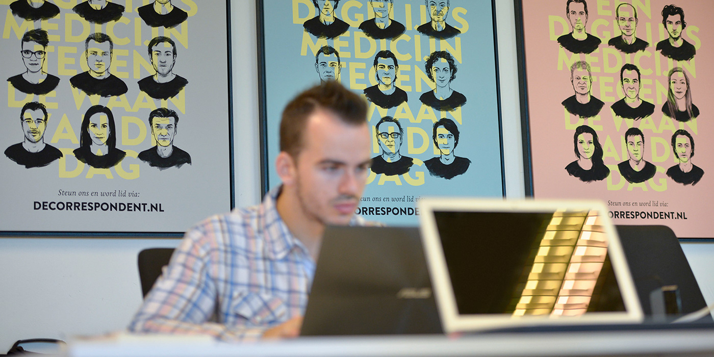
Photo: Bas Losekoot

Shaping the system
Taking people and organisations’ measure on a daily basis, a start-up in journalism needs to exude professionalism instantly. Since design plays a crucial role in building trust, we took a holistic approach to designing De Correspondent’s brand from day one. From the characterful logo to the urgent red, the identity stood and still stands, tall.

Inspiring further thought
Designing De Correspondent’s identity and platform from the ground up led us to examine our longstanding design principles. As a result, the brand and platform probably constitute the ultimate example of our design philosophy, which we set down on paper in 2016.

Visit our full portfolio at
momkai.com
momkai.com


