


Herringbone Restaurant Branding
We consider items after the logo as “Continuing Education.”
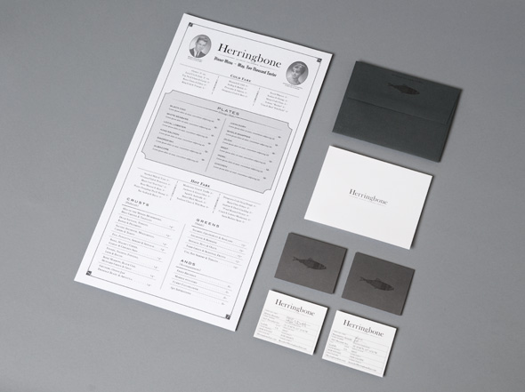
As people become more familiar with the collegiate, old schoolbook vibe, the more we can play with it. The business card becomes something that resembles an identification card and the menu is reminiscent of a table of contents or directory.
We stick to black, white and grey colors but INSIST on high-quality paper. Most people do not consider paper choice as important, but it is crucial and should not be taken lightly. Utilizing the sense of touch is another way for customers to get to know and remember your brand. And senses that live more in the subconscious have been known to be more influential in people’s perception of a brand.
For the Grand Opening Invitation, we went super luxe and made traditional letterpress coasters, making a fantastic first impression first impression and has reservations full since it’s opening in May of 2012.

