Client: Shanghai Muhe Network Technology co., LTD.
Designer: LI Sangli
Publish date: August 2012
View Full Screen Picture HERE
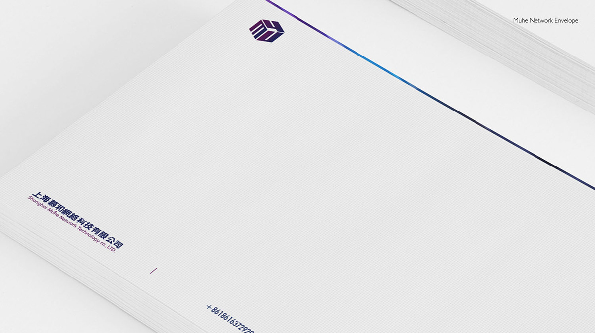
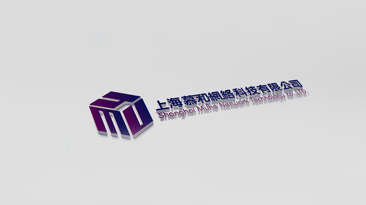
The Shanghai Muhe Network Technology co., LTD. is China-based company focusing on web development, as well as mobile apps development, user interface design, etc. The idea of the “box” logo is inspired by the pronunciation of Muhe in Chinese. The Muhe pronunciation sounds similar to “wooden box” in Chinese. The “box” logo is heavily constructed on the letters: M, U, H, E.
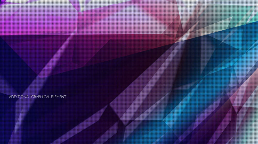
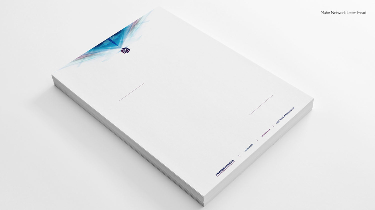
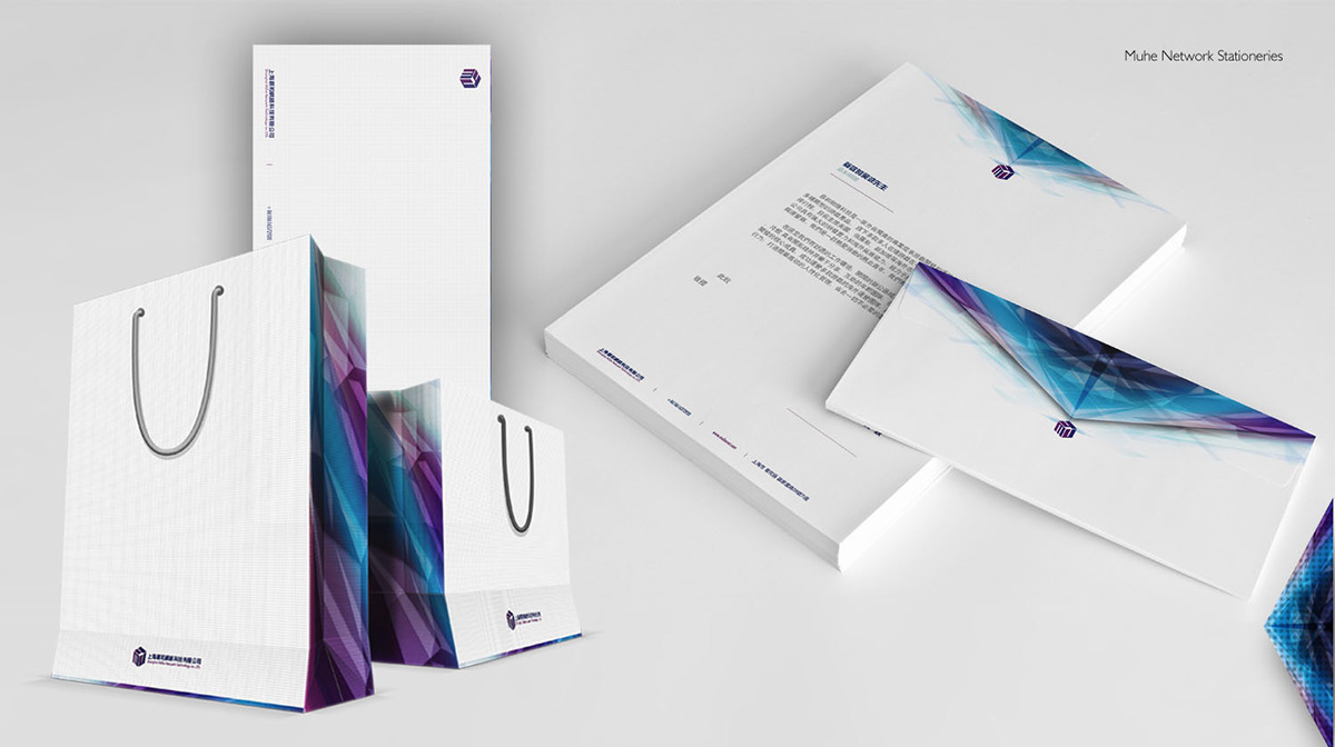
Diamonds shaped graphical element to the full range of the brand creates an illusion that diamonds are shining from the box, which indicates there are numerous kinds of splendid apps, products in this company.

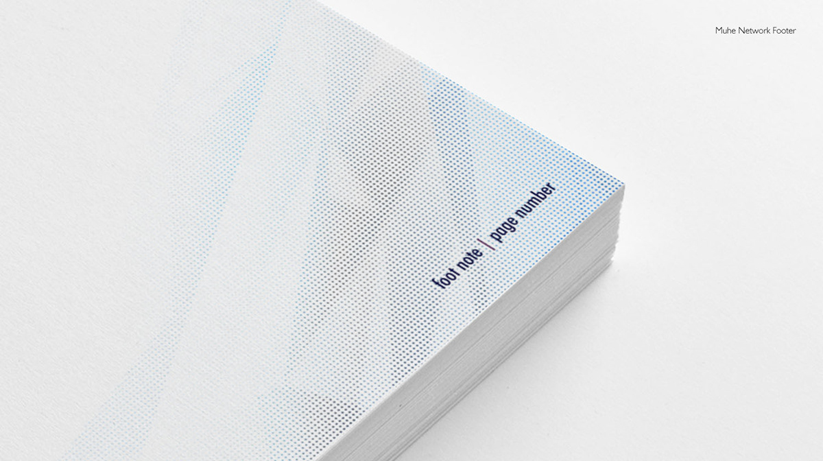
The additional graphical element has been applied to every single branding item. Tiny dot points has been applied on the surface of the graphical element and printed in a spot UV varnish. Spot UV varnished can be felt as a raised surface with packed stationeries delicately.
