EARTHA COSMETIC PACKAGING UPGRADE
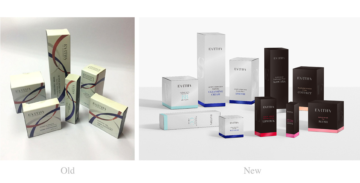
Eartha is a high-end cosmetic brand from France. They started to distribute their products into China market in 2016. However, the old packaging was outdated and not suitable for Chinese marketing. Hence, Eartha hired us for a brand new packaging design.
We looked at the old packagings and intended to upgrade the design from 2 key perspectives: aesthetic and function.
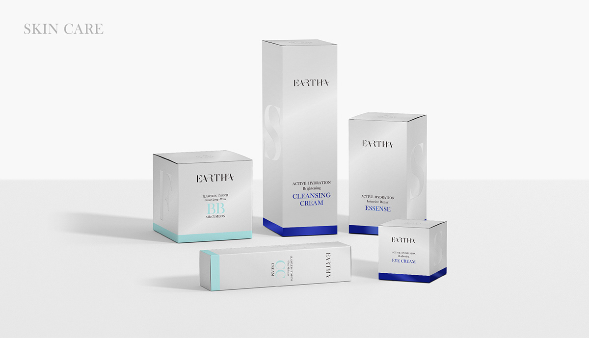
1. Aesthetically, we removed the unnecessary elements and trying to focus on the product information hierarchy system, a minimalism approach suggests a premium quality of the products.
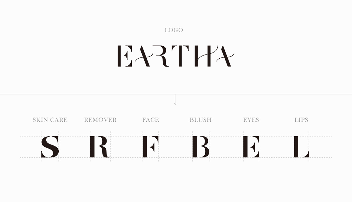
2. Functionally, we have categorised the products, as well as developing typography from the logo. 6 alphabets represent 6 categories of the whole product range. We have also differentiated product lines of skin-care and make-up. This is much easier to be identified different products in different categories in different lines. An efficient system has built for Eartha.
We are honoured to announce that the packaging has won a finalist award at the CGDA design award 2018.


