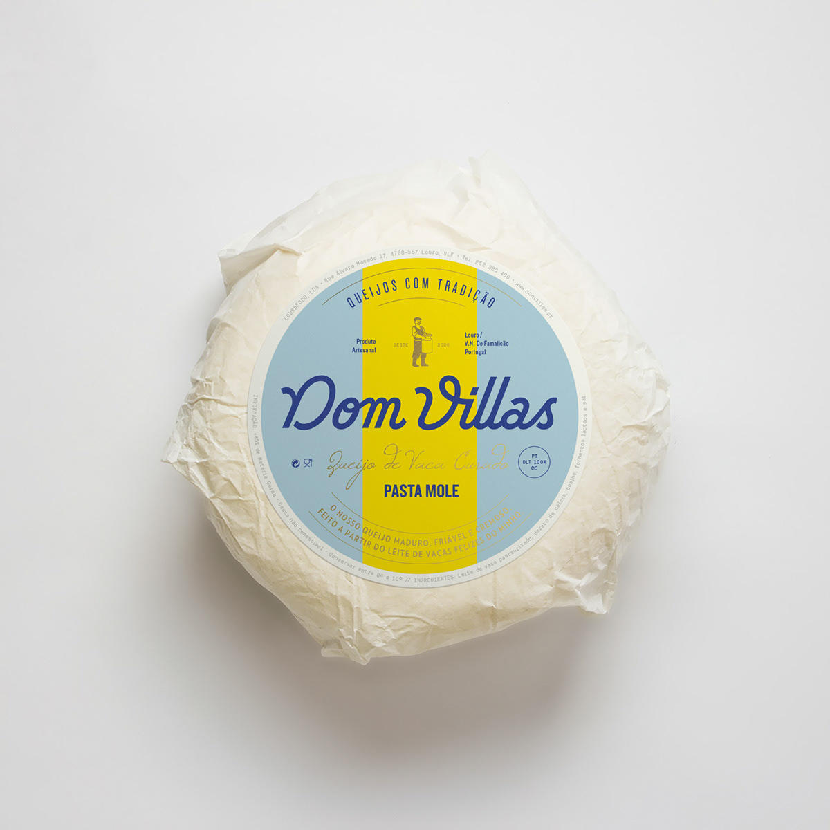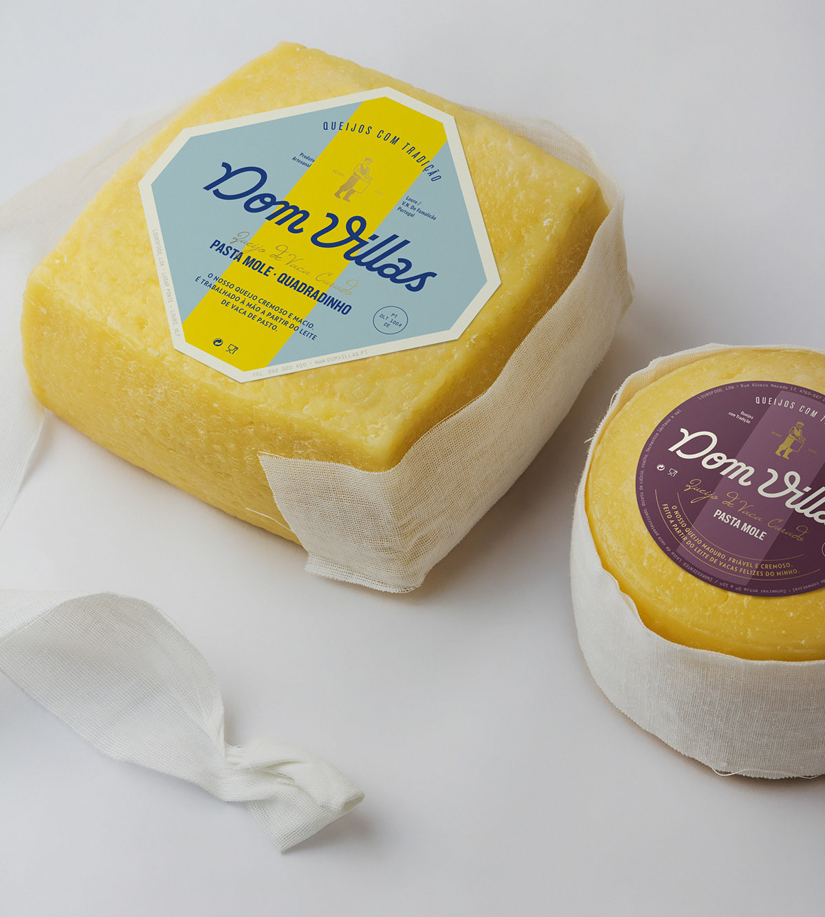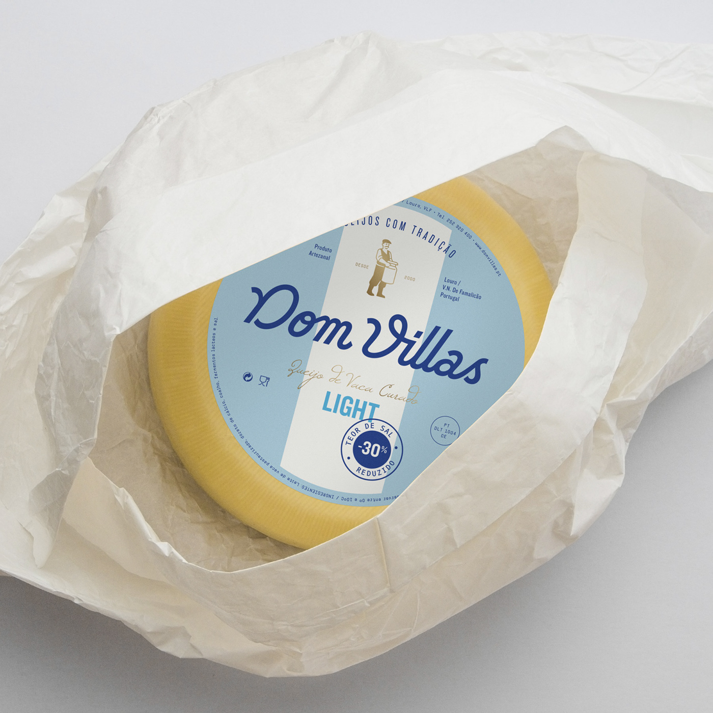
Dom Villas—Cheese with Tradition (proposal)
Dom Villas is rooted in the story of the family business—the hard work and dedication that mark the origins of family tradition. This story became an inspiration for the logo and the brand.
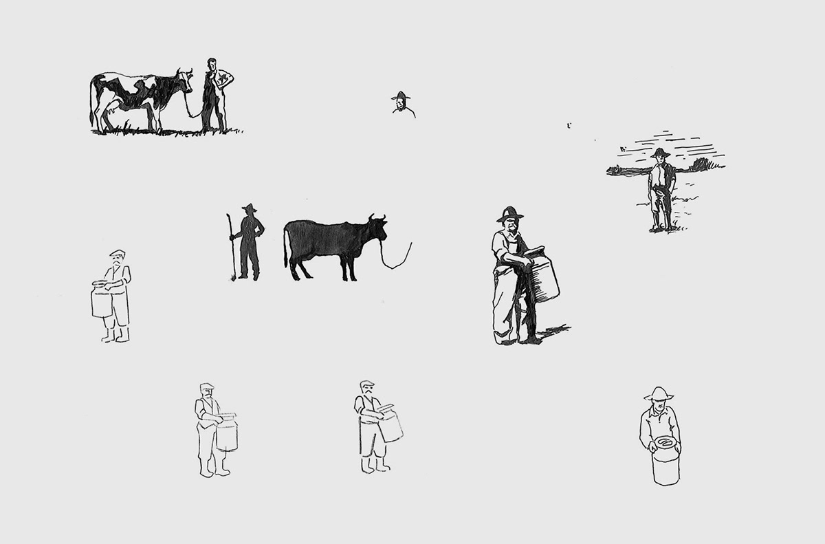
Therefore we created the character of a Dairy Farmer. The man who works by hand, using the traditional methods, who takes care of his cattle and quality of the final product.
Therefore we created the character of a Dairy Farmer. The man who works by hand, using the traditional methods, who takes care of his cattle and quality of the final product.
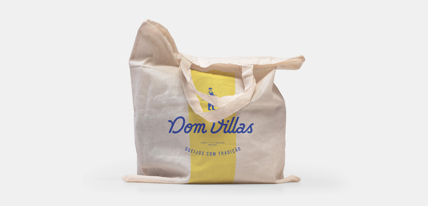
We combined the mark with a custom-made wordmark that would reflect the purity and originality of hand-made. The predominant use of blue is unusual for cheese in the Portuguese market, which makes Dom Villas stand out in what tends to be a gold-tinted and over-decorated category.
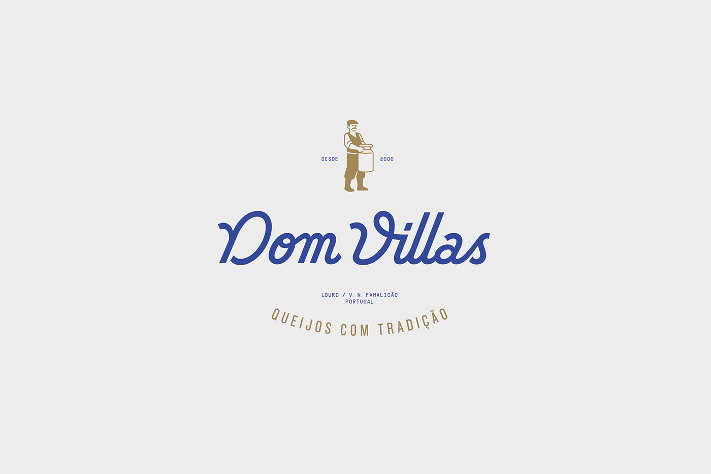

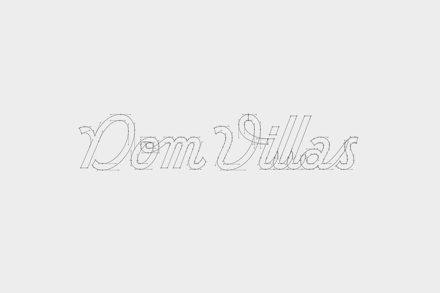
Wordmark. The custom wordmark is a monoline script with a “geometric” look and slight art deco overtones. It takes inspiration from the vintage hand lettering of the Italian 1930s, also very popular in the Portuguese visual culture. Its style corresponds to a handwriting tool—the square stroke ending evokes the broad-nib pen.