
---
Casey Neistat has started a new startup called "368(c)". It is still not much known about the company or what it is really supposed to be about. I am using it as mock project focused on the fluidity of the logo. I usually use mathematical shapes based on the golden ratio principle. The color choice is meant to be a soft classical combination of two colors: red and blue. I would humbly like to hear/read your opinion...

1. Creators for Creators
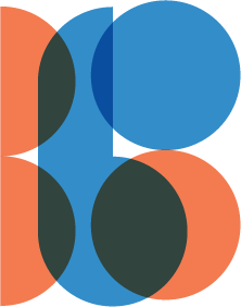
2. Together as one

3. The more the merrier
---
I would like to hear your opinion on that. I personally like the second one. In my opinion, it has something the other two logos don't. I don't what though. And on a further notice: does the first logo, somehow remind you of the Bang und Olufsen(c) logo?
Stay frisky,
J

