


The edible dreams of home makers
A startup envisioned to bring the best of the edible dreams of home makers on one platform. Empowering all women to not just cook in the kitchen but use it as a means of livelihood, to package their homemade snacks, jams and pickles under one brand name.


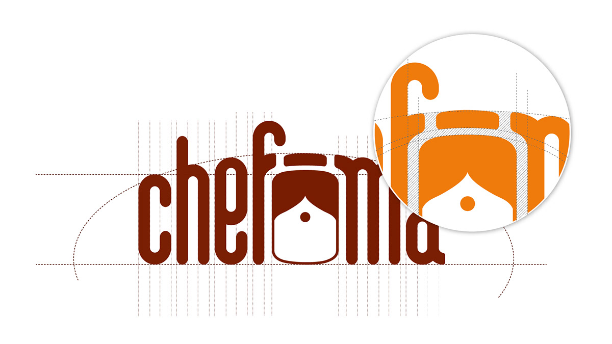
We used elements that represented age-old traditions like the pickle jar and the iconic profile of an Indian mother. This symbol of the pickle jar was merged with the mother’s forehead, placed strategically in between ‘Chef’ and ‘Ma.’ The logo was developed in a way such that the F and the M were forming an arc around the symbol placed in the middle of Chef and Ma. This gave a feeling that the brand ‘ChefMa’ was protecting tradition, the Indian mother and the pickle jar.

The colour scheme chosen for the logo, orange and brown, were selected keeping in mind the colours of the home and the hearth which represented domesticity and tradition. To affirm the traditional appeal of the brand, it was imperative that the products be sold in paper packaging for the snacks.


We have made colour palette as per the flavour. Which will be easy to recognise and it will stand out from the crowd because of the white background.


