


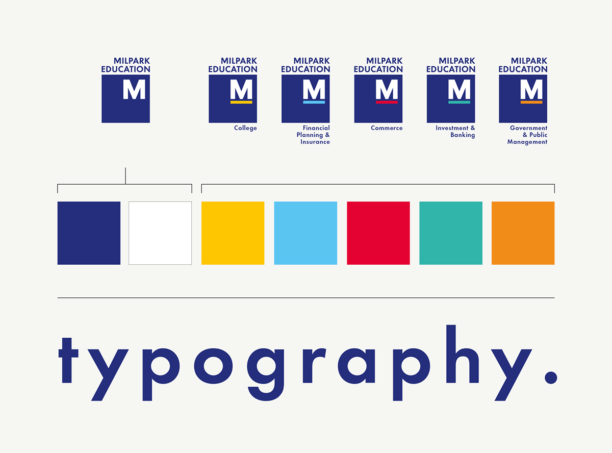
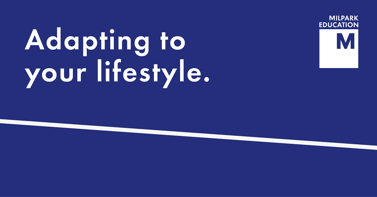
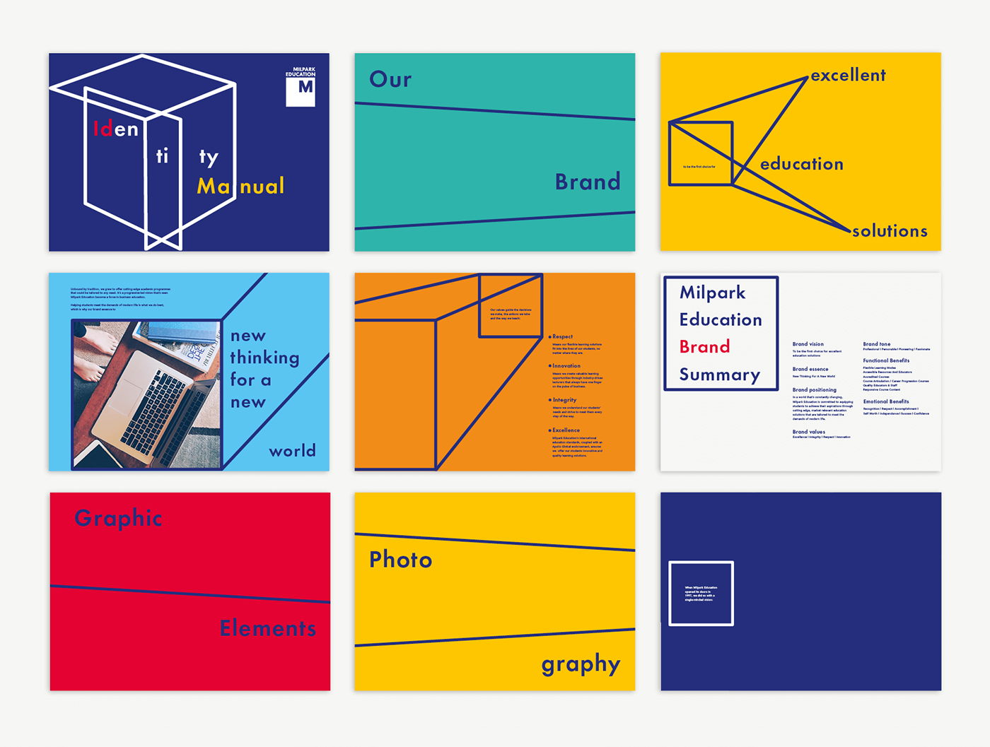
Milpark Education, established in 1997, is a South African private educational institution offering business education via distance- and contact learning options. They believe higher education should inspire both stability and flexibility - it should adapt to the lives of students, speak to the modern world, and inspire growth in any environment, at any time. This is the very ethos that inspired the Milpark Identity.
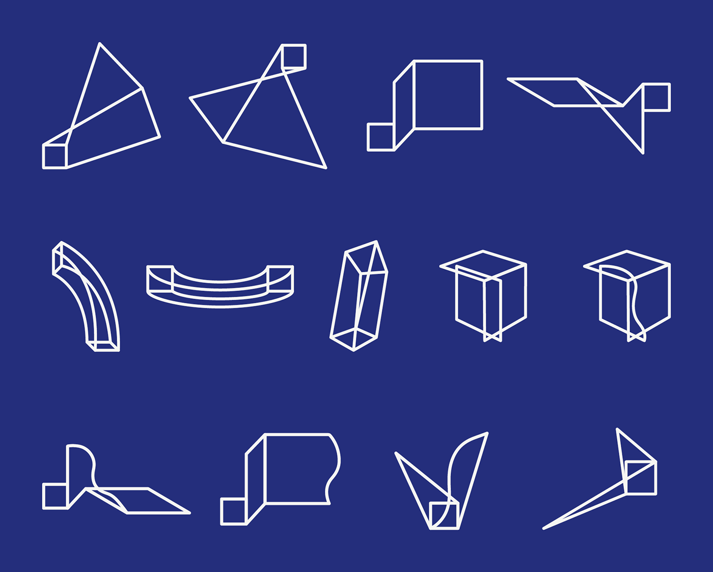
The ask was to create their identity as well as 'refresh' their existing logo. Using the Milpark square (logo shape) as our starting point - we relooked the ‘traditionally rigid’ square to become an instrument of flexibility. We created a collection of graphic elements which captures the potential of a square - being more than just straight, rigid lines. Its ability to adapt and grow in size and shape, yet still equate stability, speaks to the Milpark brand. The collection ranges from various two-dimensional to three-dimensional shapes - each one designed to bring a sense of dynamic movement and growth to any layout. This simple, bold and contemporary graphic language became an effortless visual representation of what Milpark stands for.
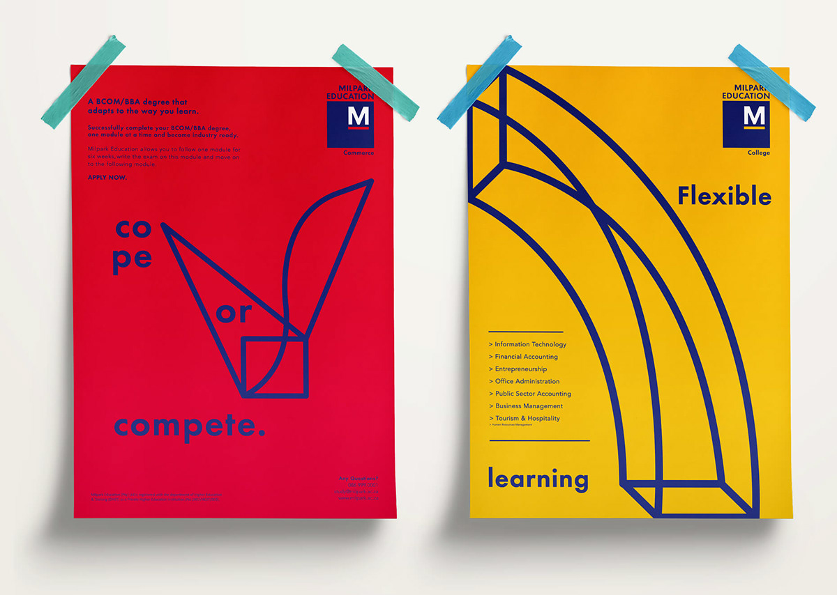


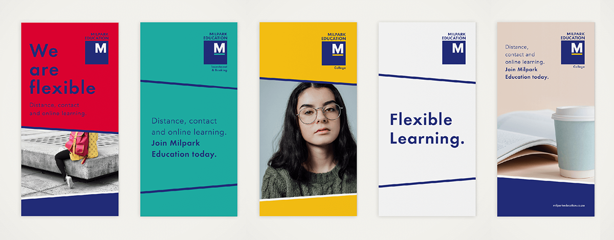
We had to create easy-to-use templates that can accommodate any concept, yet also convey a sense of flexibility and dynamism.
We simplified the square into one/two flexible, dynamic lines which have the freedom to move up and down to work with any content.
The result is a vibrant yet simple design tool that is adaptable enough to accommodate both imagery and text in various types of layouts.
We simplified the square into one/two flexible, dynamic lines which have the freedom to move up and down to work with any content.
The result is a vibrant yet simple design tool that is adaptable enough to accommodate both imagery and text in various types of layouts.


Concept + Design: Alwine - Blood, Sweat + Polony
Creative Direction: Carla Kreuser - The Jupiter Drawing Room
Copywriting - Ayesha Daniels
Created at The Jupiter Drawing Room
Creative Direction: Carla Kreuser - The Jupiter Drawing Room
Copywriting - Ayesha Daniels
Created at The Jupiter Drawing Room
Thank you for viewing, we appreciate it.


