


my swiss world: one graphic designers journey into applying ideas from the past to provide meaningful communication in the present
my swiss world is a part of a research project in which I undertook during Bachelor of Arts (Honours) at Curtin University in Australia. The research project involved the combination of creative practice and academic writing which resulted in the book presented here accompanied by a thesis.
contents
1 project description
1 project description
2 photographs of book spreads
3 experiment finals and descriptions
4 conclusion
1
The project involved investigation into applying the International Typographic Style (Swiss) design philosophy and design principles into my present-day graphic design practice. My interest for this subject came from previous smaller projects with the Swiss design movement and personal observations of a world seemingly cluttered, in need of space.
Swiss designer and teacher Josef Müller-Brockmann argues that design should be based in mathematical rationale concerning aesthetics, functionality, objectivity and intelligibility (Müller-Brockmann, 1981). He further states that democratic behaviour is founded in objective, well composed and refined design dedicated to the common good (ibid). My project is centred around understanding this idea and the design implications of this philosophy in which the path for this project follows.
Swiss designer and teacher Josef Müller-Brockmann argues that design should be based in mathematical rationale concerning aesthetics, functionality, objectivity and intelligibility (Müller-Brockmann, 1981). He further states that democratic behaviour is founded in objective, well composed and refined design dedicated to the common good (ibid). My project is centred around understanding this idea and the design implications of this philosophy in which the path for this project follows.


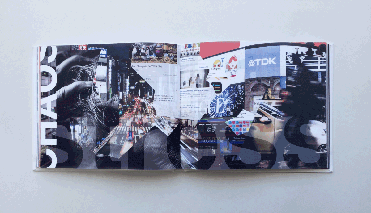
I have found that present in today society is a clutter of advertising where the consumer cannot pay full attention to it all because of an excess in signifiers (Anderson and de Palma, 2012). There is an agreement in various literature that we are in fact living in an age of information overload (Otlet, 2013; O’Grady, 2008; Levitin, 2014; Goldsborough 2009; Anderson and de Palma 2012). Evident is an issue of how to make meaning of information – in other words, generating knowledge (Furedi, 2015). With my research I investigated what this information overload means in the context of graphic design and how a graphic designer can interpret information to give it meaning and generate knowledge in general western culture where it is easy to be distracted by a disorganised spread of information.

While it is easy to simply copy the aesthetic of swiss design, this has not been the aim of my research, instead it has been about looking behind the aesthetics, at why and how the swiss designers communicated information in that way. In the context of graphic design, I think that a nostalgic copying of aesthetics from the past is the same as longing for a time and a place that does not exist anymore and has little value in the present culture.
My methodology involved a human centred approach to design using methods of grid systems, typographic hierarchy and simple illustration – but with emphasis on making it suitable for present-day. The principles in my methodology are grounded in a minimalist design philosophy which emphasises the significant and removes the irrelevant. The end product is my swiss world – a book that investigates Swiss design through a series of different types of experiments – to see how the design principles could be applied in a variety of possible real world design problems. Evident in the final artefacts of the project is a functional beauty, where the aesthetics are presented through organisation and a minimal use of signifiers, with emphasis on the most significant information.
2


3
grids in odd places
brief
as an introduction to the project and the grid system I stepped away from the computer and looked for sources of inspiration in the habitable environment. This experiment involved taking photographs of objects such as walls and decorative items, in addition to experimenting with paper folding. I further explored the photographs in Adobe illustrator and created grid systems out of the found lines and patterns. I then implemented typography and other design elements to explore the functionality.


facebook
brief
redesign Facebook (for web browser). Create a strategy and focus on building a user-friendly experience based in the swiss methods of organisation. Techniques: great focus in planning the hierarchy of the Facebook functions; exploring different grid systems; “less is more” philosophy. Outcomes: With simple geometry, white space, few colours, typographic hierarchy and a grid system, the final interface is clean from unnecessary repetitions and signifiers. Consequently, every function has its own space and drawing the full attention from the end-user. This design project proved to be complex and time consuming, and it is far from complete, but it serves as a reflection into the process of the design of web interfaces.

political posters
brief
create a poster series communicating the implications of war and environmental issues. Tone of voice: powerful, uncomfortable and serious. Techniques: simple, abstract, associative and innovative illustration or typography; minimal, non-repetitive and complementary text. Outcomes: The final posters are created with minimal design elements to ensure clarity. Colour contrasts, clean illustrations and composition makes for a striking aesthetic. The illustrations and typography do not repeat each other and works together as a whole to convey a strong and serious message.


wine packaging
brief
Redesign three existing wines from a winery in Switzerland to be marketed and sold overseas in Australia. Brand personality: confident, quality, international. Techniques: symbolic, associative and simple illustration; typographic hierarchy. Outcomes: The Swiss inspired approach, the abstract mountains, the structured and clean design tells a story of where the wine is from, its quality and confidence.


typography
brief
Design an A3 poster for a new series of events using one sans serif typeface and/or one serif typeface family. Techniques: exploring different grid systems; typographic hierarchy experimentation. Outcomes: when limited to only a few communication tools (no other design elements than typography) I had to step out of the comfort zone which resulted in innovative design, yet clear and informative. The final posters are simple, but still interesting and eye-catching because of the composition. The message is clear and easy to follow.


Posters from the process


contrast
As an additional exercise in this research, I created a poster inspired by postmodernism to contrast the different aspects of modernist and postmodernist design practice. A consequence of no apparent rules in postmodernism meant that I had to rely solely on my design intuition which made the design process much quicker. Outcomes: The final poster presented as stimulating, yet cluttered and evident with an overload of information. When contrasting the final modernist and postmodernist inspired posters, they did not signify the same message. However, the postmodernist poster intrigued, but the modernist posters were easier and more efficient to understand. Although this exercise provided me with an insight, it only presents as one investigation into this subject and would require further testing in form of additional experiments to hold any significance.

information design
brief
redesign the annual report “Pilbara 2050: ensuring the long-term viability of the Pilbara”. Presenting financial information, graphs and charts in clarity. Techniques: illustrating simple icons and symbols; typographic hierarchy; grid system. Outcomes: The resulting design is evident with a clear and stimulating presentation of information which is easy to follow without distracting design elements.


illustration
brief
Make an advertising poster, using illustration and typography. Experiment. How simple can you make the illustration for it to still communicate effectively? Client: Keep Dry, Product: Umbrellas, Message: High end, modern and artsy umbrellas with good quality. Techniques: simple, abstract and associative illustration; non-repetitive and complementary, abstract heading, typographic hierarchy. Outcomes: The final poster communicates through a minimal use of design elements with a simple abstraction of rain and a non-repetitive (not repeating the message in illustration) heading. These elements play on associations and mystery in which the message is not overly obvious; none of the eye-catching elements says anything about an umbrella, yet the heading and illustration combined signifies its purpose and the need.

4
Studying the Swiss methods of organising information and values of minimalism, proved to be useful in my graphic design practice to convey messages with clarity and efficiency. Some of the things I found was that I could better provide functional design artefacts that clearly and efficiently conveys information - in other words, generating knowledge.
Presented here is a short overview of the project and if you are interested in the research and my findings please feel free to ask questions. Thank you for taking the time to look at my work!
references
Anderson, Simon P. and de Palma, André. 2012. “Competition for attention in the Information (overload) Age” The RAND Journal of Economics 43 (1): 1-25. https://doi.org/10.1111/j.1756-2171.2011.00155.x
Furedi, Frank. 2015. “Information Overload or a Search for Meaning?” The American interest 11 (4): 1-9. https://www.the-american-interest.com
Goldsborough, Reid. 2009. “Battling information overload in the information age.” Tech Directions 68 (9): 13. Business Source Complete, EBSCOhost (Accession No. 39460097)
Levitin, Daniel. 2014. The Organized Mind: Thinking Straight in the Age of Information Overload. Dutton Penguin
Müller-Brockmann, Joseph. 1981. Grid systems in graphic design: A visual communication manual for graphic designers, typographers and three dimensional designers. 10-139 Niggli Verlag.
Otlet, Richard. 2013. “Surviving or thriving? Building an information landscape.” in Chandos Digital Information Review. Baker, David and Evans, Wendy., ed 71–90. Chandos Publishing. https://doi.org/10.1016/B978-1-84334-723-1.50005-X.
Visocky O’Grady, Jenn and Ken. 2008. The information design handbook, 9-77. HOW books.


