


What could be the identity for
a company that makes
coconut-based products?
a company that makes
coconut-based products?
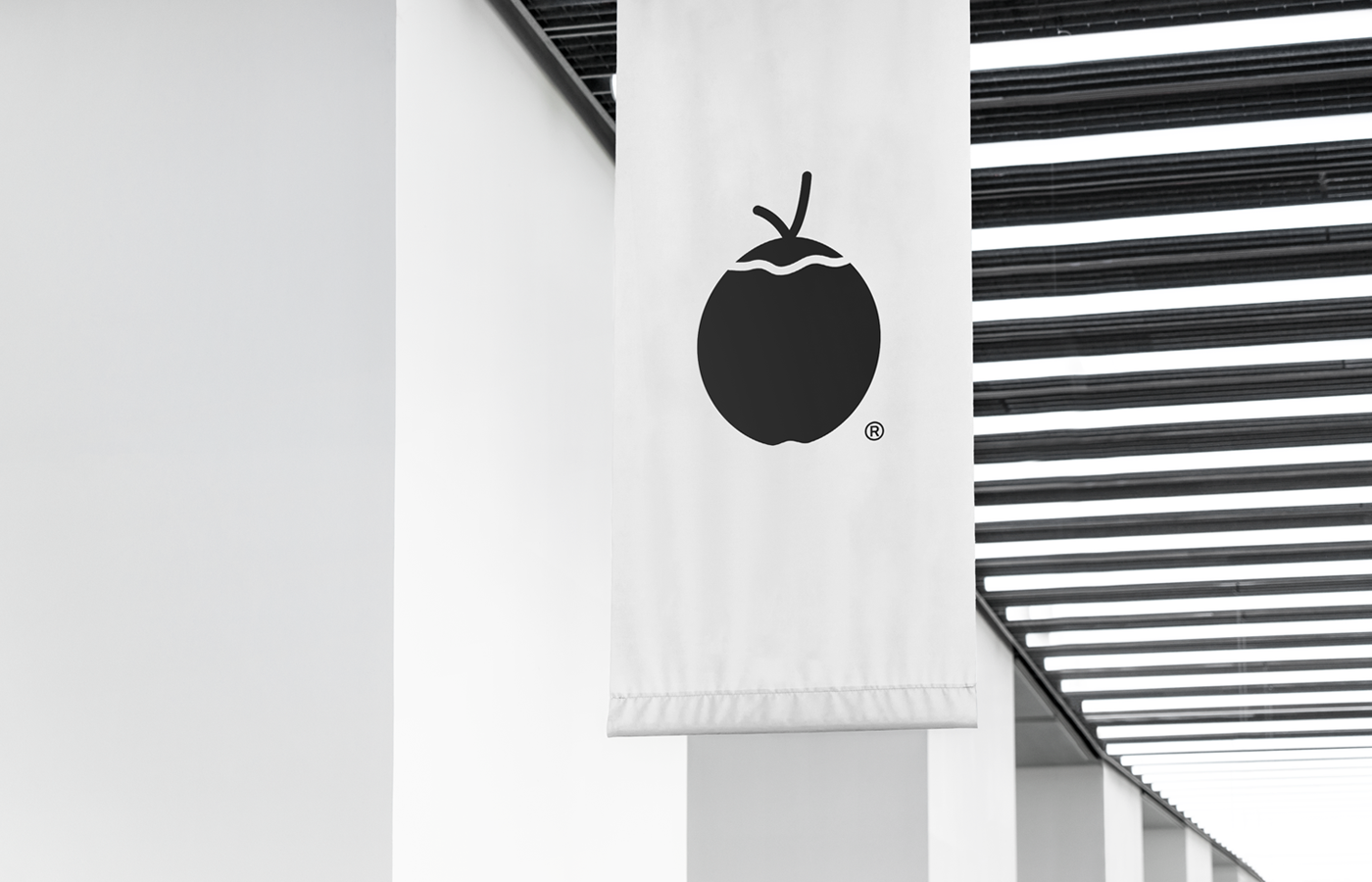
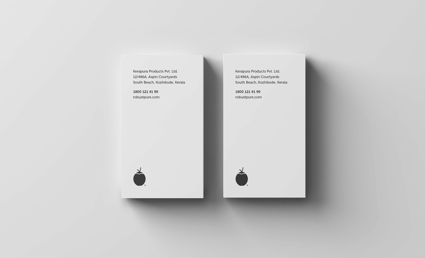
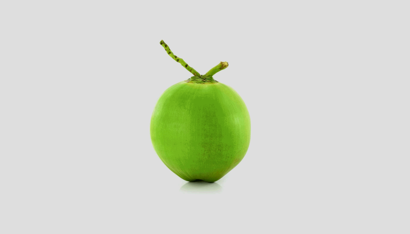
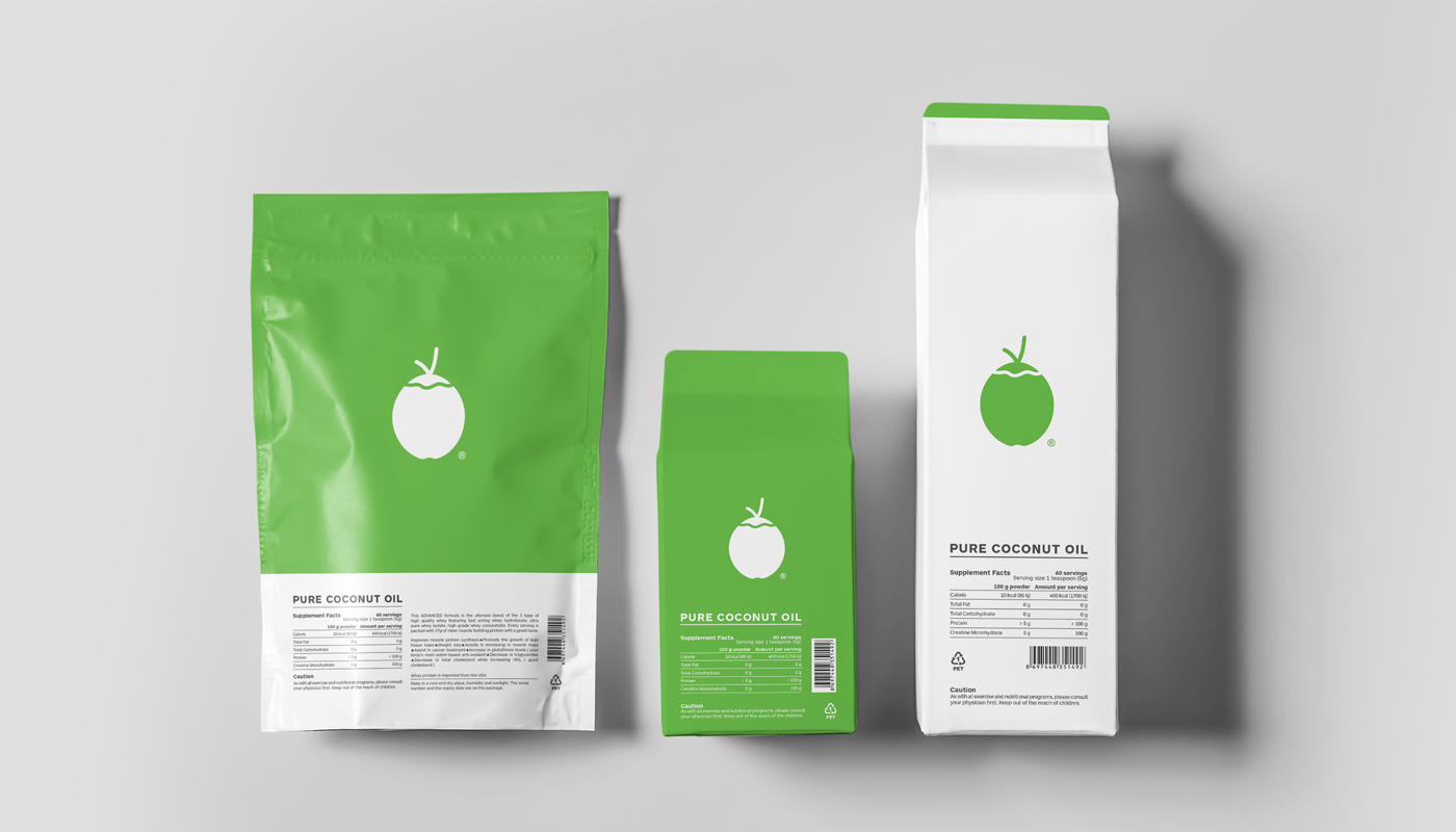
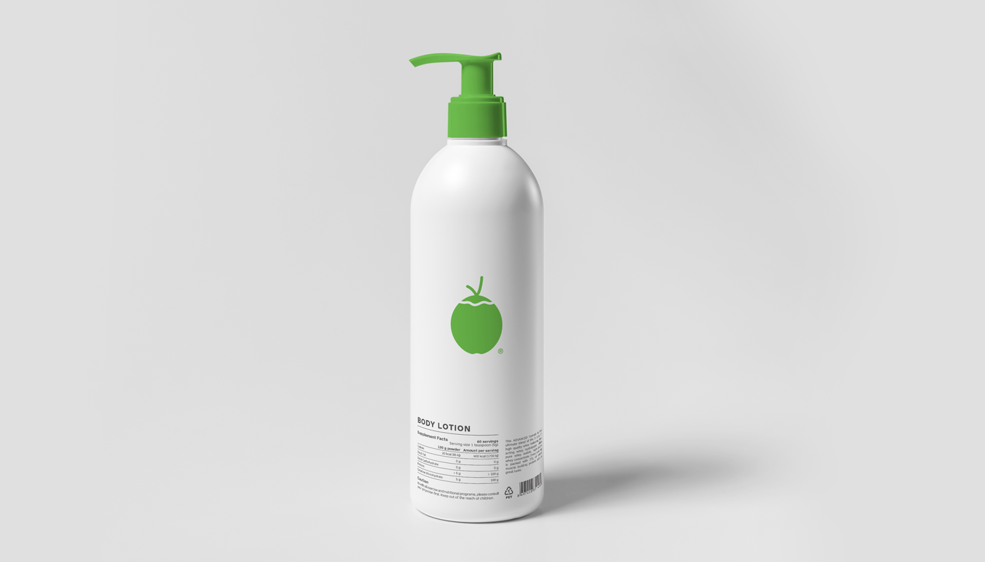
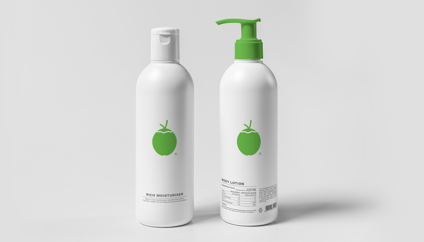
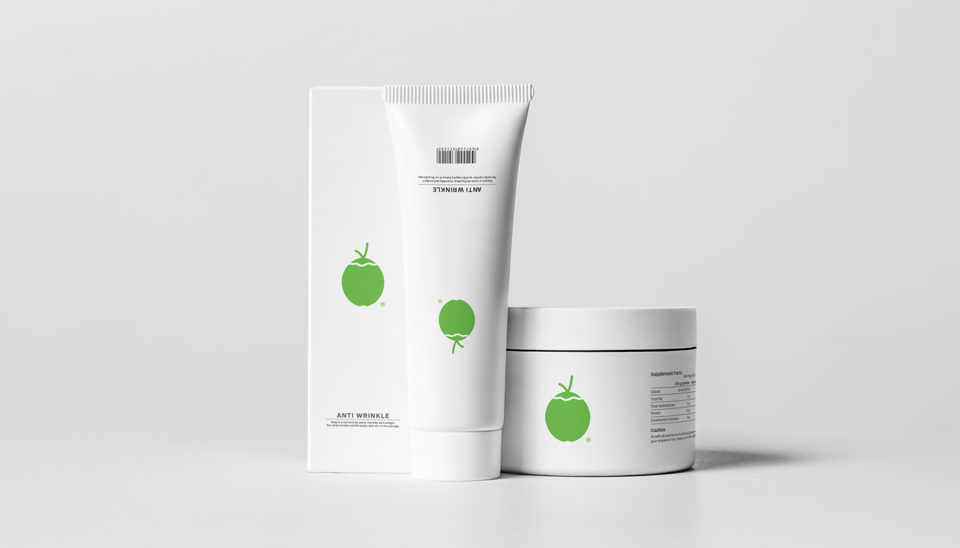
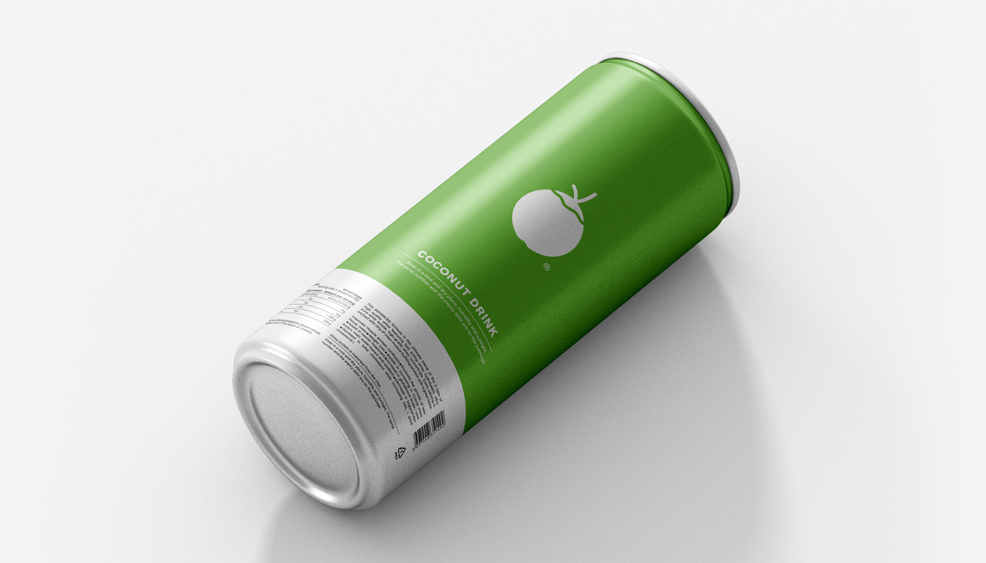
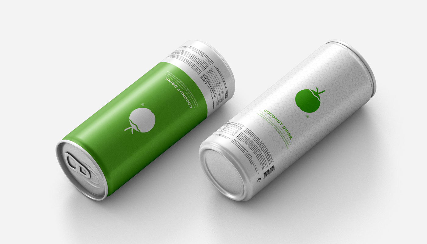
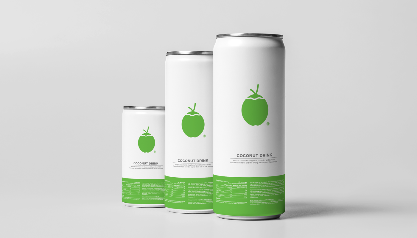
A well-designed coconut, of course. The best way to escape the cliche was to design it in a simple and iconic way. The coconut represents everything the company stands for: sure, healthy and pure.
The best examples of harmonious asymmetry are often found in Nature. We made the coconut silhouette more iconic, suggesting both the hard and the soft, the fluid and the firm feel associated with the fruit and its products. The Pantone 360C green is our take on the fresh feel exuded by the best coconuts.
Graphic design, illustration: Pixl_knight
Copywriter: Javed Imtiaz
Agency: Yara Communications
Client: Robust coconut products


Participant of the CGTrader Digital Art Competition
Disclaimer: The images and objects shown above have been used only to demonstrate how the logo works.
Their copyrights are the property of their respective owners.
Their copyrights are the property of their respective owners.


