


Nursentials
Delivering smiles to medical professionals with a brand identity design for a new medical supplies delivery company.
Delivering smiles to medical professionals with a brand identity design for a new medical supplies delivery company.
Every day, medical professionals face immense pressure; dealing with high stress, fatigue, insufficient time, inadequate resources and expensive equipment. We were astonished to learn that even poorly made products are often ludicrously overpriced and that better quality, more durable items were often beyond the reach of many nursing staff. Nursentials is a new venture supplying high quality, reasonably priced products which will make their jobs just a little bit easier. Nursentials had the brand name but needed a brand. We were approached to create an identity to reflect this mission.

Delivering the essentials of nursing
Our client, retiring from a career in nursing had experienced first hand the daily challenges faced by health professionals. She believed her colleagues needed a friendly supplier who would not rip them off. The solution was Nursentials, selling high quality products at down to earth prices. Our immersion began by getting under the skin of what it feels like to work as a medical professional to understand their challenges.


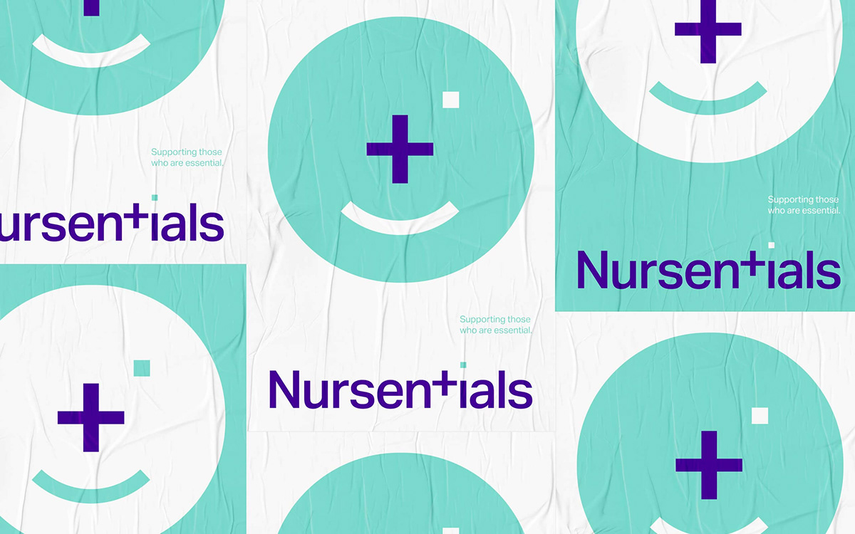
Giving an appreciative smile
Whilst medical professionals are largely driven by passion, it’s nice for them to know their services are valued. Our strategy was to give them an appreciative smile for their service. We were drawn towards the symbolic clichés of medicine, but we didn’t want to just ‘bolt’ something on to the name - our idea had to ‘fit’. The solution was simple - by crafting the typography and removing the lower arc from the letter ‘t’ in the name we create a medical cross symbol and, by adding the smile underneath we complete the face. To strengthen the connection to medicine we used an aqua colour, counter balanced with dark purple. Stylistically, Helvetica was the obvious font choice, but it was so overused in this industry. Instead, we opted for Aktiv Grotesk, arguably a more elegant Sans Serif.
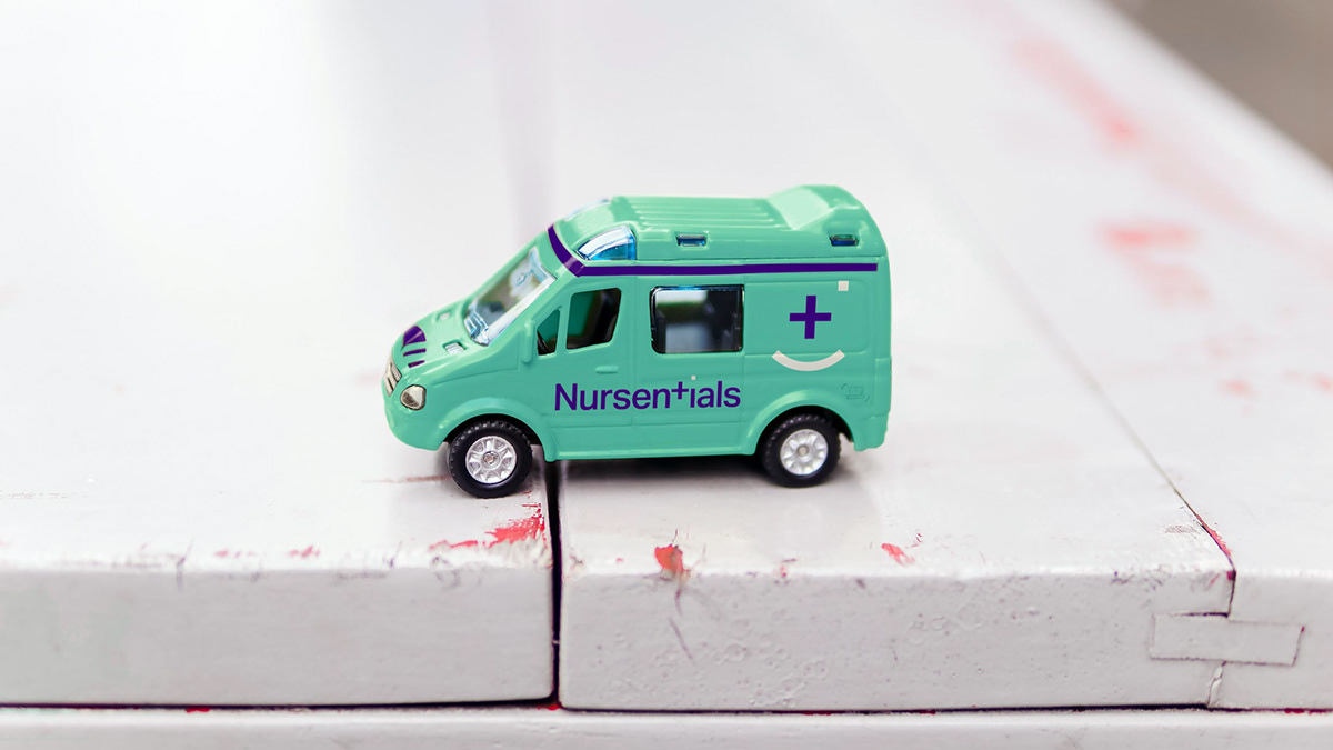
The brand was launched amidst the pandemic and was perfectly positioned to supply all the items needed by medical professionals to help make their work a little easier. We continue to evolve the brand to keep pace with global change and demand.


Acknowledgements
Project Date
2017
Agency
Propella
Design
Gary Broadbent
Client
Mark Mallinson
Thank you!
Your likes and comments
are much appreciated.
Based in Sydney, Australia
we work on projects big and small
all around the world and we’d love to
talk to you about yours.
For all project enquiries
media and PR requests
or job opportunities, please


