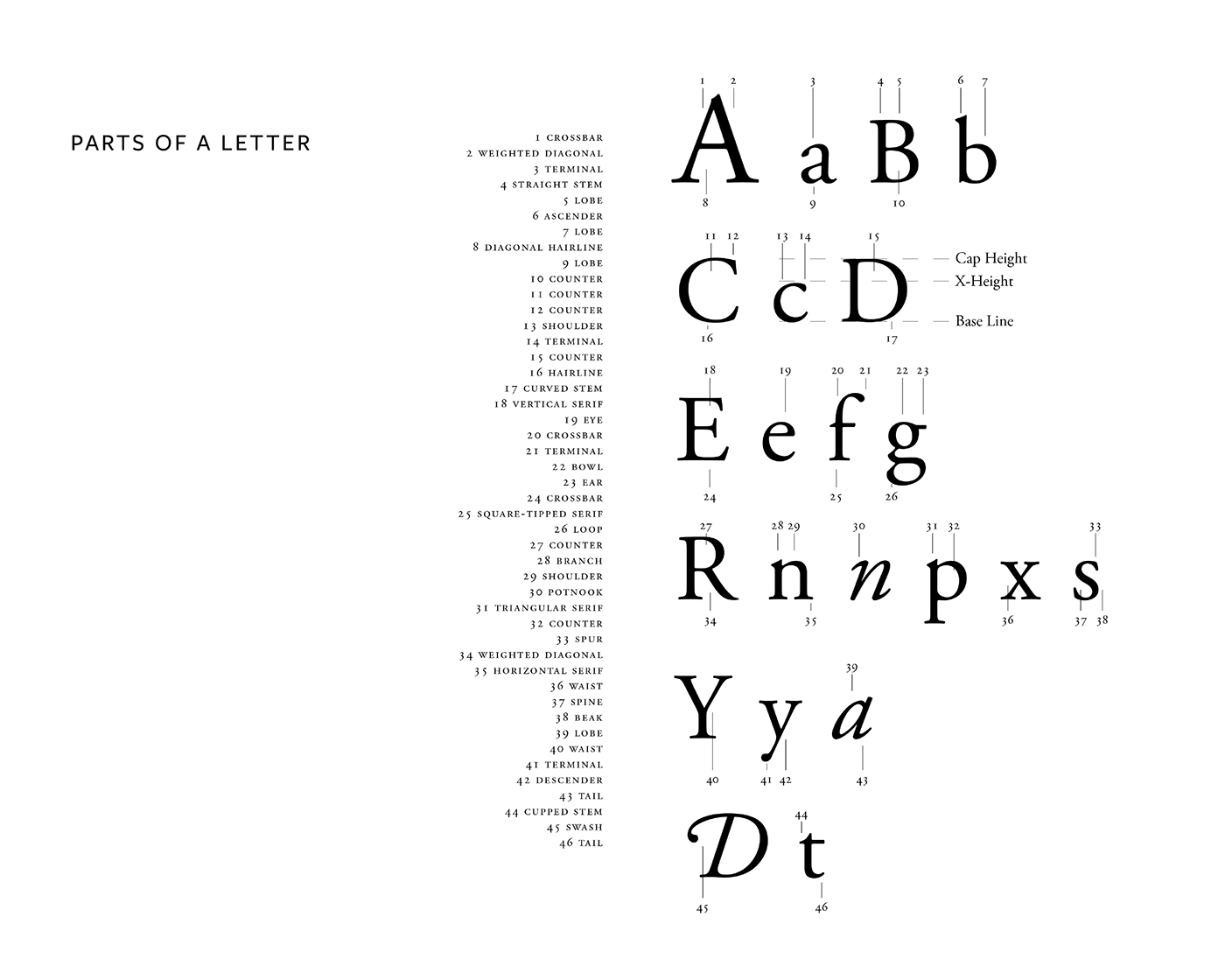
The objective of this project was to learn the different parts of the letter and language of the letterform
used by professional graphic designers. Using the typeface Adobe Garamond Pro, I had to identify
the anatomy of a typeface choosing more than 20 parts.
used by professional graphic designers. Using the typeface Adobe Garamond Pro, I had to identify
the anatomy of a typeface choosing more than 20 parts.
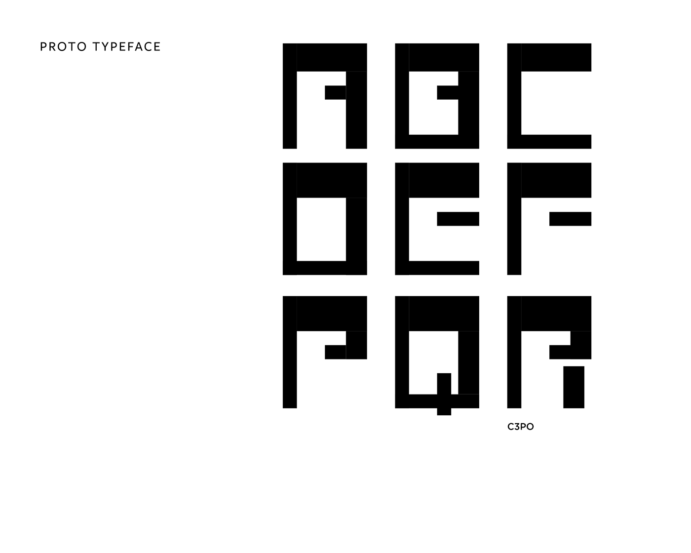
The objective of this project was to explore how a typeface functions as a system of shared parts.
I had to create 9 letterforms of an original typeface within given parameters.
I had to create 9 letterforms of an original typeface within given parameters.
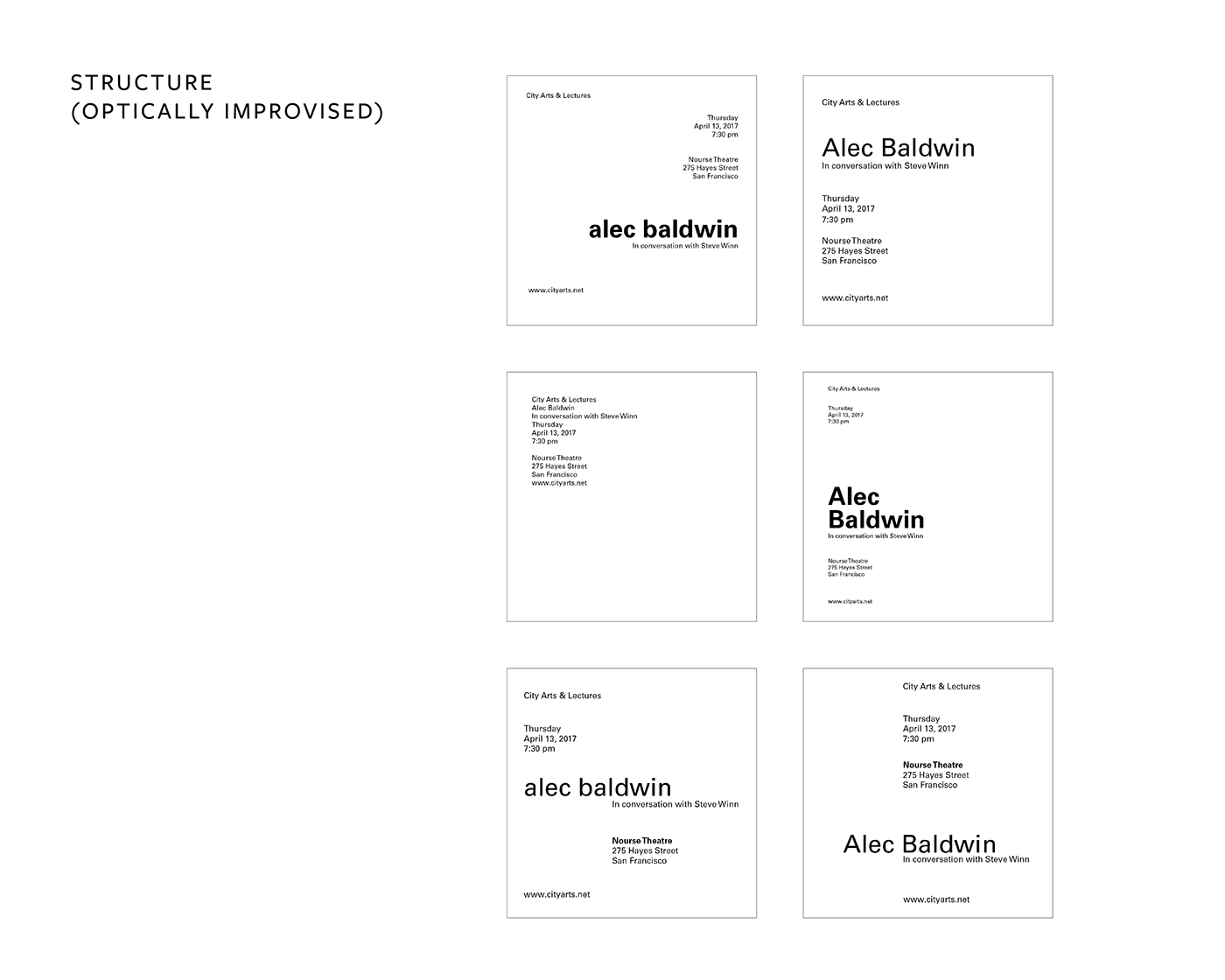
The objective of this project was to become familiar with aspects of structuring visual hierarchy.
Using only one family(Univers), I had to compose 6 typographic compositions.
Using only one family(Univers), I had to compose 6 typographic compositions.
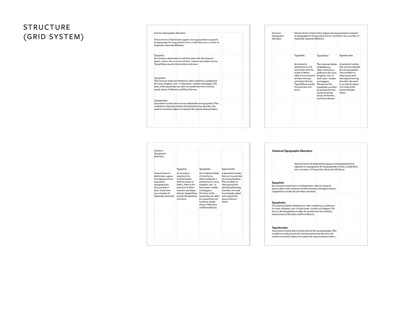
The objective of this project was to become familiar with aspects of structuring hierarchy with the use of a grid system. I had to create a modular grid and create four different designs using the same underlying grid.
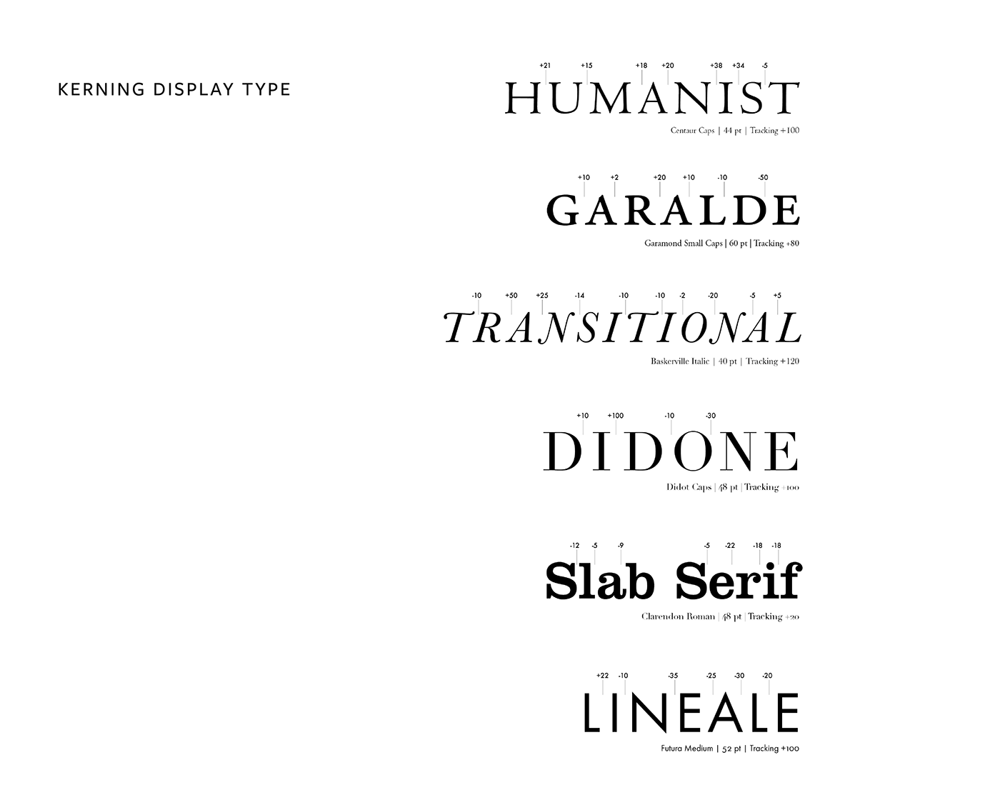
The objective of this project was to become aware of the inconsistent letter spacing that occurs in display type and to learn how to correct it. I had to set the given words and kern wherever it was necessary.
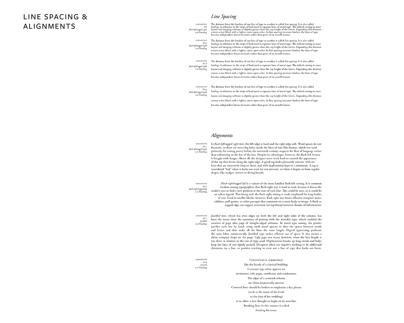
The objective of this project was to explore classic typesetting conventions. I had to
demonstrate different configurations of line spacing and alignments.
demonstrate different configurations of line spacing and alignments.
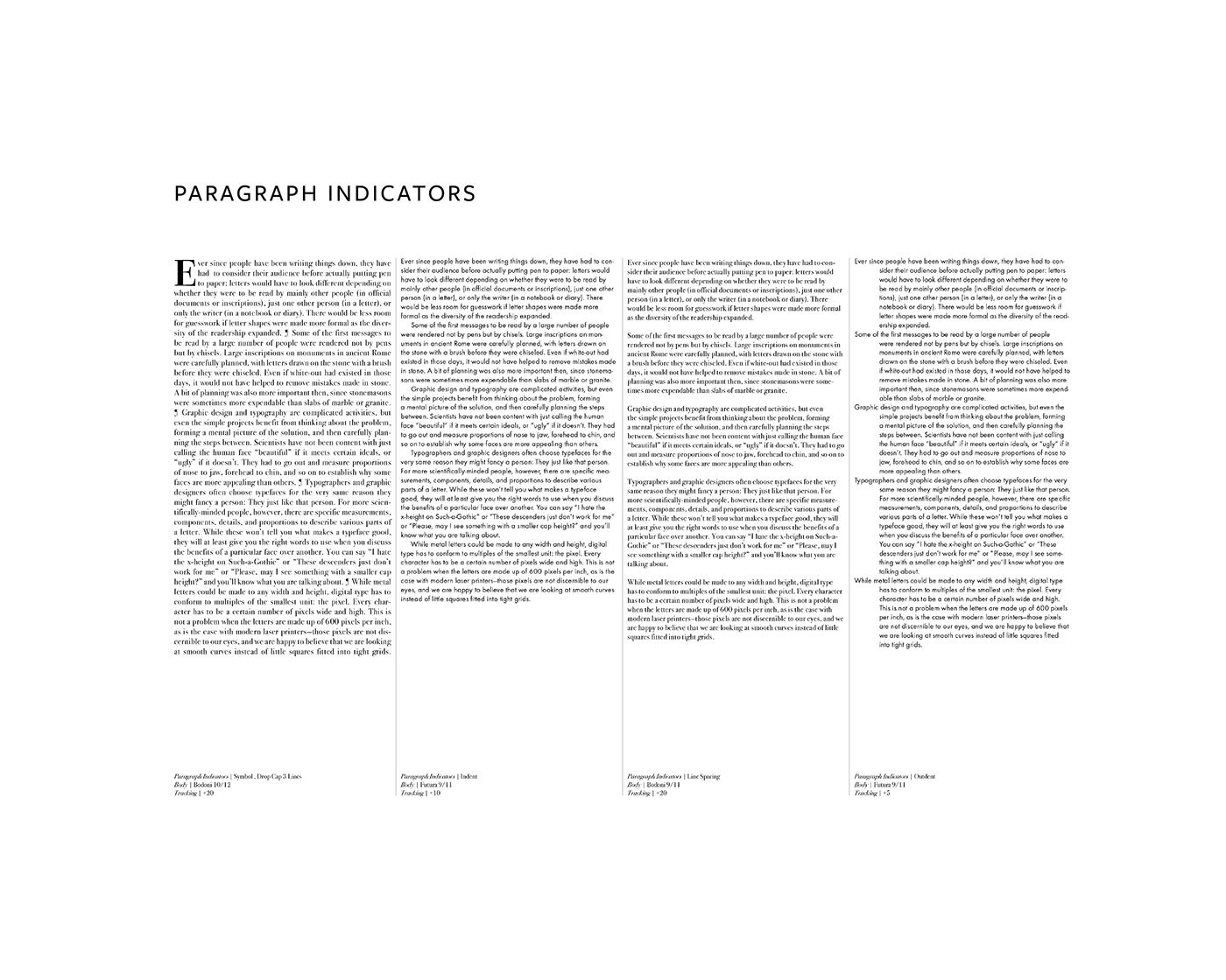
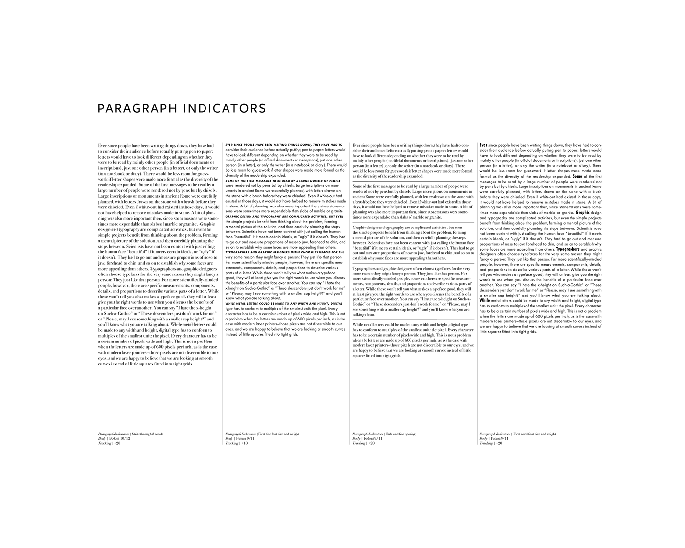
The objective of this project was to learn about how paragraph indicators are used and
what looks aesthetically pleasing when applying a paragraph indicator.
what looks aesthetically pleasing when applying a paragraph indicator.
The objective of this project was to learn about how paragraph indicators are used and
what looks aesthetically pleasing when applying a paragraph indicator.
what looks aesthetically pleasing when applying a paragraph indicator.
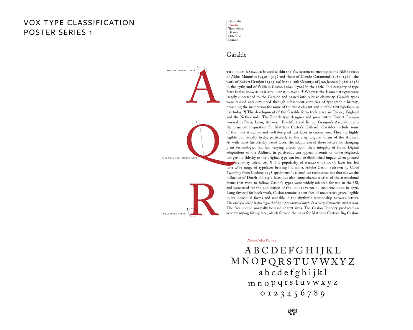
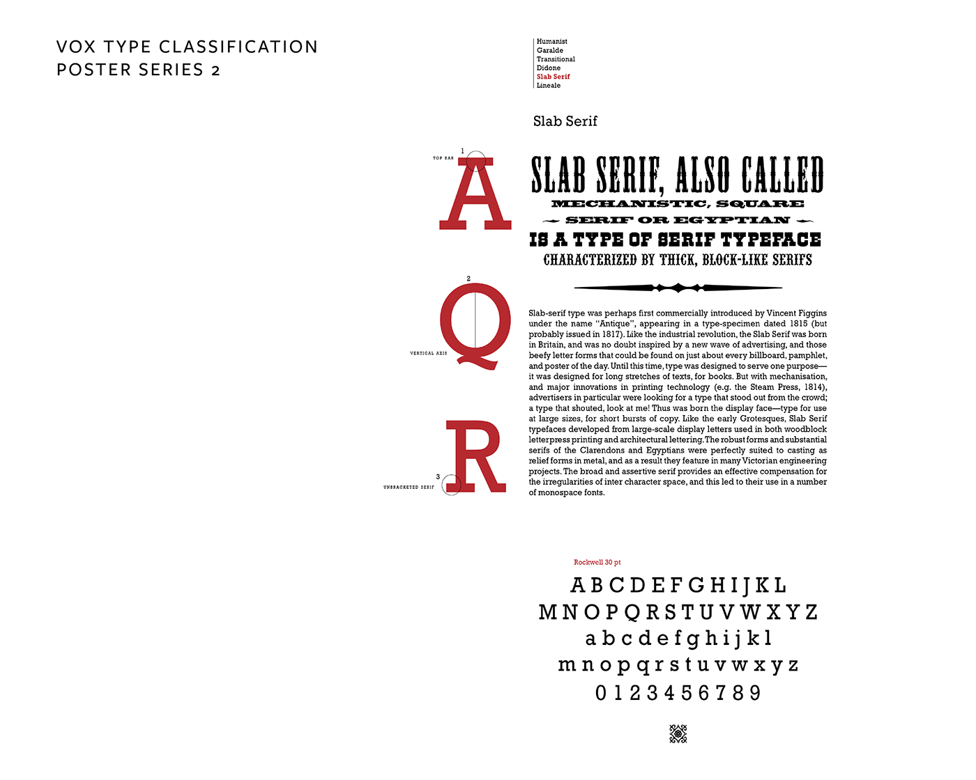
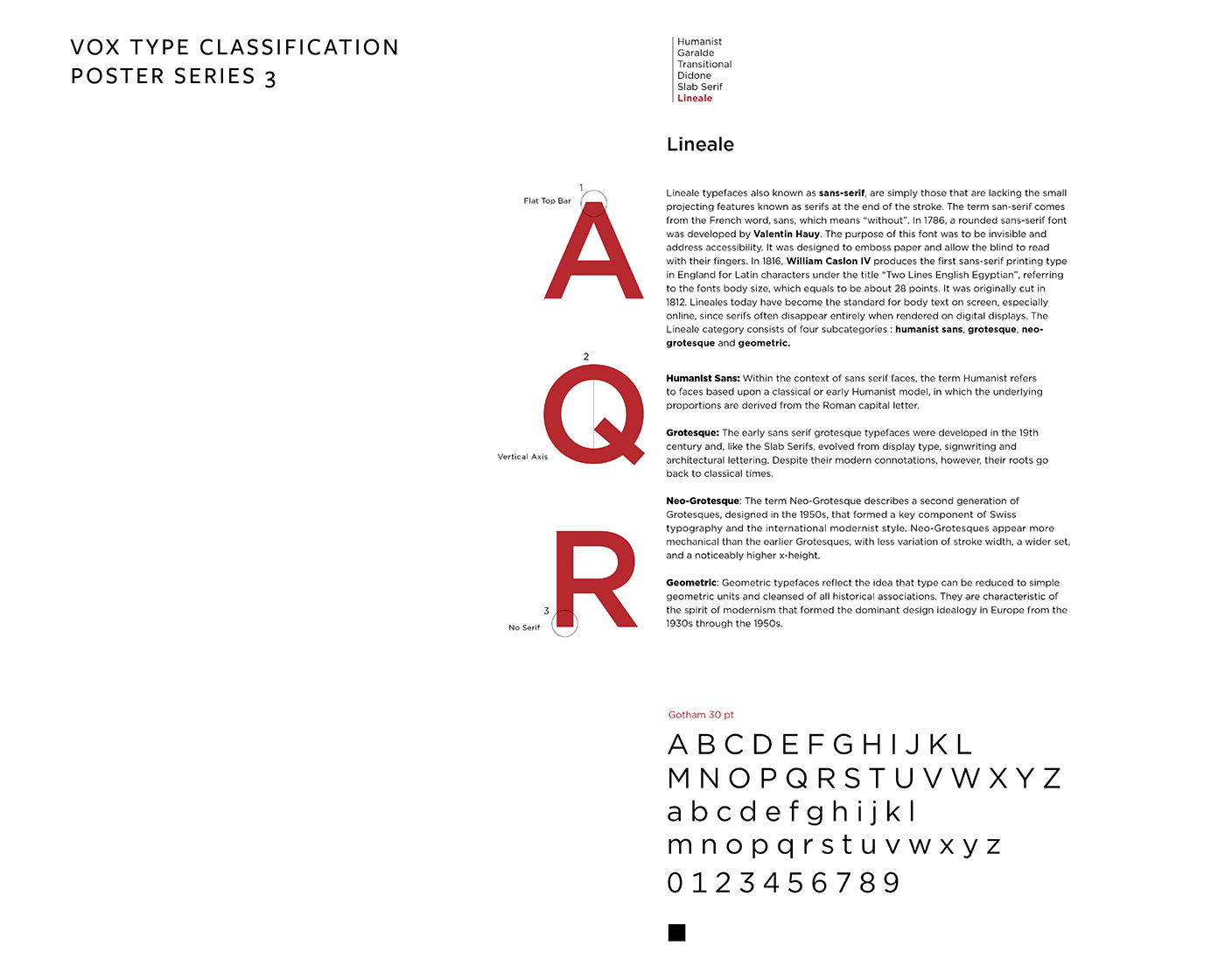
The objective of this project was to learn about the typographic conventions originating from the
scribal times and to understand how type is classified. I had to design a series of 3 posters
for three different type categories that would work together as a set.
scribal times and to understand how type is classified. I had to design a series of 3 posters
for three different type categories that would work together as a set.