

6 Words of Advice Posters
This project was centered around 6 words of advice for incoming freshmen at MECA. I came up with several ideas, eventually narrowing it down to "At some point you will cry" and "Ask questions; critique makes art stronger".
"Ask questions; critique makes art stronger"
This piece came together after a lot of critique and thought. I used different iterations of a project done in GD 101 to emphasize the connection to MECA students and not just any art school. Contrasting colors in this piece give it a simplicity as well as interest. It is pleasing and draws attention to the message, while still keeping the rest of the content of the poster valid. The hand is directing the viewer to the message, but only the hand is present because other information about the person was not needed and would have detracted from the message.
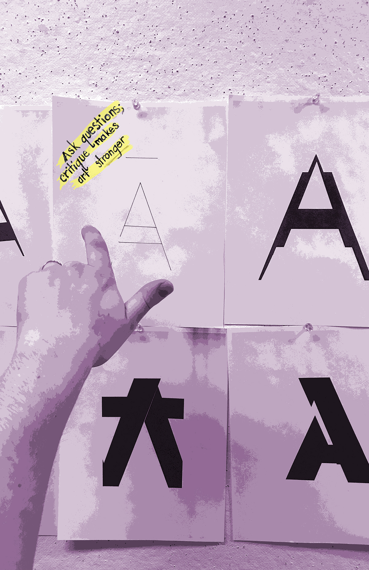
This grid is of some process pieces of "Ask questions; critique makes art stronger." I thought photography would be helpful in this project because I thought the visual of a critique wall and clear pushpins would get my point across without being too literal (or apple apple). I used a hand to direct the viewer to the message I was trying to convey, and literally pinned my words up to the critique wall as well. I experimented with color and angle, as well as shape


"At some point, you will cry"
This poster took much less time. My idea from the beginning was to create a visual frustration that the viewer could relate to. After several different iterations, I was looking at my "to do" list and decided to screenshot it, adding in the words "at some point you will cry" into the list. The resulting poster is below.

This grid is my process for this poster. I originally wanted to go into Indesign and screenshot over "quit Indesign" but the idea wasn't quite there. From there, I experimented with different ways of showing it visually in Indesign, but eventually settled on my "to do" list.


These are some of my ideas that slowly became more refined and turned into the two final pieces. As you can see, I had several different approaches to this project, and what I started with was different from what I ended up with, but still I had some similar elements that came back around to the final pieces. Figuring out how to screen shot certain elements of my poster design and use them without them being pixilated was a big challenge in this project. I had a hard time limiting my color palate and trying to find that graphic element that wasn't too much or too little, but all things considered I'm very proud of where I ended up.


