
M O O N F A R M E R
creating a brand for a creative digital studio
Background & Beginnings
Moonfarmer is the studio I have spent most of my career working at as a designer. When I first joined the team, it was under the name Evolving Media Network. While that name is still in use today as Moonfarmer's parent company, it was expressed that the name of the digital studio would be changing to Moonfarmer. Part of my responsibilities when I joined the team was to be a part of the team that developed the visual identity to accompany the name.
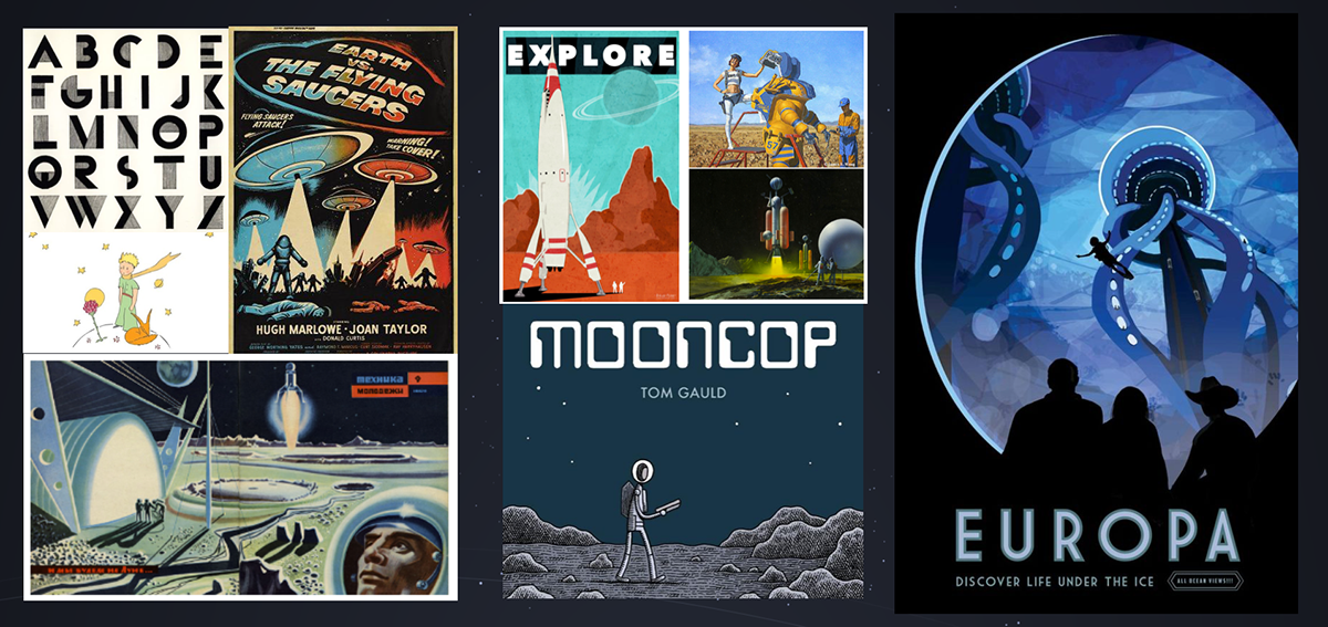
This was the start of a near 12 month effort to create an identity that we all felt really aligned with who we were as a company. Before I started, there had been some efforts to develop a visual art style that would go with the Moonfarmer brand. So we started out with this.
Below: Artwork developed by our internal team, and process work from Matt Pleva, a local artist commissioned to help visualize some of our ideas early in the process.


Logo & Identity Development
Around the time I joined the team, the focus shifted to investing more time into the logo, which would then in turn inform the art style we should use. We started out making decisions about what design influences and inspiration we wanted to inform our process.
We were really drawn to old school sci fi art and the feeling of narrative that comes from looking at comic books. Once we settled on a general direction, we started making some basic logo concepts. We kept them black and white.
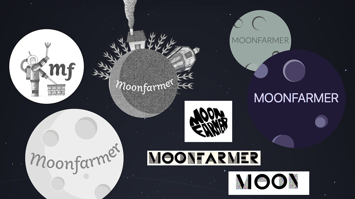
Ultimately, we weren't really super into a lot of these really circular compositions. we felt it might be awkward for some of our desired applications for the brand. We then went back to the drawing board and decided to try out some compositions focusing on an astronaut's helmet.
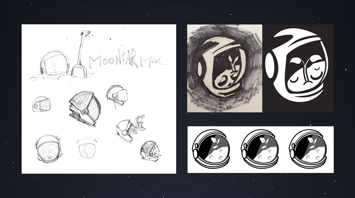

We iterated and iterated on this concept (it's worth noting we don't use an astronaut in our logo at all) and we started seeing things in our concepts that we liked, and felt we should carry into our final solution.

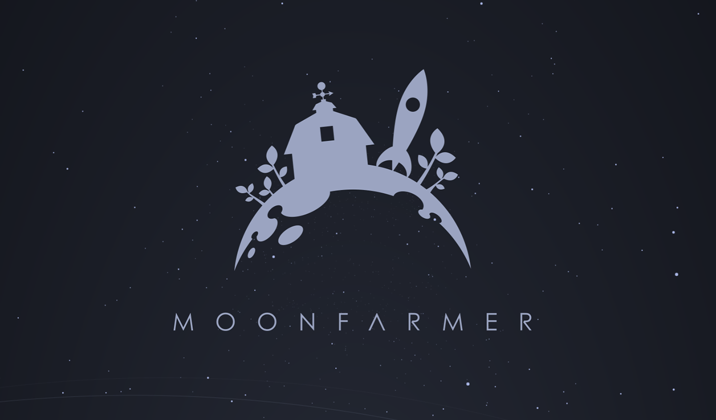
We then really started getting somewhere! The next concept has a lot in common with what we untimely went with. We still had to revise small details and adjust the composition, but we were getting really close to the Moonfarmer brand we know today. Our logotype, general composition, along with our signature barn and rocket are the core things that we really had right at this point in the process.

We took this idea and ran with it. We tried out experimenting with the type a bit more, and tried out arranging things a bit differently on the surface of the moon to see how it could read as a "farm" best, especially from a distance.

From here, we finalized our logo to what it is today. We ultimately kept the logo type as we had it, but changed the way the plants looked to make them more simple and identifiable.
Since the logo was completed, we have developed the art style (one of my co workers is a really talented illustrator and did all the artwork on our website and in most of our materials.
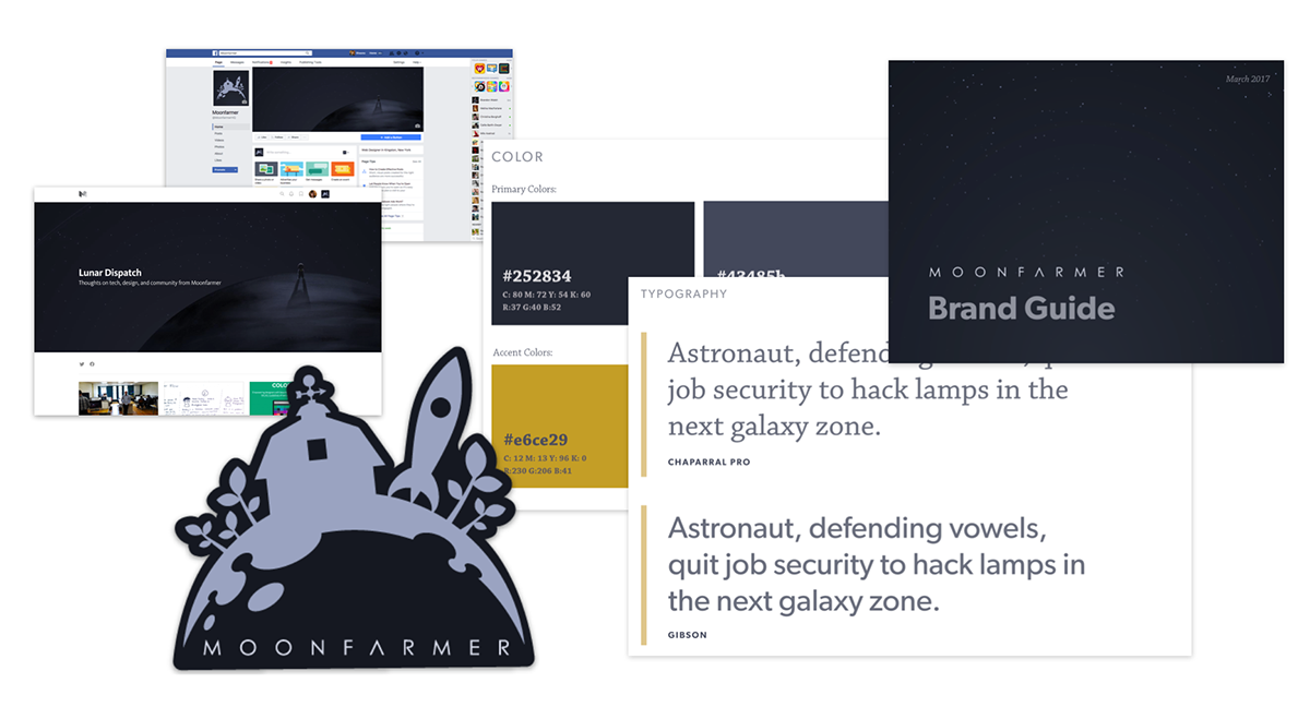
We chose Chapparal Pro and Gibson as our brand fonts, and refined out color scheme to be mostly monochromatic with occasional accents of a warm yellow and the teal you see for links. The idea is to have a handmade feel in a digital setting. It is meant to align to our innovative atmosphere (web/app development & design) in what is traditionally an agricultural setting (the Hudson Valley)
At this time, we also worked with Matecki & Co. to work on out lexicon and language that surrounds our brand when we talk about ourselves.
The Website
After we had made all the decisions about the brand, and we made the logo, we started building the Moonfarmer website. My role in this mostly was providing the basic styling concepts that were carried into the site. At this point in the process, a lot of the work was development (in React) and illustration. I did supporting work as needed. I migrated all of our portfolio content from our old site, and have since been a part of the team developing the method of building templates to make the case studies we show more dynamic and custom.


In February of 2020 the website was awarded Best UI, Best UX, and Best Innovation People's Choice awards from CSS Design Awards.


Thanks for viewing!
Moonfarmer Brand Development Team:
Dan Stone, Kale Kaposhilin, Avi Arenfeld, Amanda Postle Rosado, André Malkine, Shauna Keating, Jenna Matecki


