Illustrating the culture (of) code
The client: Mono, software development company
Software development company Mono based in Osijek, Croatia, set out to attract talent by emphasizing its culture code and positioning itself as a perfect environment for personal and professional growth in the tech space.
Mono pools local devs and designers interested in working on software development projects for global market.
Their goal is to stay on top of latest tech trends and deliver custom solutions for widest scope of new technologies ranging from web and mobile apps to robotics and AI.

The goal: To illustrate a culture code
We embarked on quest to capture their unique culture code through a set of illustrations that will sit well and enhance existing visual identity. We also needed to achieve a degree of versatility to be sure themselves could easily apply the illustration style to the requirements of different digital outlets.
The process started with a research. We interviewed the company executives, and crafted questionnaire to collected input from the employees. We wanted to discover a secret sauce of the company’s culture.

The solution: Explain it to your grandparents
Among the answers, one struck a cord. When asked how do you explain to your grandparents what do you do for a living, few of them answered something in line with: “We are making the internet” - and that became the idea we started playing with. And it turned out that they are making not just internet, but future, and robots, and growth...
First step: Deriving the lowest common denominator
To build a strong visual system, we needed to define a lowest common denominator we can use throughout each level of communication. We turned to existing logotype and derived an element which became the foundation of style, the basic unit of a mesh that builds a network.

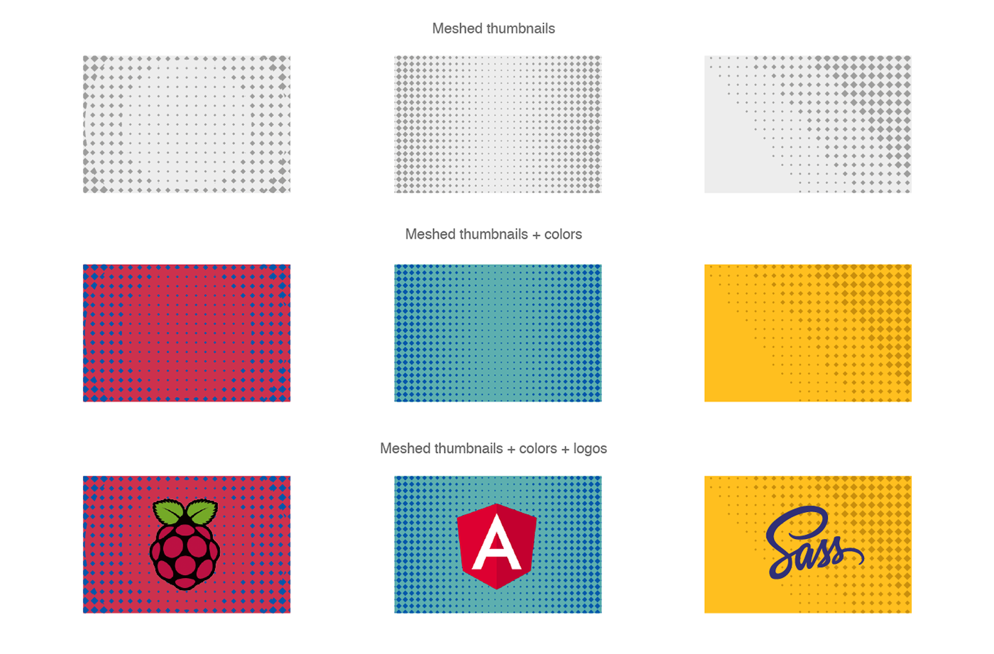
This approach provided Mono with the versatile system to uniformly illustrate their content across multiple online channels. After settling with the foundation, it was time to expand the story to include the typical user personas.


The digital identity: Putting it all together
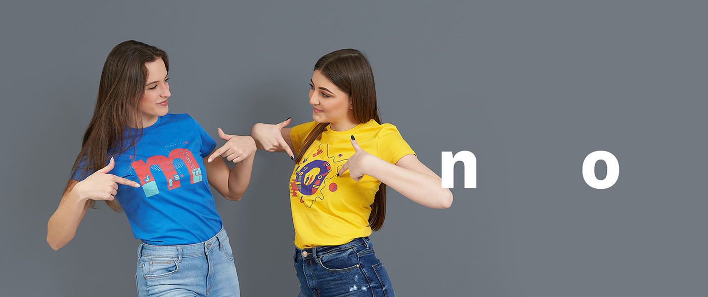
The name of the company was the element that brought everything together. Large lowercase letters became a windows to the world of software makers, providing us with the opportunity to see how stuff is made behind the scenes, spilling over to our world.
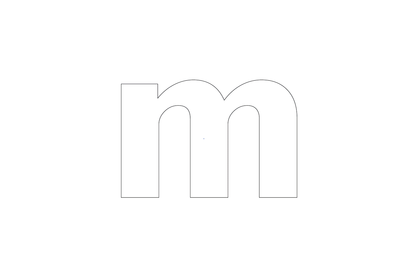
Used independently, each letter works for itself, but combined together, forming a company's name they reveal full scope of tech-world activities.


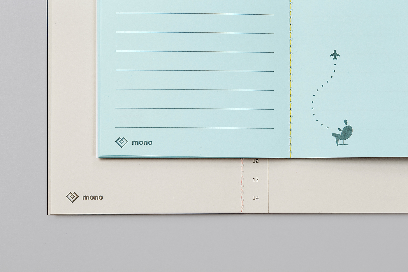
The transition: Stepping out to the real world
The visual language had to fulfil one more task: to work well IRL. And it did. How well it looks printed you can see on the following applications.


So, what do you think? Would you like to build the internet with Mono? ;)

CREDITS
Client
mono.software
mono.software
Art direction & design
Marko Jovanovac, Marivo
Marko Jovanovac, Marivo
Research
Ante Vekić, Symbol
Ante Vekić, Symbol
Photos
Kristijan Cimer
Kristijan Cimer
Print
Bunch
Bunch