

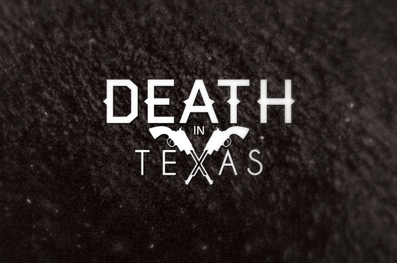
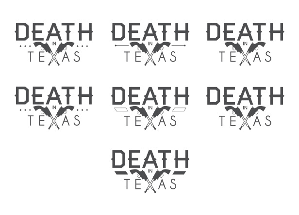
DEATH IN TEXAS
BAND LOGO - AUGUST 2012
BAND LOGO - AUGUST 2012
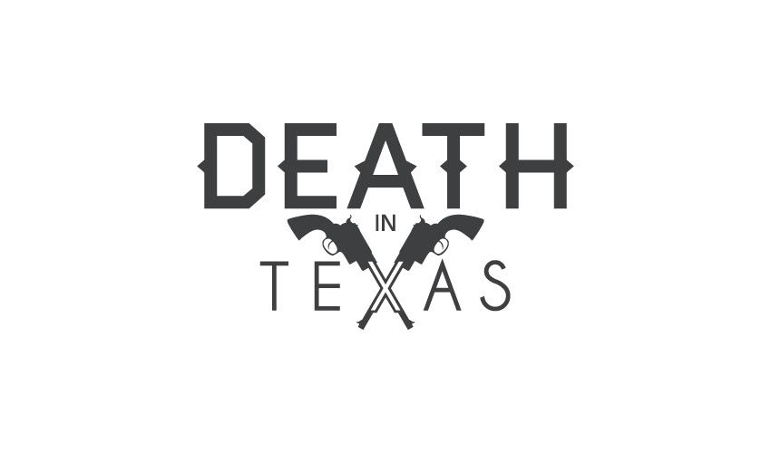
Based in London, Death in Texas are an alternative pop band. I wanted to give them a powerful logo which clearly communicated their name while remaining adaptable. With the revolvers symbol being the most recognisable element in the logo, it can be used separately and still be recognised by fans.
You can listen to their music here and please check out their facebook page too.
You can listen to their music here and please check out their facebook page too.

DESIGN PROCESS
After sketching out various ideas and concepts, initial ideas were looking at the ‘xXx’ (seen in a lot of classic cartoons and films based in the Wild West), sheriff’s badges and revolvers:

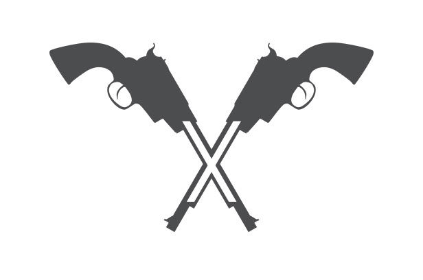
With the revolvers being the strongest/favourite idea, I started to experiment with type:

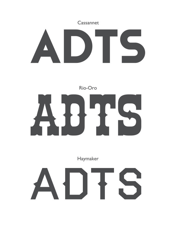
I looked into a compromise between a modern sans-serif typeface and a western-themed one:

Next I looked into developing the revolvers’ presentation and how to better show the ‘X’:


The chosen motif left a large gap between ‘DEATH’ and ‘TEXAS’ which at first I found awkward, so tried to fill in:

None of these were very satisfying and felt very military-like. I took another look at classic revolvers:
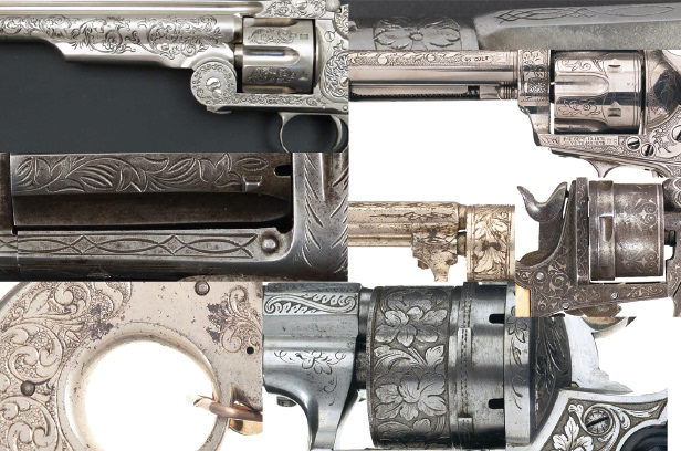
I sketched out different patterns inspired by the ones on the firearms and created these:


These felt way too over the top. We took another look at the logo without anything to fill in the gaps and thought that it looked great as it was. I made some final adjustments and we agreed on the design below.
It was finished and we were all happy.


