VERMÚ DE GARAGE (Reserva Especial)
(Branding - type design)
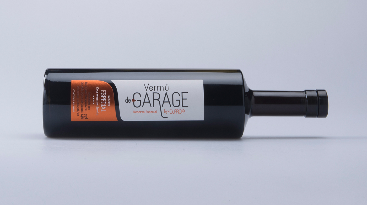
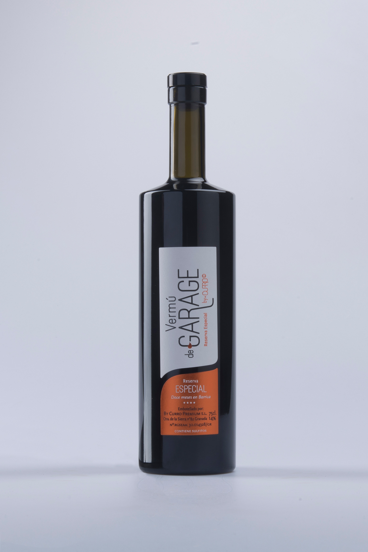
VERMÚ DE GARAGE (Reserva Especial). This design has been developed for a brand of "vermouth". The naming is linked to the french concept of "vine de garage". For "Vermú de Garage" (Reserva Especial) we propose a typographic concept which presents the product as "minimalist" and "refined".
The label is divided in two part using the arm of the letter “R” for creates two zones, one for the brand and another for the complementary informations. The label is finished with a orange metallic stamping, black ink and serigraphic relief over a Tintoretto Ultra WS Gesso paper.
Betting on the coherence of an exclusively typographic "branding", the design is based on an exclusive typographic set, i. e. the typeface "Slimfit",developed by the author in 2015 to shape the client corporate identity.
–––––––––––––––––––––––––––––––––––––––––––––––––––––––––––––––––––––––––––––––––––––––––––––––––––––––––––
Client: "Curro Premium s.l."
Production: "Vermú de Garage" has been produced and packaged in 75cl bottles by "Curro Premium s.l.".
The label finish has been made with screen printing and metallic orange stamping produced by the company Quatroetiquetas s.l.
Photography credits: Ángel Guzman
–2017–