
This UX/UI project was to research and redesign a website for a non-profit group. With a team of 3, we had 2 weeks to discover an unfulfilled need that we could aid the group in fulfilling to enhance their website and make their program more successful. I worked with Parth and Anahita on this project and will identify which parts of this project each of us were responsible for.
We decided to use a local group that could really benefit from a new focus. Once we narrowed down our options to a few community-focused groups, we decided on the web site of the Sargam Group who's sole purpose is to put on a low-cost, family focused event for a traditional Hindu holiday. One of the members of our group had a connection to the creators of this group. He explained to us that their event had been successful in the past, but was looking to grow and we thought we would be able to find a way to help them do that. We also learned more about Garba and found out that it is a regional celebration specific to the Indian state Gujarat, but still part of the widely celebrated holiday of Navratri.
Existing Site
The existing web site they have is a single page that can be scrolled though rather quickly. We made some quick observations at the potential issues that may be keeping more guests from deciding to attend.


The first issues we found had to do with the visual formatting and consistency of the site. It felt like there was a lot of untapped potential for the visual design of an event that is based around fun, music and dancing.
The second issue we found was that there was a lot of information lacking for any outsider as to what the event was. There is little context of what happens there or what someone new should expect.
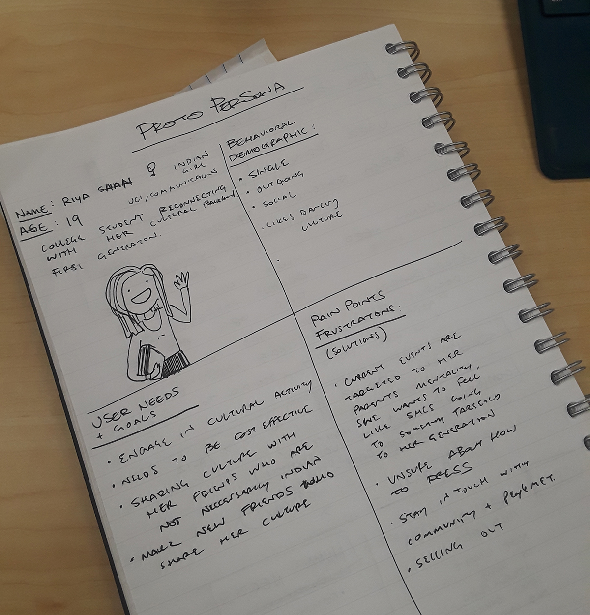
So we believed the first step in gaining an understanding of how to improve their website, was to interview someone who has never been to a Garba but was looking to attend one. We created a proto-persona as a guide to the type of person we wanted to interview and learn more about our targeted user's needs. Here is the proto-persona that I wrote up.
User Research
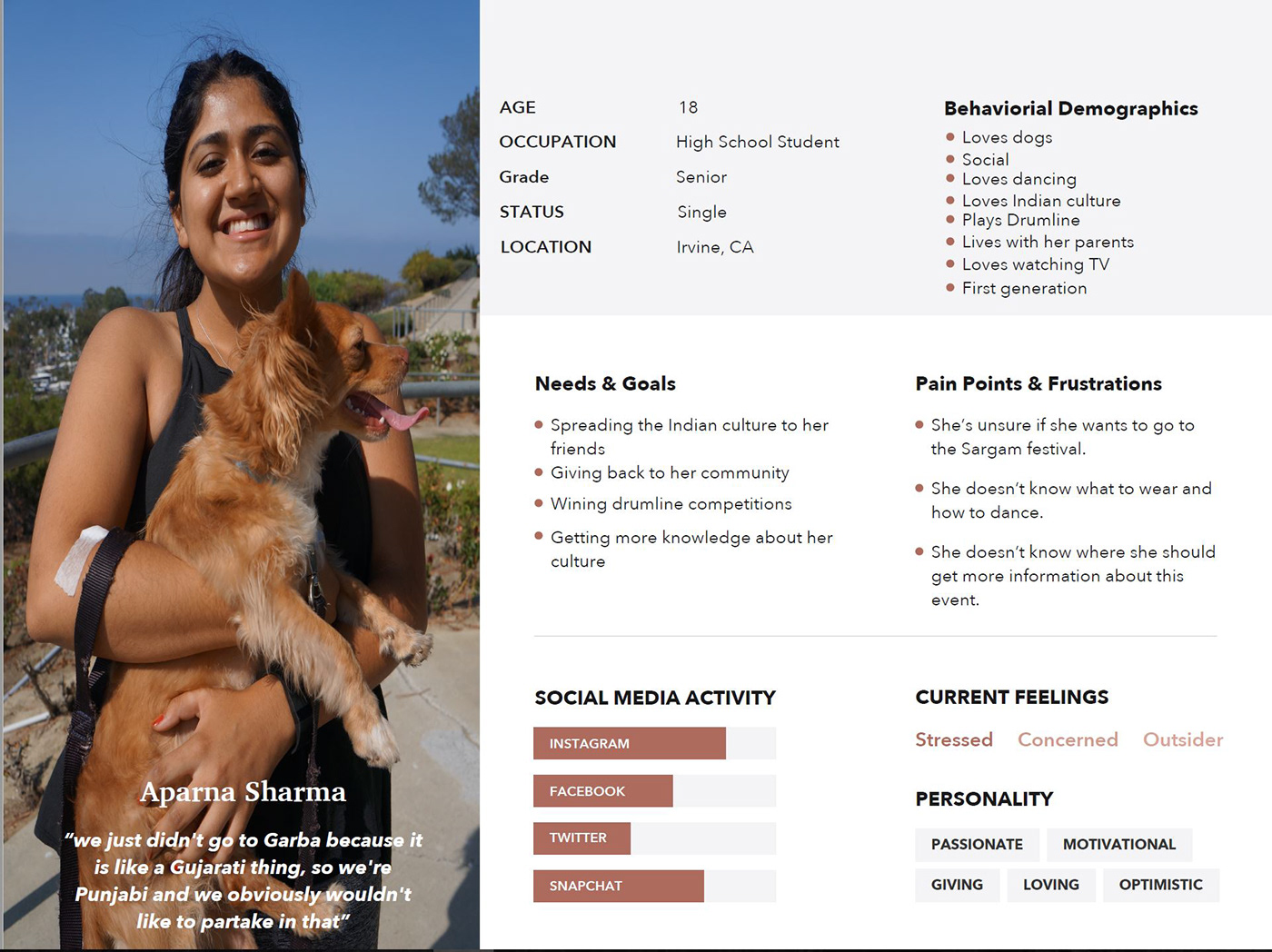
Our group member with a connection to the Indian Community, Parth, asked around to find someone who was close to our proto-persona to interview. He was able to find Aparna, who is a 18 year old high school senior who is a first generation Indian American. Her family is from Punjab, a state in India just north of Gujarat.
She is deeply involved in Indian culture, in that she has done traditional Indian dance for several years, has plenty of Indian friends, and is a practicing Hindu. However, when her friends invite her to go to garba she has been busy, the past eight years. While that may be true, we believe that she is more afraid of feeling like an outsider because her parents never took her as a child.
Anahita created a user persona for Aparna and began to explore what she told us in her interview. We wanted to find an insight to how she felt and what the Sargam Group could do to make her want to come to their Garba event. I created a storyboard for the current situation for Aparna and how it effects her and her friends.


Insight
Aparna, a first generation Hindu girl who strives to stay connected to her roots, needs to feel that she will be welcomed and taught how to take part in Garba because she’s afraid of feeling like an outsider in her own culture.
Wire Frames
With out new insight in mind, we began strategize how the Sargam group could change up their website to attract this new demographic that they have not been able to get to their event. We had a new understanding of a demographic that was interested in going, but needed more information and a warmer invitation to join. We would depend on expanding the websites using these ideas.
We started listing out possible features to add. We agreed that the existing simple 1-page layout was appropriate for the event and made the site user-friendly to navigate and the information easy to find. Because we wanted to add so much information for the first time attendee, we decided to add a second page just for them. As we went on, we realized that this that would make our target-user feel much more catered to and welcomed which would increase their likelihood to join.
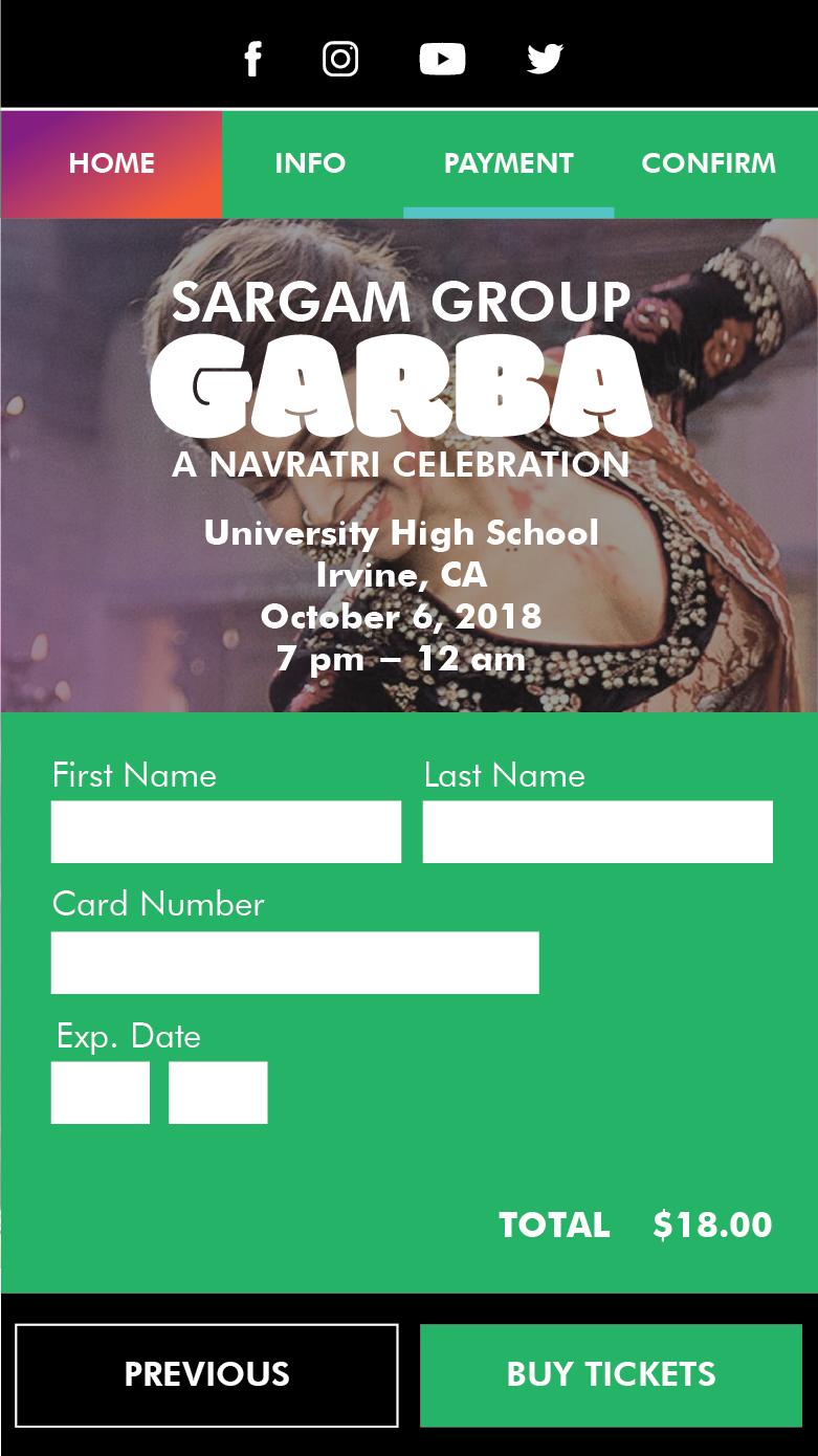
We also wanted to add an ability to buy tickets from the site as well as donate to the group. We felt that adding the checkout system for tickets to the site would enhance the immersive experience of the site as well as add excitement for the first time attendee.
Based on the interview with Aparna, we wanted to expand the social media presence of the event as well. Because this event relies heavily on word-of-mouth, we wanted the social media icons to be prominent and easy to find so that site visitors could easily follow and share the event.
We designed primarily for mobile based on Aparna's interaction on the web being mostly based on her phone. Here are the lists of items we wanted to include on the new site and the quick wire-frame sketches that I did.


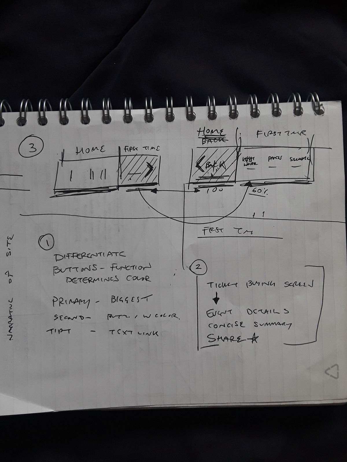
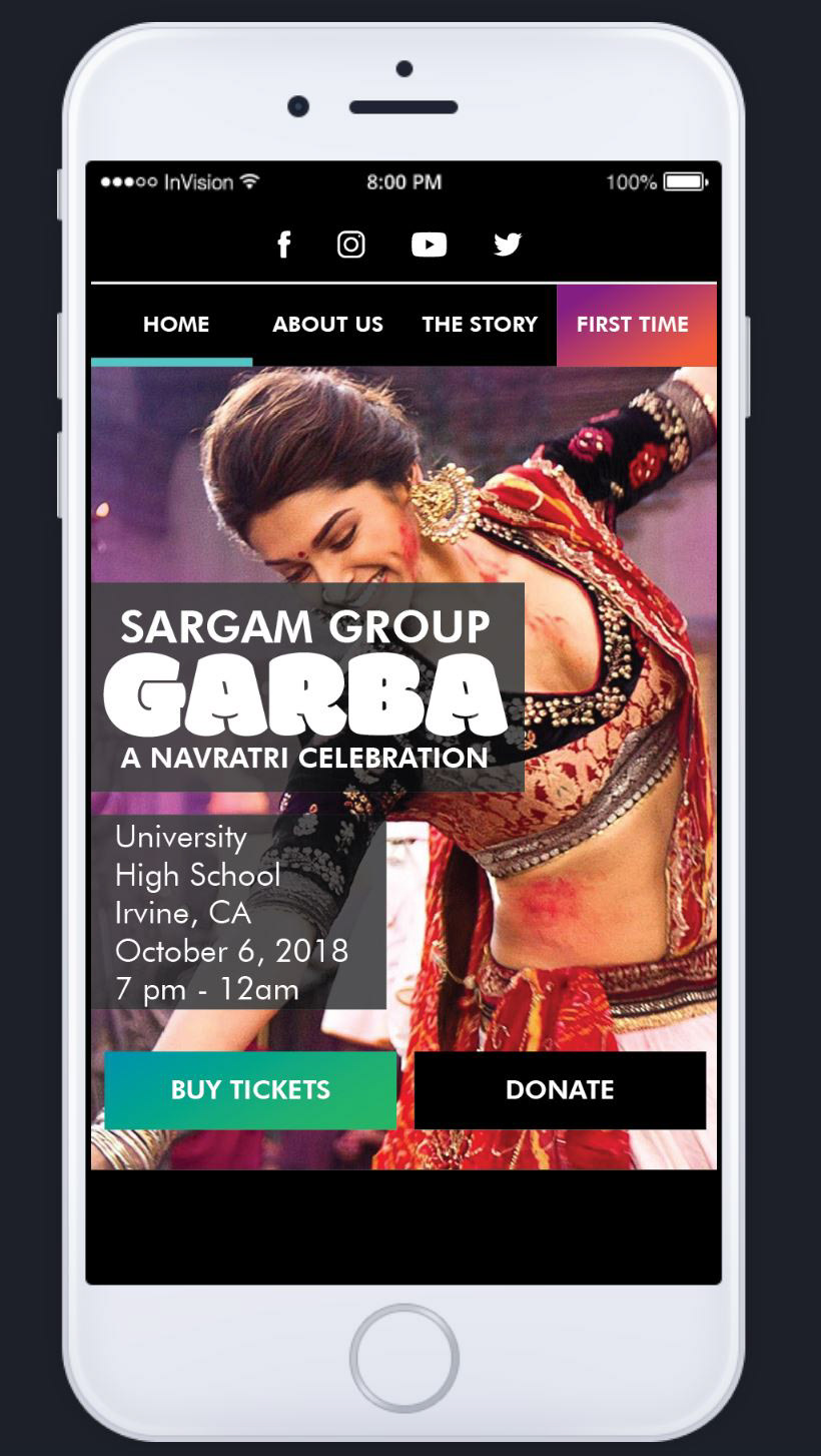
With these ideas in mind, we decided that we wanted to keep a main first page that would allow the current, experienced user that is familiar with the event to quickly navigate the page, get the information that they need and then proceed to quickly buy tickets. We wanted to keep the base audience that the event already has happy. We also wanted to enhance the experience by making it easier, giving them a cleaner layout and more cohesive and exciting presentation of the information with our redesign.
The main addition we made to the site was a second page called "First Time". It was here that we would show the new users all about the Garba event and how to prepare for it, what to expect and make them feel as welcomed and confident in coming as possible. We strategized what to do here based on what we learned from interviewing Aparna and what she wanted to know more about. We wanted to make sure that this process was just as easy as the main page and that tickets would be quick and easy to purchase for the user once they felt excited enough to join.
Style Guide
Once we had a plan and wire frames laid out, we began to design the interface and interactions. I used the wire-frames that I made to start making the style guide.
First, we focused on the navigation and how the 2 pages would coexist and flow in the most efficient way. We iterated a few ideas that lead us to having a special button on the top of the page navigation that would feel like the user was sliding left and right between the two pages.
Through prototyping and iterating on the pages, I decided to change the background of the "First Time" page menu to an orange color that changed the feeling of the page to something more exciting and new than the primary "Home" page. This later expanded to the entire background of the second page to enhance this effect. I made a special gradient using the orange color to add to the excitement and welcoming nature of this new page.
We wanted the site to have an identity and create a consistent feeling, so I choose new colors that were fun and inviting for new comers. We wanted the colorful images and the buttons and navigation to really pop, so I made the background black on the "Home" page. The white text was to add the most contrast. Choosing Futura for the primary typeface gave the pages a clean, modern feel and make the text easy to read on a screen.

Once the styling was decided on and the layouts set, I began putting all of our pieces together to layout the entire site. I created the checkout process for tickets as well. We decided to follow the pattern of matching the page background to the button colors and made this process green. After a few more iterations and changes based on testing, I finalized our pages and Parth created the Invision prototype.
Interact with the prototype here.


InVision offered us enough to provide a proof of concept, but we had more ideas to enhance the experience of the newly designed site. We wanted to add depth and movement to the pages to create a feeling of excitement that mimicked the dancing and fun of the event. We were able to show an enhanced navigation experience as well as show off some parallax scrolling through using Magic Move in Keynote. Anahita was able to simulate the site experience through the moving pieces in this video.
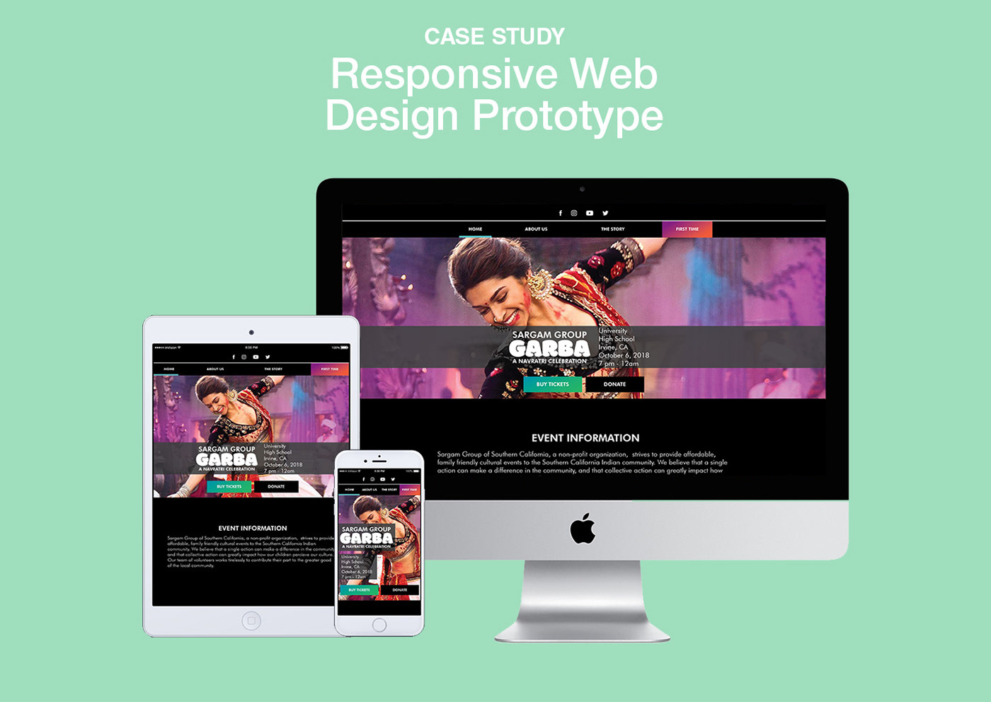
Once we had a good understanding of the interactions and layout of the site, I expanded the home page on desktop and tablet sized screens as well and laid them out into the renderings below. The next steps of this project would include laying out the additional pages for the larger screen sizes to present to the Sargam Group. We hope to be able to work with the Sargam Group to fully develop this updated site in the near future.


