


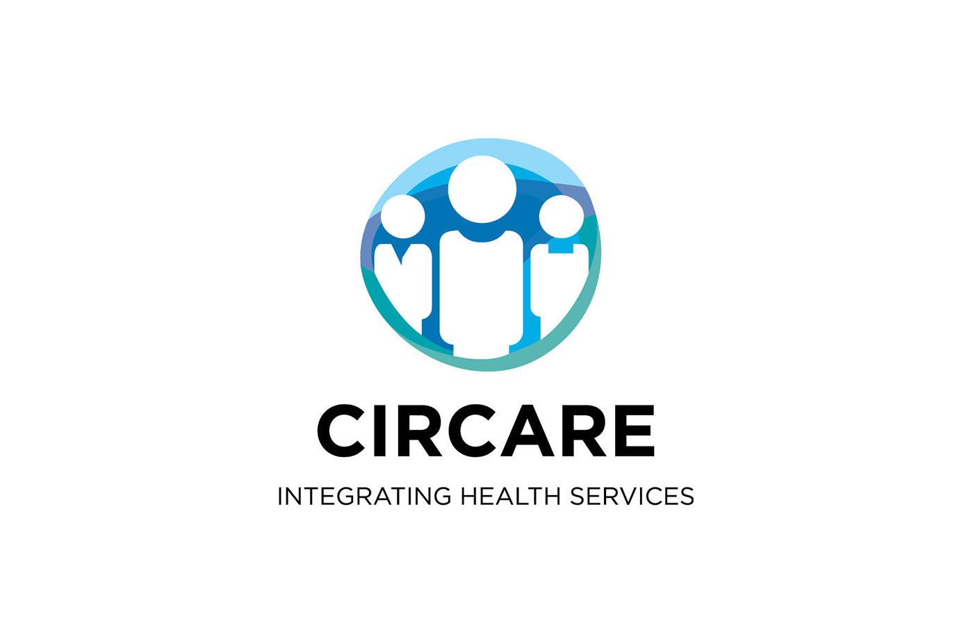
The mission of Circare is to support individuals and their families to develop the resources to live a satisfying and naturally interdependent life. A new name was developed to represents the Circles of Care that surrounds their customers.
Brand Identity Components

As a human services organization, there are many complexities to caring for the diverse needs of their patients. We chose a direction that simplifies the care giving process to its core elements. My team and I created a mark that is colorful, simple and symbolic. It features several components that twist, weave, and blend into something greater than the sum of their identities. Components that are always able to transform again.
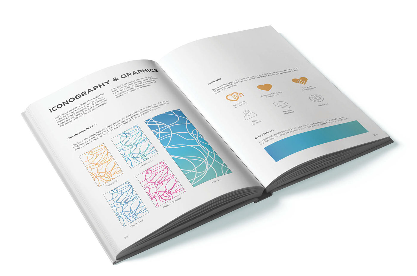
Across the brand application, we leveraged color to create a system that speaks happiness and health. The visual identity program allows a wide breadth of expression that relates to the many facets of care provided, while always referencing the complete person via the simplicity of the circular form in the brandmark.
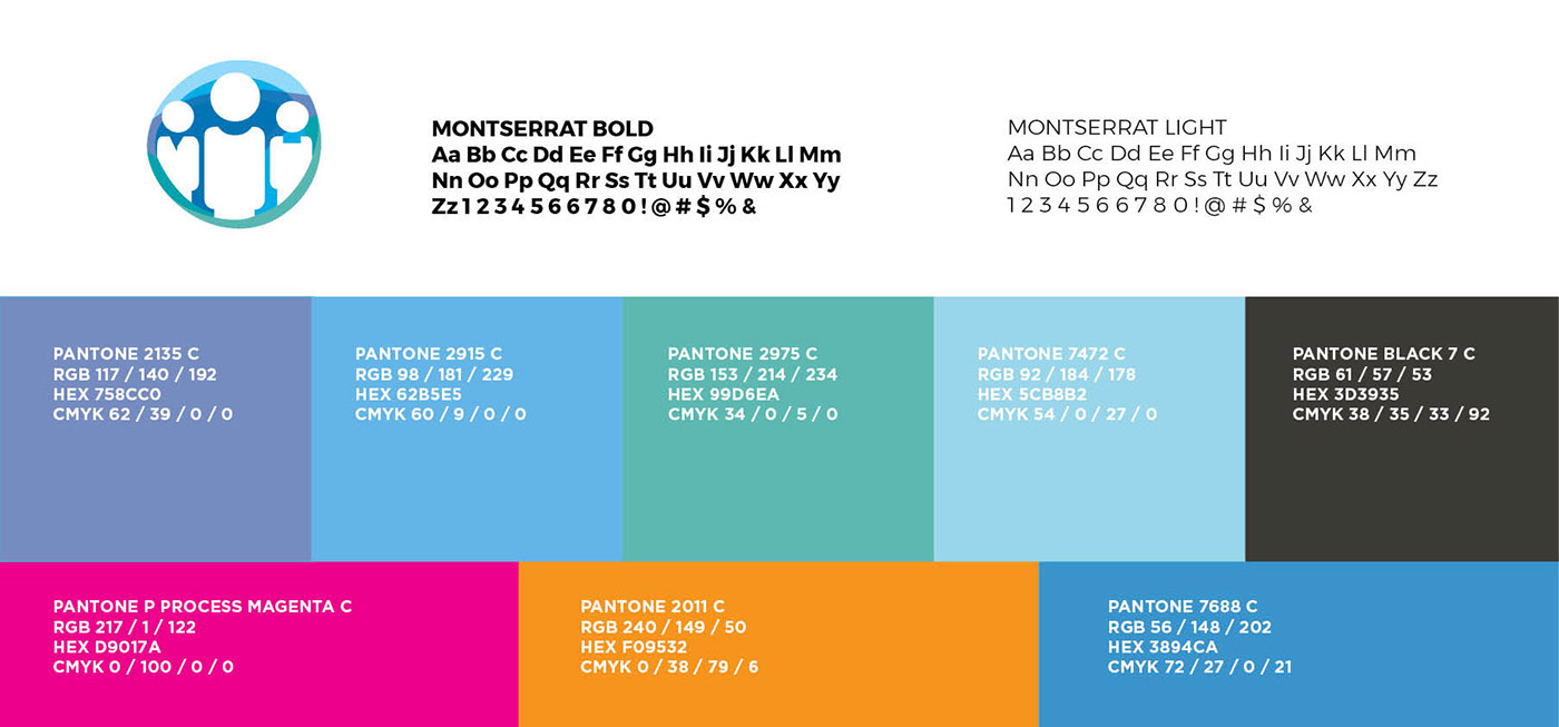
Logo component elements (above) Typography, Colorways and Wordmark lockup (below)
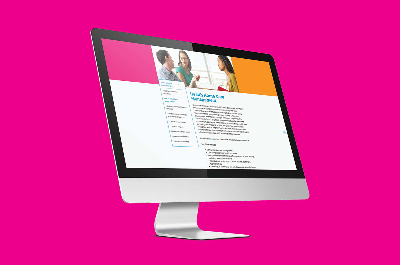
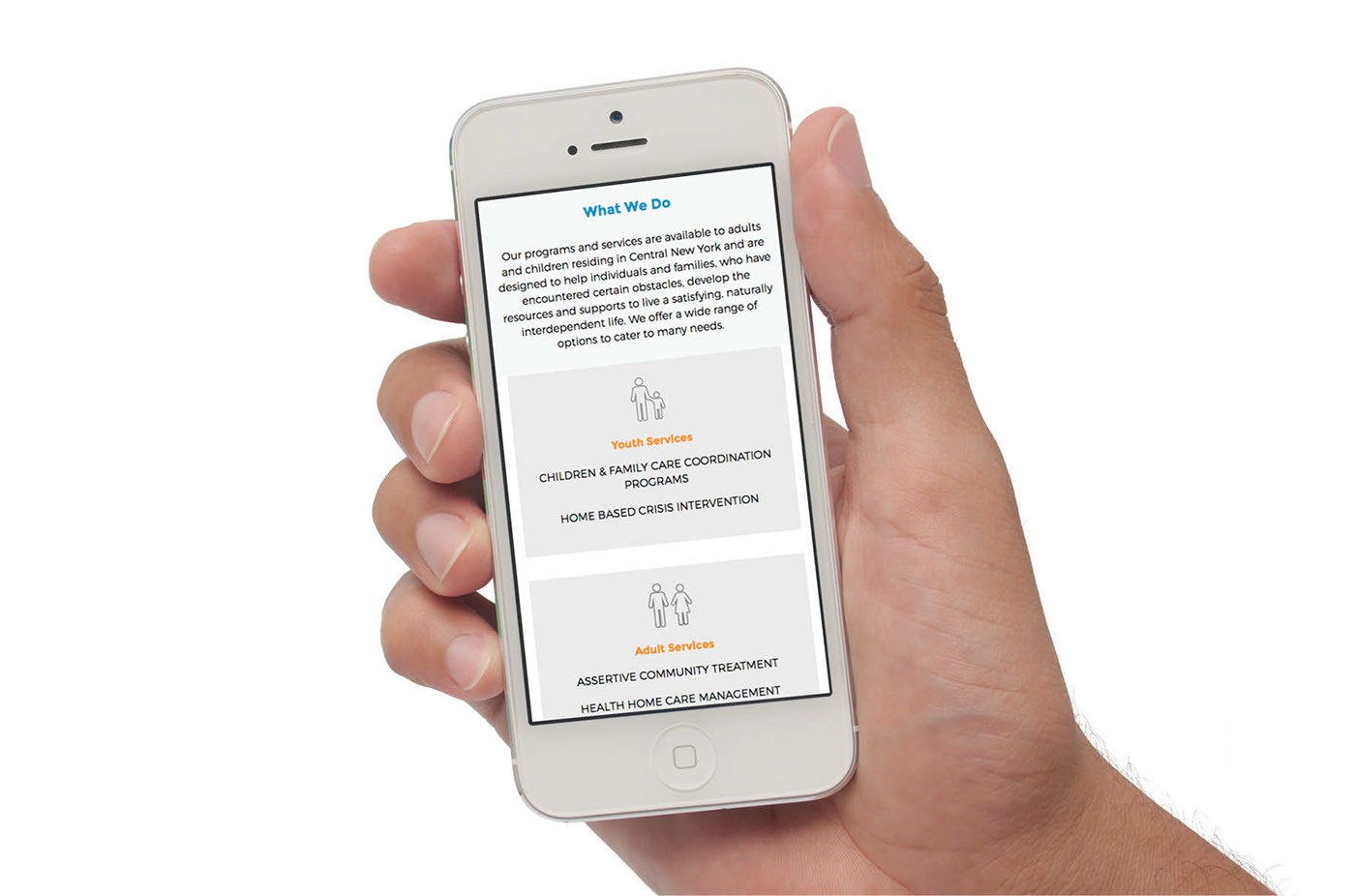
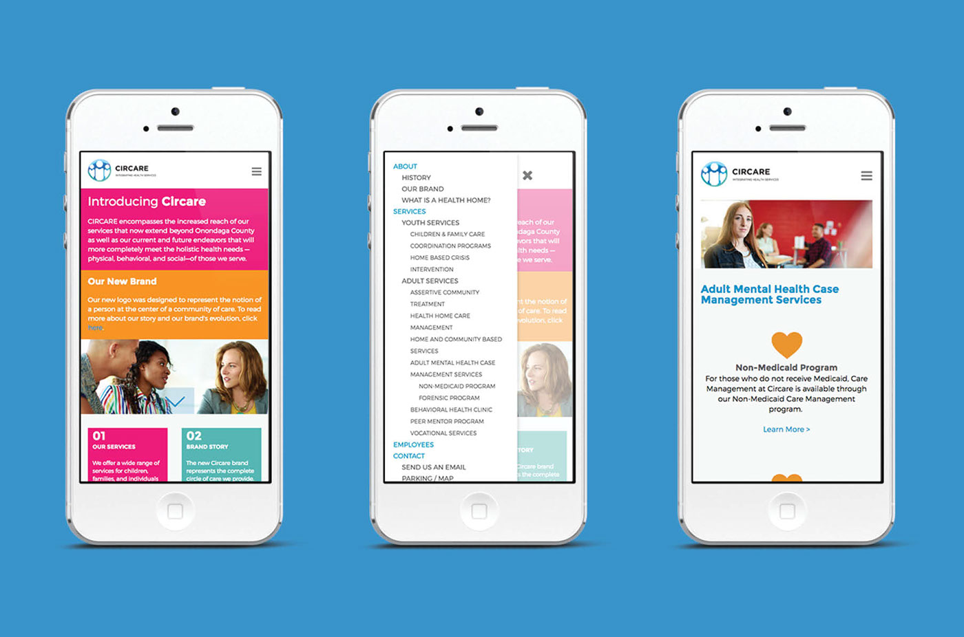
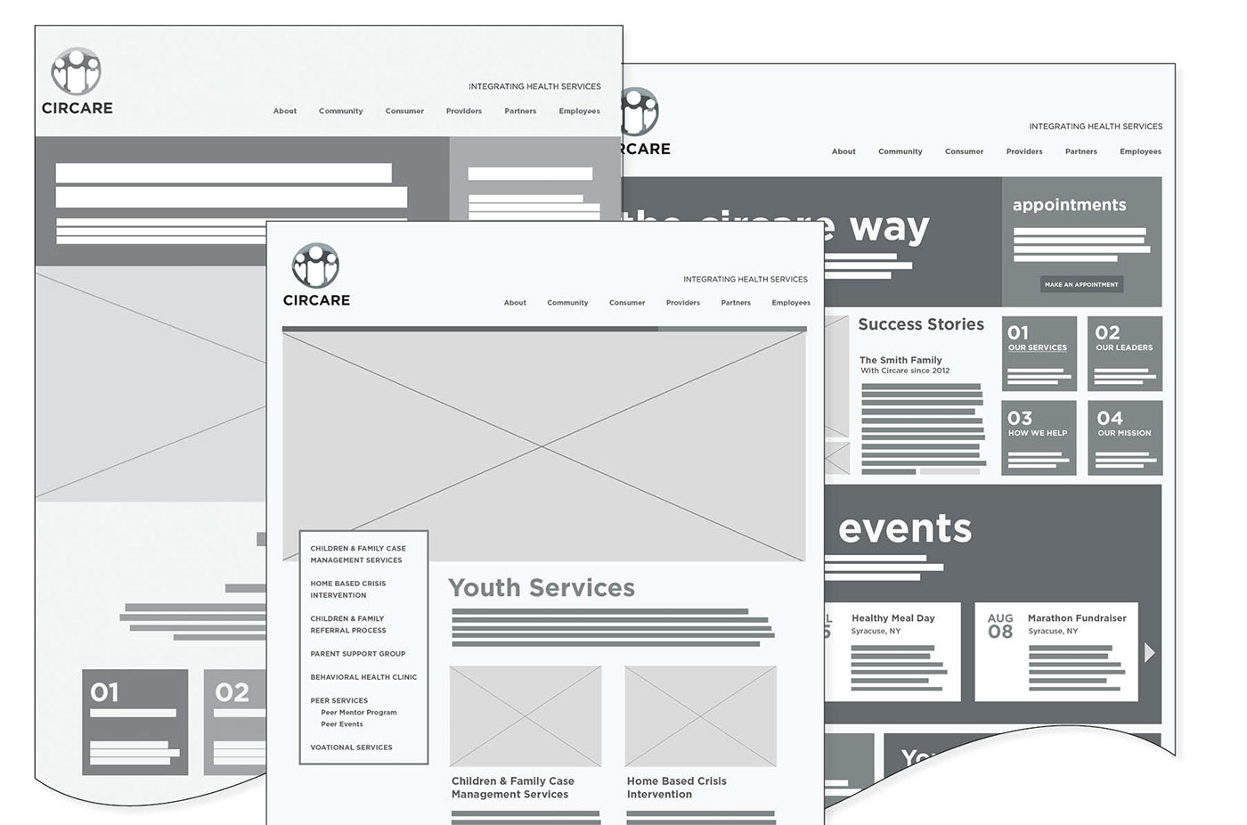
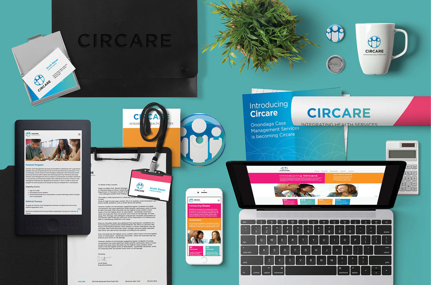
Responsive Website Platform
The website is built on the enterprise-class Concrete5 platform. Front-end code is built with Bootstrap 3 framework for reliable responsive rendering on multiple devices.
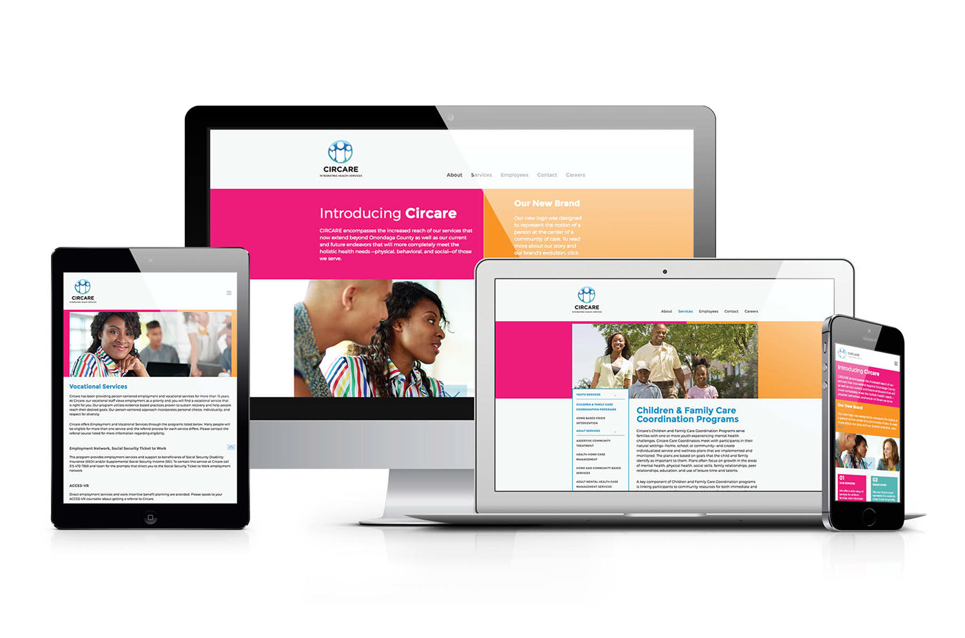


Website iconography (above) Website architecture (below)

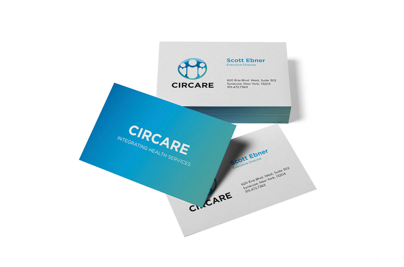
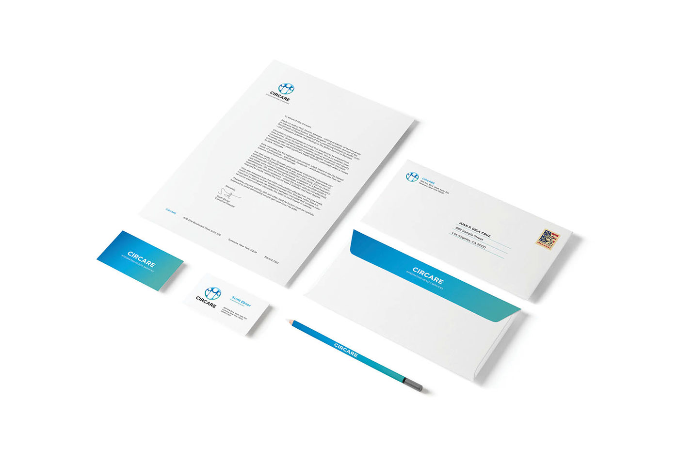
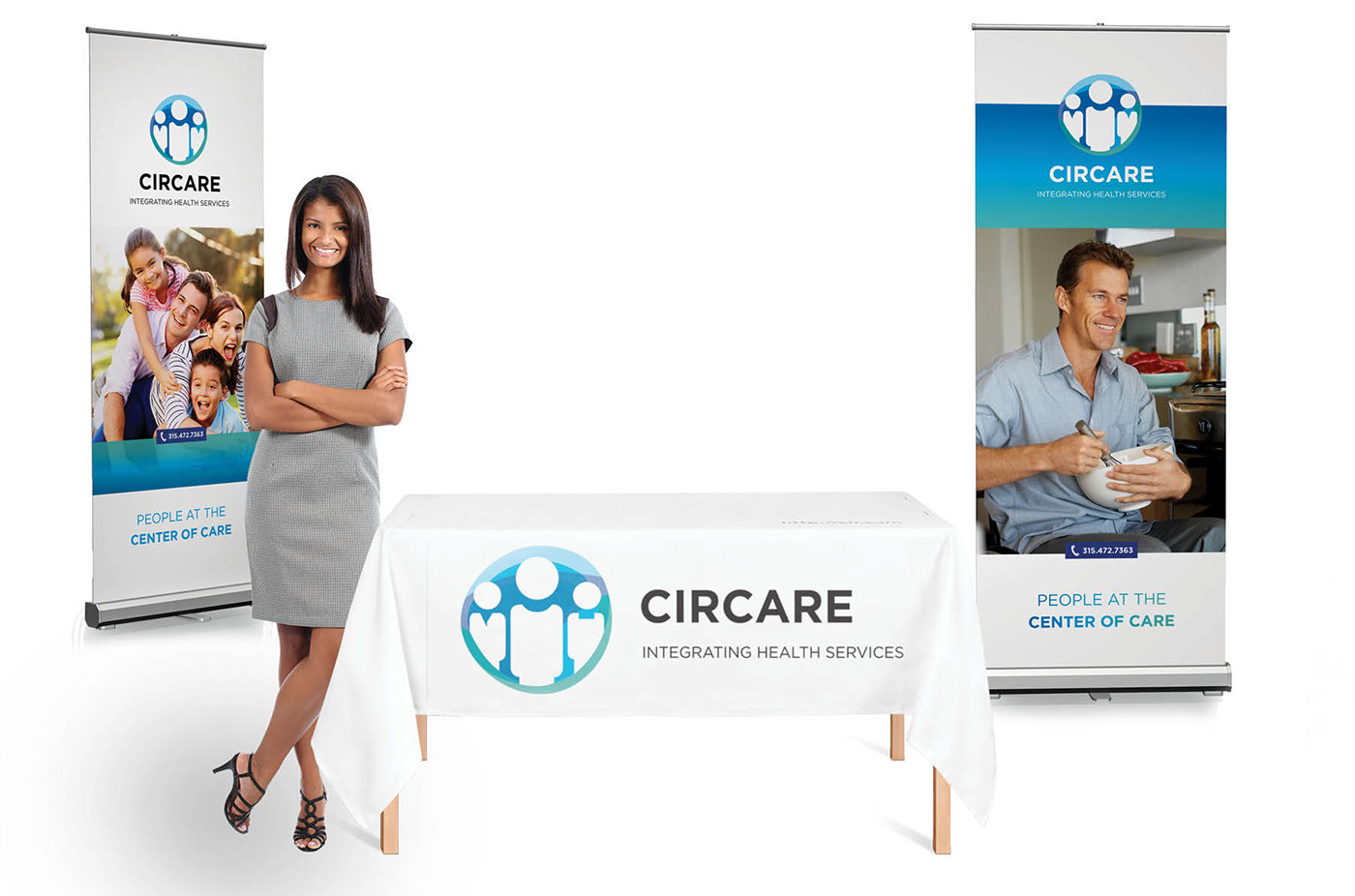
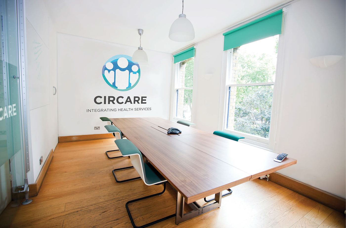
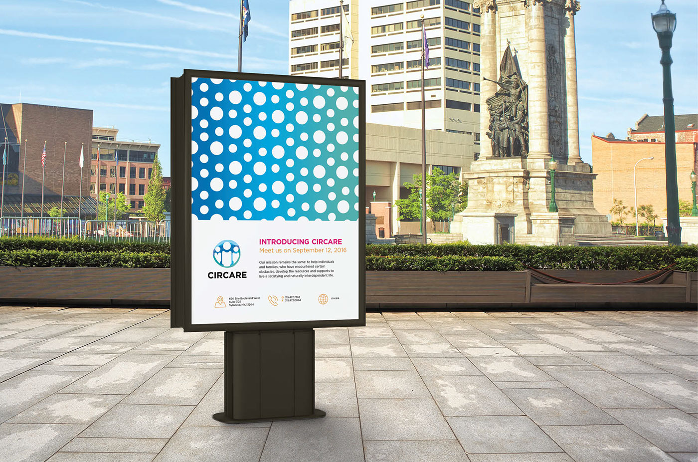
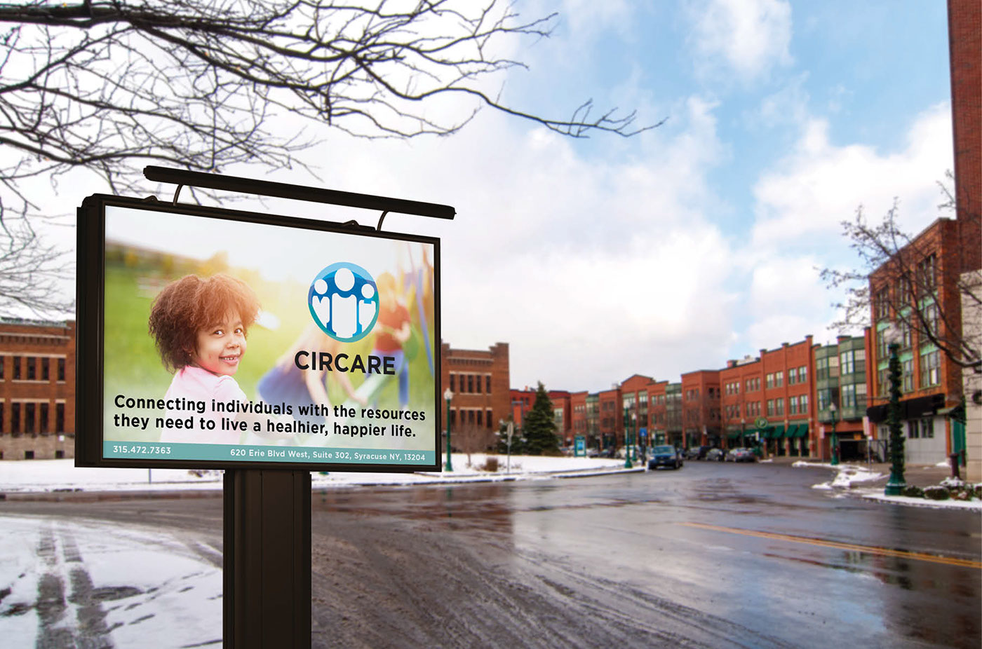
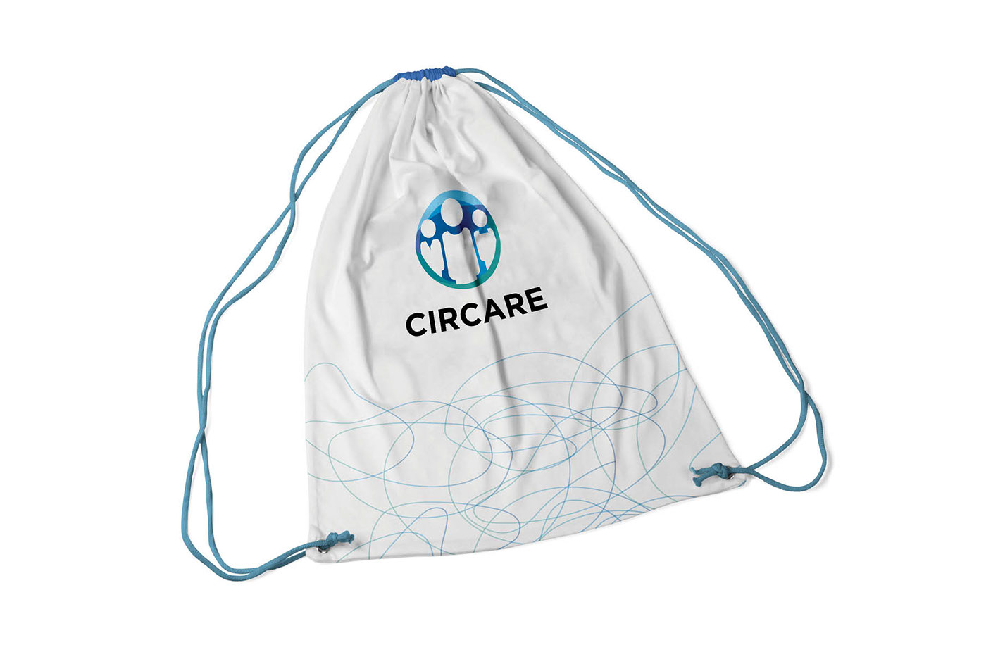
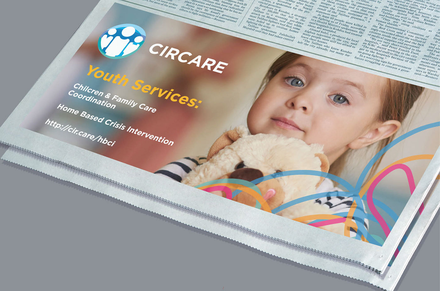
Print Identity Program and Communications Materials


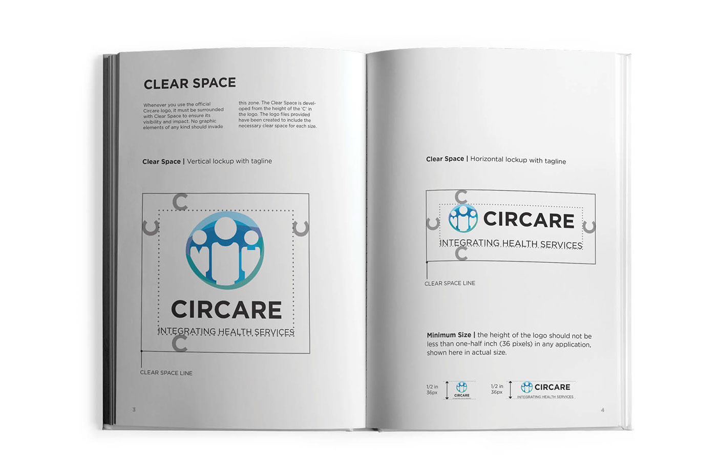
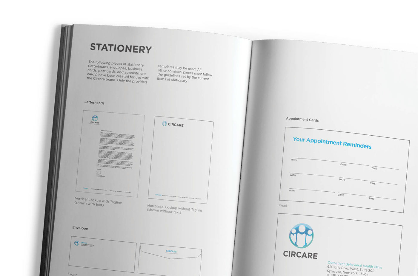
Brand Guidelines


Naming, Art Direction + Design Strategy: Marc Stress
Naming + Design Strategy: Leah Cunningham Design: Jordan Richichi, Read van der Wal, Gabriella Hale Web Development: Dave Reeder


