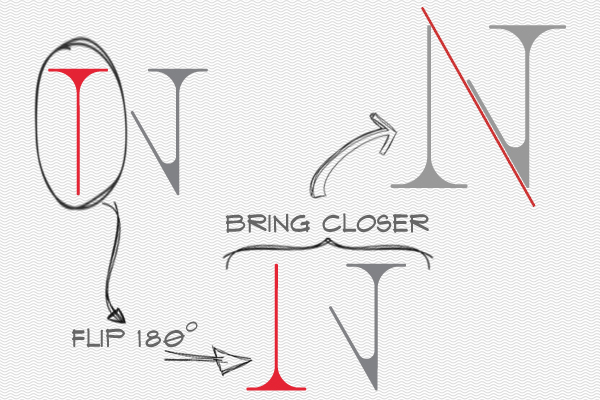
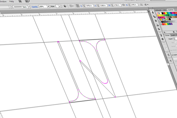
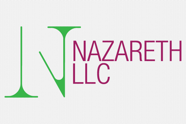
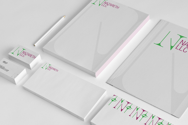
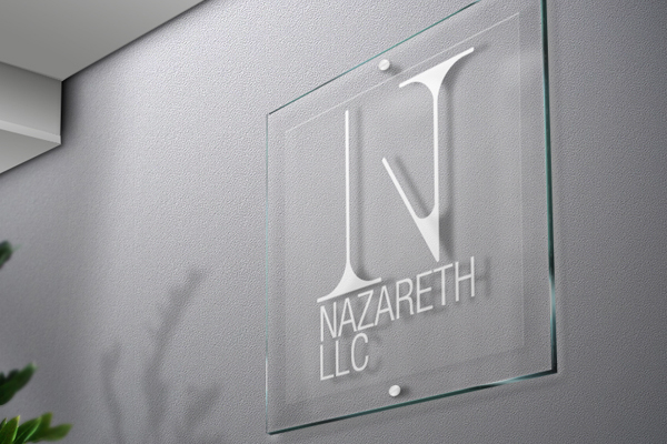
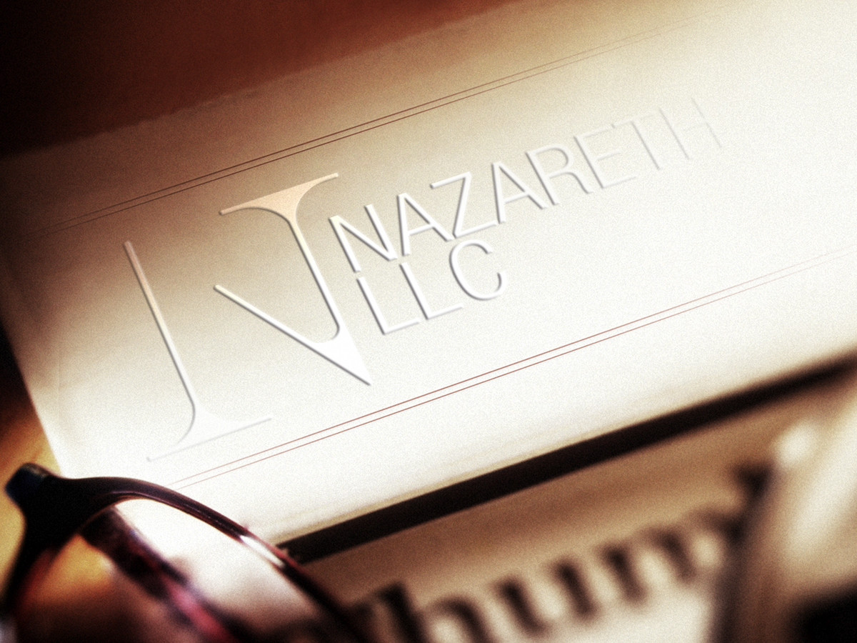
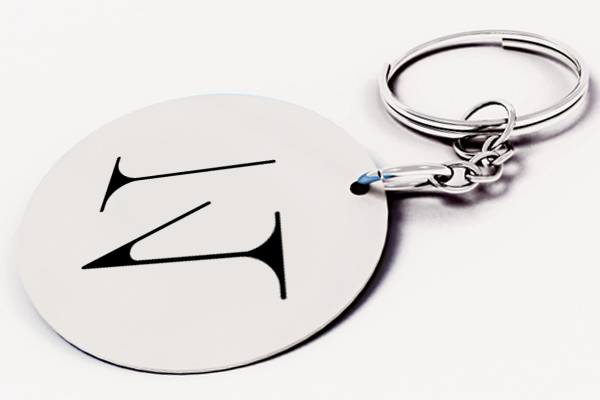
Identity for a small firm based out of Dallas, Texas. The idea was to combine first letter of the first names of both the L.L.C. partners (T & J) into one unified letter (N for Nazareth, the name of the company) in a clean and concise manner.
Join Behance
Sign up or Sign into view personalized recommendations, follow creatives, and more.
or
Join Behance
Sign up or Sign in to view personalized recommendations, follow creatives, and more.