

WINE PACKAGING DESIGN TALHA
ART DIRECTION . DESIGN . PHOTOGRAPHY . POST PRODUCTION
É na autoproclamada Capital do Vinho da Talha - em Vila de Frades, às portas da Vidigueira - que a família Honrado iniciou há 15 anos a viagem pela produção de vinho artesanal em talhas de barro. Uma técnica com mais de dois mil anos, que coincide com a passagem dos romanos pela Península Ibérica. Em 2016, com o interesse crescente pela produção de vinho, Ruben Honrado decide avançar com um novo projeto de vinho de talha. A nossa equipa inspirou-se nesta tradição milenar para o desenvolver o conceito criativo do design de packaging e da produção fotográfica.
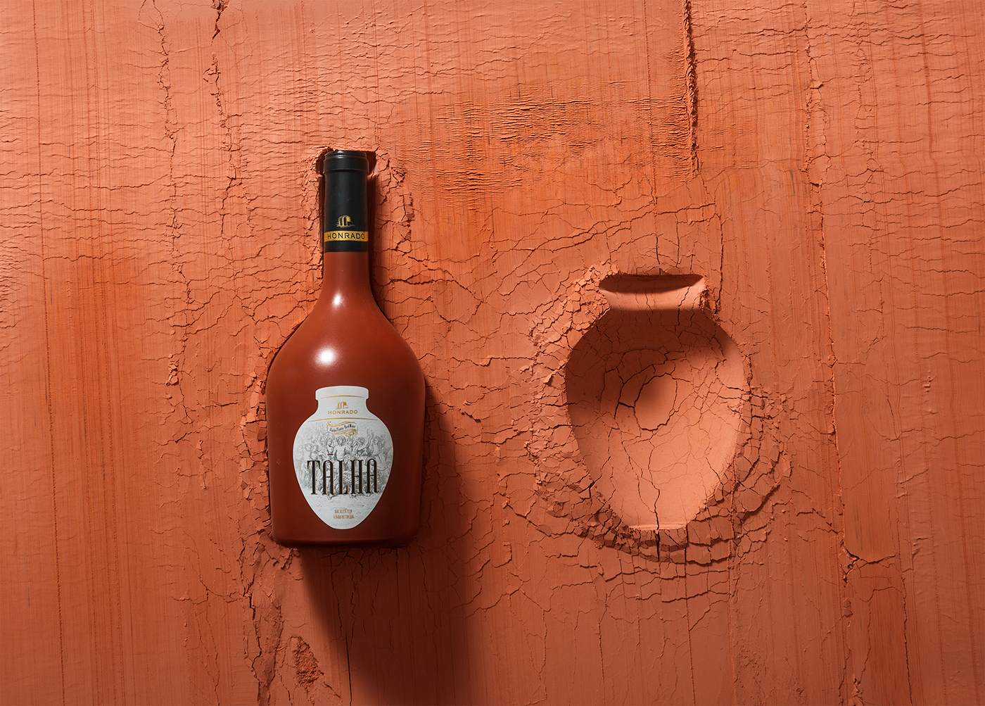
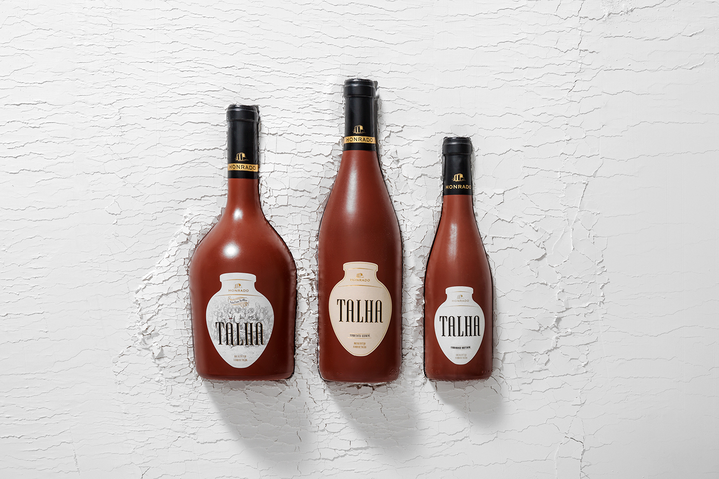
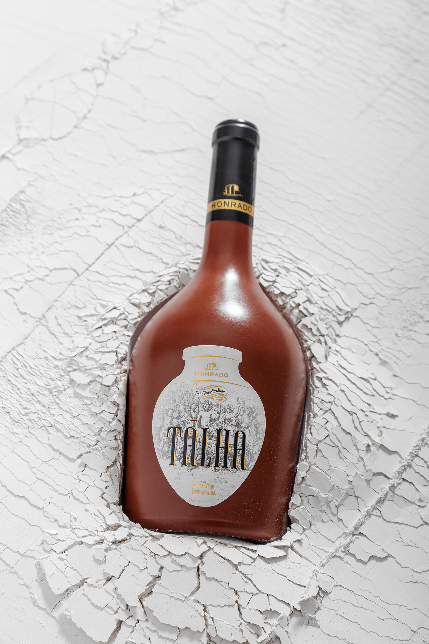
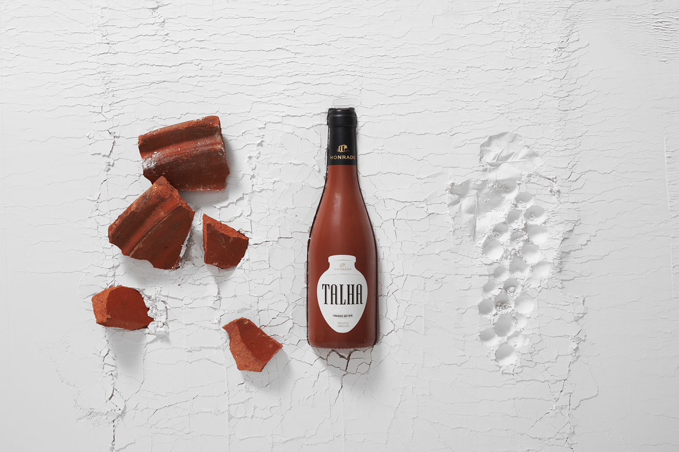
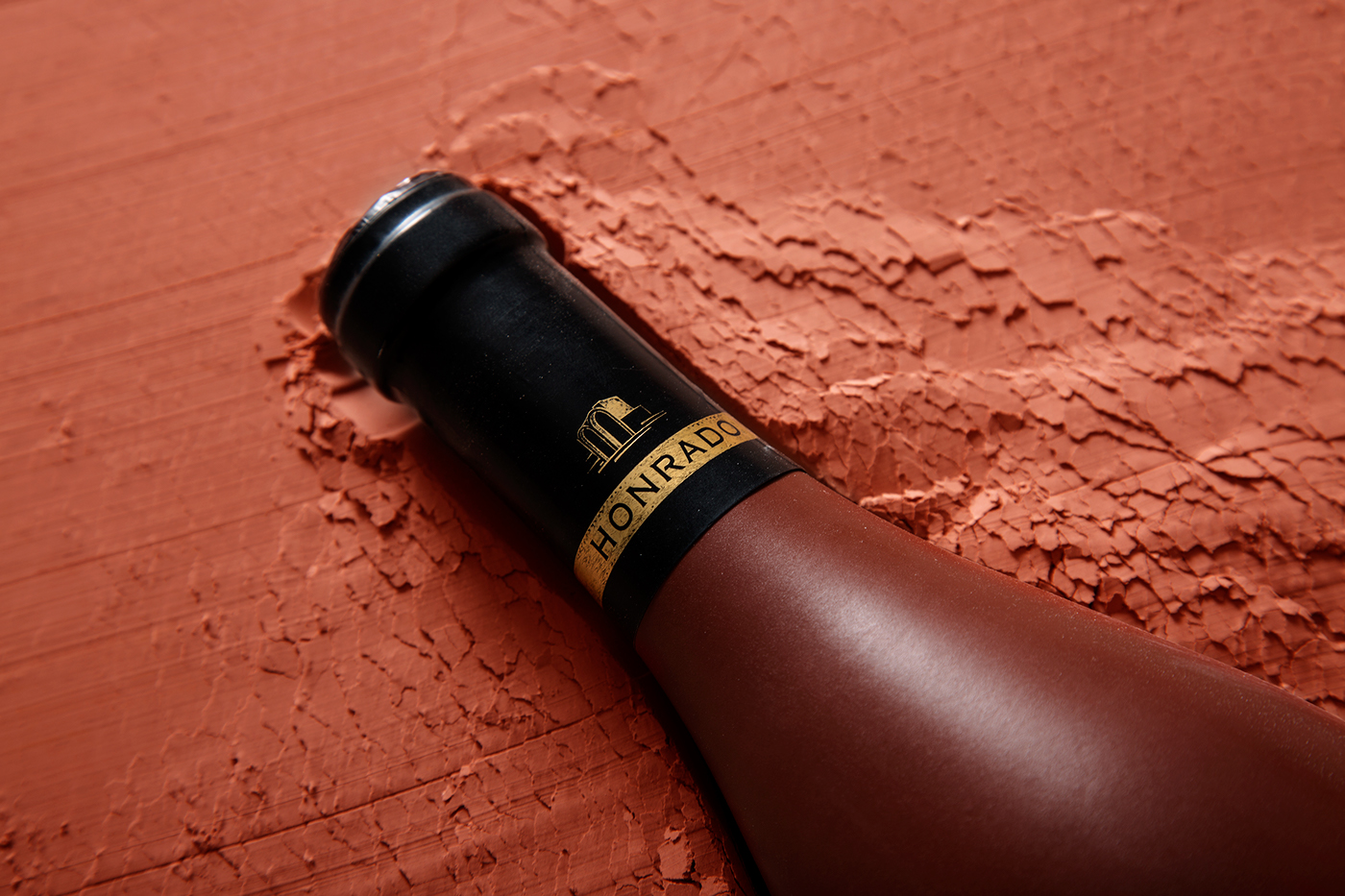
As garrafas são pintadas em tons de barro. O cortante do rótulo tem formato de talha: pote grande, de barro, onde o vinho fermenta e ganha um toque único. Daqui surgem dois rótulos distintos: um com carácter simples e minimalista, outro para edição limitada de mil garrafas numeradas, com a ilustração de uma festa romana, numa clara alusão às origens do néctar. O branding remete para as vizinhas Ruínas Romanas de São Cucufate, onde foram encontrados vestígios de produção de vinho de talha artesanal.


In Portugal, the Alentejo region has long been the guardian of talha wines. Here, the techniques developed by the Romans for making wine in the clay amphorae called talhas have been safeguarded. It is in the region of Vila de Frades, a small town in the heart of Alentejo with less than 900 inhabitants which is recognized today as "the Capital of Amphora Wine", and where Honrado family began 15 years ago this production of wine.
In 2016, with a growing interest in winemaking, Ruben Honrado decides to create a new project of amphora wine. Our team was inspired by this millenarian technique of fermenting grapes in clay hoists to develop the creative concept for packaging design and photographic production. The bottles are painted in clay tones and the label has the shape of one Talha. There are two different labels: one is simplest and minimalist and the other, a limited edition with thousand enumerated bottles, has an illustration of a Roman festival, referring, clearly , the origins of the nectar. In addition, we also created the branding inspired by the Roman Ruins of São Cucufate where traces of artisanal wine production have been found.
Visit us at creative.grupoma.eu
________
Design and Photography M&A Creative Agency
Client Honrado
Project Portugal . 2018
This is a commercial project
________
Follow us on
________
Follow us on


