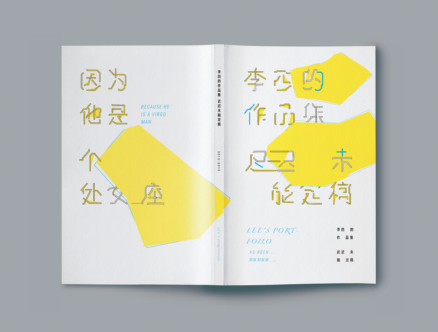
李四的作品集迟迟未能定稿 / Lee's Portfolio
Creative director/ Jia-ling Lee
Art director/ Jia-ling Lee
visual designer/ Jia-ling Lee
Photographer/Jia-ling Lee
作品集既对自己作品的整理,同时也是审视自身的过程。作品集反应了我的能力,同时也代表了我某些的特质。在这个过程中,我开始思考我自己与作品之间的联系。我立志于通过所学的设计让生活变得更美好。身上有着处女座的优良传统,对自己追求的东西有会变得非常偏执、好强。又有着轻微的社交恐惧,不太敢在人多的公众场合发表言论。但是碰到做设计牛逼的同龄人会开启话痨模式,变得异常 HIGH。有着喜静与好动的两面性。
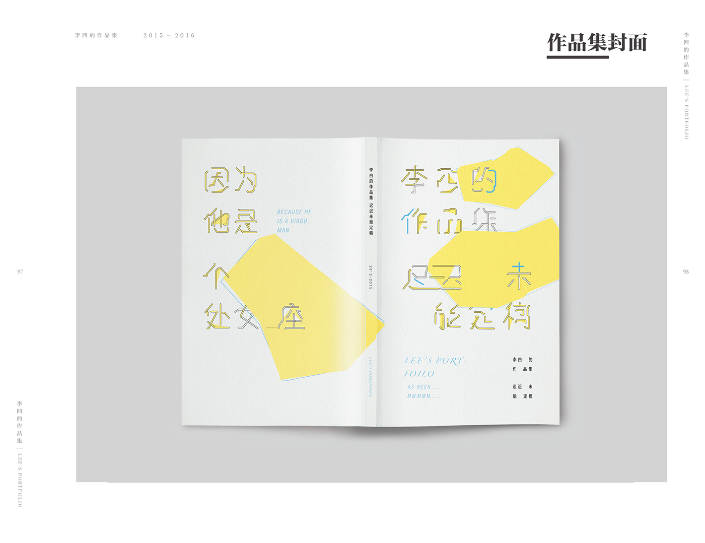
所以我选择了黄色作为作品集的主色调,这个看起来富有活力同时有很敏感的颜色,代表了我活泼却有安静的两面性。“李四的作品集迟迟未能定稿”,这本来是句玩笑话,说多了便足以说明我做作品集的状态了,于是乎这 很顺理成章地成为了我作品集的名字。那么为什么迟迟未能定稿呢? 最大因素在于我的偏执,每次再看 之前确定的方案,又会觉得不够完 善,于是就有了一次又一次修改。 这点也是一直拿来调侃的处女座梗, 大众的印象中处女座往往以追求完美著称,但是对于设计来说对完美的追求也是非常必须的。欣喜地看着自己的作品越来越完善,所有的付出都是值得的。
This collection is to sort out my works, but meanwhile to reflect on myself. The collection represents my capabilities as well as some of my characteristics. In retrospection, I begin to think about the connection between myself and my works. As a traditional Virgo man, I am sometimes very stubborn and assertive about what I am looking for. At the same time, I have mild social anxiety and am afraid to share opinions in front of the public. When I meet with excellent peer designer, however, I might switch to another model: being talkative and extremely high. Quietness and activeness, these are my two sides.
Therefore, I chose yellow as the dominant hue of this collection. This energetic and sensitive color represents the two sides of my character. “Lisi’s works are still on the way to be finalized”, which was joking at the start. But after being said time and time again, it literally represents how I did my collection and naturally becomes the name of the collection. So why it was always on the way instead of being finalized? The major reason is my stubbornness. Every time when I review the finished design, there was always something imperfect for me and I chose to modify it again and again. This is the aspect that a Virgoan often being mocked at, as a Virgoan is famous for being obsessed with perfection. However, it is necessary to be obsessed with perfection to accomplish a good design. When I am watching my works become more and more polished, everything was worth it.

作品集整体视觉


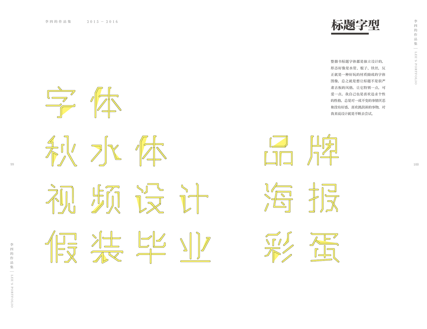
作品集订制字体
整册书标题字体都是独立设计的, 形态好像是水管、棍子、铁丝,反 正就是一种好玩的材质拗成的字体 图像,总之就是想让标题不是很严 肃古板的风格,让它特别一点,可 爱一点。我自己也是喜欢追求个性 的性格,总是对一成不变的事情厌恶 和没有好感,喜欢挑战新的事物,对 我来说设计就是不断去尝试。


作品集内页


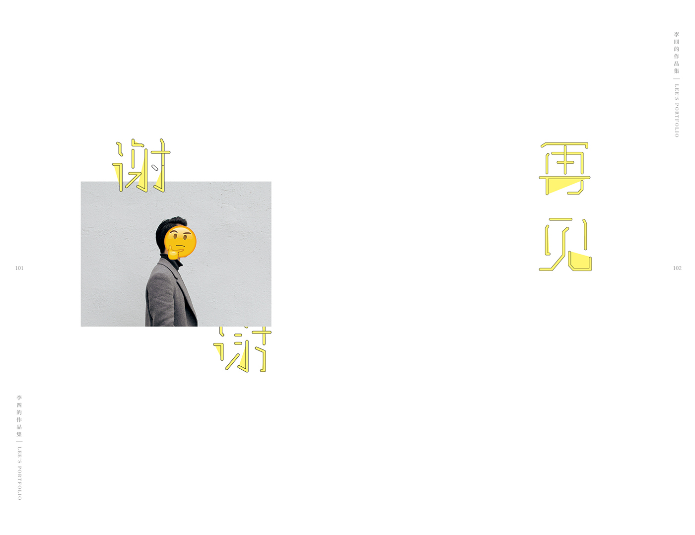
最后
。
。
。

为作品集特地去拍的的自拍照
thanks for watching :)


