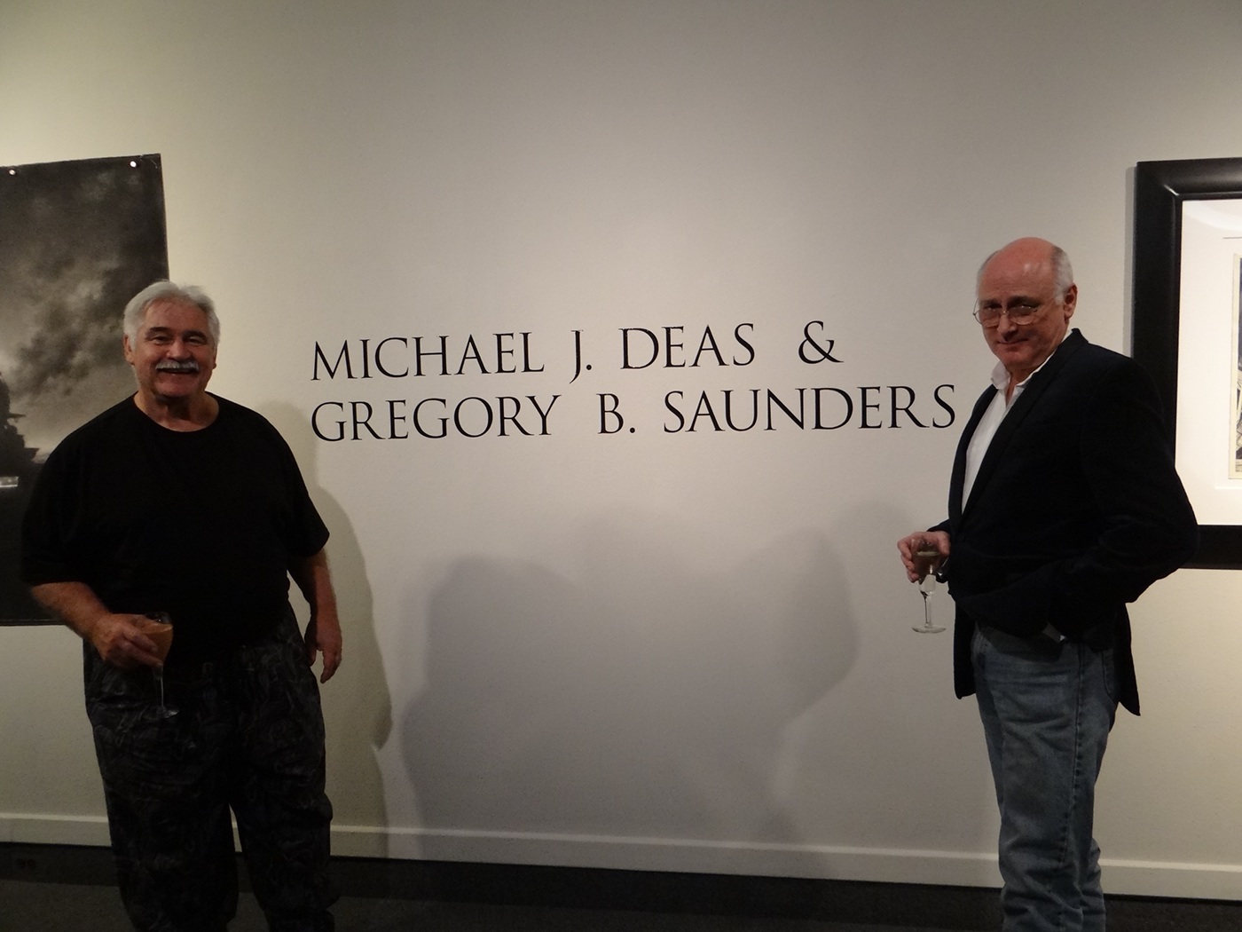
Title wall with works of Michael J. Deas (left) and Gregory B. Saunders (right)
For this project, I designed the title wall and promotional materials for The Art Gallery (TAG) at the University of West Florida. The exhibit showcased the works of Greg Saunders and Michael Deas.
Greg Saunders is an illustrator specializing in photo realistic graphite drawings and a UWF professor. Michael Deas is master realist painter and illustrator famous for his stamps, redesign of the Columbia Logo and other iconic designs.
Logo and Title Wall
With Micheal Deas having more pieces in the exhibit, he became the main focus of my exhibit identity. My first attempt at the logo was inspired by cover of Beeton's Christmas Annual 1887 which first published Sir Arthur Conan Doyle's A Study in Scarlet.
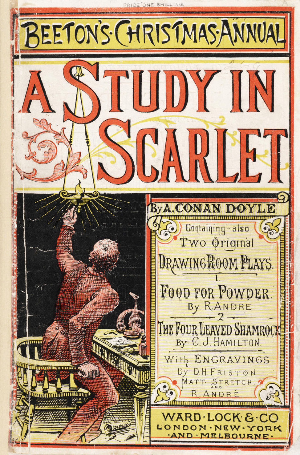
Beeton's Christmas Annual 1887 (first appearance of Sherlock Holmes in print)
When researching Michael Deas I discovered he was a specialist in Edgar Allen Poe and has even published a book on the subject. Through my weird thought process I thought: IF Doyle was inspired by Poe AND Michael Deas is an expert on Poe AND I have to be inspired by M.Deas THEN I would use Doyle as my inspiration (to be inspired by one also inspired to create). Perhaps that did not make sense, but that was my first thought.

The gallery director thought the idea was interesting but wanted something different. Going in a different direction, we decided to focus on the signature of Michael Deas. His signature is very unique since it is extremely clean, almost like it is stenciled or printed on rather than painted with a very thin brush.
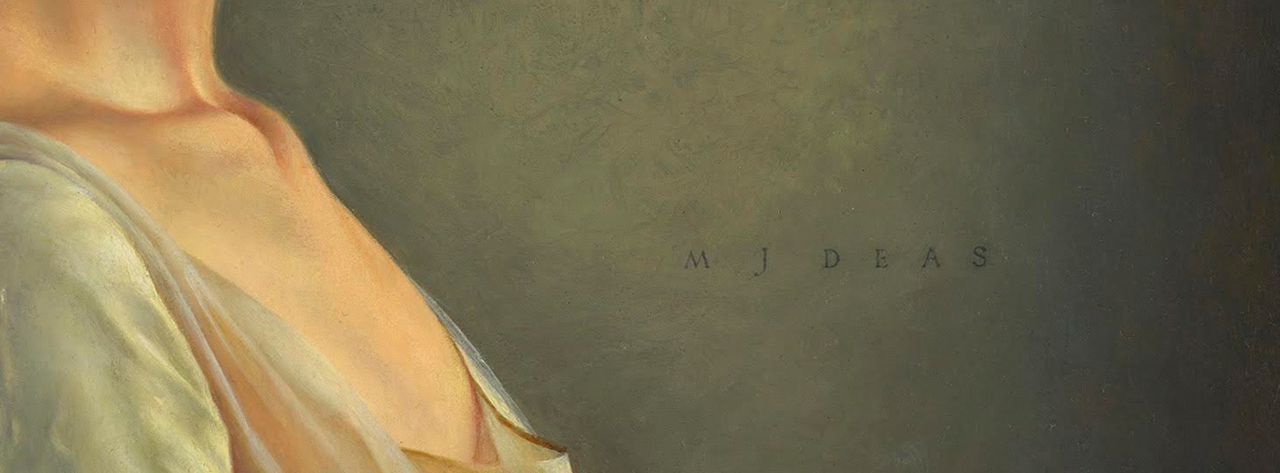
segment of Michael J. Deas painting The Neglected Keys
Ultimately, I latched onto the font "Trajan Pro 3 Regular" because of its similarity to the signature with sharp apex on the letters M and A. I played with the leading and kerning of the letters until I got the main logo.

Posters
When designing the posters, the main focus was handling the images and their respective credits. The odd size of the illustrated image for Greg Saunders made our standard 11x17'' printing impossible so I had to design using a 11x19'' size in mind. As print tech I printed all the necessary posters on a large scale roll printer and trimmed them myself. I placed the required artist credits under their respective piece.


Postcards
As with the posters, the main obstacle was the image size and the credits. Ultimately, we put the credits larger and ordered two different sized post cards to work with the image sizes. For Michael Deas post card we ordered a 5x7'' from an outside printing company.


For the Greg Saunders postcard we ordered 5x8''.


Thanks for visiting!
Gregory B. Saunders (left) and Michael J. Deas (right)