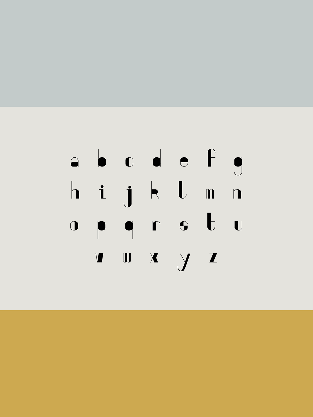
Twenty Eight is a typeface created for ‘Introduction to Typography’ at Queensland University of Technology. Inspired by the geometric shapes and bold forms of art deco and Bauhaus lettering, Twenty Eight is a san-serif, decorative typeface with a distinct personality – high-contrast and playful in its quirks.
Angular elements, such as pointed vertexes in many of the letters, are a reference to the 1920s cultural obsession with modernity – dynamic and rejecting natural forms. Though Twenty Eight is elegant in a way typical to the Twenties, it also features unusual elements inspired by Bauhaus graphic design. The capital ‘S’ lacks a traditional curved spine and instead features a crossbar that connects the two halves of the glyph, demonstrating the contrasts between curved and angular forms. The capital ‘L’ has a weighted horizontal stroke instead of vertical. All of the letters and numbers have a perfectly vertical axis, with many characters having filled (or ‘blocked-out’) bowls – another idiosyncrasy which keeps an otherwise historically-inspired typeface contemporary.