GLAS KASTAVSKI
CLIENT THE CITY OF KASTAV
YEAR 2012
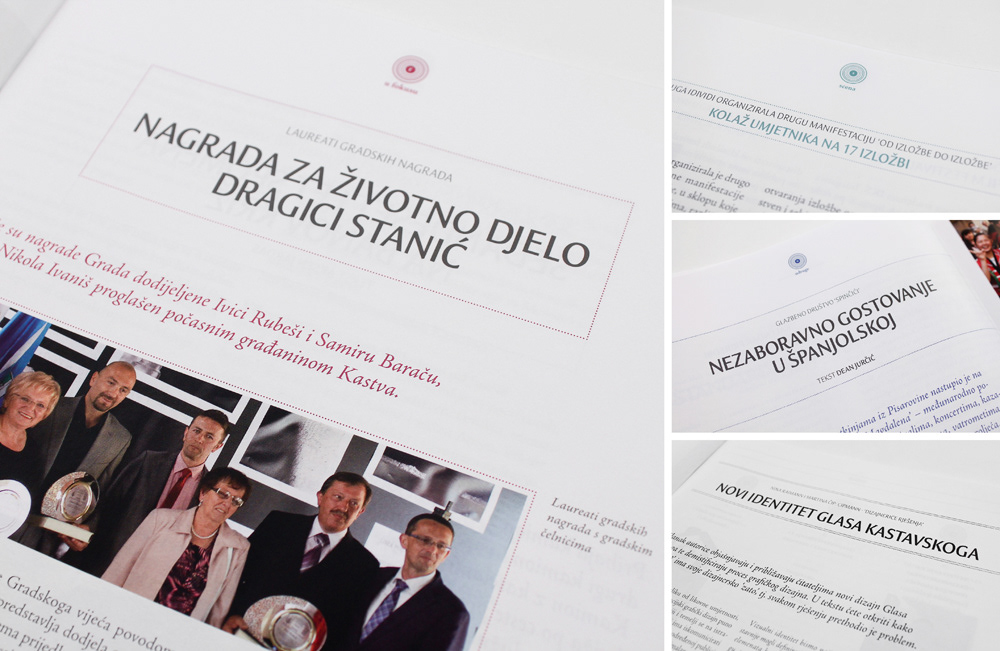
PROBLEM To redesign and organize the content of the local magazine in a way to attract younger audience but still retain the older readership. The magazine informs about the events and projects in the small city of Kastav and is distributed free of charge to its citizens.
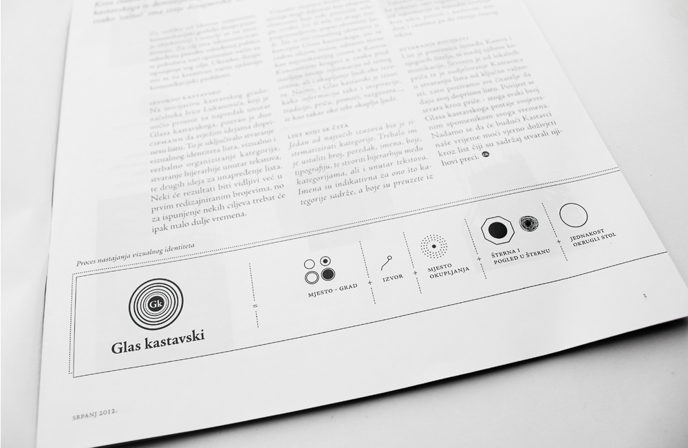
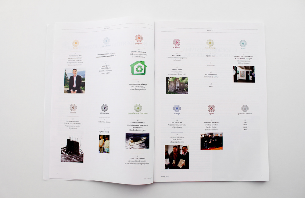
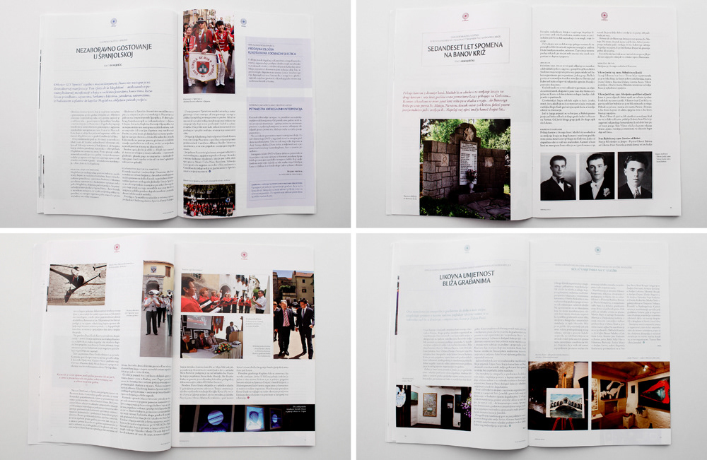
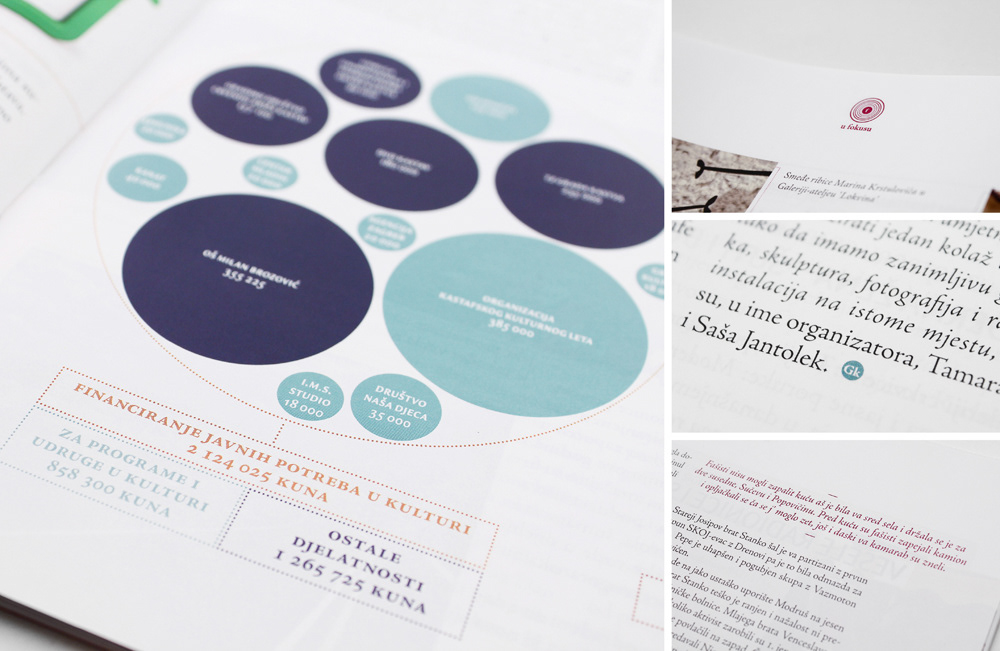
SOLUTION Enjoyable reading experience achieved through systematization of categories (each with its own color and symbol), introduction of white space (enabling the content to breathe), combination of different typographies, hierarchy within the texts...
CATEGORY Editorial design, visual identity
APPLICATIONS magazine, logotype


