
versão em português aqui
Tipocracia is an educational project that promotes typographic culture throughout Brazil. It started in 2003 when a friend and I developed a complementary course to graduate design programs. Over time, Tipocracia grew and expanded into other forms of promoting, managing and organizing typographic activities. In 15 years, over 2,000 people have attended the 150+ courses that took place in 17 Brazilian states and abroad.
To celebrate Tipocracia's 15th anniversary, I produced 50 posters at Hamilton Wood Type & Printing Museum up in Two Rivers, Wisconsin, with Assistant Director Stephanie Carpenter, as part of a one-week artist residency.


Being a lecturer at the University of Wisconsin, I scheduled my trip to Two Rivers in January, during school’s Winter Break. Four cold and intense days with the museum all to myself.

Day 1: Much like the first time I printed at Hamilton, I only had a vague idea of what the poster should look like before arriving at the museum. "One big fifteen" was the primary plan, which became my starting point: going over their archive of large wood type searching for ones and fives.


In between photos and sketches I came across Dan Elliott exhibition at Hamilton, where he explores even larger figures overlapped, including this awe-inspiring wide number 5.

Based on the dimensions of the 5, we set the poster size (26x40"). I wasn't sure about which number 1 to pair with the 5, so Stephanie suggested we use tracing paper to print samples and compare them. The five could barely fit the testing page.


With proofs photographed, I explored some layout variations on my laptop overnight.

Day 2: Alan Kitching's colorful and expressive style got me inspired to combine texture and gradient on this piece.
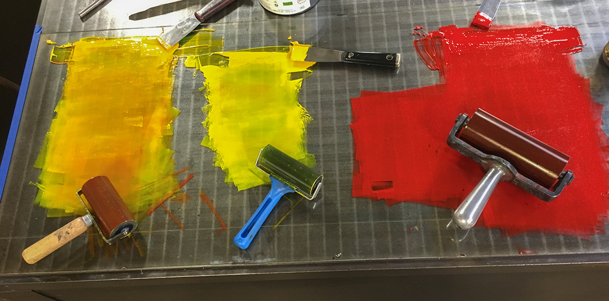
The use of a third brayer helped to maintain the yellow portion 'clean' throughout the print run while securing a smoother transition to the red bottom.


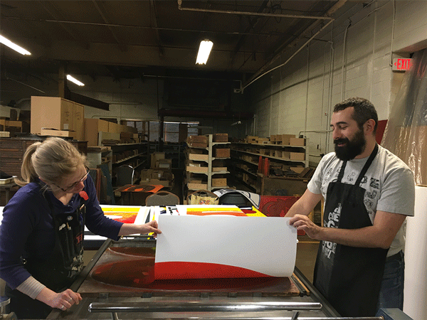
As Stephanie and I entered the quick pace of inking, rolling, and pulling impressions, we allowed ourselves to be more playful with the rollers, thus enjoying the uniqueness of each new print.

Day 3: Cool colors dosed with transparent ink to print the 1 overlapping the 5.


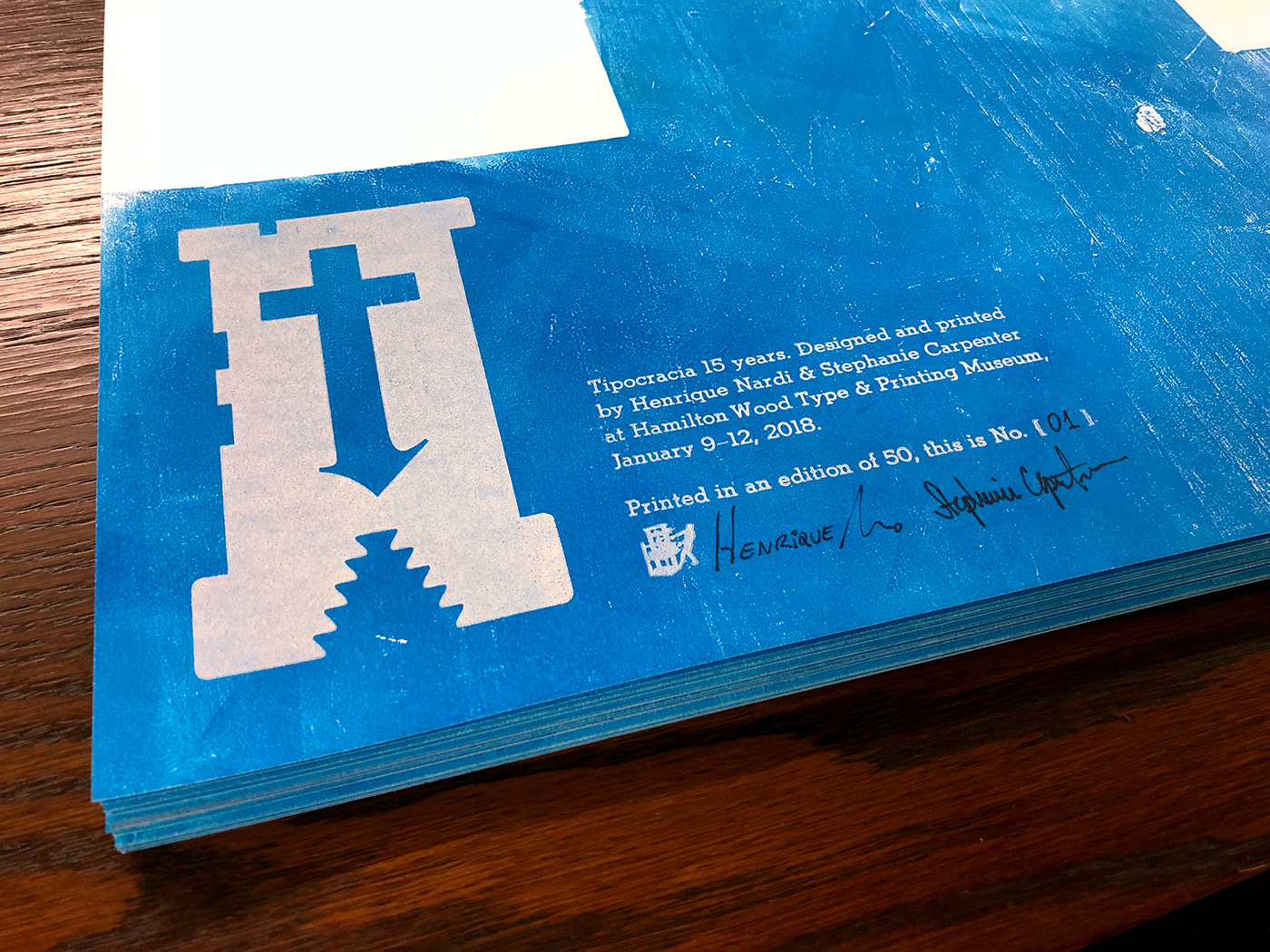
Day 4: setting metal type (with the enormous help of Hamilton's director Jim Moran) and printing the colophon + Tipocracia's logo in white. The printer's dingbat, found by accident, was too awesome to be left behind.


Speaking of which, I did leave the prints behind, as they needed drying time. I came back a few weeks later to the Hamilton to number the posters and sign them with Steph.


Tipocracia 15 Years – Printed on Neenah Classic Crest Solar White 176 gsm in five colors. Wood and metal type from the Hamilton Wood Type & Printing Museum collection, 66×102 cm (26×40"). 50 posters printed, numbered, and signed by Henrique Nardi & Stephanie Carpenter.
There are still some posters left for sale.
Ask me here: tipocracia@gmail.com
There are still some posters left for sale.
Ask me here: tipocracia@gmail.com


Mission accomplished with the best crew!

