

The Finial Interview is a Danger Noodles based production at CART. The Final Interview is a short film about a man named Mr. Harrison that invented a TV show using a time machine to pull historical figures out of their time period to interview them before they died. This doesn't have an effect on the space-time continuum, since these historical figures get sent back to the moment of their death after their interview. Having the power to pull people out of time, Mr. Harrison and the people around him must continue to decide on whether or not they should stretch out the moments before someone's death just for the entertainment of the public.
Our trailer and special effects were created by Andrew Agustin. Throughout the movie, we have decided to stick to a black and yellow theme. Our posters, banners, and other promotional elements utilized these two colors to match the pattern of the warning stickers that were used on the time machine. As for special effects, we have chosen to outline the time machine with a rather bright glow when it is running. When the time machine is idle, the machine glows blue and when activated, it glows red.
Noah Martin was the director and producer for this movie. He knew he wanted to challenge himself to turn Andrew’s concept of a story, using a time machine to interview famous historical figures, into the genre of a drama. So Noah helped Andrew write an adaptation of the story into a script, and added the character arc of Mr. Allen realizing the cruelty of stretching out the final moments before someone’s death. Noah’s involvement in the script writing is also why the Blackbeard scene of the film is very comedic, since Noah decided to add something funny into that part of the movie to lighten the movie up from its darker tone. This story has three parts to it, featuring a present time when Mr. Allen is being interviewed, a flashback to how Mr. Allen got started in his job, and a moment where his flashbacks start to lead up to the present. So Noah color-corrected the movie so that it had 3 different colors to it, a yellow color to represent the living present, a blue color for Mr. Allen looking back at his sad actions in the past, and a green color for when Mr. Allen is in between the two by still having the flashback that is slowly leading up to the present. Noah casted the actors in his film and found all of the shooting locations and times to film as well. When it came to film days, he filmed the same shots over and over again until he got a good take and then he would film one more time just in case he wanted use another take later on. He would try to film an entire scene of the movie from just one camera angle at a time, that way he could use the extra footage from that point of view if he wanted to. Noah did have a storyboard for this film, but he still added edits for when he wanted to see a certain character speaking or a character’s reaction to something in the film. Noah also made the choice to include the fade out, time machine sound effect, and the empty chair at the start of the credits of the film. This way it was shown that Mr. Allen did get sent back to the moment of his death after his interview, and not even he could escape the fate that he has forced so many others to go through.
The documentary was created by Jack Brownell. I chose the more up lifting, faster pace for the documentary. I had the members of the team talk about filming and creation process during our time together. I had interwoven the videos and the photos to go along with the audio. I had also created the custom lower thirds for identify the people and to add a bit more color to the more grayer backgrounds of the interview. I had the music be subtle yet also having the audience feel uplifted and happy. I did this to help show the emotions of a team who had put their time and effort into and what they take pride in.

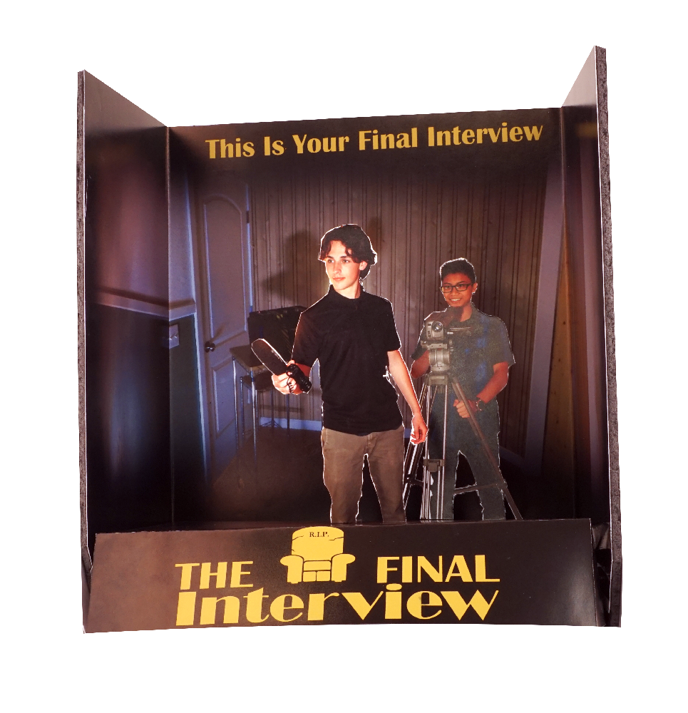
Jeremy Jimenez is our print designer 2 who made our banner and our standee. For the banner and the standee, I made them similar to the other forms of media. I did this so that the forms of media are linked together to have a nice connection to the other for such as posters and the black and yellow scheme.

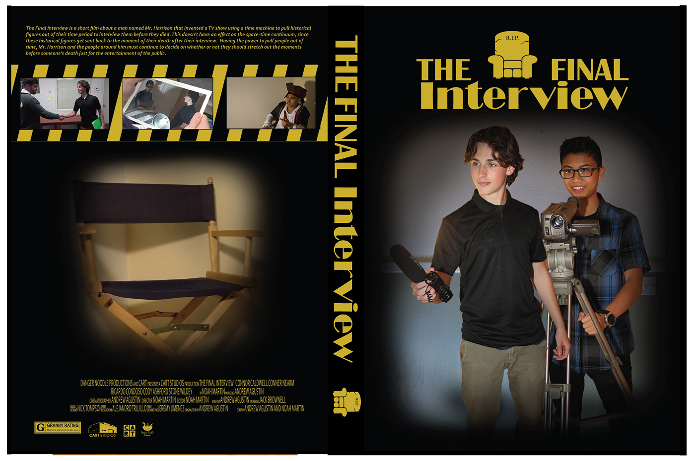
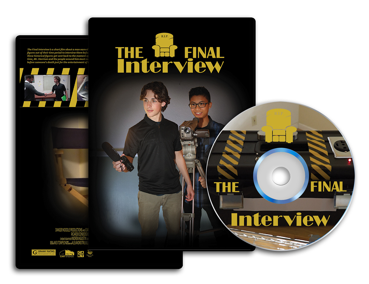
Alejandro is our print designer 1 who made our poster and our CD case.
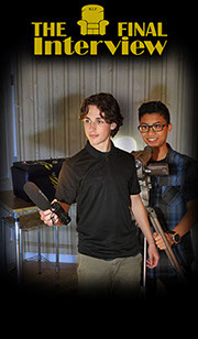
The design was based on the standee created by Jeremy with the main characters in the front of the interview room surrounded by a black with the logo and the credits in a bright yellow. I wanted the poster to match the standee to be slimier, the reason that the logo and the credits are yellow is because it's suppose to resemble the time machine used in the film that was black with a yellow yellow and black stripe markings on two of its sides on the top of it.
The front of the DVD package was made to look similar the poster with the back cover being more different. While still in them and appearance like the movie poster their were still some differences, for example while this a image surrounded by black outline instead of a image of the main characters it a picture of the chair that was used in the film when the historical figures are brought into the future and interviewed. There's also a difference in the top; on the very top is a description of the story and below it between it and the picture of the interviewee seat is a now crossing police tape in a black and yellow stripe design that has three pictures of some scenes in the movie.

file:///S:/ClassShare/_Final_Movie_Website/AM/AM-Thompson_N_P3_Site/index.html
Nicholas Thompson created our website (link above) and our two wallpapers for our movie. I designed the website to be dark and use a black and yellow theme to parallel the rest of our ad campaign, however after my initial design it was too empty so i added very faded images to the background to liven it up, and i think it worked out well, for the wallpapers i followed most of the same design patterns as the rest of the campaign.


