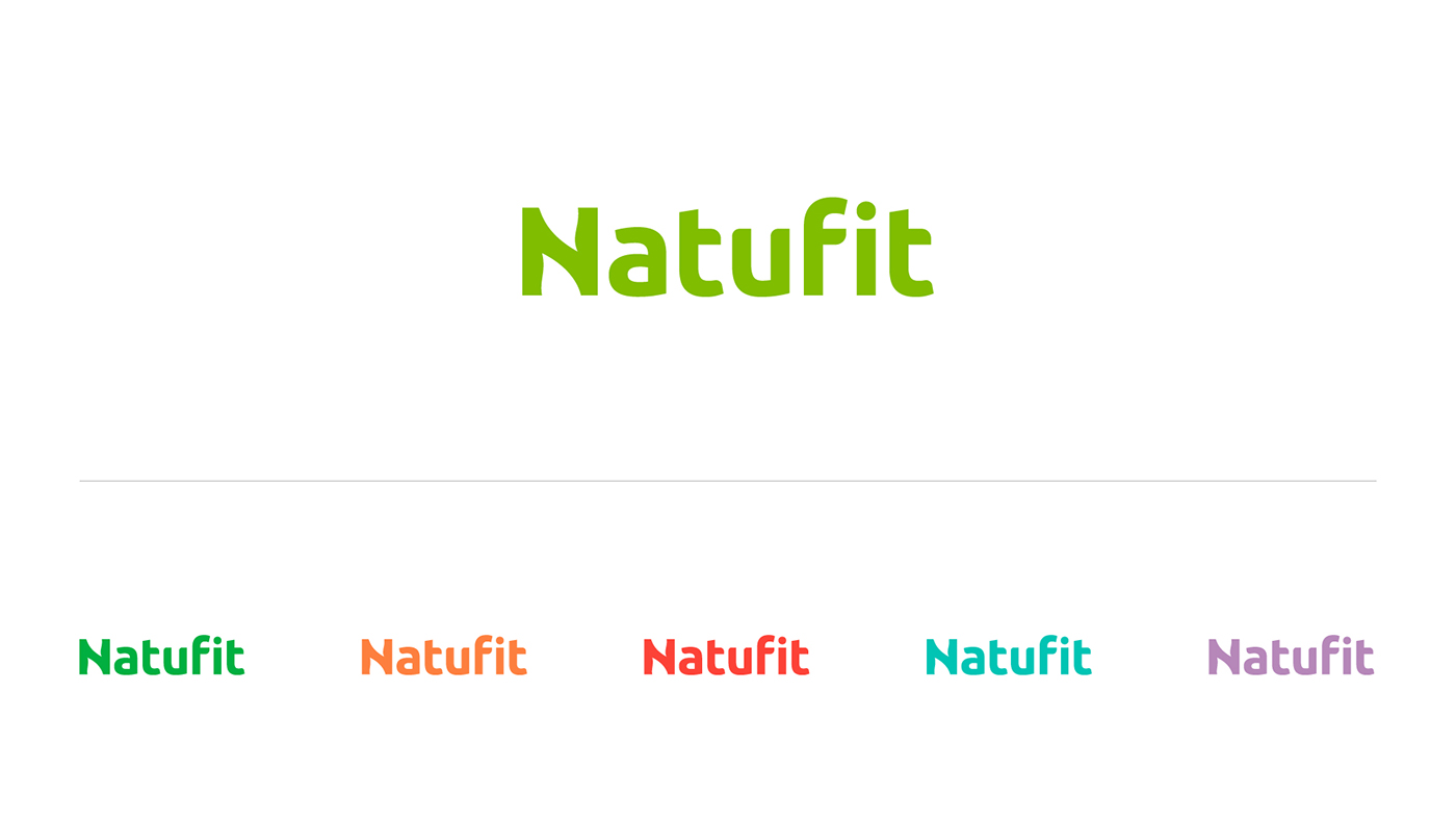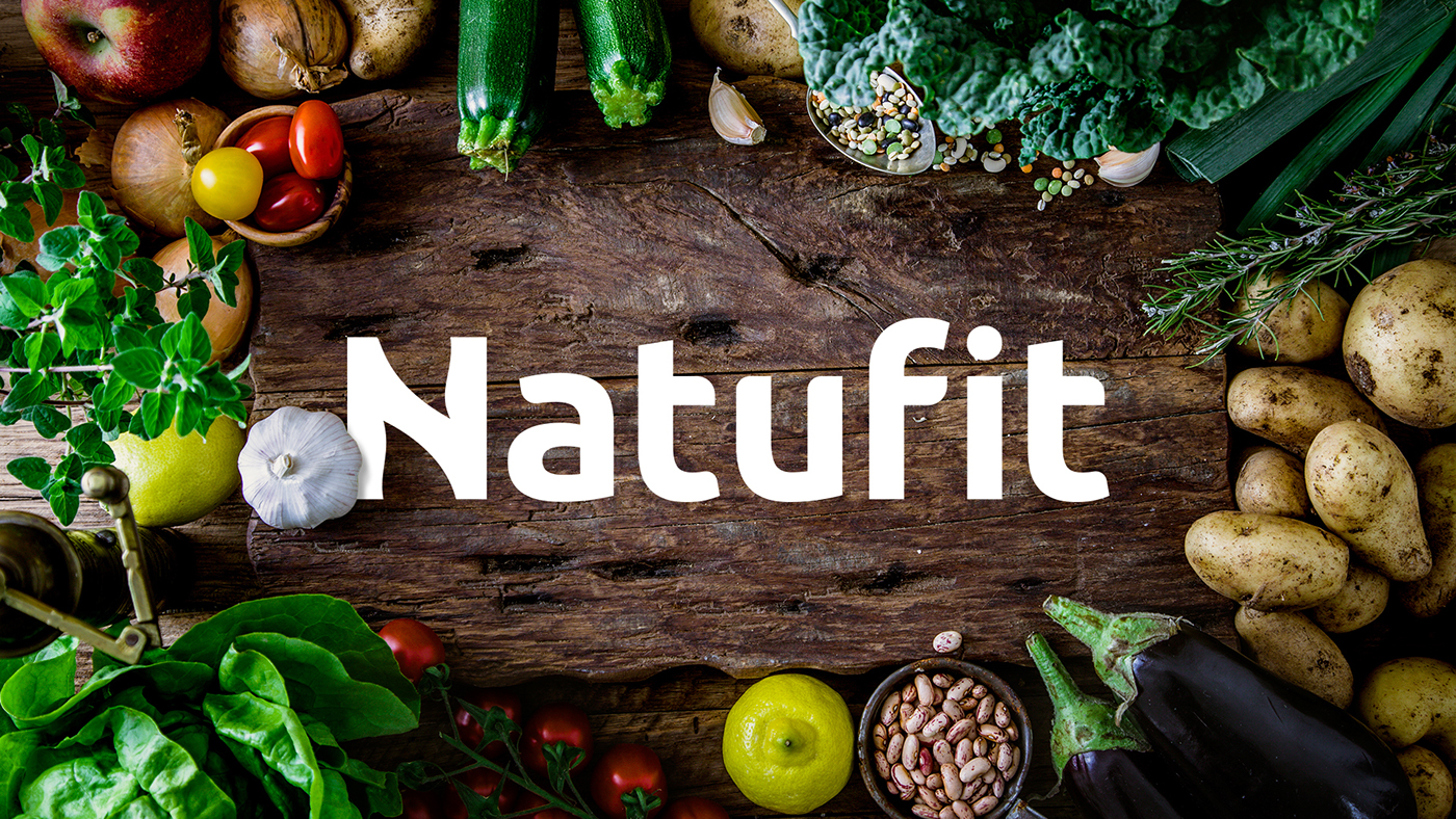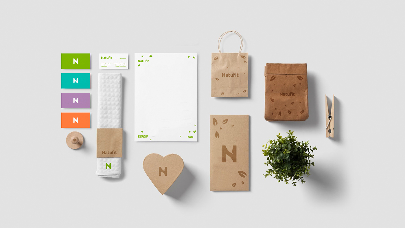
Natufit - Healthy Food
Visual Identity developed for a new healthy food company based in Sorocaba - Brazil.
The company is specialized in healthy frozen food and wanted a fresh and clean identity,
so it could represent its ideology.


__________________________________
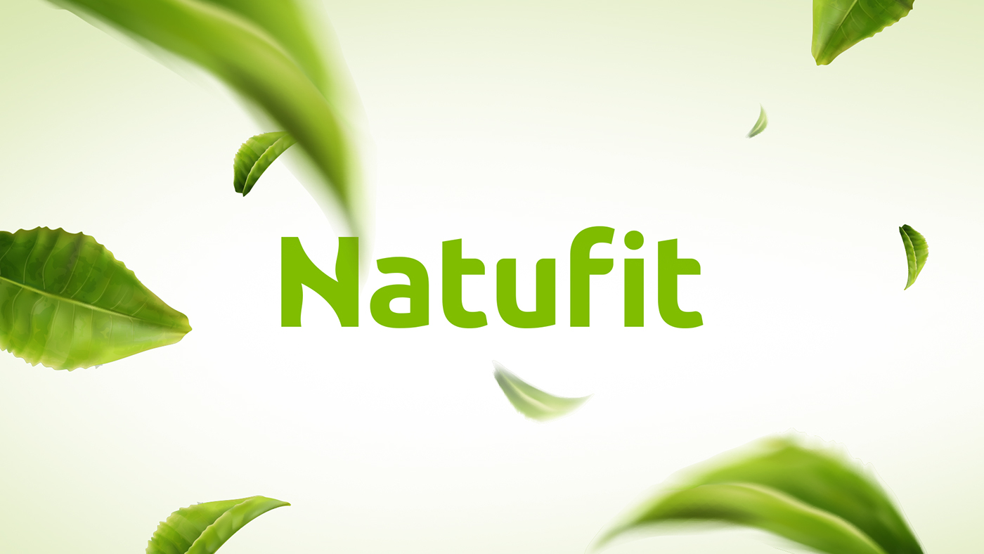
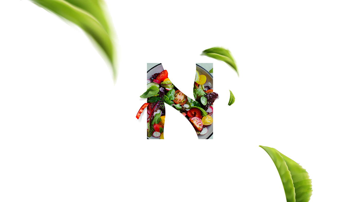
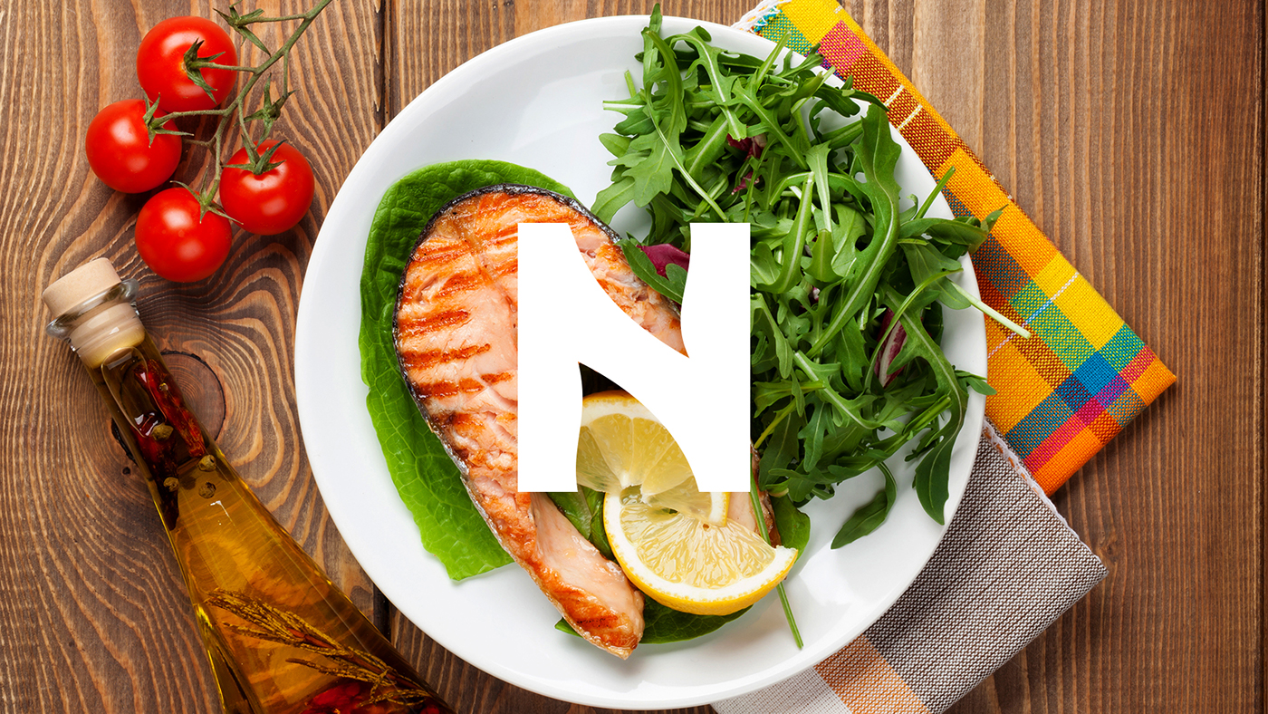
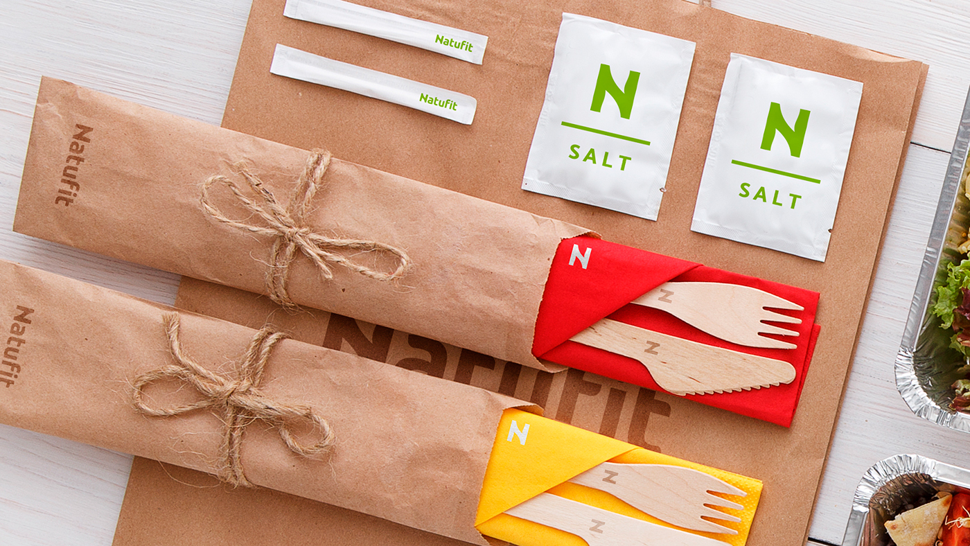
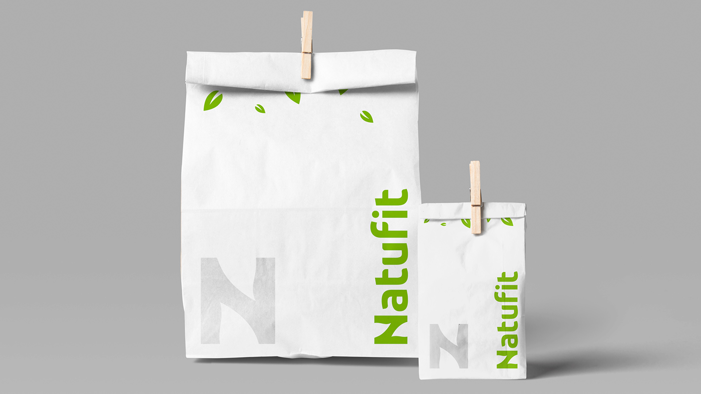
The logo was inspired by the leafs, an universal symbol for healthy and natural.
The letter N was developed based on 2 leafs and a square, to represent simplicity and natural.
The identity had the be clean and fresh, to represent the brand essence,
working bright happy colors and with the green as the main color.
__________________________________