

TÊTE-À-TATE
The brief asked me to combine the name of my given company (TATE) with one of the selections of businesses provided to act as a starting point for developing a distinctive, memorable identity for a
new company. TÊTE-À-TATE plays on the French phrase tête-à-tête that I interpreted as 'a conversation involving or happening between two people'. Thus, my identity design intends to help facilitate active, vibrant conversations exchanged in a fictional organic Greek eatery. I intended to base the eatery in Cardiff because its name is also shared with the Narcissus flower (formally known as the daffodil), one of Wales' national symbols. Therefore, the opportunity to introduce a thriving busy city to organic Greek food accessible for a range of audiences is realised with an exciting identity design focusing on the diverse range of meals it serves.
new company. TÊTE-À-TATE plays on the French phrase tête-à-tête that I interpreted as 'a conversation involving or happening between two people'. Thus, my identity design intends to help facilitate active, vibrant conversations exchanged in a fictional organic Greek eatery. I intended to base the eatery in Cardiff because its name is also shared with the Narcissus flower (formally known as the daffodil), one of Wales' national symbols. Therefore, the opportunity to introduce a thriving busy city to organic Greek food accessible for a range of audiences is realised with an exciting identity design focusing on the diverse range of meals it serves.

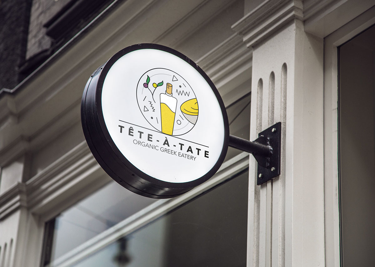
The wordmark's alignment is justified that increases the negative space between the letters. This strengthens the communication of the eatery's openness both to people and to the dishes that it serves. I believe the circular nature of the logo and its interchangeable qualities has the potential to be successfully animated in situe, i.e. on a table hosting two or more people next to each other. Animation is a process I am extremely keen on and I intend to explore this in the context of my brand and its collateral in the future.
The logo is accessible for static and digital signage. It could display the wordmark and custom logotype on opposite sides to further communicate the conversational aspects of the brand, or display the complete logo encompassing both to promote the name, the type of company and the food it serves from both directions.


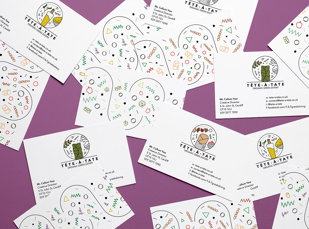

It seemed fitting to apply a layout design to an apron for the kitchen staff to wear whilst cooking in the restaurant. The nature of the icons and lines in the pattern encourages curiosity from the staff and customers because their direction guides the eye towards the pouch, making you consider what may be inside! Creating designs for the handles of cutlery in the future could be a potential avenue to explore to extend the scope of the identity within the restaurant as much as I have tried to outside of it within the business cards and letterheads.
As the identity is adaptable to the dishes TÊTE-À-TATE offers, the aprons could also be personalised to each member of staff through several options, with one being the names of each employee being (screen?)printed above or below the logo and/or the employees having the choice of what pattern design they wanted on their apron. This would help generate a friendly atmosphere in the workplace whilst remaining accessible to others' dietary requirements, i.e. there being food and designs options suitable for non-meat eaters.

The identity is equipped for adaption to social media platforms such as Facebook and Instagram with the lively patterns and custom illustrations placed in an easily understandable context. For the module submission I designed the logo around the starters the restaurant offers, however the accessibility of the pattern could incorporate main, dessert and more starter dishes.


