Simplifying a Mobile App Design
toronto star
SOME BACKGROUND
The Toronto Star is Canada's largest daily newspaper, with the largest readership in the country. While news is a vital means of understanding the world, it is evident that we live in a highly visual culture where people's attention spans are lessening. Therefore, messages are to be read and understood quickly on mobile phones. People don’t have time to figure out their way around.
THE PROBLEM
Considering this is the most popular means Torontonians receive their news, it’s typographically messy with questioning hierarchy that doesn’t help guide the eye quickly and efficiently.
MY STRATEGY
My aim for this project was to explore type as an information delivery system on a small screen. do not handle type efficiently. I redesigned the splash, news landing, navigation, and news article screens while paying attention to the needs of busy people and the limitations of short and long form information on a mobile phone.
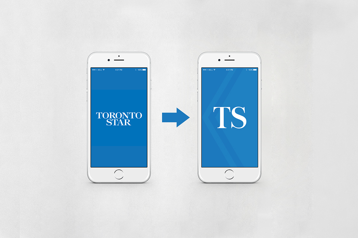
Splash Screen

News Landing Screen

Navigation Screen

News Article Screen