


Concept New Hampshire Fisher Cats 15th Anniversary Logo


These were the original concepts I came up with. I knew I wanted to include the Woodchuck font as it is extremely similar font to the one used in the interlocking NH logo. I also wanted to include the mountains as it's one of the most distinctive parts of the state. I also liked the visual of the banner crossing the bottom of the logo with the team slogan.
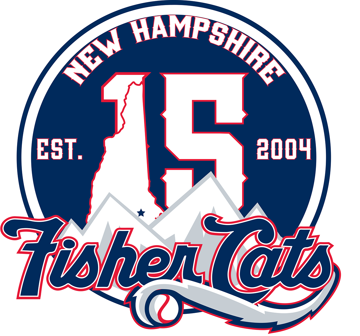
This was the final result I came up with. I stuck with the roundel look since it transfers well to print and digital applications well also having the double stroke allows it to work on both dark and light backgrounds. The 15 now includes the state outline as a part of the 1 with a star over top of Manchester. The mountains are still present and are the background to the team wordmark with the tail from the primary logo. I at one point tried to keep the banner in this version but it just cluttered the look and also wouldn't work well in smaller applications. I think the final concept takes the 3 elements that make up a sports anniversary logo (City/State, Team Name, Anniversary) and combines them in a unique and meaningful way.


