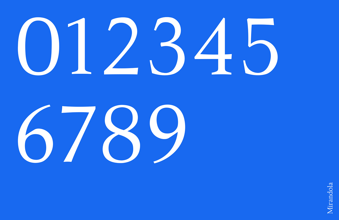
Over the course of 3 years, Mirandola grew from an idea, to a 26 letter alphabet with punctuation, to an alphabet with punctuation and numbers, to an alphabet with punctuation, numbers and diacritics!
Mirandola is based off the old style characters of the 16th century. It has an upright personality owed to its minimal amount of stress and contrast. It's high x-height promotes better readibility.