


Romet bikes
logo collection
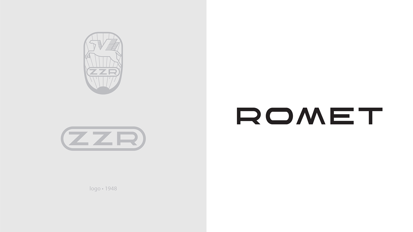
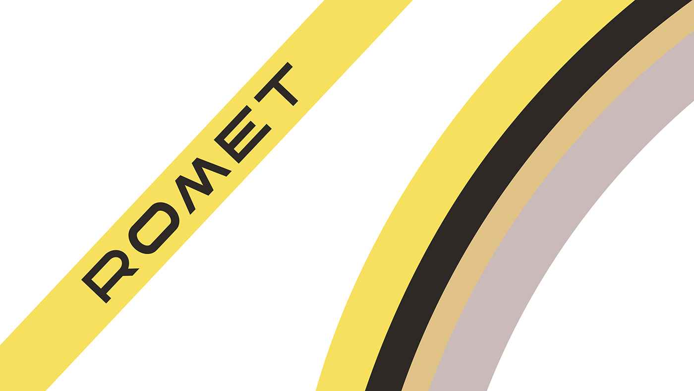
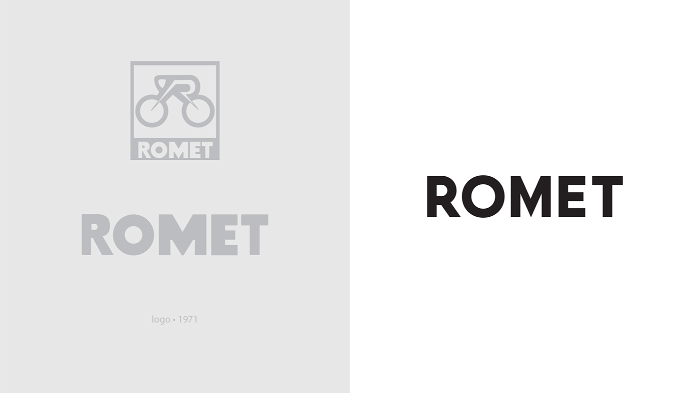
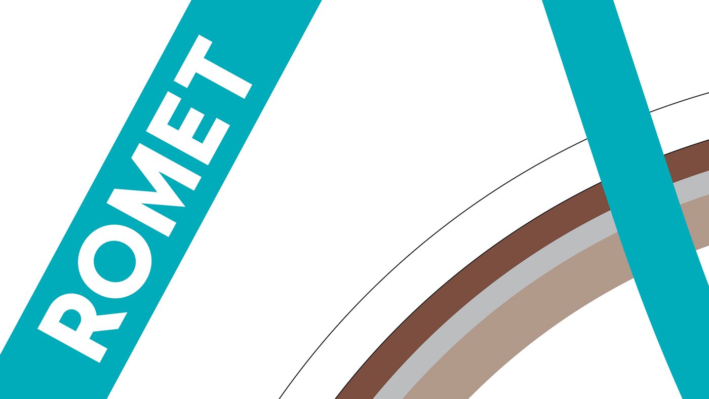
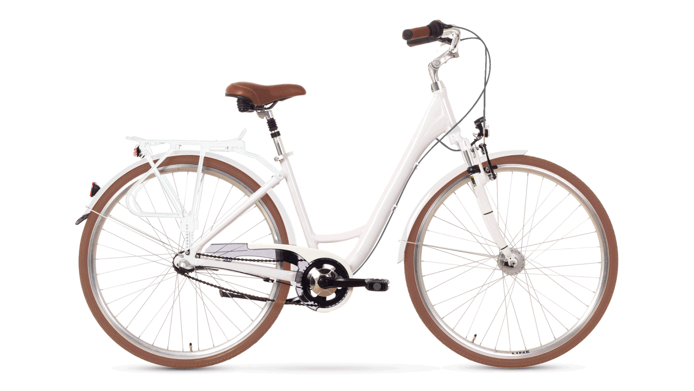
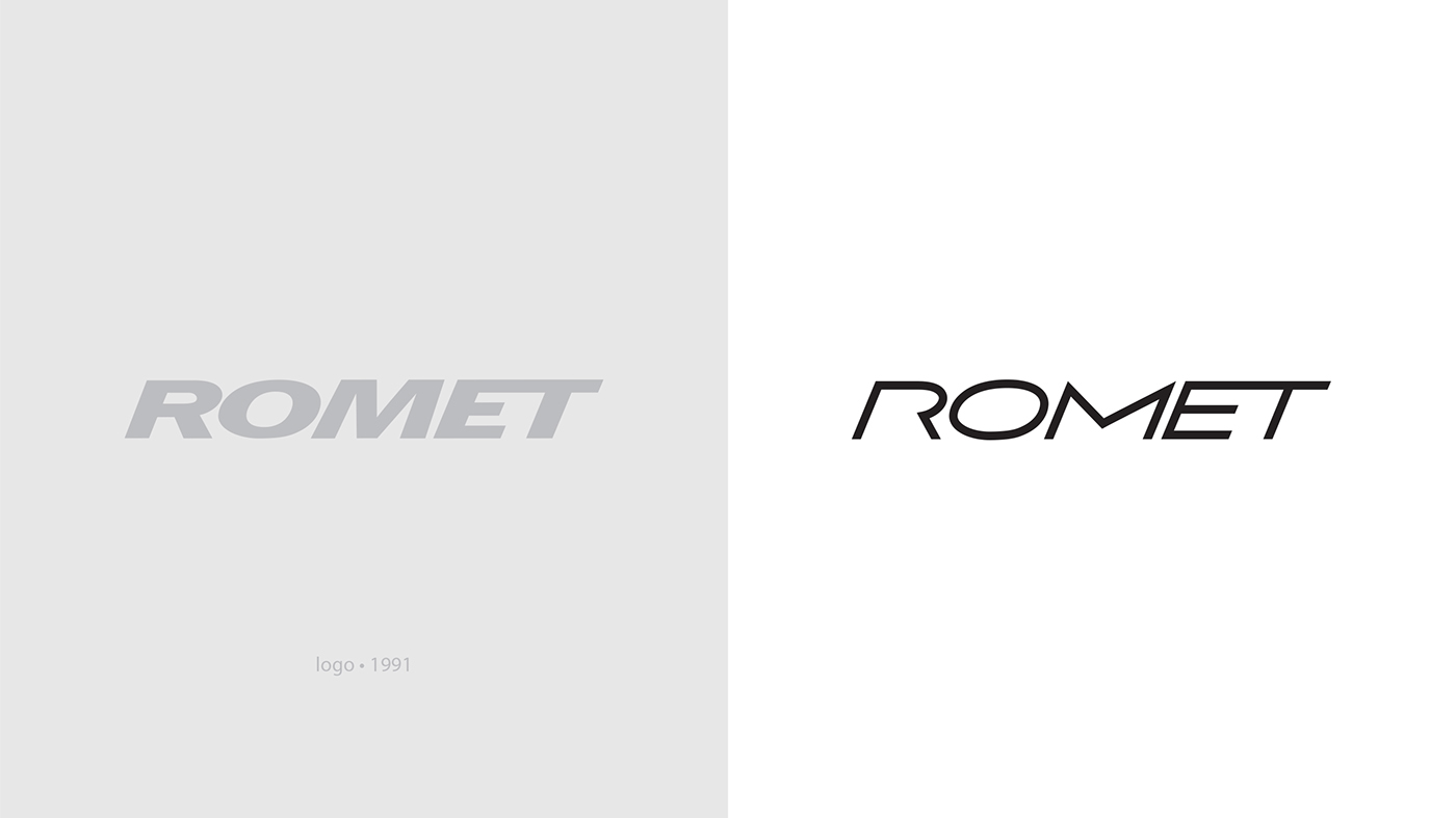
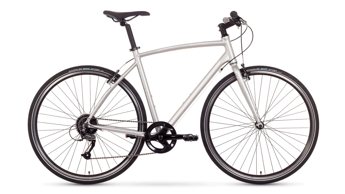
I created bicycle frame logotypes for twelve city bikes from Romet collection. Due to significant differences between their form and riding style I proposed a division into three categories. Retro are classic, vintage style bikes. City are modern style bikes. Fit are fast and dynamic bikes. Previously all city bikes belonged to one group named City. They all had the same looking Romet labelling, regardless the style. Different were only names, frame colors and graphics. This year I designed a new Romet labelling, unique to each collection. The typography refers to historical emblems, used by the company in its crucial moments:
Retro - 40s mark the birth of Zjednoczone Zakłady Rowerowe works (1948)
City - in the 70s works are transformed into a national enterprise named Romet (1971)
Fit - in the 90s Romet becomes a privately owned company (1991)
Retro - 40s mark the birth of Zjednoczone Zakłady Rowerowe works (1948)
City - in the 70s works are transformed into a national enterprise named Romet (1971)
Fit - in the 90s Romet becomes a privately owned company (1991)
Furthermore, I developed typographically twelve names and stylish artwork, as well as new color schemes for bikes comprising the city collection.


2016
Design: Kinga Dybek
Instagram: https://www.instagram.com/galloop_kingadybek/
Design: Kinga Dybek
Instagram: https://www.instagram.com/galloop_kingadybek/


