AGENT 80
Visual identity + packaging
A typical small business that wanted a brand on a limited budget with big impact.
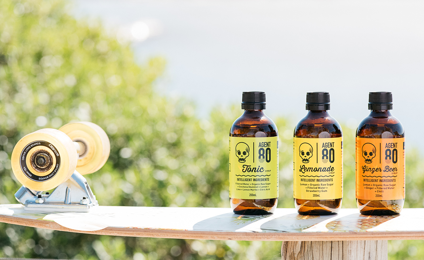
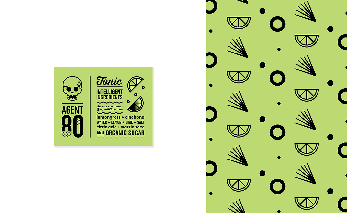
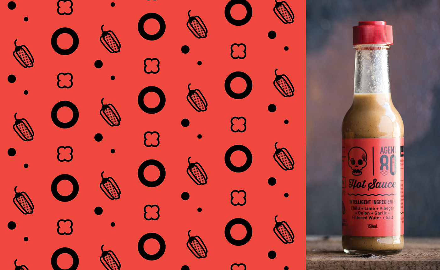
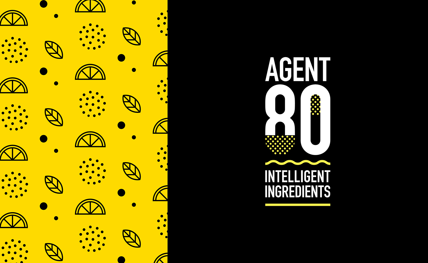
With a minimalist approach to the design, Agent 80 is as clean and simple as the product itself. Simple icons and patterns are used in conjunction with bright, popping colours to create a fun identity based mostly on typography.
AGENT 80 sell real products with real ingredients.
A company that don’t rely on fake additives and artificial flavours. Ethically and environmentally conscious, they strive to give the customer a healthy product, whilst being transparent and chucking in some education to boot.
© Photography AGENT80