
The shape of wine.

This is the story of a brand in search of a new look, a brand that loves wine and selects it.
Wineowine is a company that chooses the best wines from small Italian wineries and offers them to their customers.
Wineowine is a company that chooses the best wines from small Italian wineries and offers them to their customers.
Their need was to make the existing brand more passionate, humane and close to their target, increasing the customer's perception of quality and refinement of the selected wineries.
In the first stages we sought the solution in a soft stretch, which represented the passion that drives the selection of wines. During this study we noticed a particular gesture that distinguishes wine tasting, and in this we found the shape of the wine.
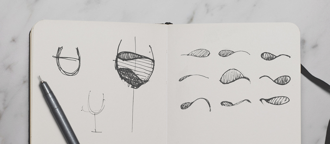
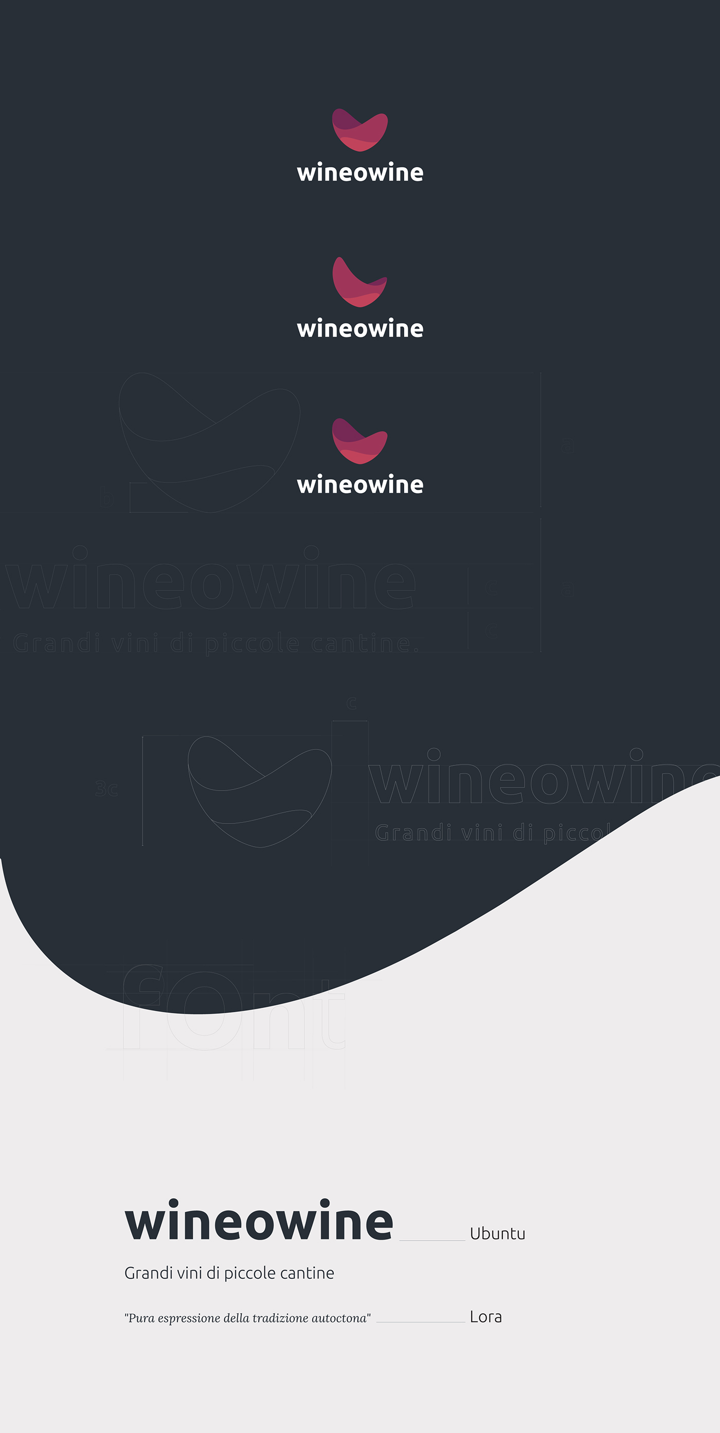
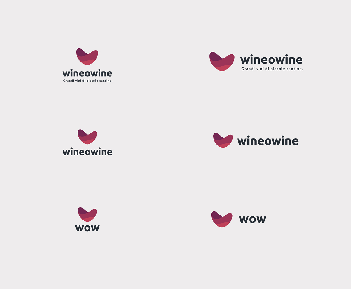
At this point the challenge was to create a clear, liquid, but also simple brand. After the first sketches we opted for a revolutionary approach, drawing the wine movement in 3D first and when we found the right shape, we vectorized it to make it simple and linear.
The result we called Lowe


The resulting dynamic shape is a fantastic expression of the love for wine.

Thanks for watching!