


For my digital essentials class, we were required to create a logo to represent ourselves and our services. I chose this opportunity to develop my own personal brand - including a logo, business cards, and a website among other materials.
My concept was to marry the concept of an illustrator and graphic designer in a fun way.
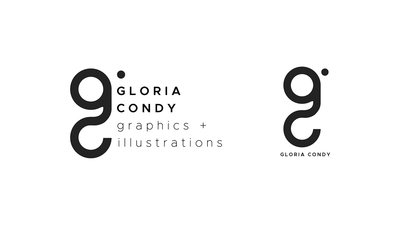
Old Logo

This was the first logo I made for myself - from around 3 years ago, when I first started learning about graphic design.
As for the name - I had a hard time figuring out whether to create an entirely new name to brand myself, or to use my own. So I started playing around with different combinations of my name - and tadah! Low and behold I found by combining the first two letters my first, middle, and last name, I'd created something fun and somewhat euphonious. It was the lightbulb that went off in my head... which basically explains the lightbulb icon in the last 'O'.
Redesign Concept
This time around, I wanted to keep it simple. Although I like my logo from before, just as in writing - sometimes you have to kill your darlings... that and it didn't exactly scream "graphic designer".
I had several things in mind that I wanted in my logo for sure:
1 - For it to have only the initials of my first and last name.
2 - For it to visually communicate professionalism.
3 - For anyone of any field to be able to look at it and know instantly that I'm a graphic designer.
4 - For it to be fun.
Inspiration
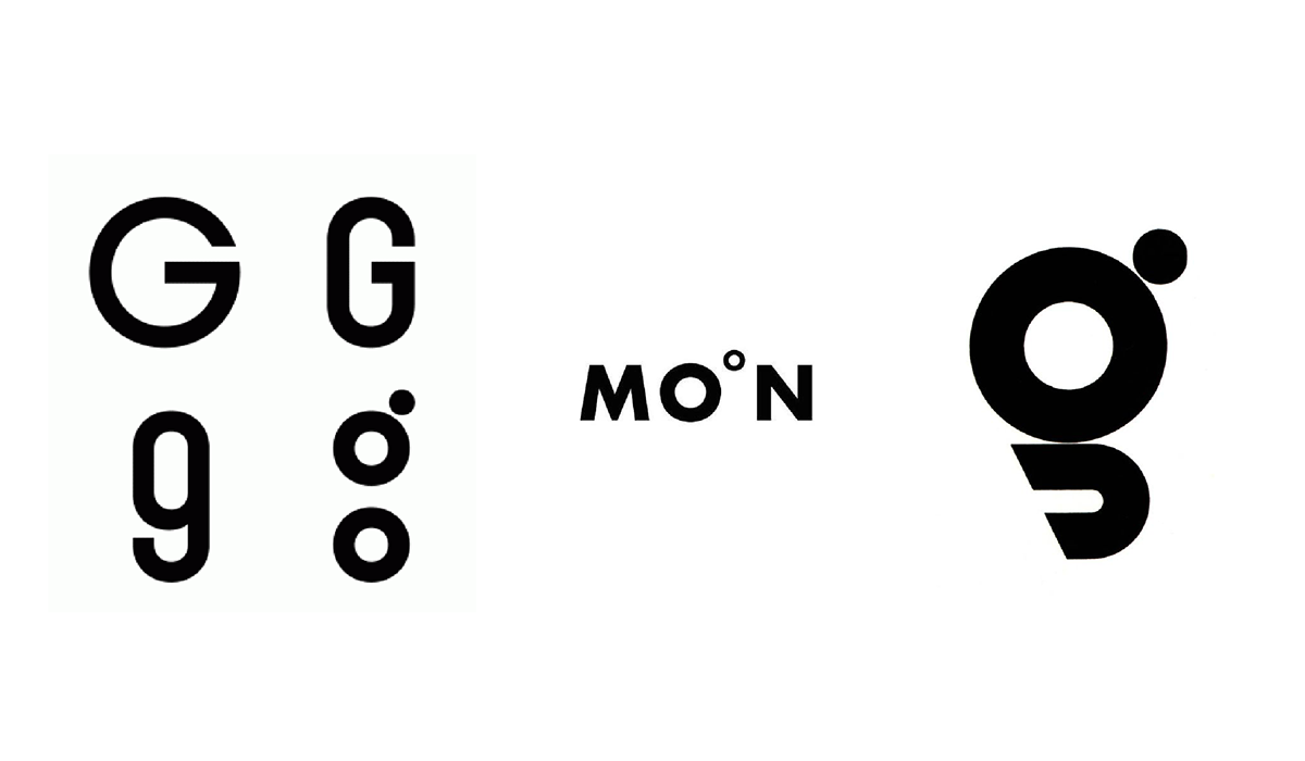
I looked into other examples of successful type treatment of the letter "G". Kept in mind the three points I needed to portray
GC. Professional. Designer. Fun. The images above were things I thought were succinct & inspiring to the development of my logo.
Ideation
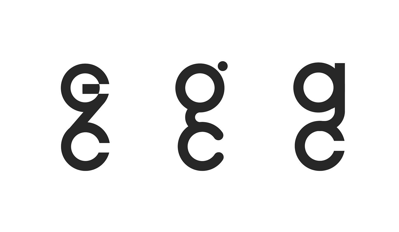

Some of the unused logos I developed.
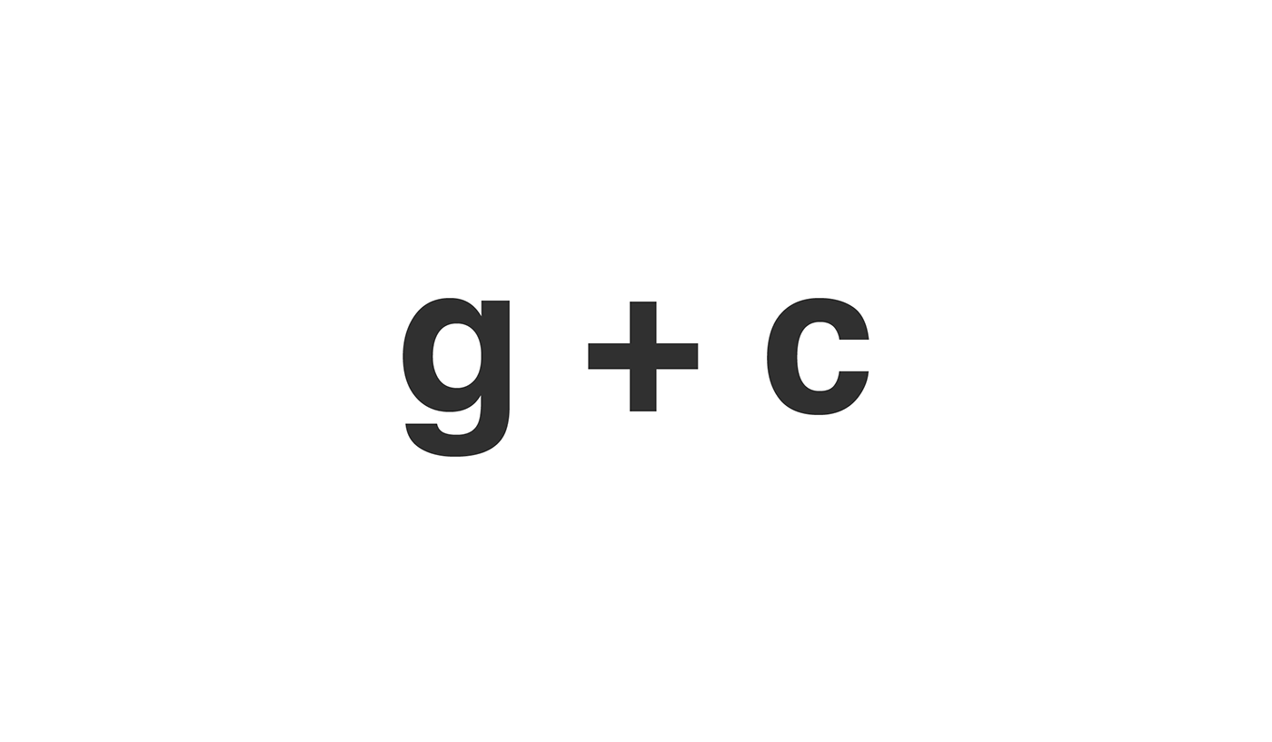
Final Logo
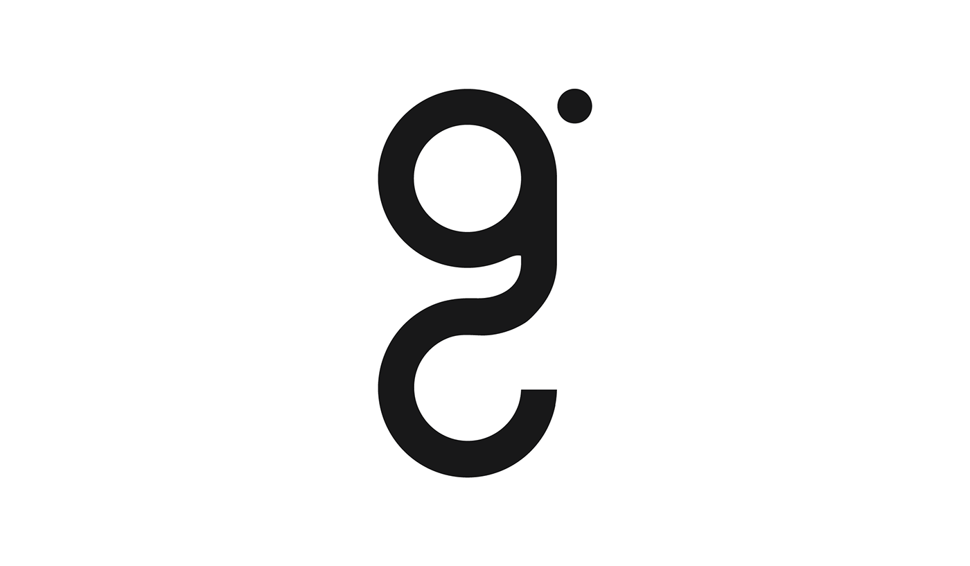
The logo I decided on developing. It combines the initials of my first and last name - g & c, and includes the ear of the letter g. I liked this one because of its simplicity and movement.
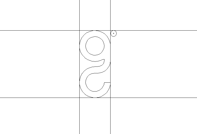
Typography
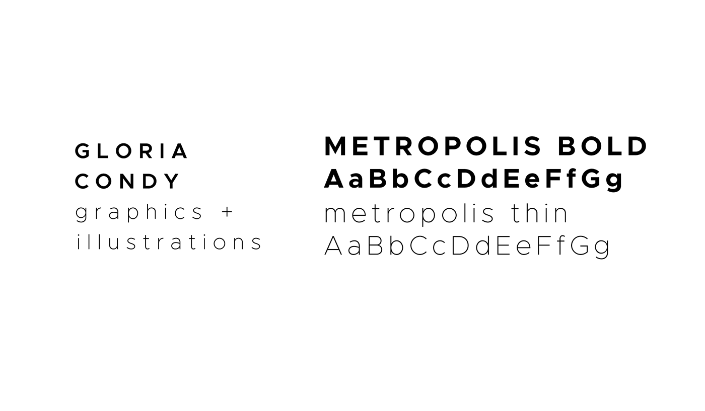
I really like the look of rounded typography, and because my logo is quite symmetrical and round, I wanted to mimic those geometric components within my type. I chose the font Metropolis - an open source sans serif - as it also quite versatile as it comes in 18 different styles. I wanted it to be friendly, and easily readable.
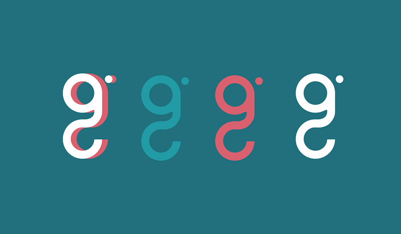
Colour Palette

As for the colour, this colour combination happens to be my favourite - it's just another way to incorporate a little bit of 'me' within my logo.
Logo Variations

Business Card Mockup

Letterpress mockup visualization of logo.
Branding Stationary Mockup
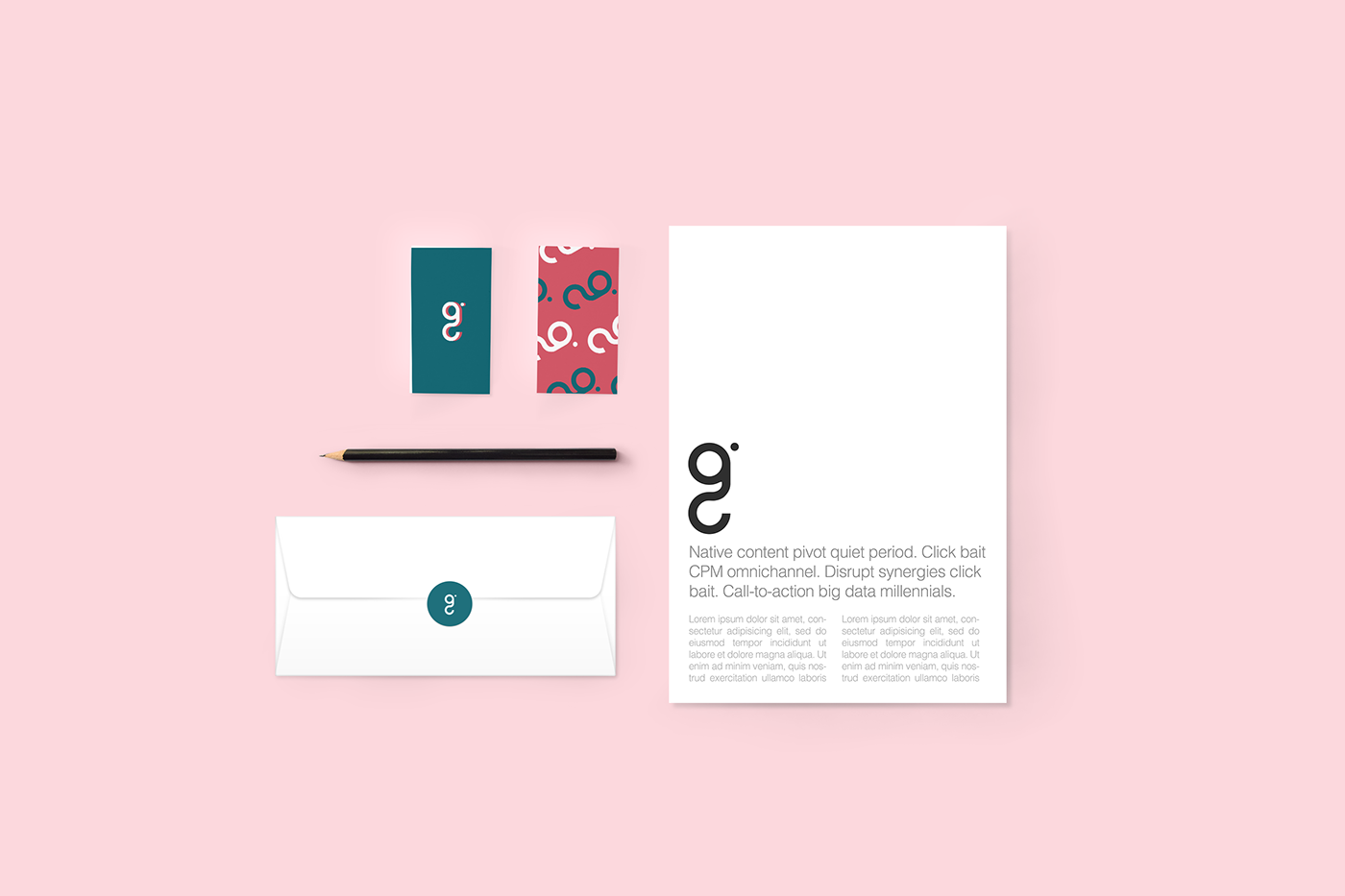
Branding Stationary Mockup visualization - mostly playing with the colour scheme. Thanks for checking this out!
Thank-you!
links+sources:


