
Overview
The problem was that water sport fans needed a simplified way to evaluate weather conditions because current apps use overly complicated maps, show unrelated conditions, and limit personalization. The solution was to develop an app that allows water fans of all kinds to quickly evaluate weather conditions to determine if conditions present opportunity. The app could proactively suggest "Try Sunday 3 at for a smooth waterski" based on user's preferred sporting conditions.
The Plan

Step 1: Competitor Analysis
Based on the problem statement and hypothesis, I needed to research weather apps and sport-specific apps (with typically a social element) to understand the intersection between the two.

So, the goal was to determine if there was a market for a watersports app that combined weather data specific for a given sport with the ability to find a particular location.
Using two apps, Fishing Spots and Weather Live, I first created a profile highlighting the app's objectives, strategy, and market advantage. I then used a SWOT analysis to figure out which features could be improved upon.

A heuristic evaluation helped me see the main takeaways in each app's usability:
1. Search function--Filtering within the search is important for travel opportunities/competitions. It's also necessary for differentiation between sports. A fisherman wouldn't need to check wave height, for example.
2. Clean UI--If weather charts are needed, make sure they're easy-to-read and not bogged down by unnecessary details. Navigation icons should be clear.
3. Personalization--If a user could create ideal conditions and preferences for a perfect day out on the water, would they want to be notified when those conditions arose? Would they want to be warned if conditions changed?
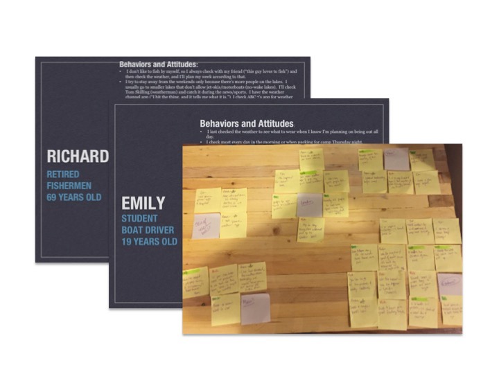
Step 2: User Research
Now that I knew there was a potential market for an app, user research helped me determine how water sport enthusiasts checked the weather before and during an outing. What were their pain points? What did they look for in a weather app?
I developed a script with open-ended questions and interviewed five water sport enthusiasts--aged 19-84--fans of fishing, boating, paddle boarding, surfing, and sailing. After user interviews, old school affinity mapping with sticky notes was used to see patterns and identify key takeaways.
Takeaways:
1. Localized weather--Localized weather websites are preferred since they typically provide specific radar/ conditions to the area. Being able to favorite a location would be handy since users said they bookmarked favorite spots online.
2. Engagement--All interviewees said they enjoy their sports with other people, so there’s a social component here. When exploring new areas, interviewees used suggested spots and tended to stay away from publicized, touristy locations, which suggests a P2P element.
3. Notifications--Challenges with weather do occur but are infrequent, seeing as weather predictions are typically correct, and users can plan accordingly. It seems unnecessary to notify users during the outing itself. Most notifications should occur beforehand.
4. Target--Ages for app use vary—I was surprised that the oldest interviewee, 84, loves his weather app. (Yes, I do have stereotypes.) As long as the interface and navigation are straightforward, it could be useful for all ages.
Step 3: User Personas
Three distinct user personas were created in order to help understand the goals of the user and focus on the major driving forces and actions required for the app.
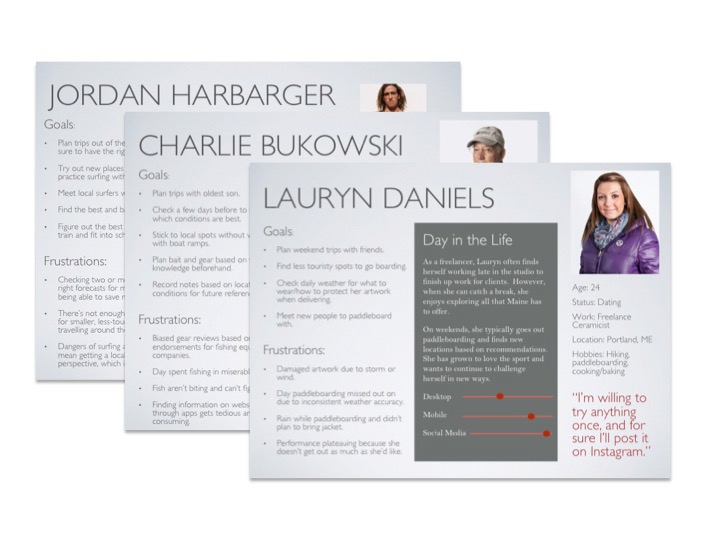
User stories helped to show a simplified description of a requirement.

Takeaways:
1. Why do users go? Spend time with friends/family, enjoy a new hobby or keep up a current one, compete and challenge oneself physically or mentally
2. When do users go? Anytime, only in certain conditions, only on the weekends or as time allows
3. What are users' main goals? Plan gear based on the weather, plan a weekend outing with friends, plan for an upcoming competition somewhere new
Step 4: User Journeys and Flows
User journeys were used to represent a particular scenario where a user might interact with the app.
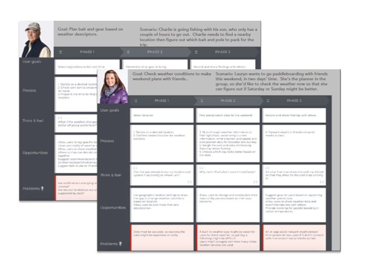
Taking the main goal from these journeys, user flows were developed. Originally, my user flows included all the navigational components, listing all filter options, search options, etc. I realized I needed to pare down to focus on the main interactions and tasks.
Takeaways:
1. Being proactive--Each user checks the weather beforehand, so if the app can work proactively in providing suggestions, it could provide an edge on the competition.
2. Filtering uniquely--Each user is looking for unique weather conditions, so it's essential to provide filtering options and set-up the app contingent on each sport selection.
3. Sharing is caring--Saving and favoriting locations allow users to share information with others, which goes along with social aspirations.
4. A date with destiny--A date picker seems essential with a way to see the weather based on that particular date.
Step 5: Information Architecture
User journeys and flows helped me to figure out the essentials for a sitemap. I used Google Drawings to create sitemaps. Originally, I had planned for "Activities" to be on the navbar, but usability testing revealed the vagueness behind an "Activities" category, so the sitemap changed greatly as time went on.

Card sorting with Optimal Workshop helped me evaluate whether the sitemap and its terms were correct. Did users search for a location and then favorite it?

Takeaways:
1. Confusion with category names--Open card sorts give users all sorts of options for category names (my users came up with 7 navbar items), so a further card sort or usability testing was needed to determine category naming.
2. Sitemaps require continual revisions--the sitemap was revised after the card sorting but was also revised further on with additional usability testing.
Step 6: Wireframing and Prototyping
First, responsive paper wireframes for desktop, tablet, and phone were created simply to establish basic navigation structures. These were then translated into mid-fidelity wireframes using Sketch. These were in grayscale to emphasize high-level functionality. High-fidelity prototypes, still in grayscale, were then made interactive through the magic of inVision prototyping tool.
In each stage of wireframing and prototyping, I went back to the original user flows to make sure I was fulfilling the original plans and intentions for the designs.

Takeaways:
1. Don't reinvent the wheel--Utilize free icons and buttons when possible.
2. Ensure consistency--Establish style guide early on. It. saves. time.
3. Don't worry about pixel perfection--Focus on primary functionality for the first round of user testing.
4. Simplicity sometimes means adding a step--My original filter feature, for example, featured a dialog/modal box that appeared after the user clicked on the filter icon (see first image in high-fi above). Why not push the filter options into the original search function? It added a step, but it helped reduce cognitive load.
Step 7: Usability Testing
Now for the real test--can users complete intended tasks? A test plan was used to outline the objectives for testing. Originally, I had outlined 8 or so tasks. It was way too much. I realized I needed to focus in on the real issues and ask follow-up questions. The script was created to ensure consistency between tests, make sure I emphasized the importance of speaking thoughts aloud, and ensure an understanding of the nature of a prototype and the fact that usability tests are meant to be show weaknesses in a design, not in a person's technical ability.

I had the time, and I had the ability to recruit people from my network who were sports enthusiasts themselves. Because of this, I was able to do moderated in-person testing, and I appreciated the ability to follow-up with more detailed questions as well as observe behaviors in person.

Based on usability testing, a rainbow spreadsheet was used to identify the major pain points of the design. These findings were then organized into a concise usability test report which outlined suggested changes for future iterations.
Preference testing was also used to test icons versus photographs and different locations views. Oh, how I messed up on this! I should have made both in grayscale and didn't. Obviously, participants chose the color version because who wouldn't?

Takeaways:
1. Focus is key--Usability tests should hone in on potential pain points. Don't ask a user to spend time and energy on tasks like logging in or editing a profile picture.
2. Think before you speak or before you publish--The old adage is true. Usability tests and preference tests are only effective if the task questions and follow-up questions are effective. When a user asked me something like, "What's this icon for?" I could have answered their question with the answer I intended, but that wouldn't have been useful in figuring out the flaws in the design. Instead, I had to stop myself and answer socratically with, "What do you think the icon is for?" to gauge their thinking. Similarly, I should've checked my preference test for uniformity before publishing it.
Step 8: Refining the Design
It was perfect, right? So wrong. I needed to ensure all components were uniform, aligned, and accessible with a style guide, grid system, and accessibility and iOS guidelines checks.
Colors were selected to represent the calming nature of the water with simple grays and whites to keep the UI clean in appearance and chock-full of whitespace. The brighter primary colors emphasize key functionality like the search function, navbar, and call to action buttons. Open-source fonts were used, and the 12-column grid provides ease and consistency for developers. Icons, images, and other UI elements were standardized. Language guidelines and general dos and don'ts were included as well.

Nine accessibility issues were considered, and the design was altered based on WCAG guidelines.

Primarily, I realized contrast was a huge issue in my design, and I needed to make sure placeholders and error alerts were clear. Maintaining accessibility guidelines reduced cognitive load for users if they didn't have to remember what was required for a password or what was needed for a form.

Takeaways:
1. KonMari-ing the app--Visually decluttering sometimes might mean a mental decluttering as well. Take the filter for example. Cognitive load is reduced by simplifying into a two-step process. It sounds counterintuitive, but it's far more efficient in helping the user focus on a step at a time.
2. Accessibility at the forefront--Checking my contrast ratios at the get-go would have saved me time and energy.
3. Whitespace squared--Increase whitespace until you've think you've gone overboard and it's too sparse, and then it's probably perfect.
