


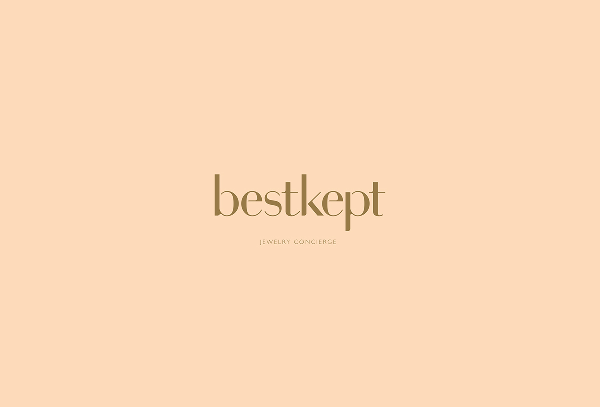
Best Kept
Jewelery Concierge
Startup Branding
Logotype & Mark
Packaging Concepts
©2018 C.Ruprecht
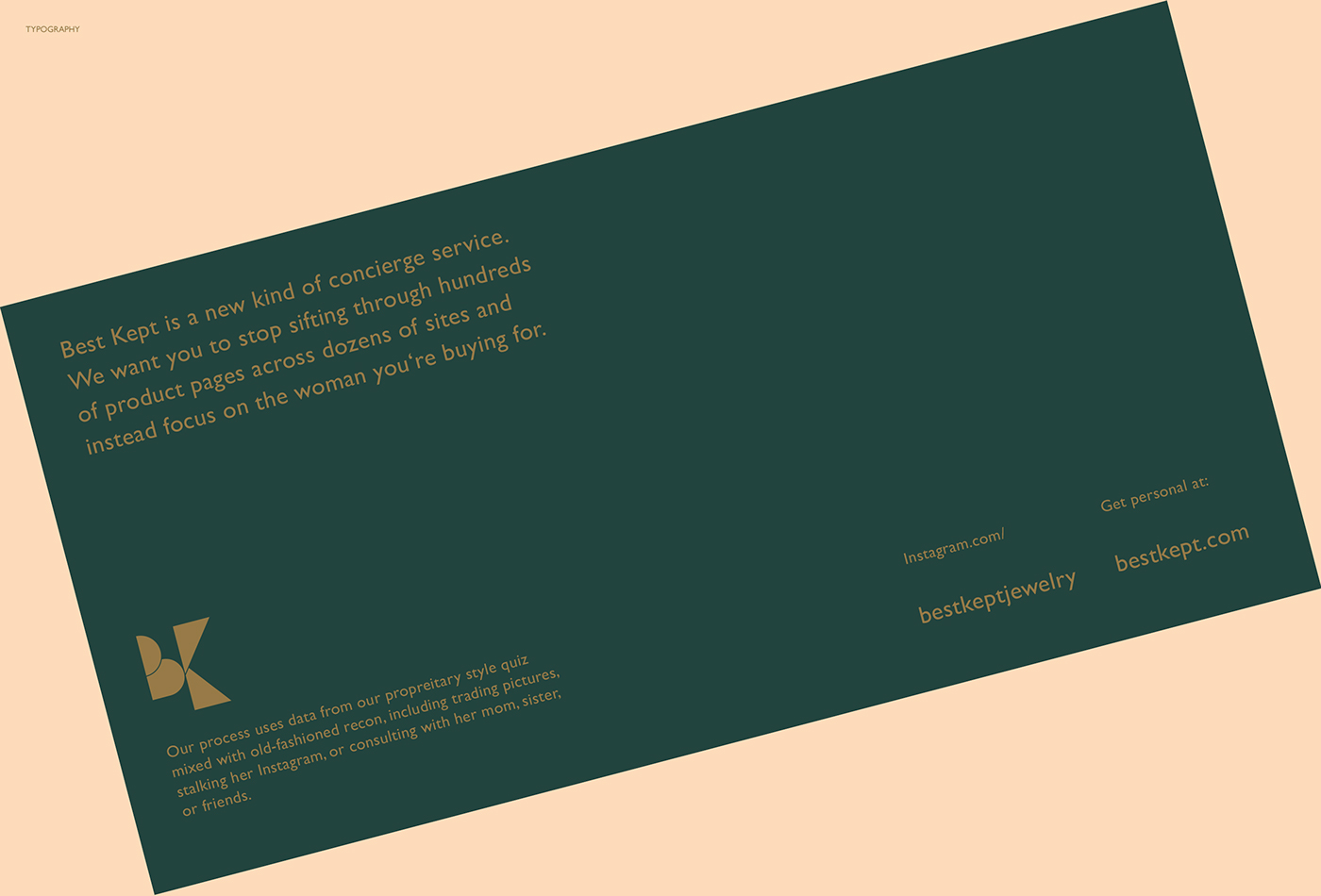
Best Kept is a personal Jewelry Concierge Serving, coming to the Aid of the modern gentlemen, who is looking for the ideal surprise for their loved one. Based on in depth personal Dialogue the right type and style of Jewelry is determined and recommendations are given based on budget and aesthetic profiles initially based on intelligent Questionnaires.
Influenced by the Clients' desire to have both female and male energy shine through the Corporate Design, the Branding aims to strike the right balance between a warm, subtle vintage and a boutique style modern feel.
The Logo
For the Logo-System a feminine lowercase custom Word Mark is paired with a modern geometric,
jewelry-inspired Logo to achieve a contemporary, yet classic look. Both parts work individually
and as center aligned Unit.

The Custom Work Mark was based on finding the right contrast between
a feminine (rounded / delicate) and masculine (angular / bold) feel.

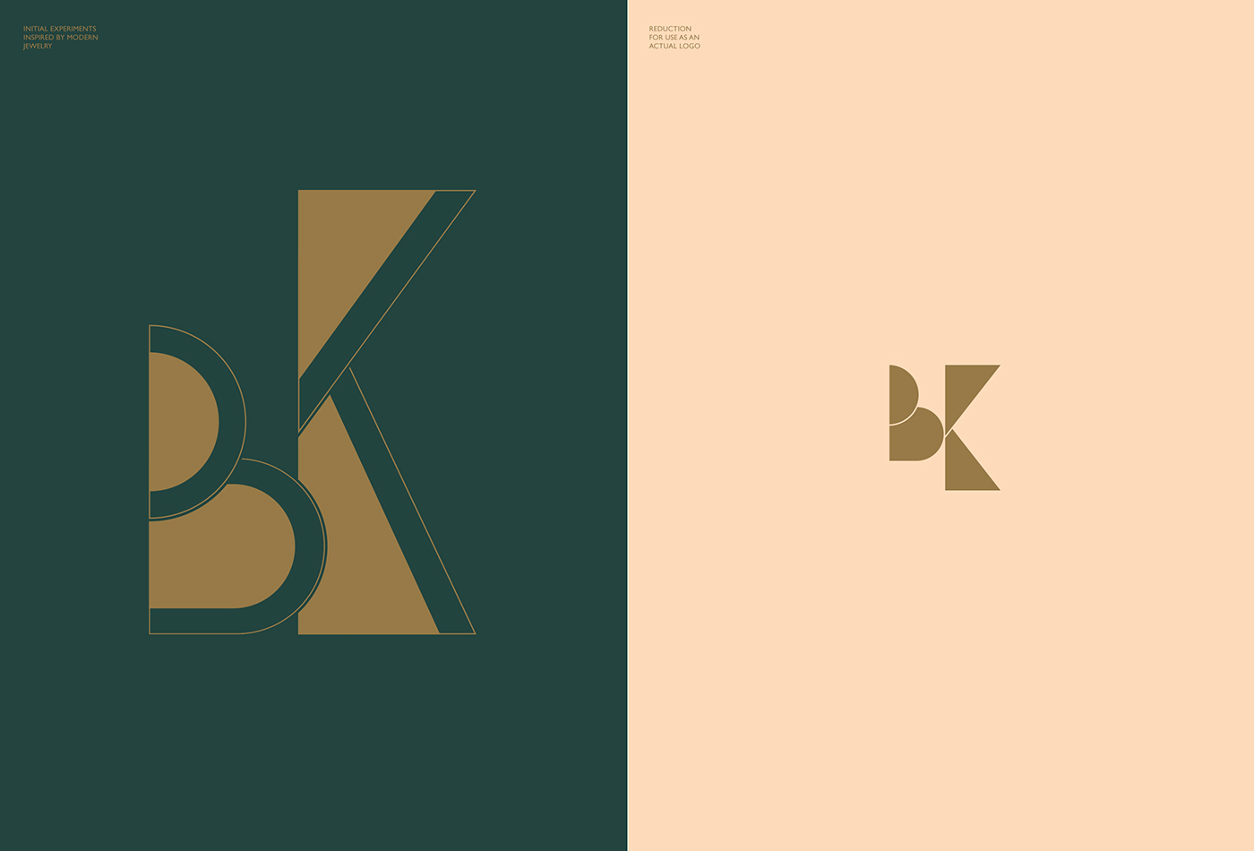
The Logo Element strikes a more progressive and modern Tone
as a counter Weight to the Word Mark.

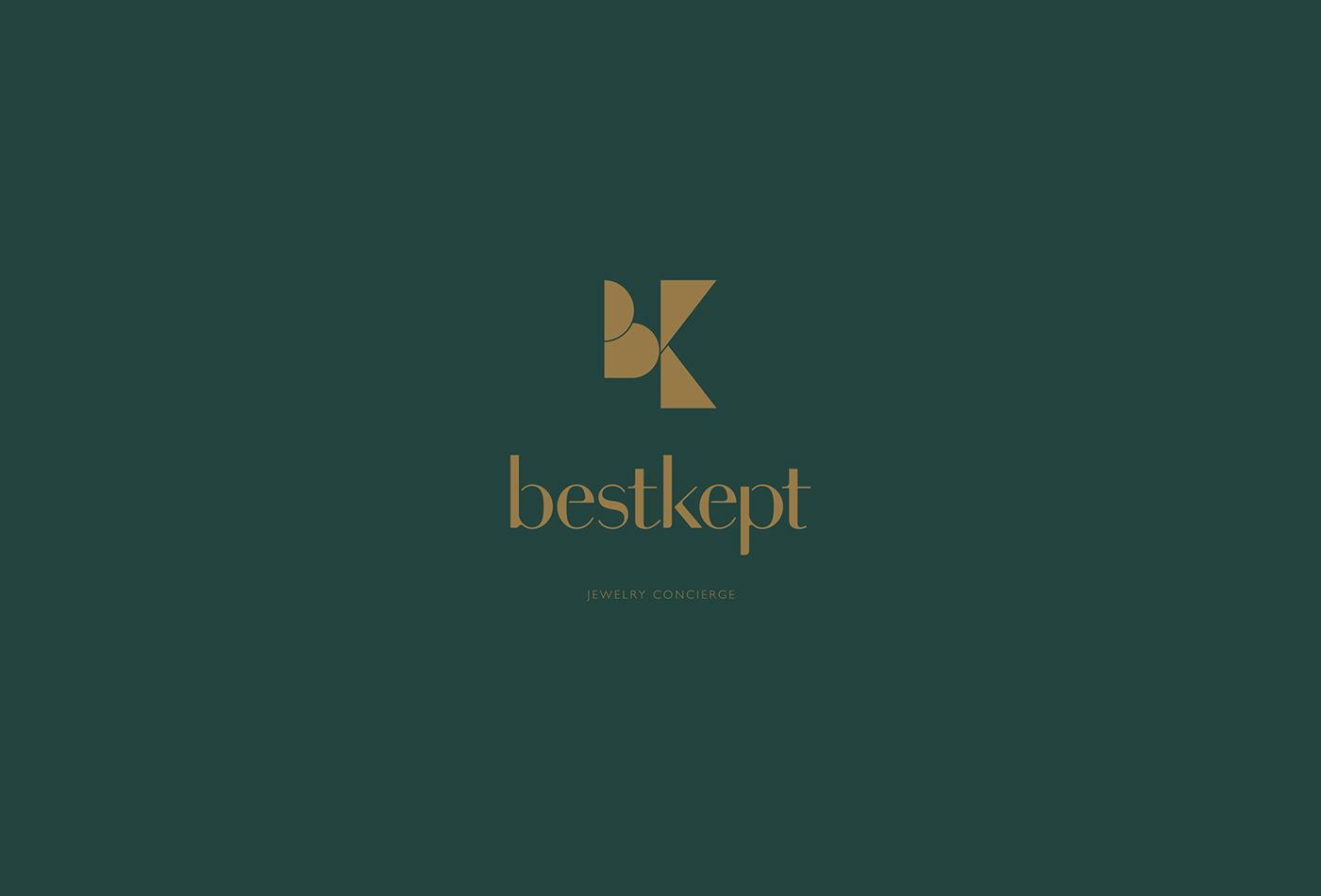
Combined Logo-Elements

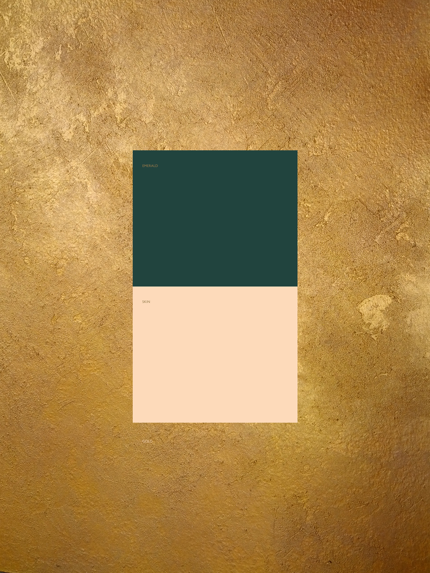
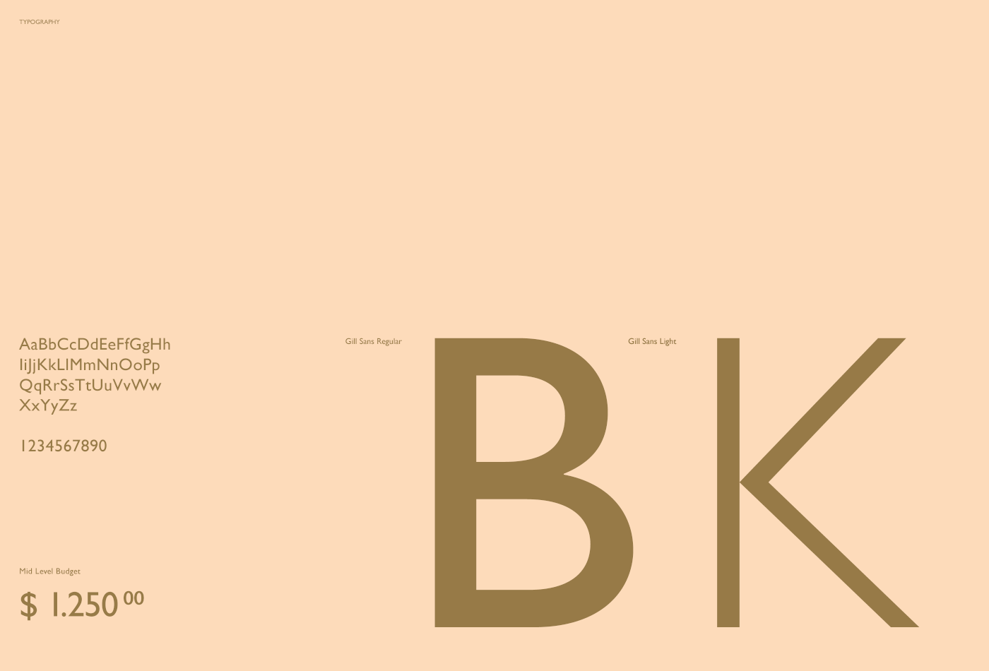
Colors / Typography
A tried and tested combination of a warm gold and a deep emerald green is brightened and modernized
by a pastel skin tone. Use of Typography is understated and subtle. Gill Sans is paired with moderate
use of Baskerville to re-emphasize the modern/classic balance.

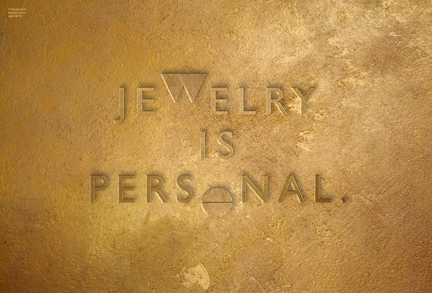
Geometric Elements are used sparely across important Text or Headlinesto tie creative
typography and logo together and to help add a more visual aspect to the branding.

Branding in Print & Online
Visualizations of the Brands presence on and off the screen
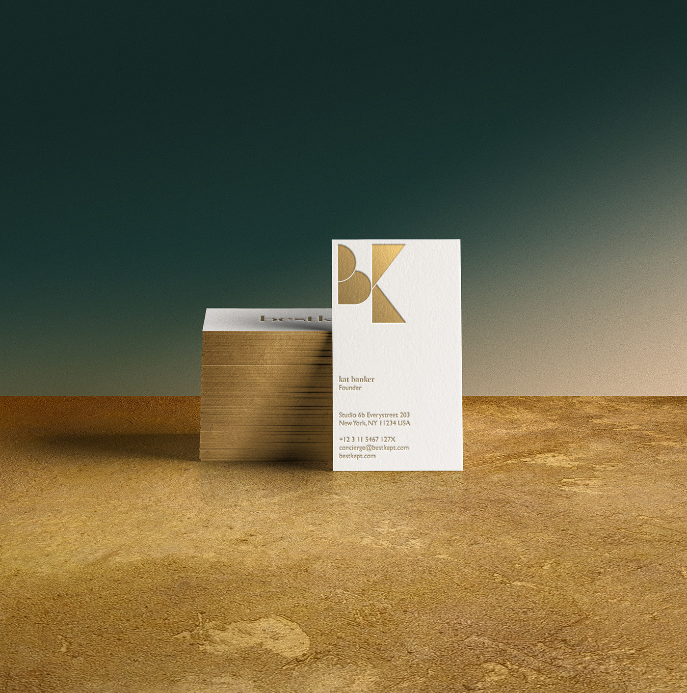
Business Cards
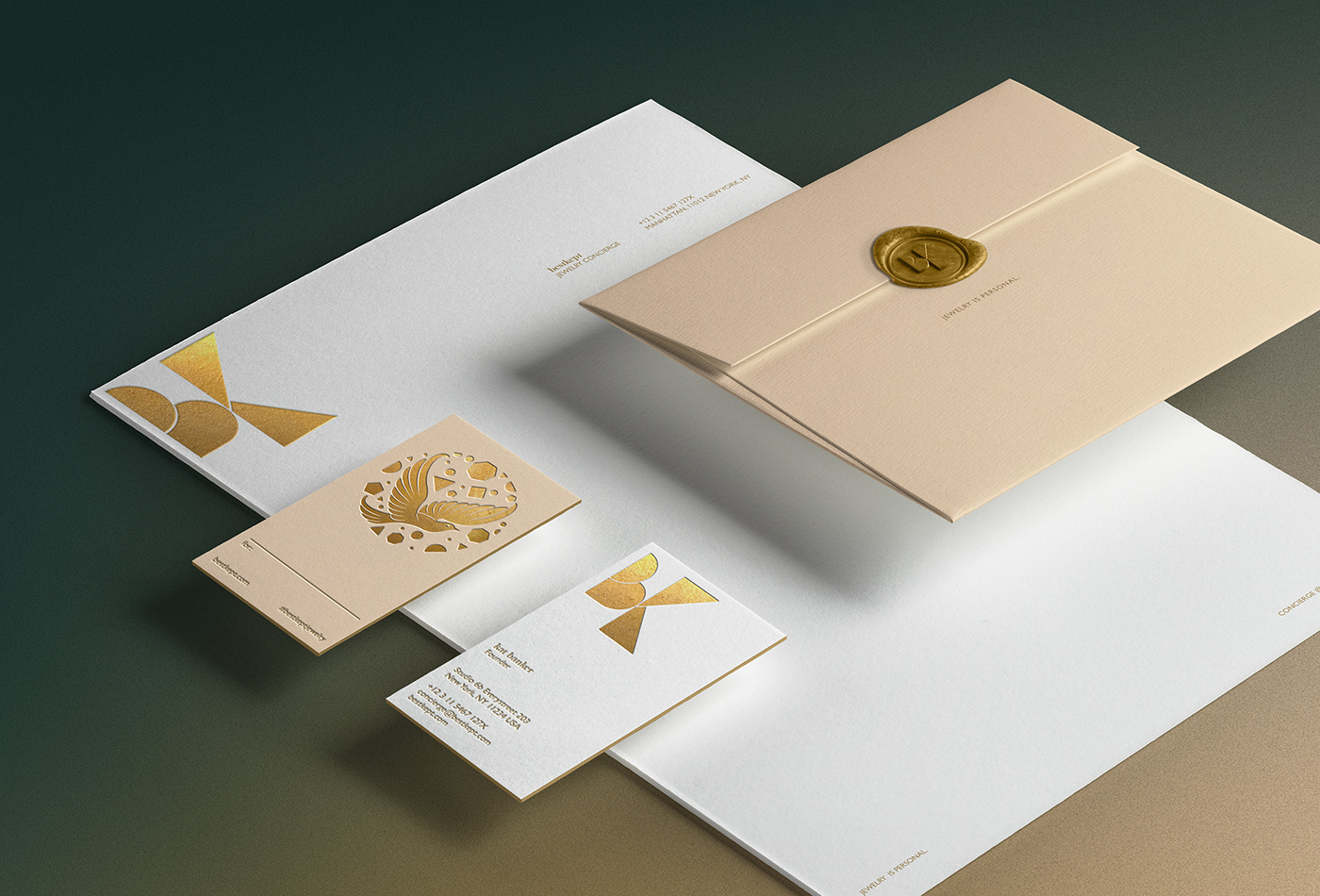
Stationary Elements & Gift Tag

Additional illustrative Element visualizing the Concierge and research
Aspect of the Company, as well as adding a romantic touch.
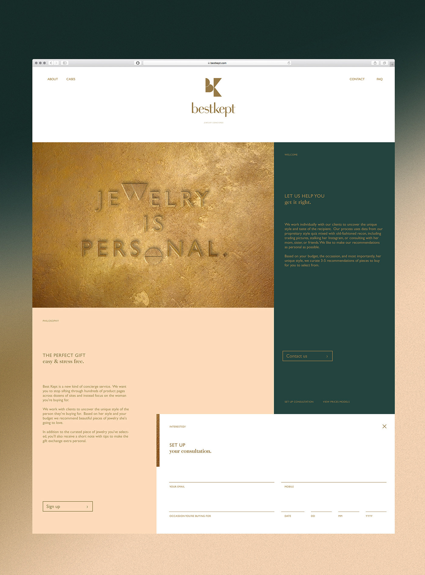
Online Presence Visualization
Packaging Design
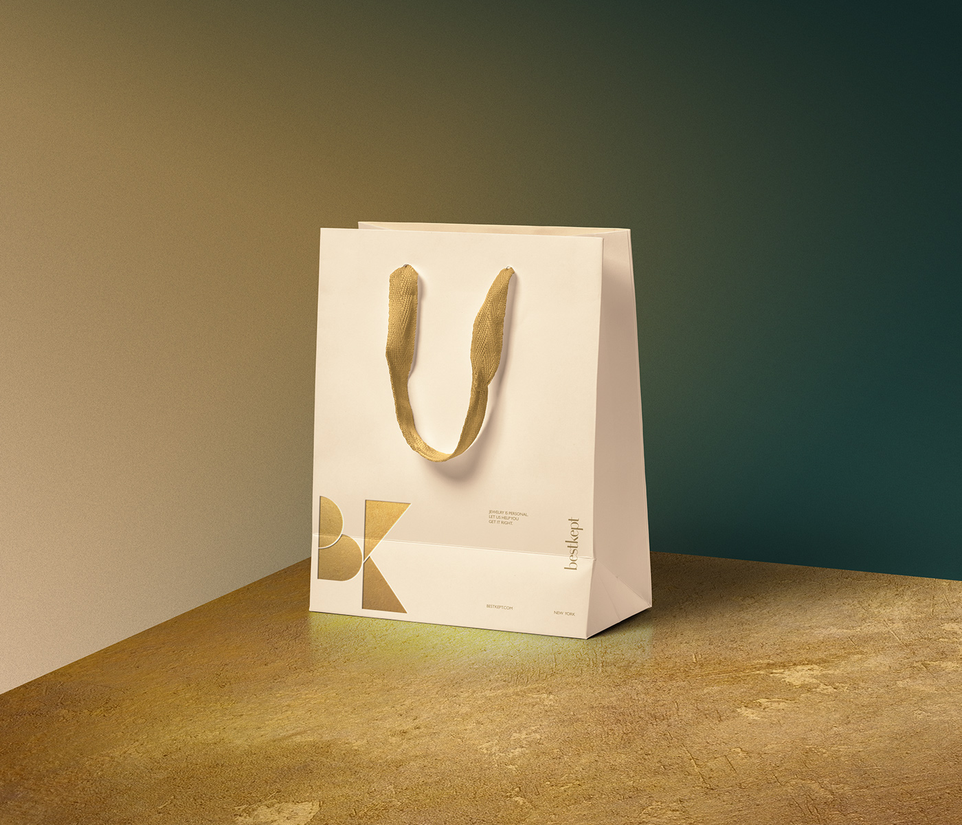
Shopping Bag Design

Art Direction & Design: C.Ruprecht
Mock-ups: Courtesy of Pixeden.com
Inquiries: studio {at} christophruprecht.com
_


