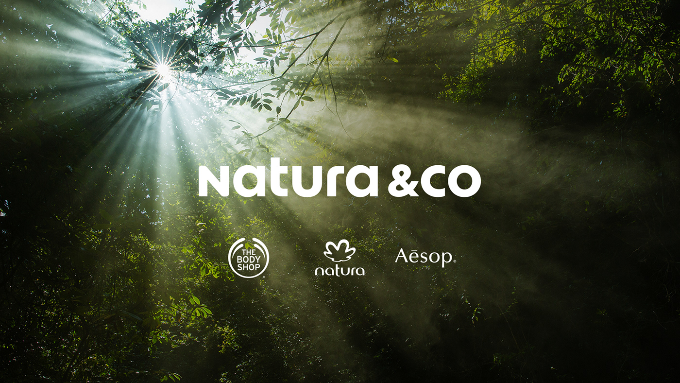
Identity design puts Natura &Co at the forefront of a new beauty era
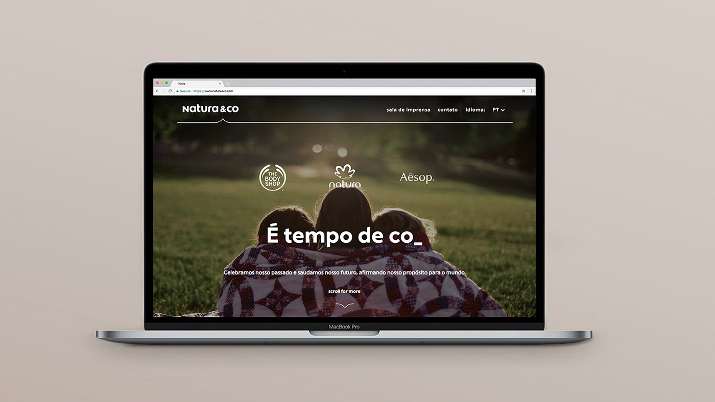
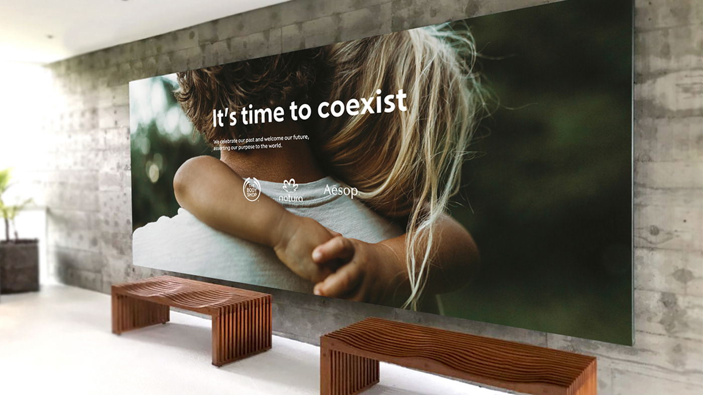
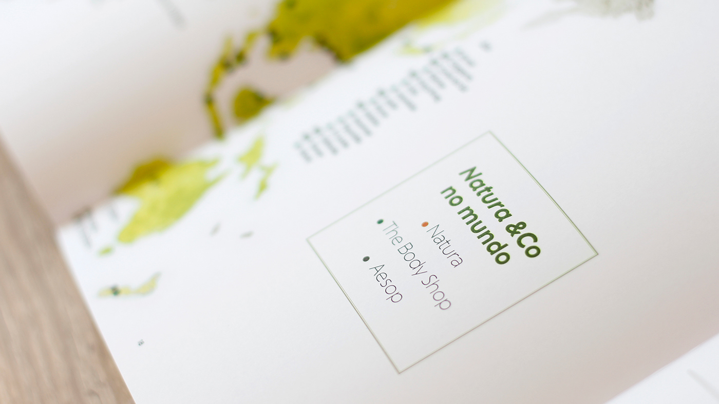
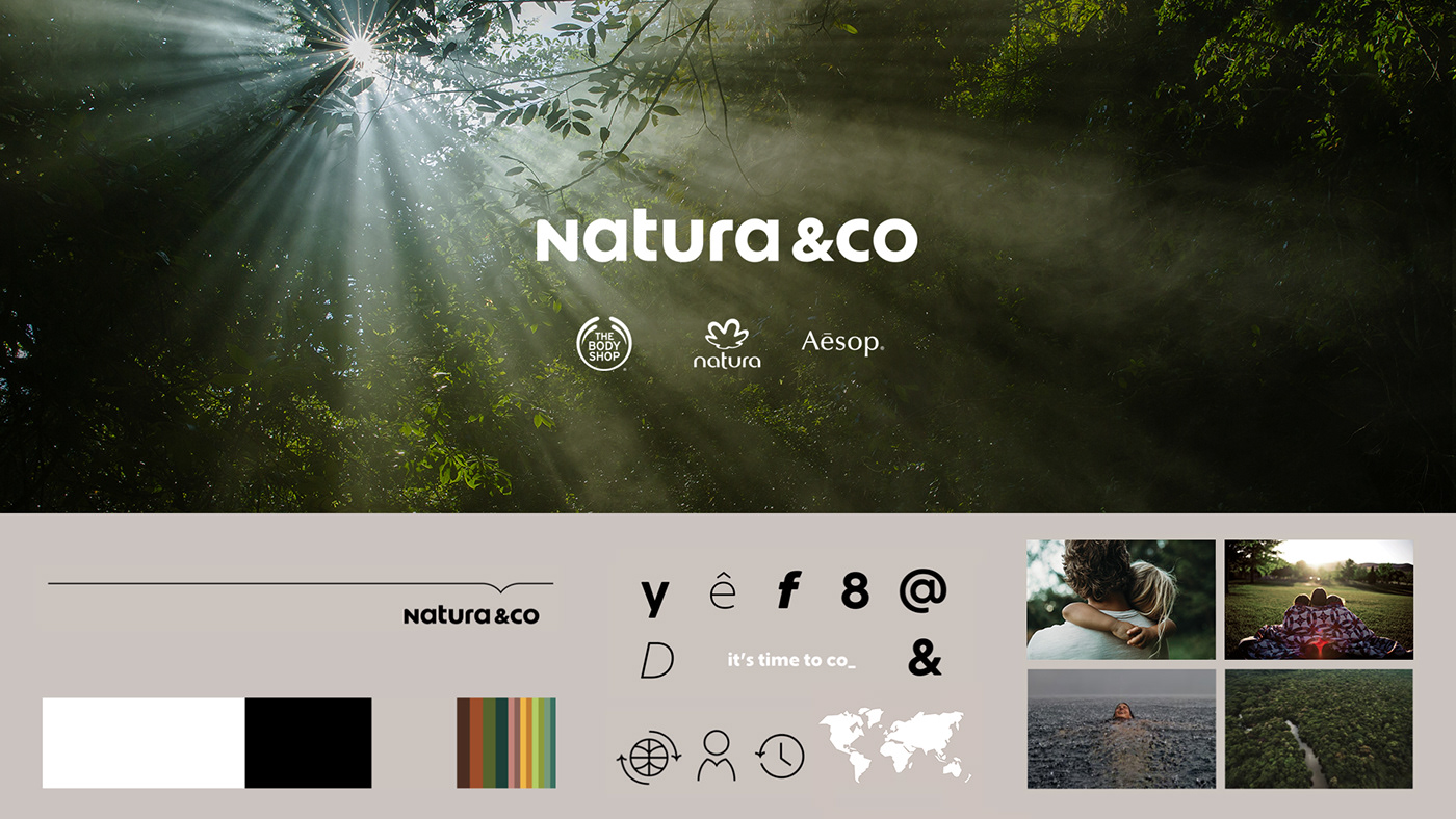
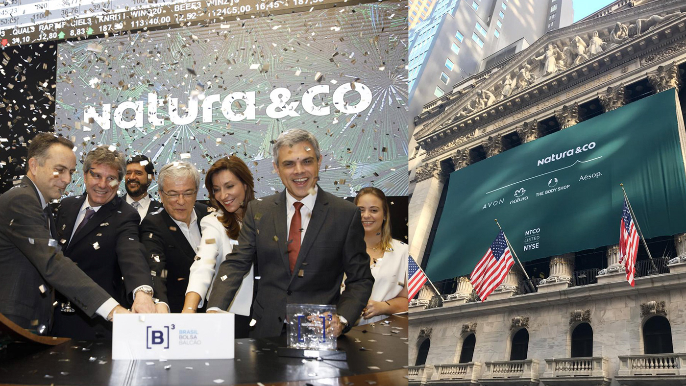
Natura, the icon of sustainability in Brazilian beauty market, has acquired 2 other beauty brands: The Body Shop and Aesop. The recently born group aims to establish its expertise in beauty, combined with the fight for a better world. The challenge was to develop the corporate brand to represent these 3 iconic brands and their shared values.
About the name: we found this perfect synthesis in the name Natura &Co. Natura—besides being the enabler of this union—carries near-universal recognition as the term for “nature” or “essence”; the “&” conveys the sum of strengths that this new group brings together; and the abbreviation “Co” also alludes to “collaboration,” “coexistence,” “connection,” and “comprehension”—central themes in the contemporary world, and essential elements of this new group’s ethos.
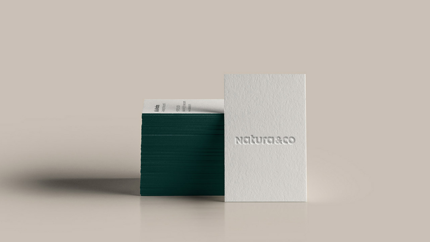
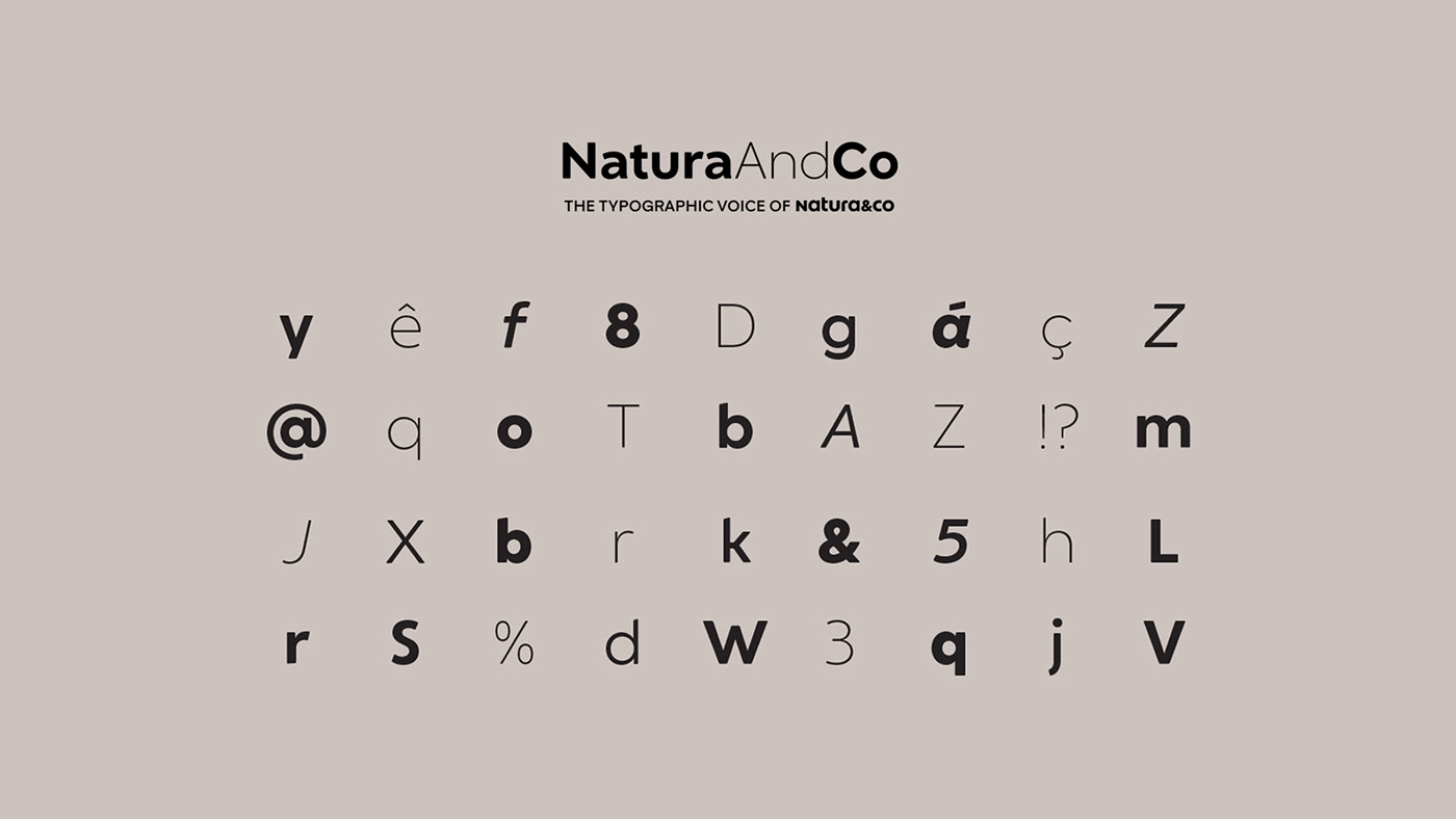
With a name already loaded with so many meanings (Natura &Co), we searched for a timeless, simple and elegant solution for the identity design. The typography, clean and clear, was specially designed and pays a simple tribute to the brand Natura. The visual universe was created from a single graphic element, the "key," symbolizing the coexistence of Natura, Aēsop, and The Body Shop, and expressed through a chromatic palette inspired by nature.


Project by Interbrand São Paulo