The brand
One Self provides promotions, business consulting, data analysis with brand direction, e-commerce marketing and management strategy to assist in increasing business sales and brand presence.
Original Logo

The navy blue color of the logo looks very corporate and professional, but is a very common color. Also the symbol resembles the logo of a very famous car company. We need to design another logo altogether, preferably using a bright color, that makes it stand out from the rest.
Option 1:
Redesigning the existing logo

My client wanted a feminine feel for the logo and also wanted to retain the original navy blue. So there was very limited scope for experimenting with different colors.

The client loved the bright pink! She felt she could associate more with it now, and it also brings out her vibrant personality.
Lesson learnt: Desining a logo is not only about the business and services, and trying to make it stand out from the rest. Logo design is more like creating an identity and personality of a brand that also brings out the personality of the business owner!
Option 2: New Logo Concept
The requirement was a geometrical construction that symbolized a systematic approach. My client handles e-commerce, events, promotions, etc., so, we discussed that the logo should symbolize keywords like “organization, tension free, trustworthy, jack of all trades, good advisor, wise, stable, knowledgeable”
Inspiration
Explorations

Concept 1

Color Variations

Concept 2

Logo construction

Color variations

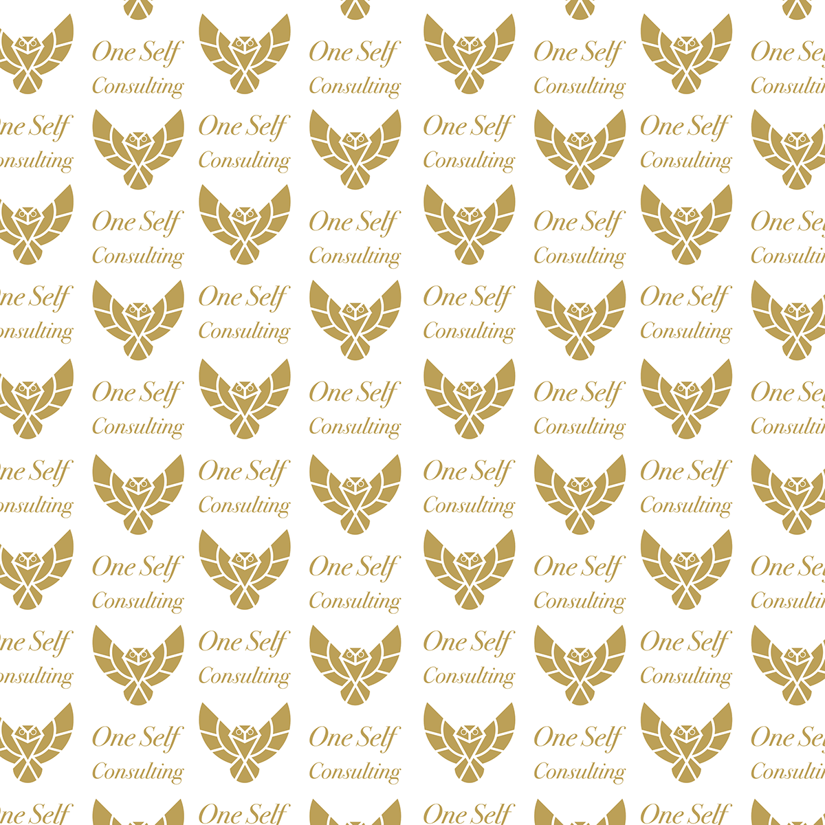
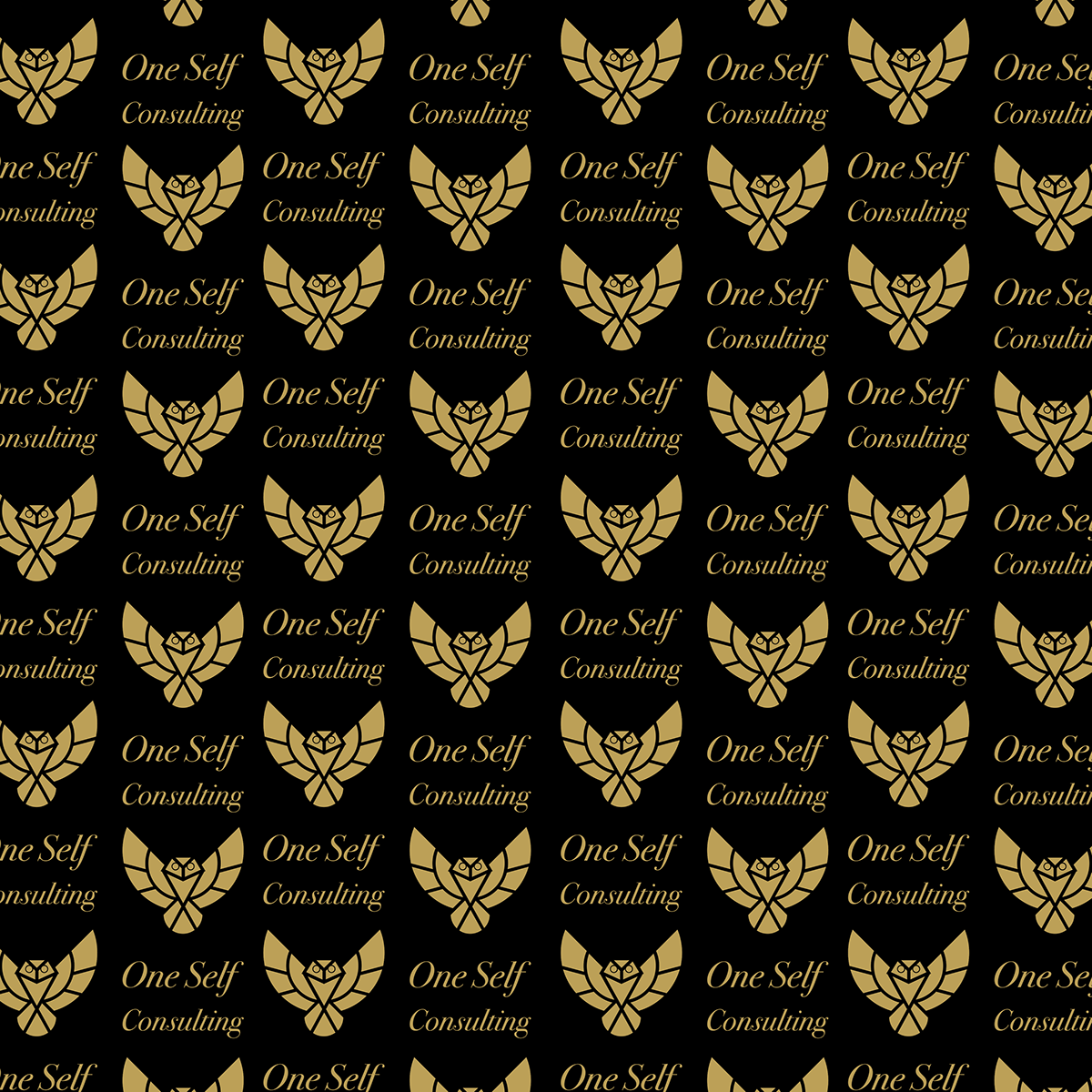
Color variation on different color backgrounds. Certain colors look good on both black and white.
Detailing

The selected concept was further worked upon, for detailing. How the logo would look if it had an outline? The initial selected colors were bright pink and black. The client wanted a two-color logo. I experimented with both colors to see which combination works best. Ultimately, we both agreed that the logo looked best in a single color. So, we selected bright pink.
Pretty in pink!

The selected colors were presented on both black and white backgrounds. A color palette was developed using tints and shaded of the selected color.
Challenges
Initially I thought bright pink would really stand out because not many businesses use a bright pink as a primary color in their logo. But keeping in line with what the businesss is about, I felt that a subtle, more earthy color like golden brown would be more suitable for this business. Also, the logo should look good on both black and white backgrounds. A color background can be used but black and white are more preferred as they make for a clean and crisp presentation.


Developing a color palette

Spacing

Proper spacing in the logo is important to ensure good visibility. For this logo the alphabet ‘O’ is used in the same font as the one used for the logo, for defining the amount of space needed between the logo and the text. The same spacing is used around the logo to ensure uninterrupted visibility of the logo on any surface.

Notice that even when displaying the logo on the whole page, the alphabet ‘O’ has been used as reference for spacing, for the placement of the logo from the edges.
Patterns


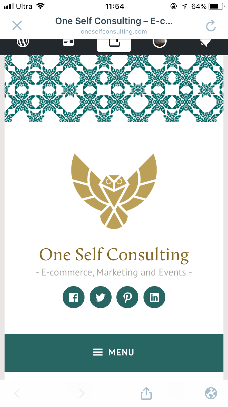
Wordpress Website Redesign