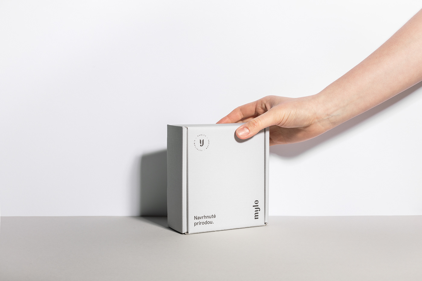
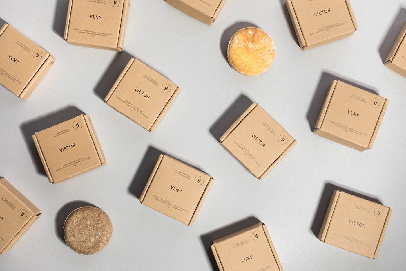
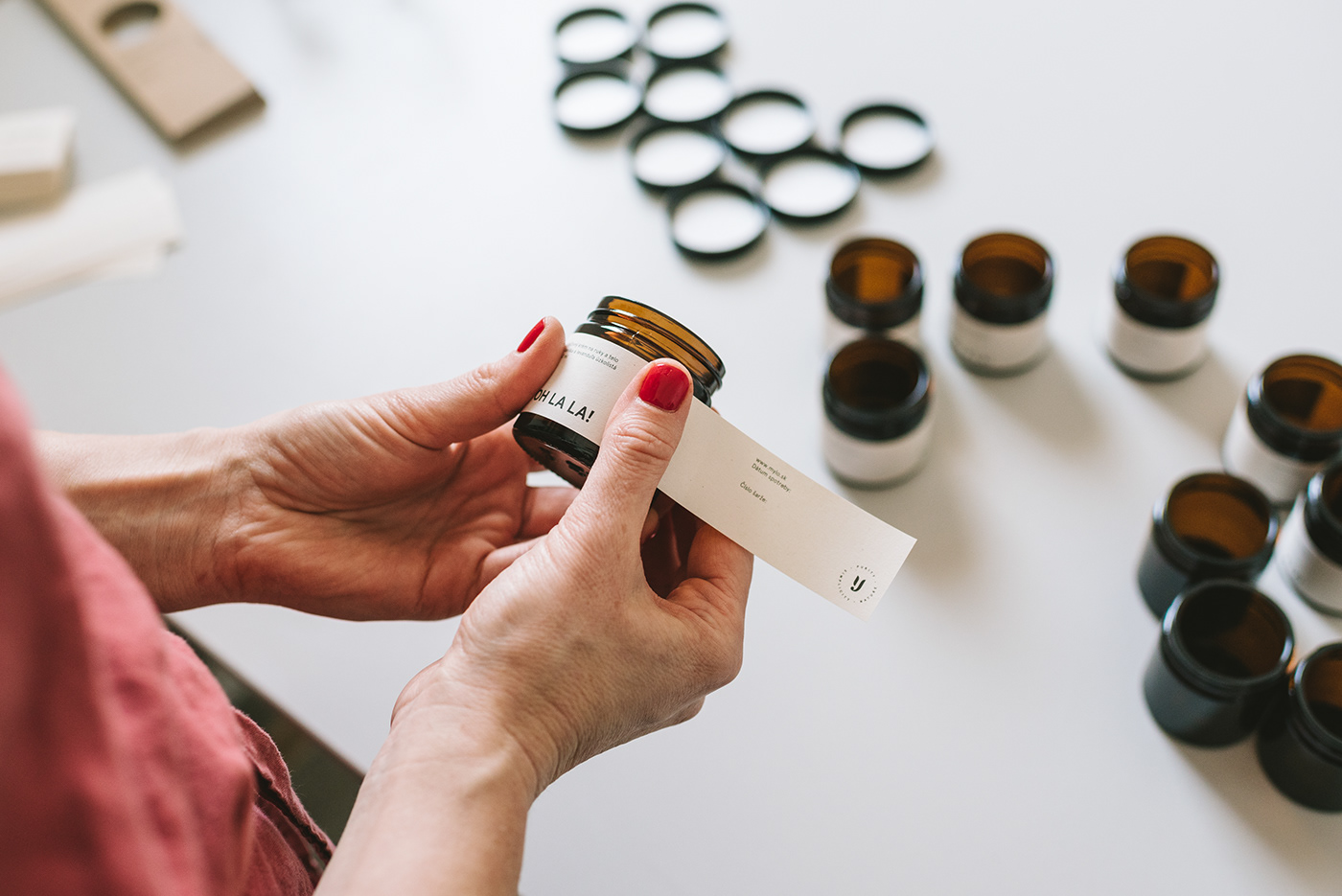
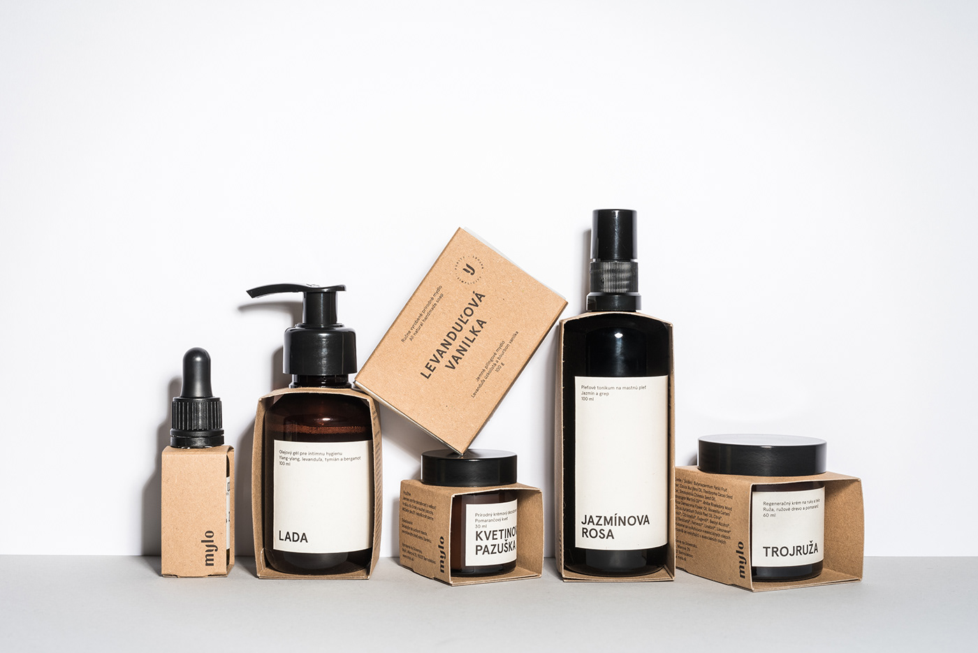
Visual identity and packaging system for a popular local natural cosmetics brand. When we were first introduced to Mylo brand, it looked like all natural cosmetics on the market at that time (that means colourful illustrations, handwritten font, etc.). Though there was no problem with the product — it was all perfect with clearly defined strategy — purity, simplicity, nature. We decided to build a brand around these principles. The result is clean design which the best resembles the ingredients used in products. These products are piece of art itself. The whole magic lies within using only natural ingredients, perfect craftsmanship, knowledge and creativity of the owner. Nothing more, nothing less.