
Ecommerce Product Listing Page - UX Case study

Background
A new born India ecommerce website. The major competitors are (Flipkart, Amazon etc.
Scenario
The user searches wrist watch on the homepage and lands on the product listing page. User is able to shortlist the watch from listing page itself. Also user able to do their selection much faster than they would have done it on any other similar websites.
Problem
The market is quite wide. There are many competitors and who are have quite strong positions (like amazon, flipkart). This is the page where user spend most of the time. Make the product listing page accessible and understandable, so that user can easily decide what they want to purchase. But the underlying question and the fundamental problem with this page is, why would the user choose from this? How will he come to a decision?
The market is quite wide. There are many competitors and who are have quite strong positions (like amazon, flipkart). This is the page where user spend most of the time. Make the product listing page accessible and understandable, so that user can easily decide what they want to purchase. But the underlying question and the fundamental problem with this page is, why would the user choose from this? How will he come to a decision?
Design Solution
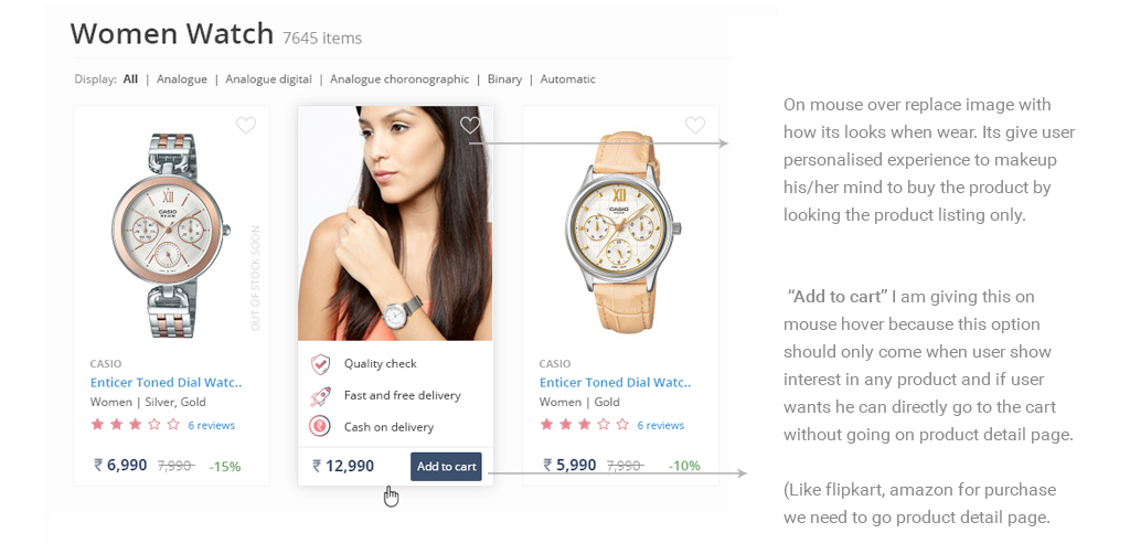
Users select and reject products in the product listing pages based on the information available about each item. Display all the major services upfront so that user can easily find what he wants. Clean and minimalist design with abundant white space for the user to focus on the content. Few points:
1. Try to give major information for every product so that user can easily makeup his/her mind to buy the product by looking the product listing only.
2. Easy filter system for selection of the product. Left side filter is clean and clear easily understandable to user. Major filter is on first scroll like gender, category, brand and watch type.
3. Clean and clear layout. Focus on every little but important information of the product without cluttering the design.
4. In order to make user come to a decision is to provide user with more information about the product. Details of each product which is relevant to the user to purchase the product:
a. Brand name, title and product colour information is easily distinguised
b. Customer rating and reviews is important to the user. A good rating system
a. Brand name, title and product colour information is easily distinguised
b. Customer rating and reviews is important to the user. A good rating system
creates a trust in the user’s mind and motivates him to make the purchase.
c. Price and discount
d. Assured tag - Quality checked, free and fast delivery
e. Showing “Out of stock soon” information so that user knows which product is
c. Price and discount
d. Assured tag - Quality checked, free and fast delivery
e. Showing “Out of stock soon” information so that user knows which product is
selling fast
5. Add to cart is important in listing but instead of showing upfront I am giving this on mouse hover because this option should only come when user show interest in any product. That’s why I have used “Add to cart” button and other details like free shipping, cash on delivery on mouse hover.
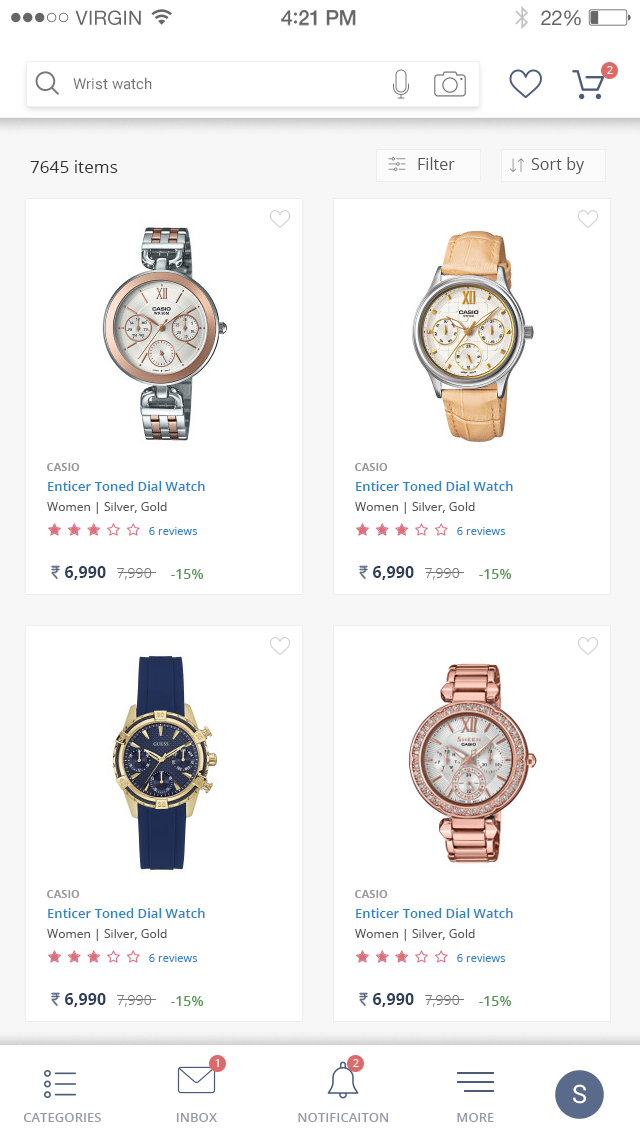
Product Listing Website - Visual Design/UI

Product Listing Page App Screen - Visual Design/UI
Design Solution
1. The focus of the app is clarity. Simple clean Black & white layout and everything is upfront, easy to use.
2. Focus on every little but important information of the product without cluttering the design. Most of the important element user found in this screen
3. Introduce advanced Search features like search by talk or image click.
2. Focus on every little but important information of the product without cluttering the design. Most of the important element user found in this screen
3. Introduce advanced Search features like search by talk or image click.

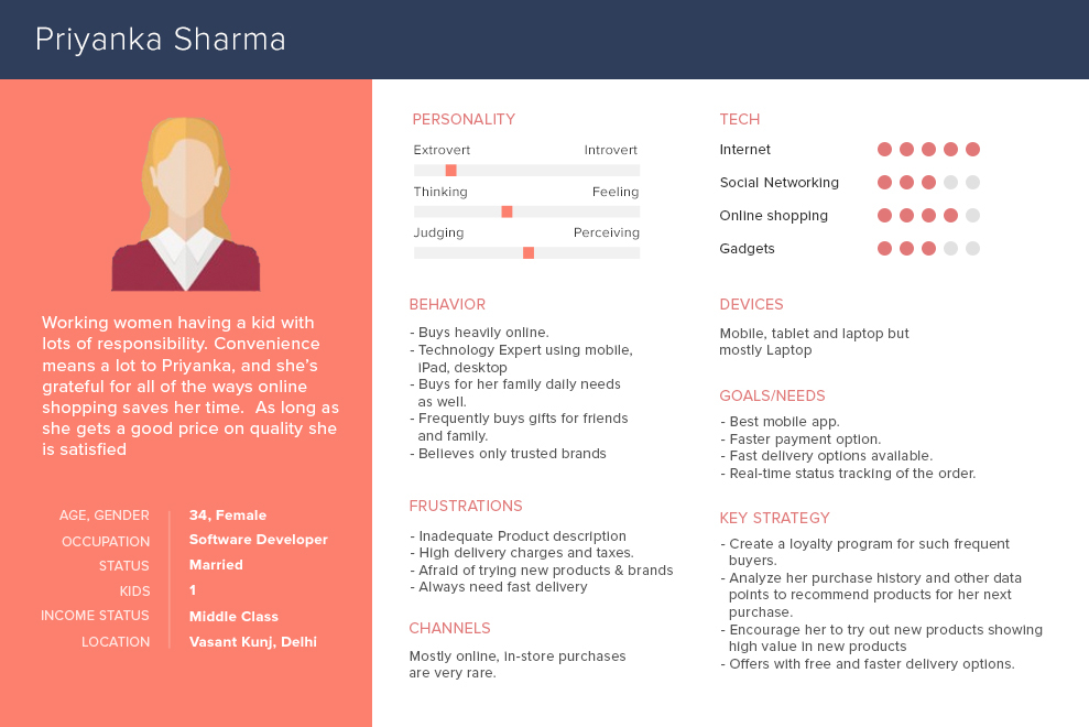
User Persona
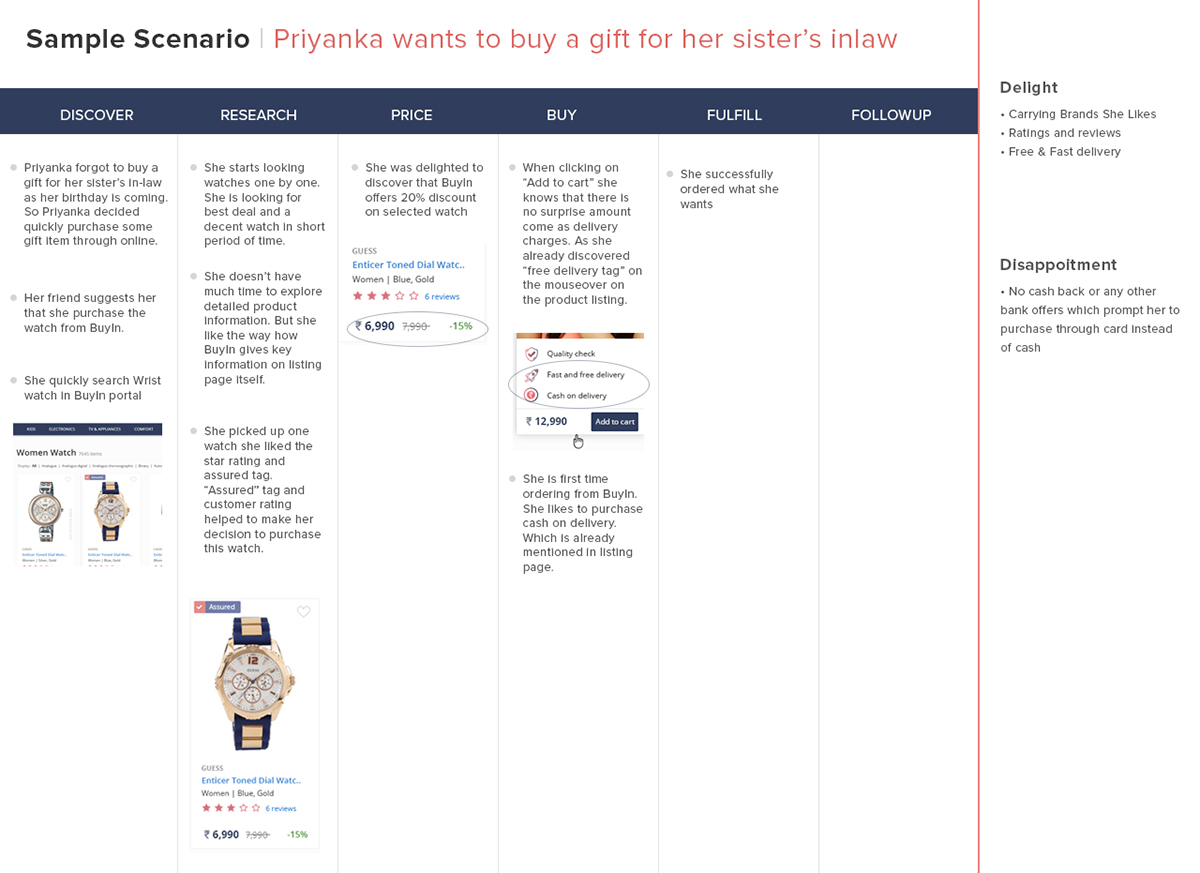
User Journey Search to Payment
Iconography

These screen is for prompting users to explore listings or to buy something. Icons are a quick, visual method for expressing ideas and communicating information. The approach is use the icon a fun and visual way to communicate with users. I offer a call-to-action button that redirects users back to the explore menu, also have some design elements on the screen so that user doesn’t feel bored to see this screens. I think these icons add significant value to the experience of the website and app.
Design approach of website and app is simple, clean and black& white clear layout. Colours used only for button and to highlights something. In above screen using some cool colour and flat icon shapes with some small elements to refresh the mood of user and to attract the user to explore product and purchase them.
First icon - To prompt user to purchase the items which user has already shortlisted. Idea behind this icon to prompt user to express some love the product he is interested.
Second icon - To tell the user that He has not done anything. Sad face icon on empty bag to motivate user to explore products.
Third icon - When user hasn’t ordered anything. This icon to tell the user that you have an
Thank you
Please like and give your suggestion and feedback
Please like and give your suggestion and feedback


