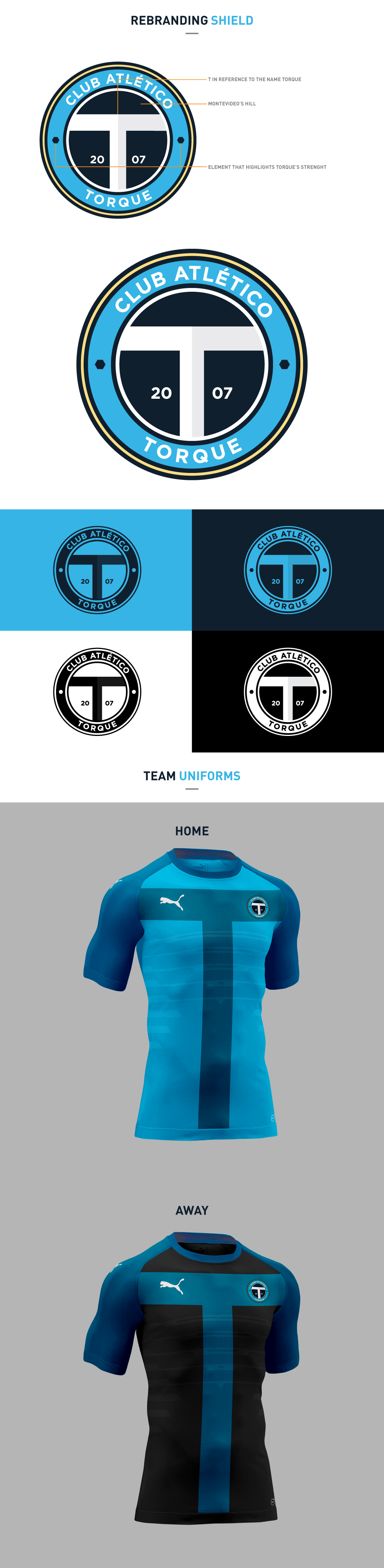
While investigating the teams that belong to the City Group, I noticed that the they had changed their identification badges in order to match the identity of the Group. This research helped me straighten my ideas and decide to go for something simple, effective and timeless, combining old and new elements. Therefore, creating an identity that is different from what Uruguayan teams show on their emblems and equipments.
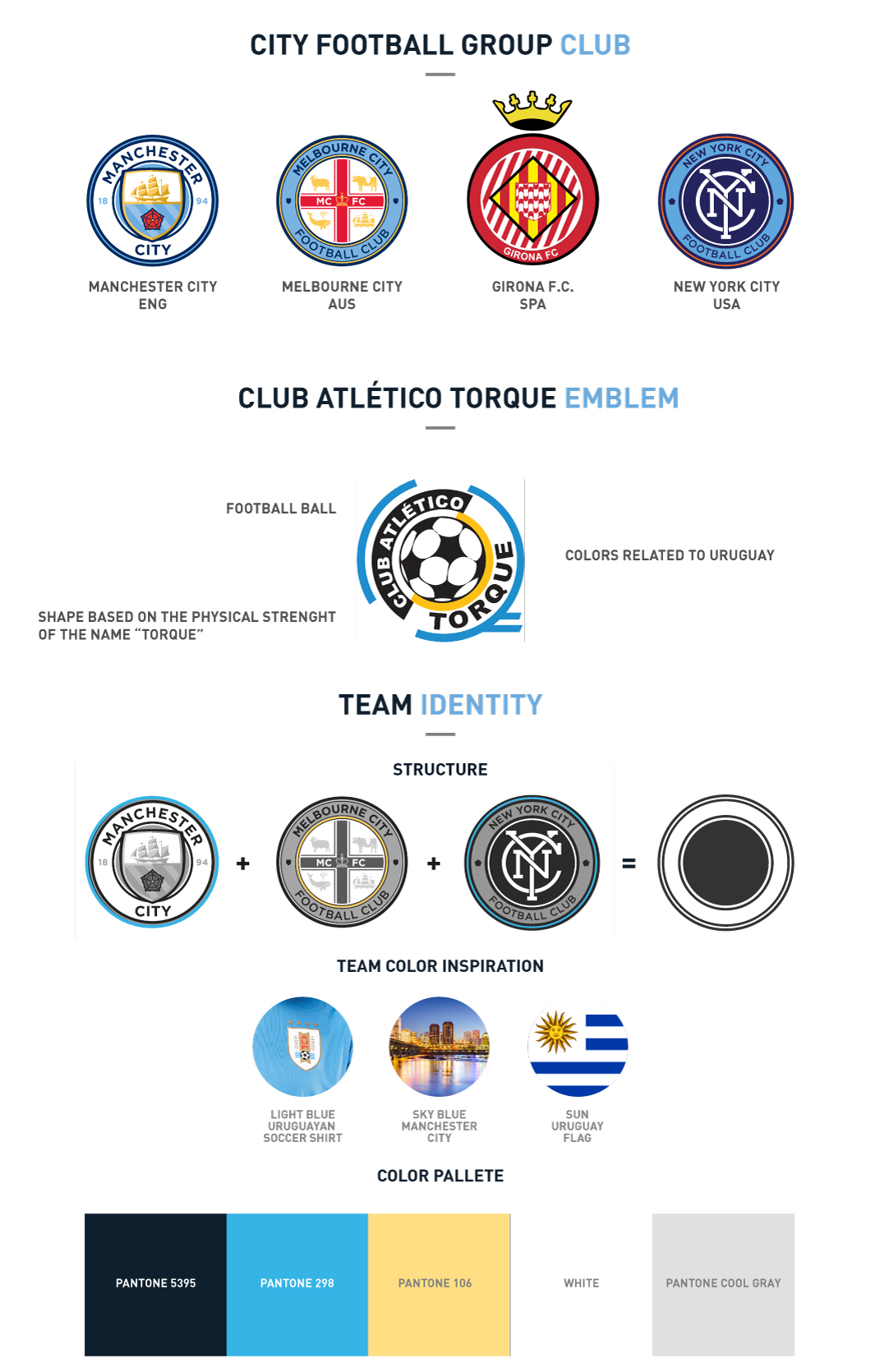
When it came to the logo / emblem, I wanted to include several elements, keeping a simple and effective look. No neons, no bevels, no shadows, no chrome, no bullshit. I wanted to be new / modern, but also to reflect some history and show that the team is part of the City Group. Yes, the companies in football may be quite new here in Uruguay, but we also have to include some identifying elements of the country. I decided to include the” Cerro de Montevideo”, since it is a big part of our lives and one of the elements that makes Montevideo special. This helped me form the T for Torque. The emblem combines the blue of the Uruguayan team with the nuts that show Torque’s strength. When force is applied on a rigid body, that body tends to make a rotation movement around an axel. That ability to produce a spin or rotation around a certain point, is callded Torque.