


The St Philip's group of schools lead the way in Whole of Life Education. The College spans across six schools and caters to students from Pre Kindergarten to Year 12.
The challenge was to present a consistent image across all of their six campuses, making them all feel like part of the family and to accurately represent the passionate culture of learning and student development evident at the schools.
After significant research amongst staff, current and prospective parents, a detailed UX guideline was developed. This guideline streamlined the content architecture and allowed the presentation of content to reflect the needs of users.
Innovative, Personal, Committed, Caring, Energetic, Passionate, Welcoming, Curious, Excellence, Community—
These typify the characteristics of St Philip's that needed to be clearly demonstrated to both current and prospective students and their parents and carers.
Within the following mood boards I worked to establish St Philip's professionalism and experience.
As a common element across all of St Philip's branding, the colour gold formed a major part of the design, balancing the use of photography and complimenting each schools unique branding colours.
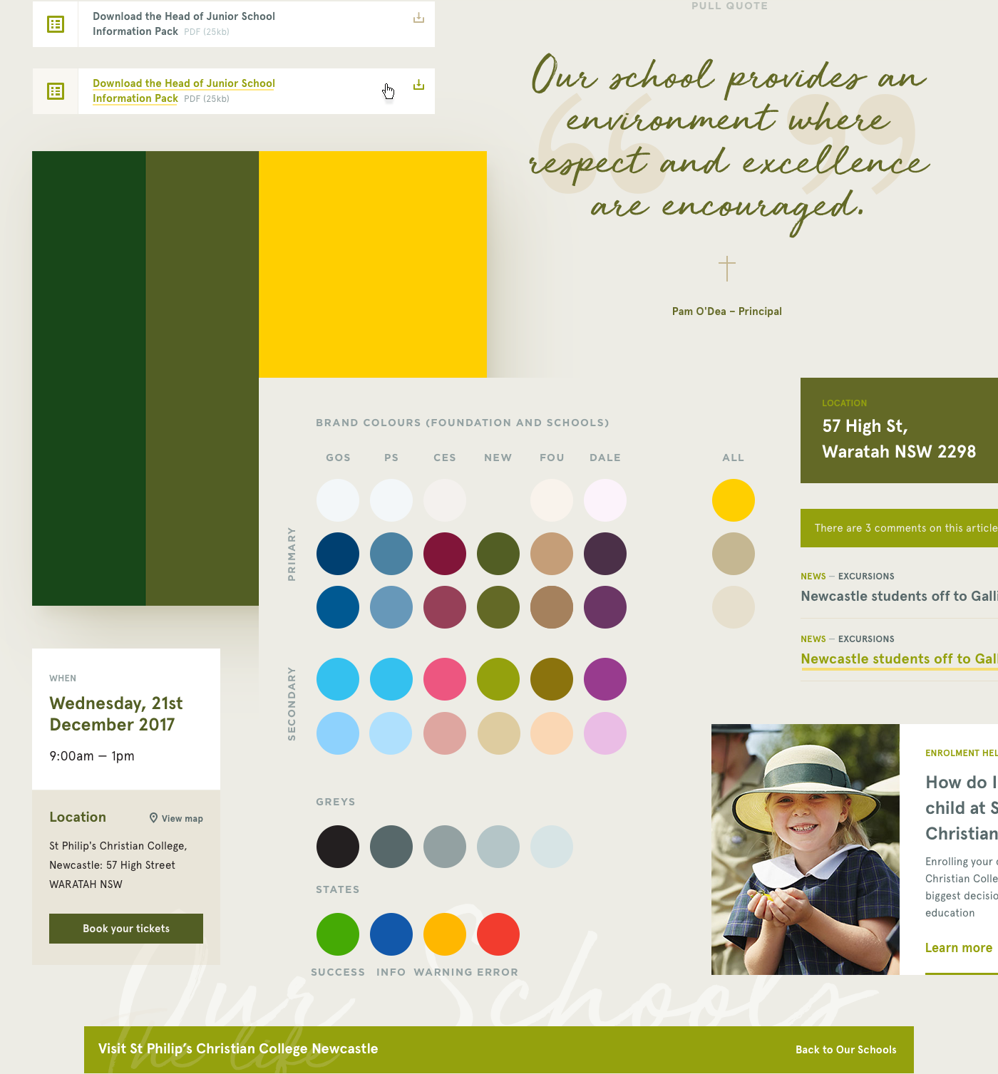
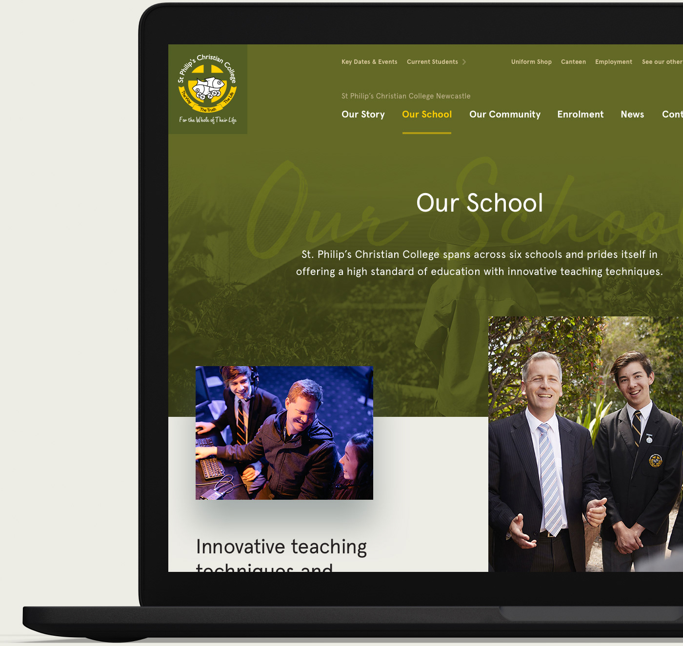
The St Philip's Design System with Newcastle's brand colours applied
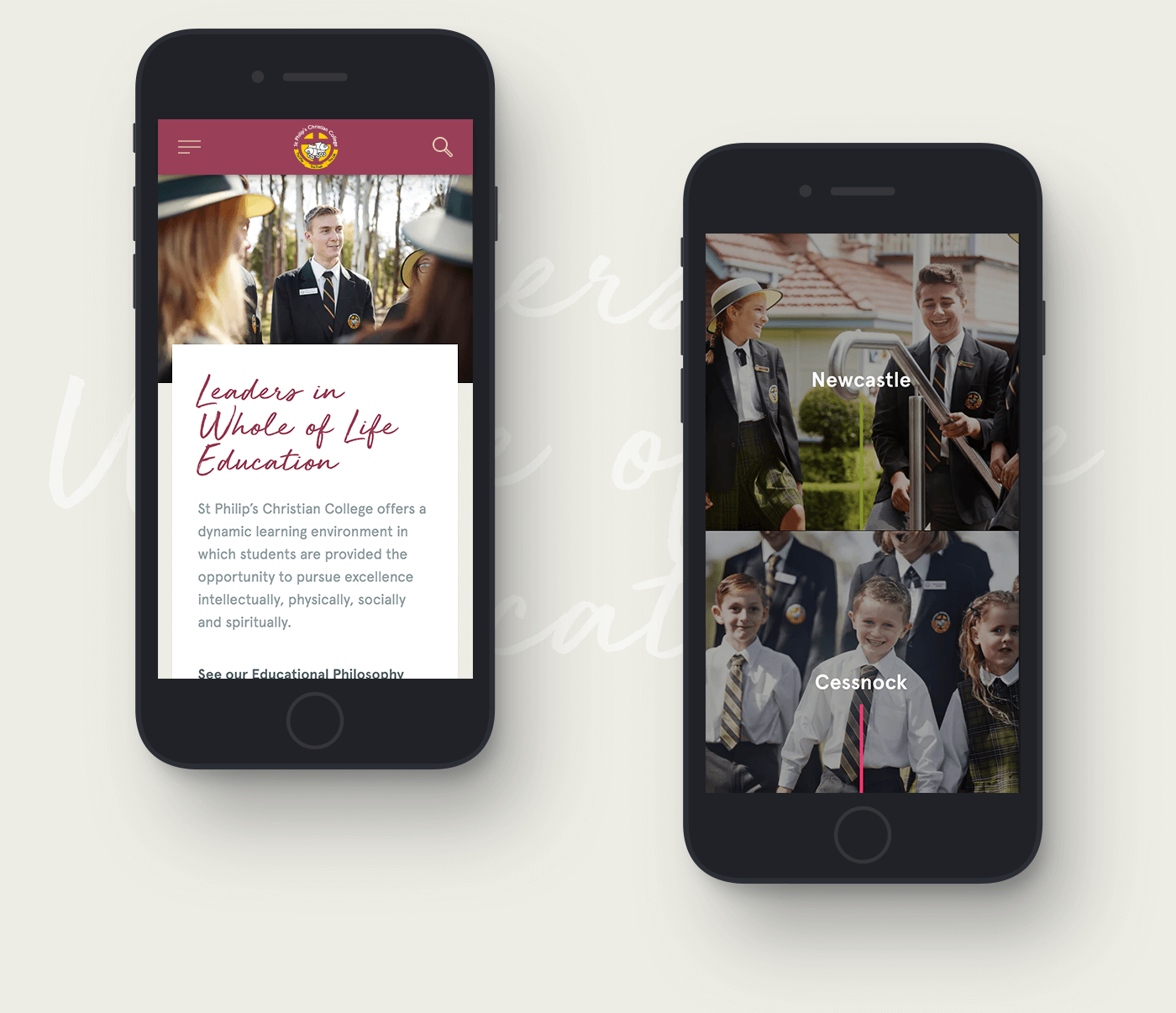
Global Homepage—
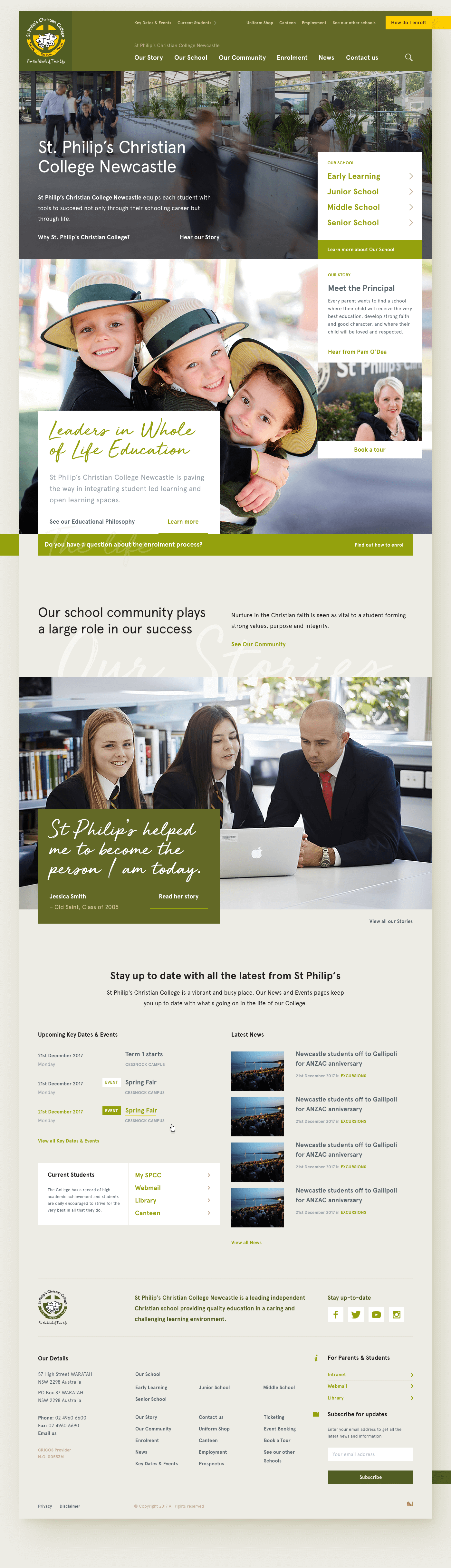
The Global Homepage ended up being a slight departure from the wireframes due to issues discovered whilst building the prototype. We were finding it wasn't clear enough that there were several schools and the Foundation page just didn't have the visual impact we wanted.
We decided to move to the following layout as it allowed prospective and current parents to quickly navigate to their chosen school. It also clearly shows there is substance behind St Philip's and allows us to present strong imagery of each school and the Foundation.
Each image would be a placeholder for a video, so that when a user interacts with each image, the video of the school will play in the background.
This layout also removed the need for separate designs for the Foundation and DALE Homepage's, creating a more consistent look and feel across the schools.
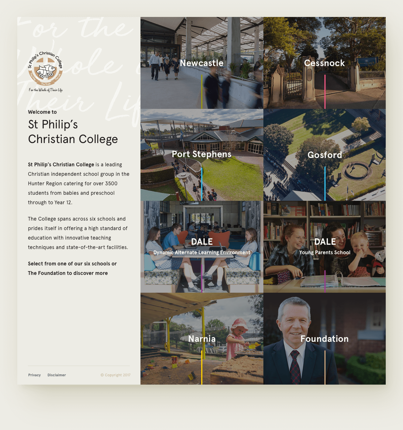
Per school branding—
Each school relied upon a custom set of brand colours, that needed to work per school and across the entire organisation. The resulting colour ways provide a design direction that presents a unique identity for each school whilst still clearly keeping them under the St Philip's banner.
Use of photography—
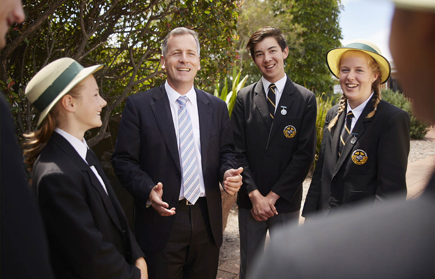
High quality photography allowed the students and facilities to shine, placing them at the centre of story and leaving users with a lasting impression of both the school and its culture.
I worked closely with St Philip's to determine a design direction for their photography so as to properly portray their values, quality of education and state-of-the-art facilities.
I worked closely with St Philip's to determine a design direction for their photography so as to properly portray their values, quality of education and state-of-the-art facilities.

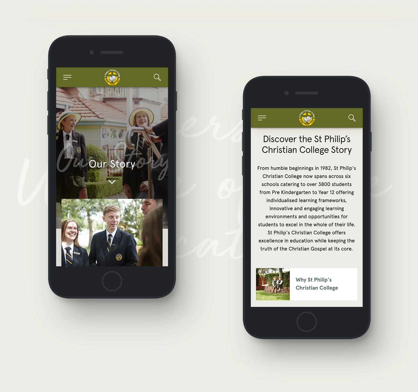
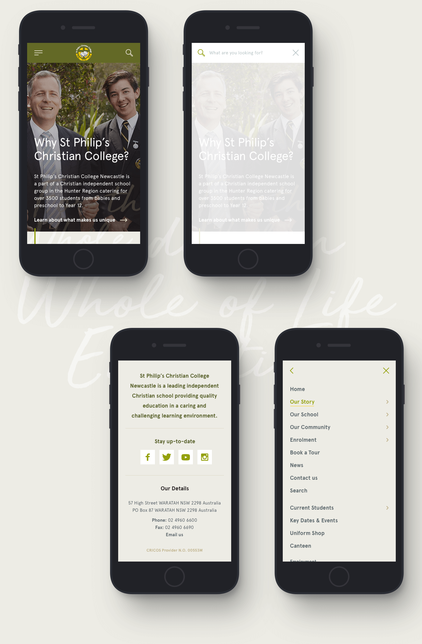
Branding of each school—
Schools are differentiated by the use of each schools branding colours, providing impact and uniqueness for each location.
Schools are differentiated by the use of each schools branding colours, providing impact and uniqueness for each location.
An extensive selection of content types were also developed to provide content editors with the freedom to create whilst presenting a consistent image across the organisation.
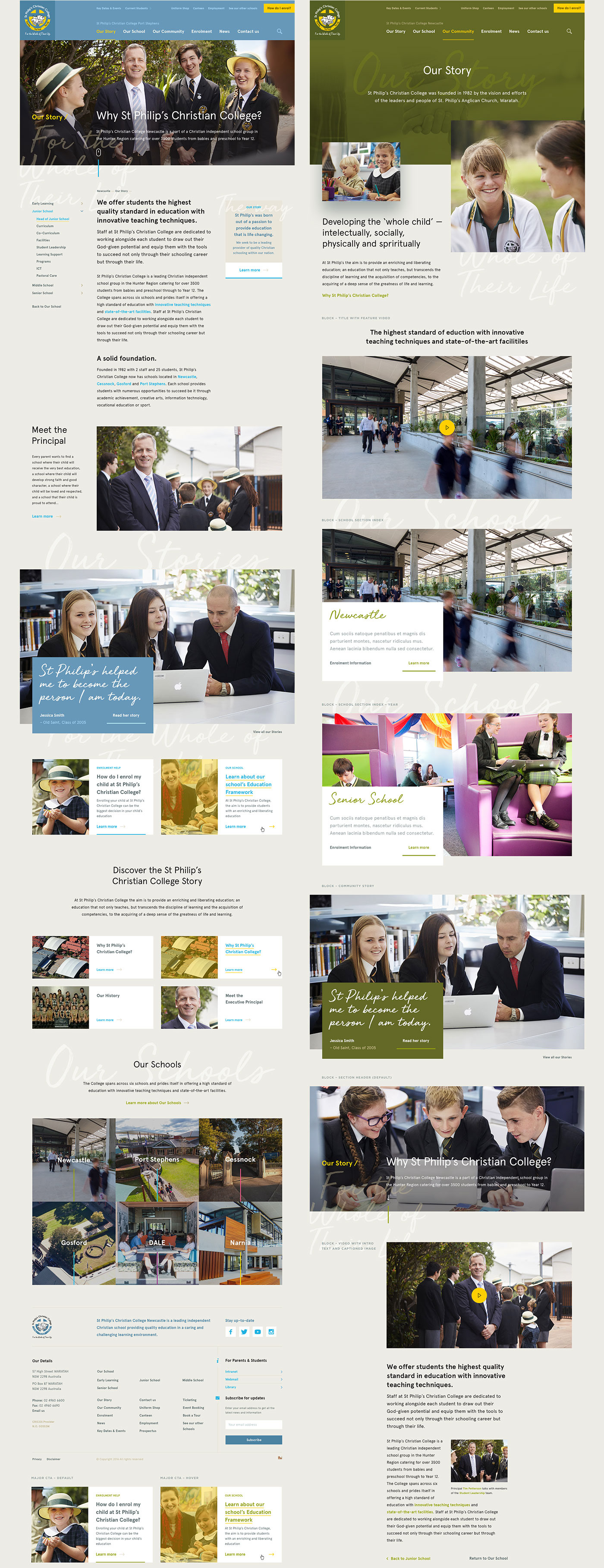
A strong community—
"Our Community" content focusses on life at the school and the success of current and former students as a selling point to prospective parents.
"Our Community" content focusses on life at the school and the success of current and former students as a selling point to prospective parents.

Role—
UX/UI / Design / Art Direction
UX/UI / Design / Art Direction


