


I was tasked with refreshing the brand of award-winning digital agency, Newism.
Founded in 2007, and with the likes of Nib, Michelle Bridges and Warner Bros as clients, Newism were looking to refresh their branding to demonstrate a new found maturity honed through a mountain of projects that were the outcome of the previous few years of hard work.
They wanted to position themselves around the theme of "out with the old"—The new kid on the block, taking down the establishment.
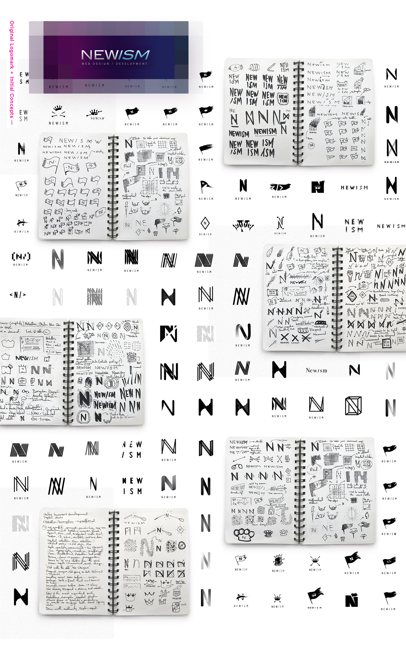
Initial Concepts—
Initial logo exploration followed heavily on this theme. Blazing Molotov cocktails, flags and the odd Viking helmet punctuated early explorations.
Newism wanted to define a recognisable symbol; something that would stand out strongly amongst their competitors and the marketplace.
With this in mind, direction changed to producing a logo mark based on the letter N. To tie it into our theme, regal, authoritative elements were introduced.
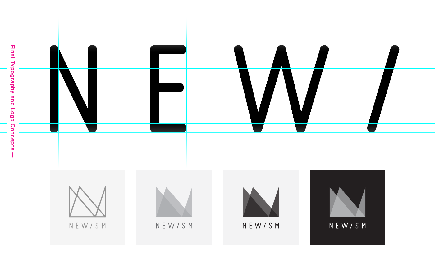
Logo Development—
The logo was developed using two letter N forms, both skewed to create the shape of an abstract crown. This built on the original theme, with the N's also being used to represented the combination of the two founders of the company.
The logo was developed using two letter N forms, both skewed to create the shape of an abstract crown. This built on the original theme, with the N's also being used to represented the combination of the two founders of the company.

Colours—
A highly visible and recognisable pink and purple colour palette was established. This positioned Newism distinctly amongst their competitors, allowing them to stand out as much for their work as their branding.

Final Logo—
The combination of shape, colour and typography formed a logo that reflected the values and updated positioning of Newism.
A set of alternate light and dark versions were establish to create a brand that is as adaptable as it was memorable.

Branding—
With the base brand elements of type, colour and logo now established, the design direction was rolled out. Everything from business cards to pitch decks to their digital presence got the treatment.
What resulted was a cohesive set of brand assets and solid image for the company moving forward.


Site Concepts—
The following are a collection of site concepts for an updated version of the Newism site, designed towards the end of 2017.
Projects—
The projects section of the site was built around a flexible grid.
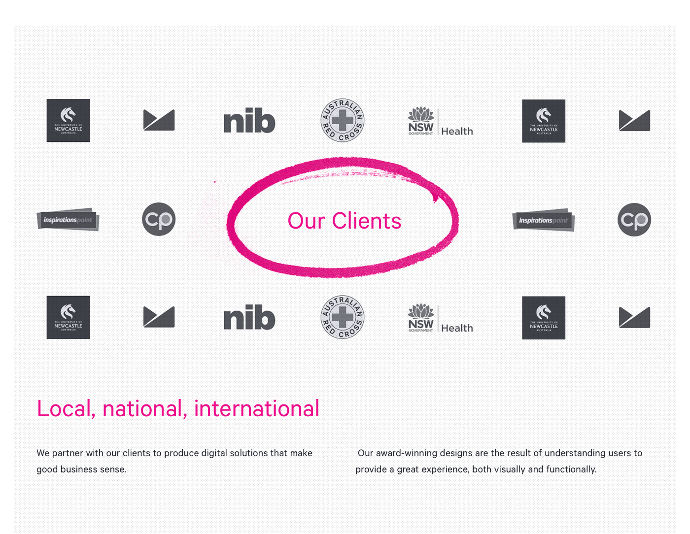
This would allow the easy addition of new projects and create a strong visual representation of Newism's client work.

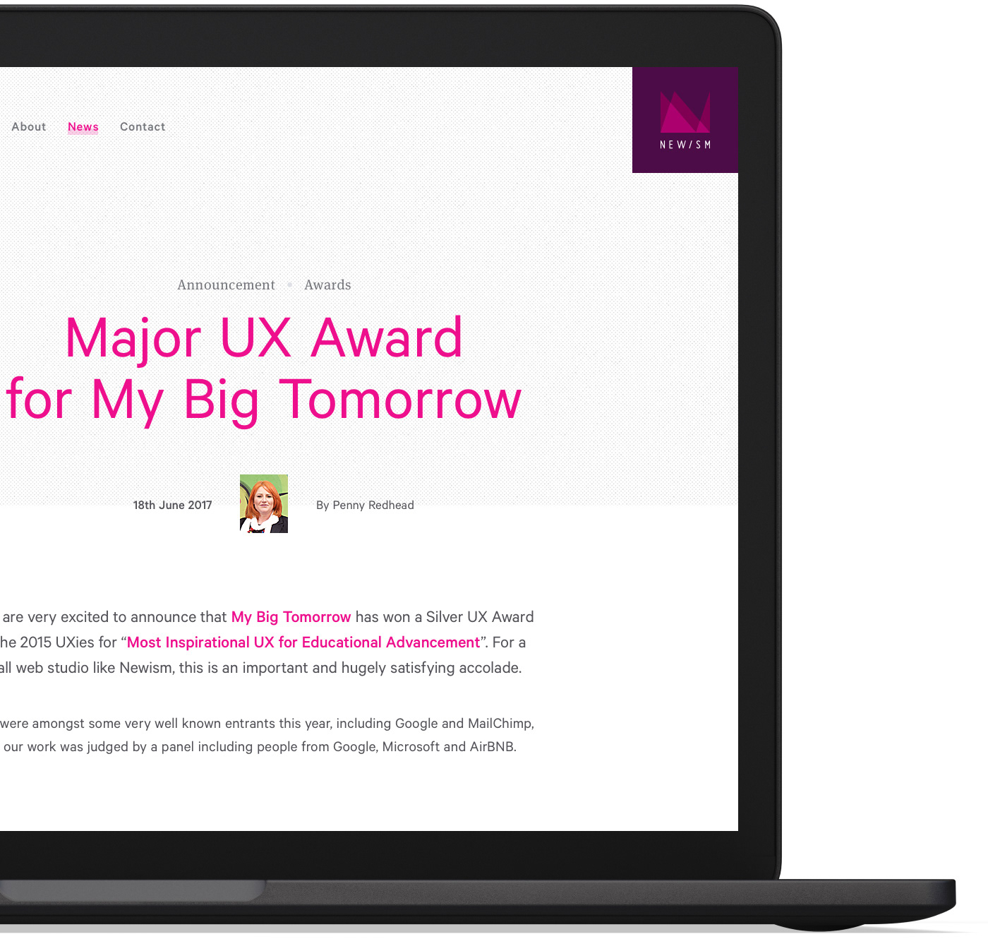
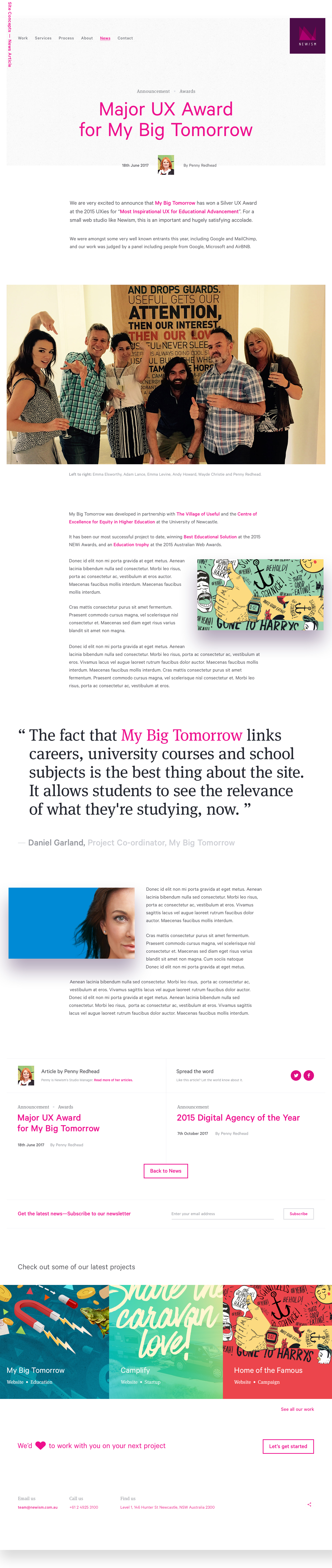
Project Details—
Project details content is all about building a story to describe each case study.
The layout needed to be adaptable and re-useable so content editors could tailor information based on the specific project and client.
A set of robust content types were established, providing editors with the ability to add anything from text and video to complex, custom grids all from within the CMS.

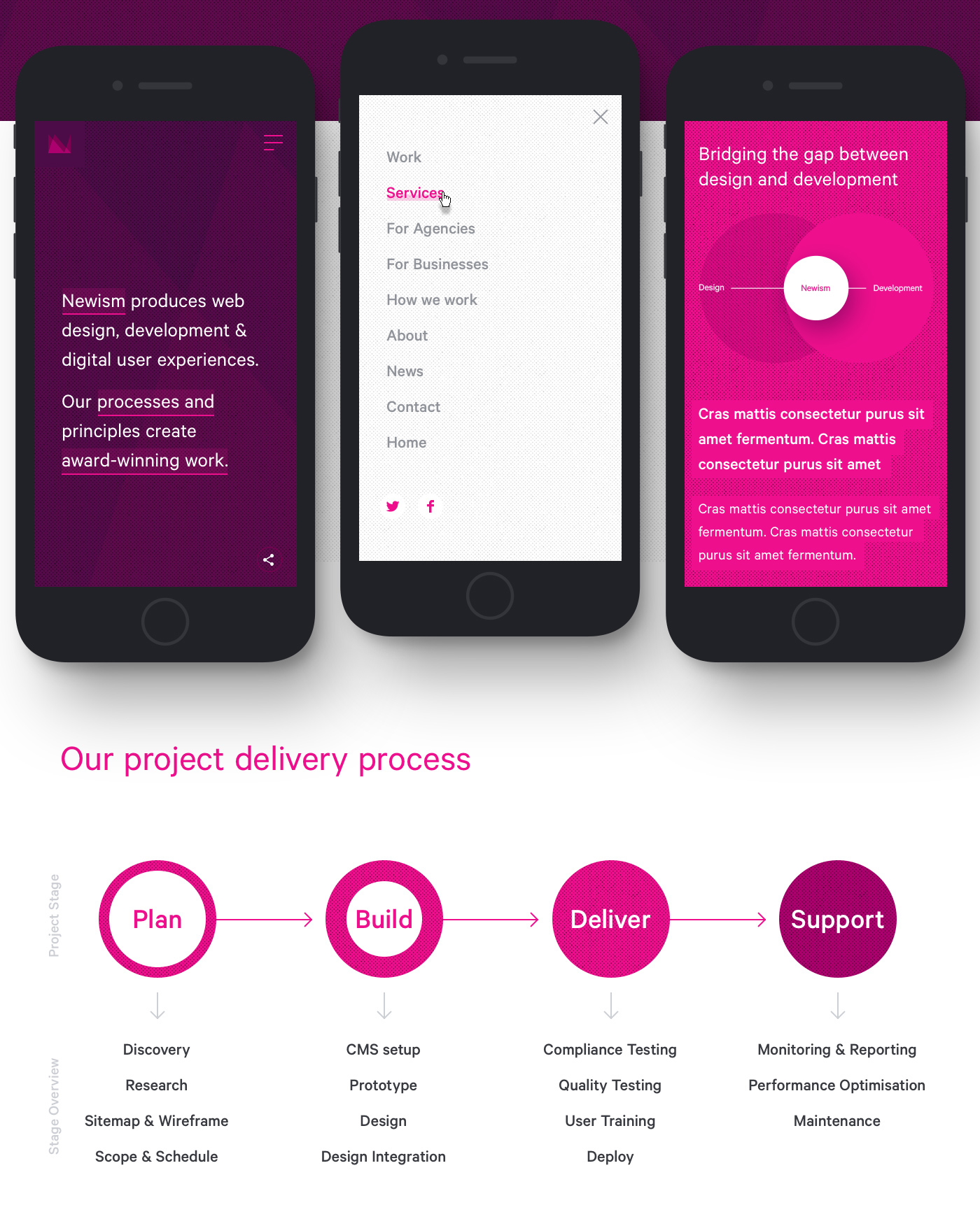
Homepage Concept—
The Homepage is all about providing users and prospective clients with an introduction to who Newism are, and what they do, straight from the get go.
Rather than provide a bit of everything like a lot of agency homepage's, I wanted to present a clear, concise introduction, allowing users to browse the content that was relevant to them by creating clear pathways and interesting presentation of content.

Prototypes—
Prototypes where developed in After Effects initially, then in-browser to test the flow from homepage to project content.
Prototypes where developed in After Effects initially, then in-browser to test the flow from homepage to project content.
Initial transition explorations from homepage to project content
Initial link hover explorations on the homepage—each link would display a custom video or gif, providing a visual indicator for the specific section. (Videos used in examples are placeholders for illustration purposes only.)


