
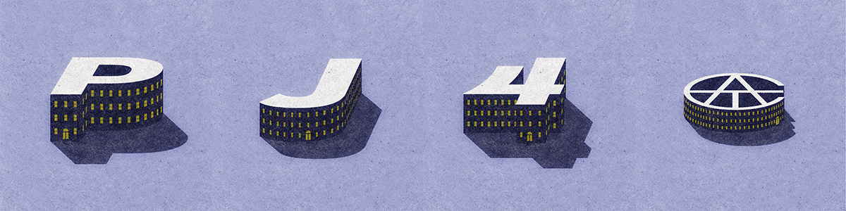
I was lucky enough to be chosen for the Avondale Type Co. Artist Series #3. The parameters were to: take a ATC typeface of my choosing, take my initials, one symbol, and the ATC logo to create a series of beautiful illustrations. After looking at previous contributions from series one and two, I decided a simpler design would stand out and fits my style nicely.
One problem: I had no idea what to do. Regardless, I shot from the hip and chose Overlook. For the name and the slight playfulness of a rigid sans.
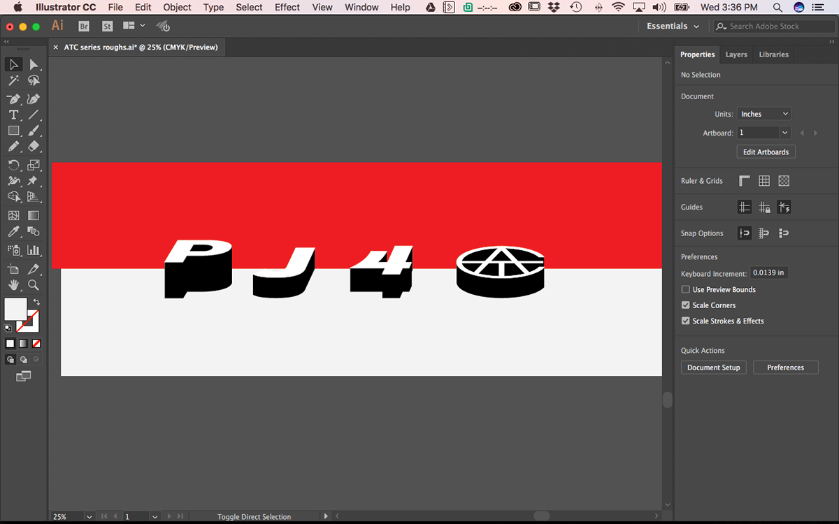
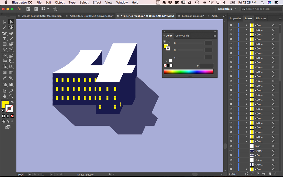
Early explorations for a 3D look...because quite a few people have gone with a flat illustration for these series. Also, I rarely do 3D artwork.
meh

hmmn

word

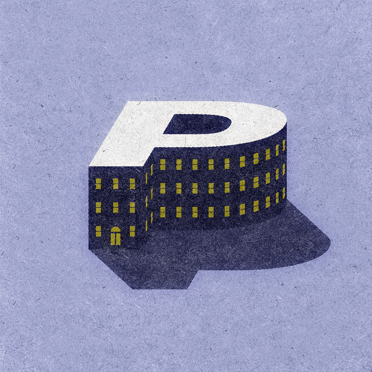
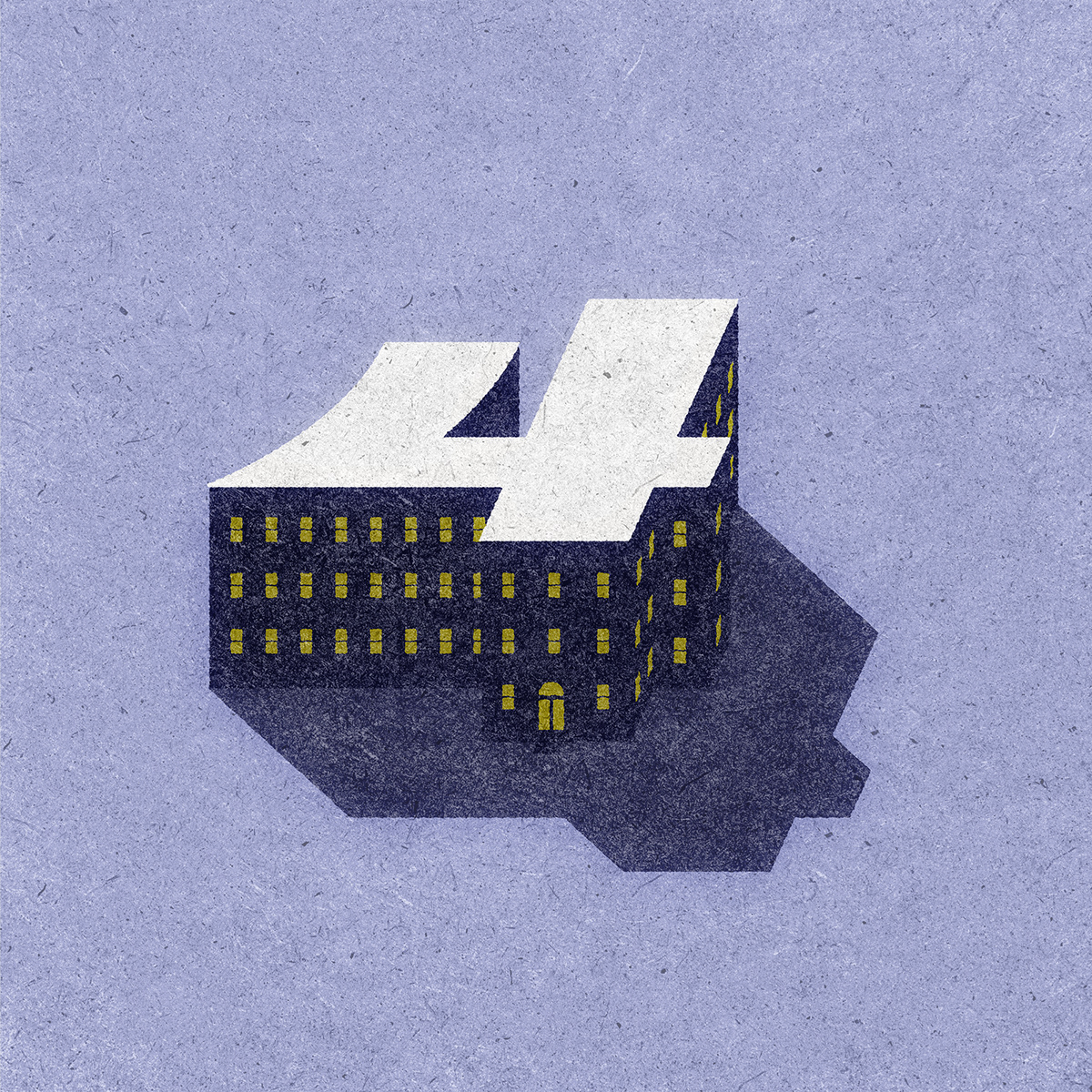
We've got a theme: it's a building!
*dm if you want to know about that smooth peanut butter file

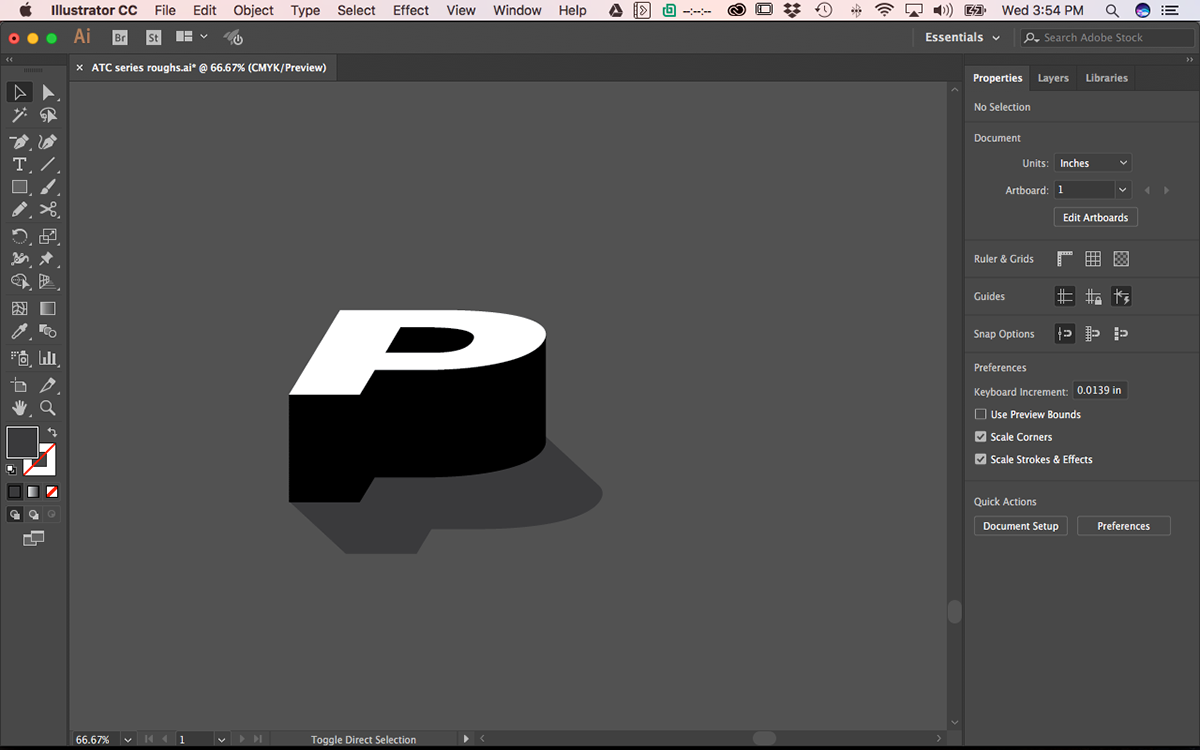
Windows by hand; probably a better way to do this. Maybe someday I'll figure it out.
Obligatory detail shot
Side note: I chose the number four because I am the 4th PJ
Last tweak: use that Matchbook texture thing I bought from Retro Supply Co

noice
Didn't add the window glow in the shadows, should I have?

The new Apple headquarters has nothing on this


