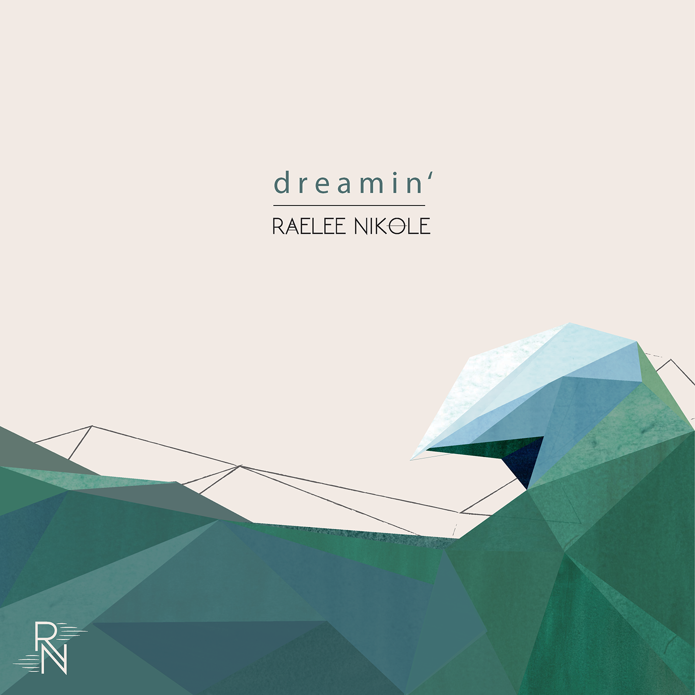

My final solution consisted of the functionality of combined type while playing with thick and thin lines. I used five lines on both sides of the watermark to represent the music staff as well as the visual pulse of music. Raelee writes and produces all of her music so I felt this was an important element to bring in. I used simplified text below in order to write her full name and incorporated some of the same music elements there as well. To me, this watermark perfectly sums up Raelee’s image, bold and strong yet sweet and relatable. The watermark works well by itself as well as with the simple type and even as a design element on its own.

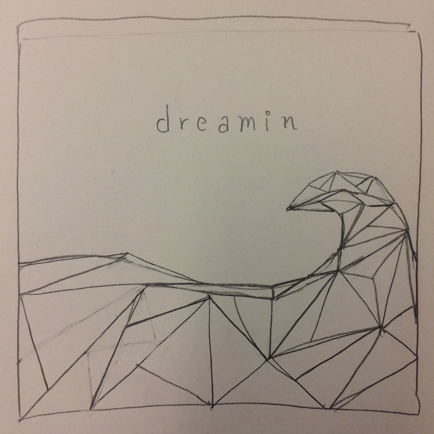
From the beginning I said that I wanted to mix the bold and hard tones of Raelee Nikole’s lyrics with the softness and sweetness of her sound. With this design I was able to do that. Using the watercolors I was able to bring in that soft, sweet sound and then reinforced it by placing these textures into the confined geometric shapes that made up the wave. Visually, it created exactly what I thought of when I initially heard Raelee Nikole’s music and after adding in the watermark and simple type it was obvious that all of the elements played well together. The design is simple and straightforward like Raelee’s music with underlying complexities that may not be apparent to the eye at first. It sums up her music and her.