
Grade5 : Design and UX Process
Phase 2: 2018 Version
If you have seen my previously updated project "Grade5: Design" here on behance; you already have an idea about the educational platform introduced to Sri Lankan community as an aid for kids who face scholarship examination. Previous project updated on behance was mainly focused on the process of the mascot and UI Designs.
In this project, the main focus is to share the process used to enhance User Experience of the users along with some inputs on the design enhancement process. Hence, I will try to make it descriptive as possible along the exact process we followed - throughout UX UI and Development stages with lessons we learned, thinking process and so on.
AWARDS
It was a privilege to be able to design for the application that won the e-Swabhimani Award by ICTA (Information Communication Technology Agency) Sri Lanka for the Best Learning and Educational Digital Application in 2017.
Award ceremony was held in 2018 January.
Grade5 was named Winner at e-Swabhimani Digital Social Impact Awards under Learning and Education
(Video creation credit: Poorna Perera and Mihirani Kulasekara)
User Experience Process
We had a great success than expected with the first release of the Grade5 application with over 10,000 user registrations.
Since the call center was handled by the team at Crowderia, we were able to identify the pain points of the user very effectively. It was not an easy task for the team to handle 24h customer support with over 7,000 appreciation calls plus, nearly 10,000 inquiries on introductions and support.
Most of the users were not tech-savvy as expected from early on. Majority of them were using an educational application for the first time. Along with that, device and network usage issues in rural areas were there as well. Specially when LIVE exams were conducted during a specific time frame for all the users. Online payment methods were a new concept for most of the users as well. Hence, more than half of the customer support inquiries were regarding purchase of the paper sets.
One of the main updates we have suggested and implemented for the second phase was the ability to go through the application on both mobile and web prior to the registration and login steps. So the user can get some insights to what exactly offered within the application once they sign up with us.
While we were researching on the first application, the analytics shown us that the user base drastically bounces off at the login process. Therefore, specially on the registration and login process we have minimized the effort users have to put in order to get into the system by only requesting for the mobile number and verification code. Whereas in earlier version user had to fill up a form with five field of information at the registration.
Brainstorming Sessions
Brainstorming sessions with the team was very effective even though it took longer period of time with information structure management, discussions on thinking process and understanding all of those.
Our main team consisted with three members: Mishari from the UX/UI team, Poorna from the 3D/Game Development team and myself.
For starters, we spreaded out and sketched individual ideas on the areas we discussed on. Then we had further discussions evaluating all of those ideas put in together - identifying the most suitable ideas for the expected outcome. We kept it going iteratively making improvements each time.
Our main focus was to make the user experience effortless as possible even though the user could be far away from being tech-savvy.
Some of the captures taken in between our brainstorming sessions are shown below for reference.


Rest of the colleagues were a big help as well; specially, since they showed up in between our sessions and contributed by making us repeat our thinking process to them out-loud over and over which made us realize on important areas we have missed.
It was one of the best practices we had. Even though it might look like a drag sometimes - to repeatedly explain the thinking process which we are still working-on, to an individual/group who's in the room for the first time seeing the on-going process. That gave us the ability to realise and improve on valuable points for the thinking process.
In the meantime, we distributed a feedback form to share internally to get the inputs on the areas we had doubts on. We had to do/get a basic form of user testing/feedback to choose from some of the flows and experiences which clashed when comes to the choosing the best option.


Concept for a Point System
As a solution to one of the pain points we have identified: "Payment Complications" of the users who aren't familiar with online payments; concept for a point system within the application was suggested. Once a point purchase was completed using easy payment methods accessible to the users; points will be added to the account and they could make regular in-app point payments to buy paper sets without having to use actual payments regularly.
Therefore, a basic flow integrated to the existing payment systems was sketched out along with the wireframes of the concept to be developed.


Wireframing and Paper Prototyping Sessions
Once we had somewhat clear idea for ourselves on how everything should be arranged in the system, we moved on to creating basic wireframes on paper with pencils, pens, color pencils and whatever we found useful to make it all clearly identifiable to anyone who would pop in for a brief discussion or occasionally scheduled meetings to discuss on the on-going progress.


We wanted to try out a paper prototype including all the screens and flows presented in a way we can discuss on the entire process without depending on more technical prototypes which shows one screen at a time. With couple of extra nights put into the effort, we were able to get paper prototypes on-time for the next scheduled meeting with majority of the internal team who were working related to the project.
Some of those paper prototype work-in-progresses are shown below.


Digital Mockup Sessions
After going through several discussions with the stakeholders and the entire team, areas to be focused on the next steps were decided. Using ninjaMock and similar tools we started mocking up the solution we came up with. It was focused on checking the progress of user results, payment flows of multiple items(bulk payments), categorization of the paper set types and the landing page for the first time and returning users.
Some of the mockups from the sessions we had are included in the below photo grid.


User Interface Design Enhancements
Once the overall mockups and flows were satisfactory and agreed upon, another challenging section had begun. That was designing the improved user interface targeted on Grade 5 kids as well as parents.
With the feedback we received for the first version of Grade5, majority of the users(all I guess) were satisfied with the design solution presented with the character and backgrounds designs to make it entertaining as possible for children - without taking off their focus for educational aspects as well.
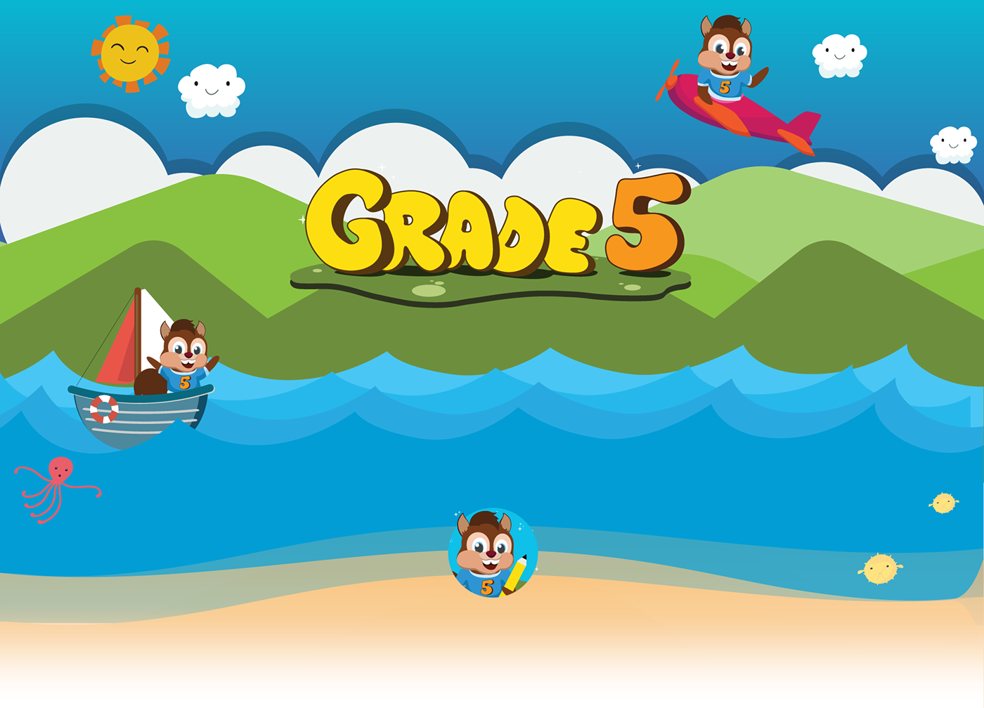
Now we had to come up with much better design solution compared to the previous. In this stage most of the designs achieved the expected outcome with the efforts of Mishari and Poorna; where they came up with the idea of expanding the existed environmental designs. Allowing the mascot 'Vidu' explore Grade5 world from sky to deep sea level with his fifth-grader friends.
We thought of making color codes in order to identify type of paper sets without much effort. As a solution we came up with Paper Sets in yellow, LIVE Exams in green and Term Tests(this type was temporary disabled for the upcoming version) in blue color codes. And then made the overall look and feel into a fluffy look with Jelly-beans sort of buttons and assets. We wanted to keep it effort-less for development as well as considering the efficiency of the site when it comes to the low bandwidth situations in rural areas.


Experimental Design variations
We experimented on several versions of UI designs on our way to making it to the final design stage. We wanted to to make it as much as simple using colors and graphical elements.


Wireframing Mobile Version for 2018
Apart from the web application, in order to make the phase two of the project a success we made an update on the mobile applications including new features as well.
When it comes to the mobile app, we have identified that the previous version could get slightly confusing and flow of the application was not effective as we expected. Therefore we sketched out the flow from the beginning and worked on to making it as similar as possible to the web application flow inorder to make it easier for the users to switch in-between and navigate through naturally.
Screenshots from the mockups are shown below for reference.


User Interface Design for the Wireframed Mobile Version
In order to meet the deadlines and to get the output as soon as possible we have used "UX is the new UI" concept. Where we didn't proceed on to a more specific User Interface Designing for new mobile application versions.
Instead, we used the mockups and flows we have carefully crafted to maintain the balance of both web and mobile applications and user experience a natural one. Thereafter we applied the new UI theme for Grade5 which was used on the web application as well.
UI Design was completed using Sketch App and selected screenshots are shown below in the photo grid.


A Demo of the Mobile Version
You can check out the demo video below for a walkthrough on the mobile application phase two we've been working on.
Grade5 Mobile Version: Work in Progress Demo
Final Outcome of the 2018 version
Within couple of months we were able to achieve the target version of the application.
One of the main struggles we had was, to get the exact design elements we wanted to be on the new version - with minimum weight on the application in order to maintain the flexibility for the users with low-bandwidths. Most of the graphical elements were in SVG format since it would maintain the quality we expect on the designs throughout all devices. Wherever it was not possible, we have used PNGs as well. Which helped in keeping the file sizes compressed as much as possible, without much loss to the quality. Because, generally SVGs in its vectorized form is the most low in size. But, when it comes to the graphics with shadows and more detailed designs SVGs could get quiet heavy, specially if using as image files rather than using SVG code itself in development, which would make the source code too crowded.


In parallel to the launch, we had to make preparations for the social media and walkthrough guides for users. Along with those we have updated the Grade5 Trailer as well.
Have a look at the trailer updated for the new version below, where our Grade5 mascot - "Vidu" introduces the new version with more features and ease of use to his fifth-graders friends.
Grade5 Trailer for 2018
(Video update credit: Poorna Perera)
Printed Designs for the Launch
Application was released on 15th of January, 2018 for the second phase which took place at NethFM premises with the participation of all stakeholders and other invitees.
Printed designs were used for promotional campaigns and at the launch event decorations as Backdrops and Banners.
Below are some captures from the launch with few of the team members who were involved throughout the development process.


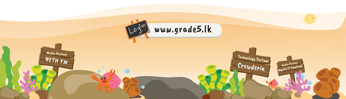
Interested in checking out Grade5 Application?
You're welcome to have a look and try it out. And let us know your feedback so we could improve in future.