LA ENCURTADA
CREACIÓN DE LOGOTIPO/MARCA Y PACKAGING
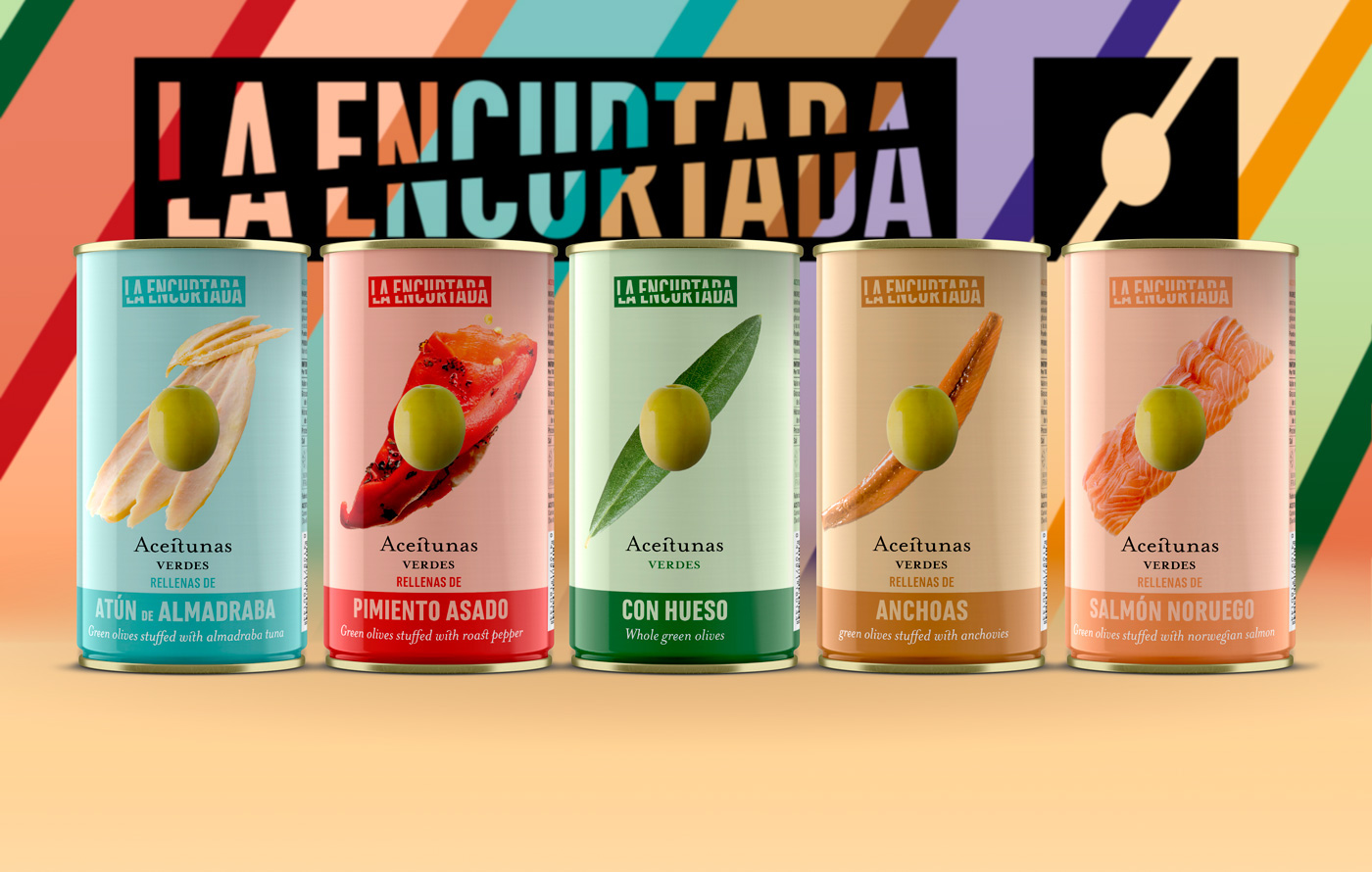
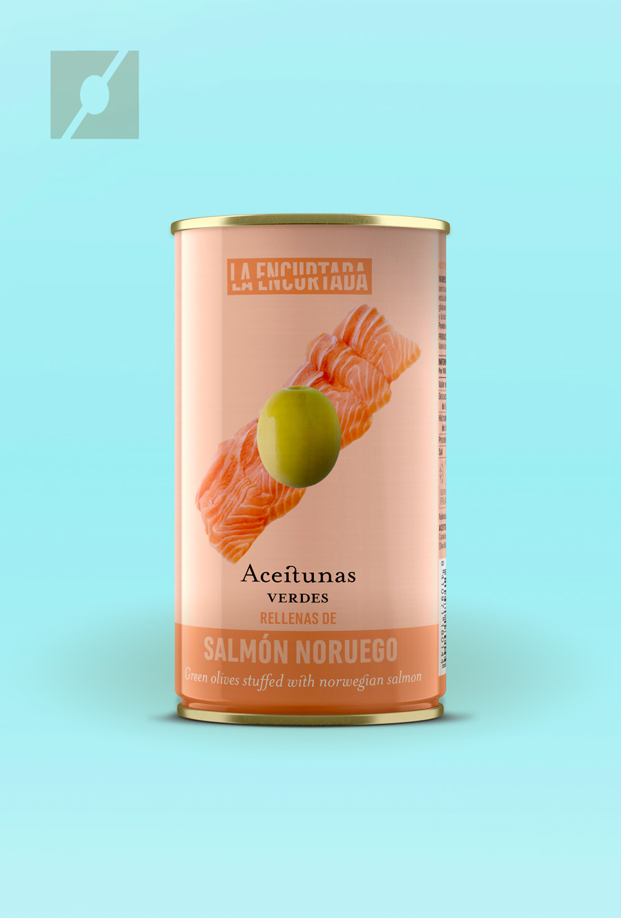
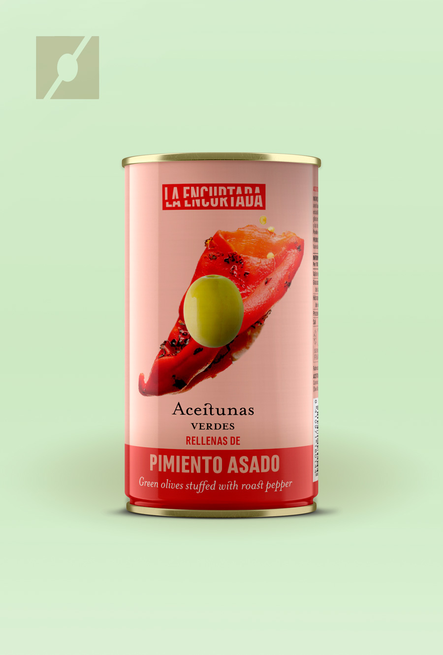
The naming of this product came out almost without having to do an extensive briefing. Our client insisted, repeatedly, that his product was pickled and his intention was to place them at a very specific time: parties, cocktail and snacks. We saw that the common points, within the "time of use" that the client had marked us, were very clear (colour, fun, music, freshness, gatherings). We decided to use the elements of colour and fun. The naming refers to the word "pickled" winking at the word "cut" in Spanish, since we decided that, both the packaging and the symbol, a single olive appears cut diagonally by some other ingredient.
El naming de este producto, salió casi sin tener que hacer un briefing extenso. Nuestro cliente nos insistía, de forma reiterada, que su producto eran encurtidos y su intención era colocarlos en un momento de consumo muy concreto: fiestas, cóctel y aperitivos.
Vimos que los puntos en común, dentro del "momento consumo" que nos había marcado el cliente, eran muy claros (color, diversión, música, frescura, reunión). Nos decidimos por usar el color y diversión.
El naming hace referencia a la palabra "encurtida" haciendo un guiño a la palabra "cortada", ya que decidimos que, tanto en el packaging como en el símbolo, aparecería una sola aceituna cortada en diagonal por algún otro elemento.